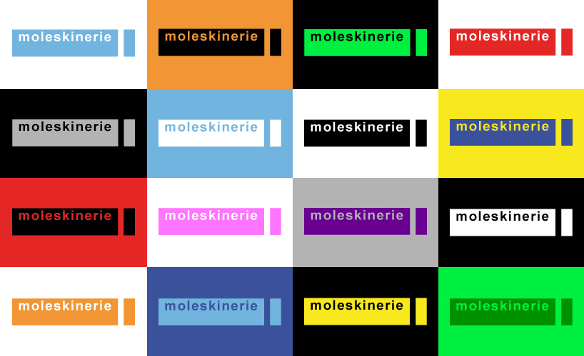
coloured moleskinerie by emma díaz gonzález from spain
designer's own words:
i think about “moleskinerie” as a way of bringing moleskine closer to that group of people that uses new technologies and social networks as ways of communication. that is the reason i believe the logo should be refreshing and made in the language of those users. i have translated that into a very simple logo, that gives hundreds of colour possibilities that makes it playful and cheerful, but still preserving some of the moleskine tradition by including that very recognizable vertical stripe.
basic
 black background
 coloured background
 colour composition
shortlisted entries (2162)