click on it by ana valverde pinel from spain
designer's own words:
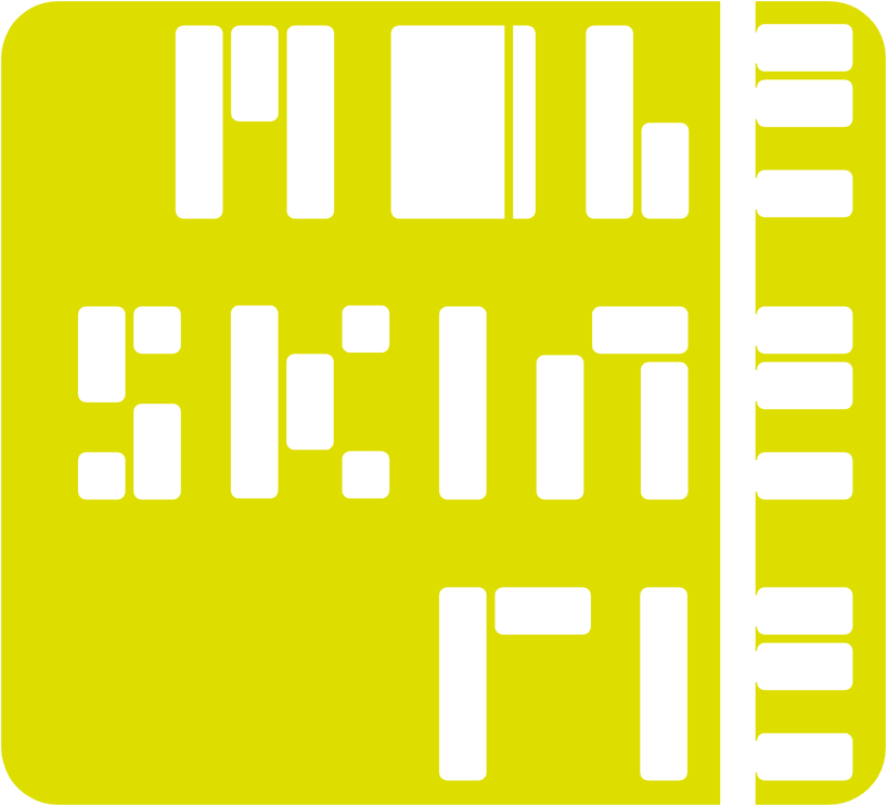
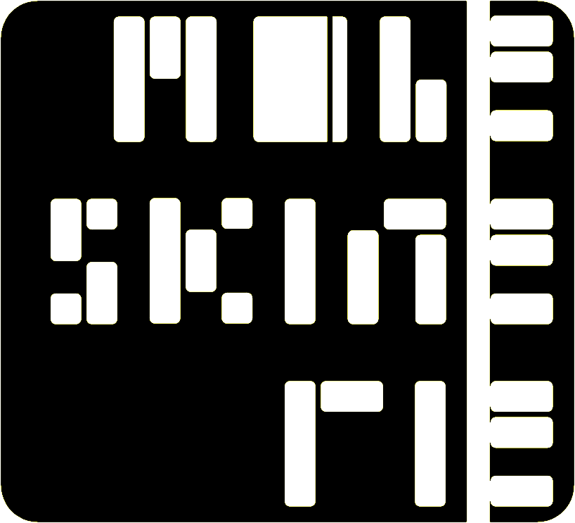
A new type for a new concept of Moleskinerie. Innovative and a bit more “free-and-easy” the logo looks for updating the traditional image by means of changing the original types. Based on a metaphor of small notebooks, the letters are included in a curve frame, similar too to the original notebook limits. This compact logo appears as an application whose extension covers many possibilities, like the Moleskinerie brand offers now, many products apart from the original notebook.


shortlisted entries (2162)