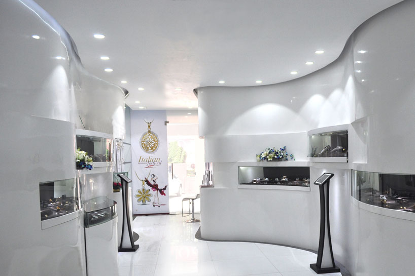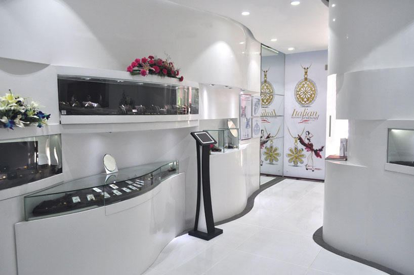
caratlane experience lounge by jasleen manrao from india
designer's own words:
ABOUT CARATLANE: Caratlane Trading Pvt Ltd : CaratLane.com is one of India’s leading e-commerce companies and one of the most visible online brands since its inception in October 2008. CaratLane.com was started with a mission to change the way diamonds and diamond jewellery are bought in India. In 4 short years, this vision is well on its way to being realized.
DESIGN BRIEF
In the Year 2011 Clients approached the design team with a vision to create continuity in the transition from cyber-space to the real-world user-experience in the physical space.
While there are numerous successful examples of brands with physical stores translating the user experience to the virtual space; very few online businesses have attempted to do the reverse.
The challenge remained to link up the essence of carefree browsing, navigation showcasing and easy accessibility of the web portal to the physical display and showcasing in a niche category of a typical jewellery store!
DESIGN TOUCH-POINTS
Segmentation: Jewellery, as a segment has very rigid display norms; amongst other things it makes the product rather inaccessible, creates a real as well perceived rarity, and luxuriance around the product
Navigation: Another challenge was navigation. The clientele on the portal, navigated by themselves, in a typical jewellery store, sales team shadows the clients, in the name of showering attention.
Showcasing: A product as precious as high value solitairs and of the scale of as small as tiny studs, still needs to be the hero in a showcase, the lighting, props, planograms and custom designed props a was a big design consideration.
Experience and sensory: to be able to create a fine balance between the new age, digital and rather aloof format of selling jewellery online to the warmth and attentive luxuriance of touch feel and see and smell…BIG CHANGE!
The design of the 'off-line-portal', as we labelled the project, was to absorb the qualities all the above mentioned qualities from the 'on-line portal'.
RESEARCH AND STRATEGY
The strategy was built around the reasons that make the consumers opt for shopping jewellery online.
• Freedom: Preliminary research revealed that on the web, the clients (women or men) had no pressure of buying. There was absolute privacy and browsing was at will. On the portal the customers escaped the physical reality.
• Information vs interaction was well-laid out on the portal. There was support available in the form of live chat and toll-free calling options. A quick glance through the FAQs, laid to rest most of the doubts.
• Engaging: Interactive features ensured that the customers spend hours browsing on the portal. The customer experience was designed to be hands-on. They could actually design their own Jewellery and try it on as well.
Furthermore, the team evaluated the design decisions with respect to the principles of emotional design. The customer journey in space was mapped.
THE CONCEPT
Just as the Homepage and site map worked out on the web portal, the concept of the store panned out as per customer touch point journey.
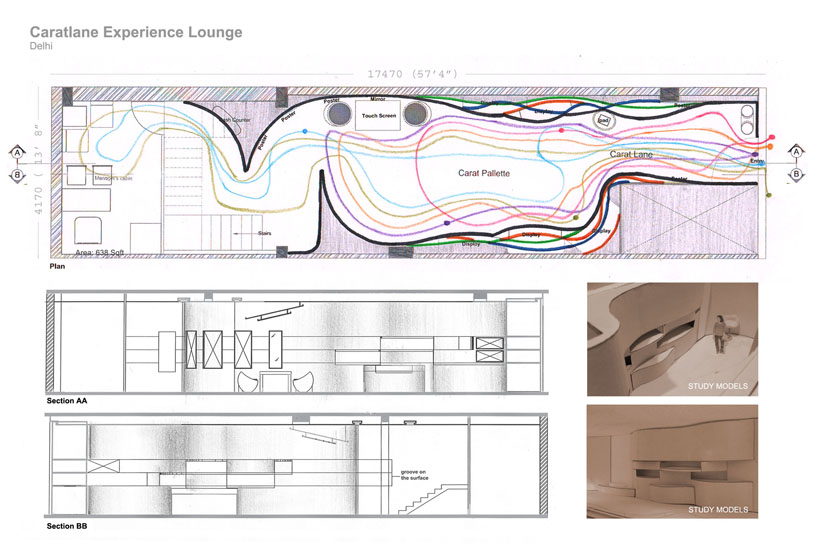
The design process started with plotting customer path for various target groups (TG). Touch-points in each path were marked. These paths were finally super-imposed over each other to define the journey. There are multiple ways in which one can navigate through the small space.
Invite – Educate – Inform – Explore – Engage – Enrich!
The residual volumes on the periphery were filled up. Niches were then carved into the filled-up volumes to make space for the products. The products displays were designed to be accessible. Customers could help-themselves. This element was critically reviewed later.
Caratlane.com(invite): The front of the facade sets the stage by incorporating an interactive touch screen embedded in the façade glass accessible from the pathway outside Caratlane.com.
Carat 'lane'(educate). The customer walkthrough was designed is such a way so that he / she educates himself through a funnel of information called the Carat 'lane'
Carat 'unveil'(Inform) So an educated customer enter the store to find a Carat 'unveil'showcasing the latest and the best!
Carat 'pallete'(explore) :Then he is exposed to the whole collection of jewellery in the form of display units and niches Carat 'pallete'. the I pad pods strategically placed link up the virtual store. Tablets and touch-screens not only reconnected to the parent portal, they also made avenues for customer engagement.
Carat ‘Cafe’ (engage) The interested customers are gently led to the Carat ‘Cafe’, where the process culminates into the multimedia presentation and commercial transactions, if any!
DESIGN DETAILS
In terms of the visual vocabulary, the mandate was that the space should be form-less. This also ensured that the design of the space shall be forever future-ready. The residual spaces on the periphery were finished in subtle curves which complimented the movement path. The space though small in actual carpet area, are visually infinite owing to the form and treatment.
Material palette was limited to three materials, Fabric, Glass and White Duco painted Flexible Ply. These in-turn provide the space with softness, transparency, and infiniteness.
Detailing and articulation of surfaces was kept to bare-minimum. This ensured that there was nothing but the products capture the customer's vision. However, elements of psycho-experience were brought in to detail out the experiential journey. Signature aromas were created to enhance recall.
Instead of using padded Visual Merchandise, as is customary for Jewellery, we designed a collection of cylindrical profiles, in rather unconventional material of CPVC pipes and silk. Silk gave the visual and tactile relevance to the product category.
The surfaces and back-drops, together reinforce the message that the product offering is accessible and value-for-money, yet precious!!!
The staff styling, in the whole setting, were not sale team or brand ambassadors. They were professional who could be consulted on the subject matter. The soft-skill training and the staff uniforms were both designed accordingly.
Technology is inherently weaved into the fabric of the space. The glass of the display window is an interactive touch-screen, which at the very threshold, sets the stage for the interactive-experience inside.
The interaction desk is a 12 sq.ft. touch-screen, where product details can be enhanced for inspection. Tablets are integrated into product displays, bringing information-technology into the plano gram.
There was no real pressure of being monitored. Beyond the customary welcome, staff interaction was designed to be on-call. The prospective customer could experience the brand and its offering; make a comparison in the real-world stores around.
At the experience centre, the customers get to handle the product. They can also browse through the web-site using interactive screens and tablets.
The modus operandi for making the actual purchase(s) are plenty. The customers may choose to either buy the displayed merchandize at the Experience Centre. They can also customize their selection at the experience centre and save it for later. The purchase may be made while sitting in the house with the family, with colleagues at work or in any other setting. All doubts laid to rest!!!
INSIGHTS
The visual vocabulary and the transition worked wonderfully, both in terms of aesthetics and the brand recall. Pitted against the established traditional-jewelers on the High-Street, the experience centre could set itself as a serious jewellery destination. It could effectively shatter myths around branded jewellery.
Retail environments are dynamic spaces. Constant monitoring and evaluation were some-things that were altered in the test stage. Glass shutters had to be added.
The visual merchandise was complimented with satin back-drops to make it look plusher.
The most important take-away, remains the new dimension of retail experience.
Experience, where notion of virtual architecture can become live-work-interact spaces in the real-world. Experience, where brand recall is consistent to the core and the unique business proposition is clearly articulated. The avatar does not mimic the virtuality in graphics but lives it in for of interaction design and multi-sensorial experience.
...
Spatial Plan & Mockups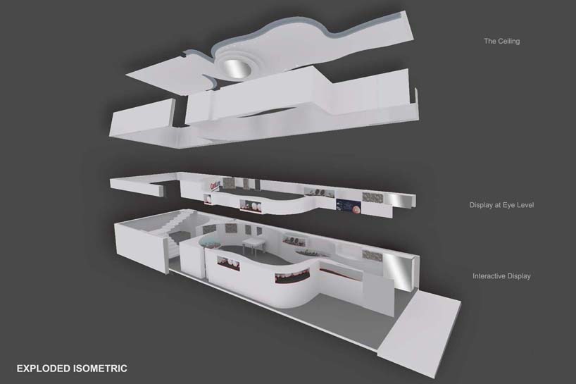 Exploded Isometric
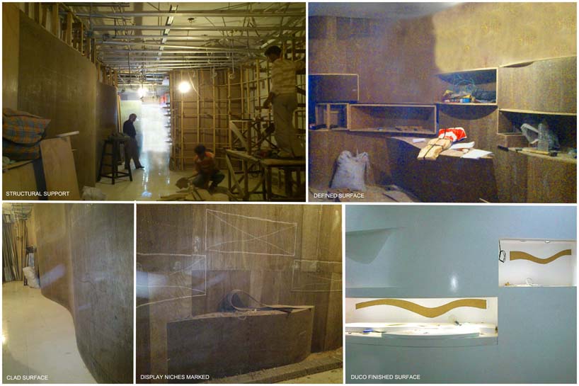 The Making
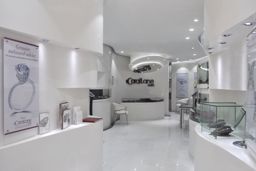 Information Funnel