building blocks as moleskinerie logo by lev zeitlin from usa
designer's own words:
shape:
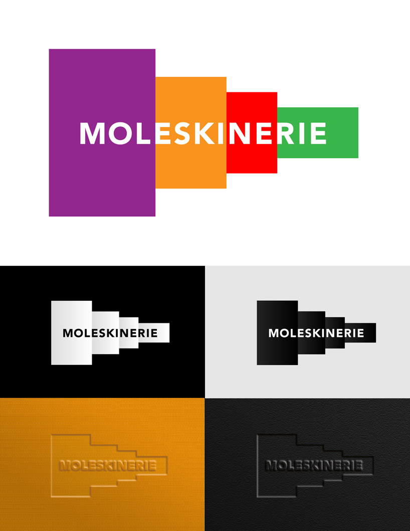
the shape of our moleskinerie logo is derived from four basic sizes of moleskine notebooks: large, pocket, reporter and classic mini. the shapes are arranged by size, in proportion to each other and represent the original classics that made moleskine brand so popular and famous.
colors:
the full version of the logo utilizes colors representative of the notebooks’ covers.
font:
avenir black, a san-serif font represents values of the moleskine brand: simple elegance, readability and functionality. It allows for reproduction in small sizes and remains readable when embossed in small size.
the spirit:
the telescoping silhouette of the logo symbolizes building blocks – the basic tools that help us develop creativity at an early age that stays with us forever.
alternatively, the shapes can also be interpreted as series of plains in perspective, similar to gift boxes on a shelf; buildings or billboards along a highway reseeding into horizon. it speaks of abundance and limitless depth of possibilities.
if considered separately, each shape with letters on the front will represent an abstract book cover with a title.
moleskinerie logo in: full color, black and white, embossed on leather and fabric covers
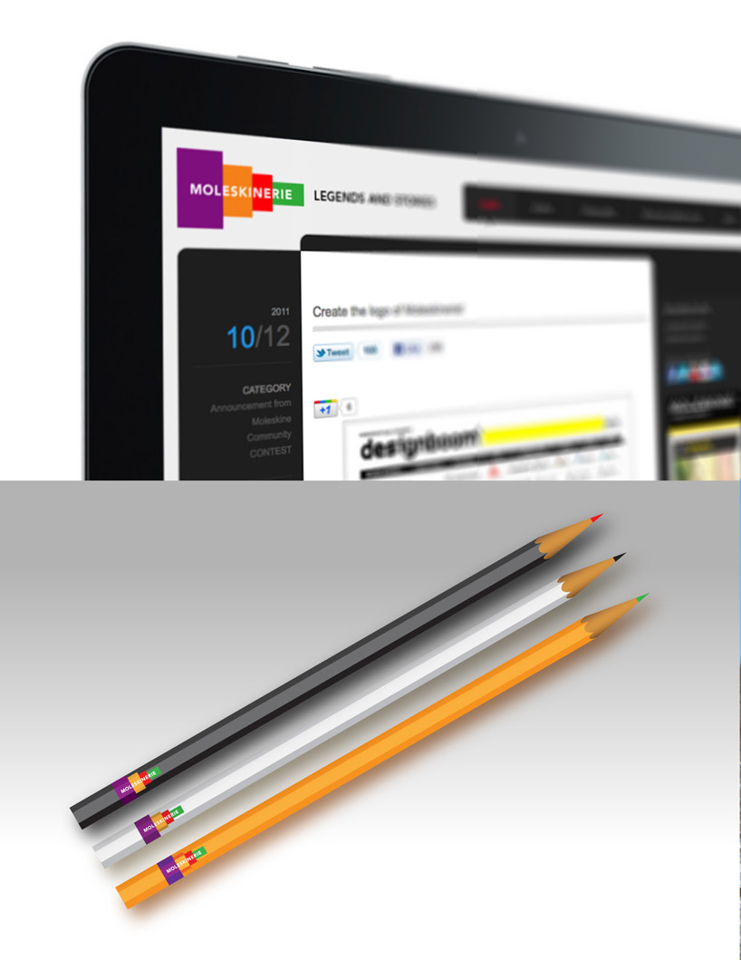
 moleskinerie logo application on: computer screen as part of masthead, pencil decal measuring 3/8” as the smallest suggested application
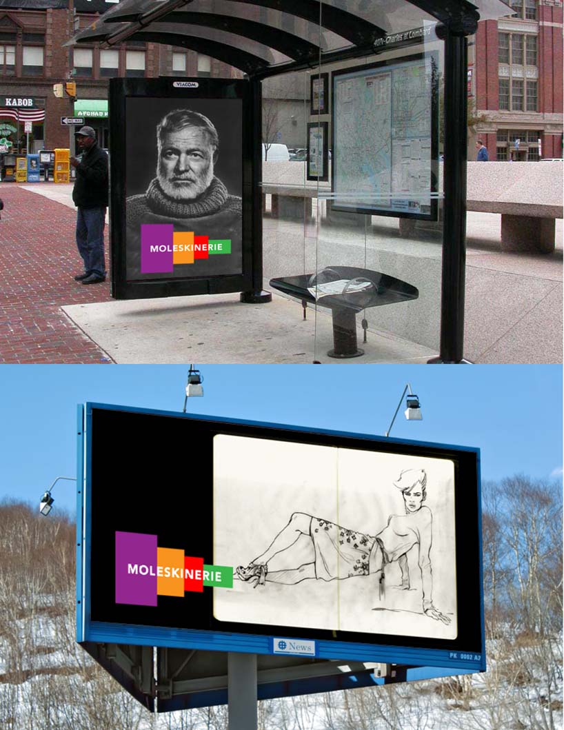
 moleskinerie logo application on: bus shelter illuminated advertisement, on outdoor billboard