bruno basta's moleskinerie logo by bruno basta from croatia
designer's own words:
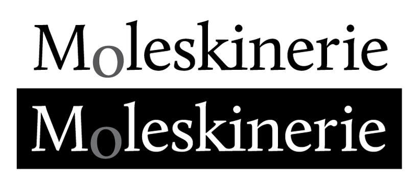
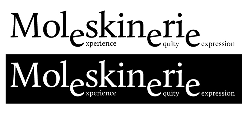
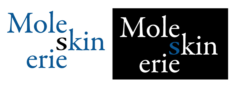
made in adobe illustrator cs4, containing logo in both positive and negative background. first logo is a completely typographic result, and an intention is that moleskine is a serious, real corporation. the second one is a bit complicated: it is a variation of a typo design, where the repetitive letter 'e' is partly separated from the main letters; each 'e' has its own word / tag. the last logo is meant to destroy horizontal alignment of the word 'moleskinerie', breaking the name apart, but also giving birth to a three new words that already have meaning.
basta moleskinerie logo 1
 basta moleskinerie logo 2
 basta moleskinerie logo 3
shortlisted entries (2162)