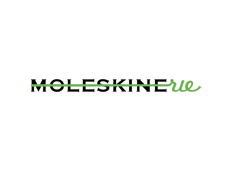
brilliantly simple by sandra lavric from croatia
designer's own words:
moleskine as a brand has a long tradition and a great reputation of indisputable quality, convenience and beauty of it's products. therefore, the smartest way to continue this tradition was to use your moleskine logo as a basic form for moleskinerie logo. to make it more interesting i added some color. thinking of moleskine first thing that comes in mind are moleskine spinners with colorful paper bends, bookmarks and great design. i wanted to keep it simple and recognizable.
with all that in mind i've made three design interventions on moleskine logo: one that is elegant (bookmark - n.1), other colorful (diverse array products - no.2) and third which is playful (freehand - no.3). hope you'll like it ;)
LOGO 1A
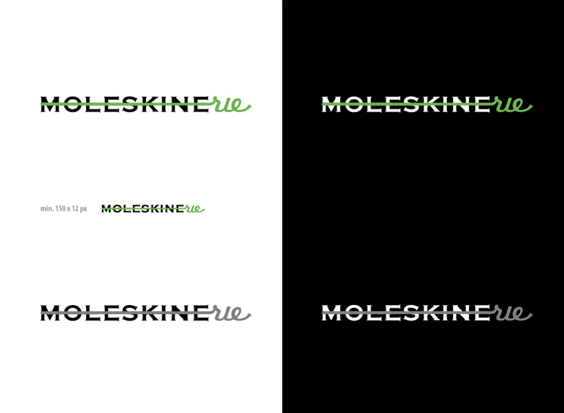 LOGO 1B
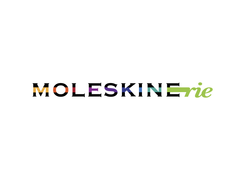 LOGO 2A
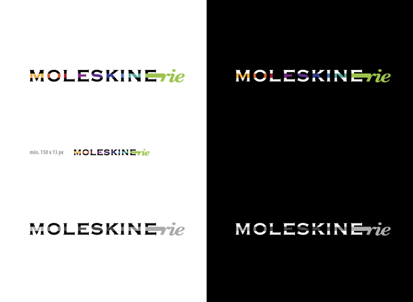 LOGO 2B
 LOGO 3A
 LOGO 3B