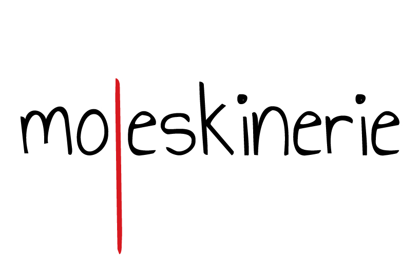
bookmark. by anja rankovic from croatia
designer's own words:
'bookmark' design focuses on the ribbon bookmark found inside every moleskine notebook. the letter l in word 'moleskinerie' in prolonged so it looks like the real bookmark. logo works in color (red letter l) and also in black&white.
design is related to the notebooks and its bookmark, but also the blog - as visitors should bookmark the moleskinerie as a daily 'stop-point'.
moleskinerie logo
shortlisted entries (2162)