Bookmark by mar horrach from spain
designer's own words:
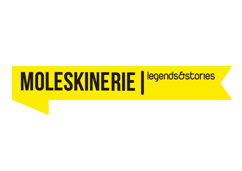
prior to the creative process, there was a key stage in the development of the project: we focus on brand awareness for which we work. we investigated about their positioning in the market, its target audience, which are its objectives and how they wish to be perceived through its identity. the logo consists of two lines of text which lies in the variation hierarchy typography. the word moleskinerie is the essence of the logo and typography supports robust and noble evergreen as well as legendary character. as a subscript, 'legends & stories' is written with a fresh and current source, based not so much the nature of branding itself as the means of insertion of the logo: the network.
in the second proposal, the typesetting is part of a rounded rectangle become an attractive figure in the form of a horizontally disposed. represents a bookmark. the way the character emerged after dietary perceive both the product in question, as the site for which has been designed that logo. the marker shape allows it to integrate and interact in some fashion with the content offered on the web.