BookMark by ivo ruijters from netherlands
designer's own words:
I've tried several design ideas on this one. Searching for a concept to translate Moleskine into a logo, I came up with the idea of the bookmark, folded as a 'M'. I started sketching and used good old paper to try out several prototype models. If you'd like a can show you pictures of this. After that I took the paper model and made a sketch out of it. The final design was made in illustrator (yes, it's all vector). I decided to add an arrow shape to the logo, to visualise the idea of movement and progression.
I wanted to show you the possibilites of the logo so I added a few texture examples to show what it can do to the logo.
White on black
 In color
 With textures
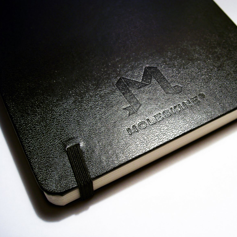
 On a notebook
 Website
shortlisted entries (2162)