
big m moleskinerie by hipo zembala from germany
designer's own words:
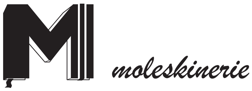
what makes a moleskine a moleskine?
the elegant sleek cover is understated and never old fashioned. its bound bookmark allows quick access to a canvas whenever an idea strikes. and the iconic elastic page-holder band is probably the best invention ever, keeping the book closed when it should be, opened where it should be and getting out of the way when not needed.
with its established and unchanging design, the moleskine is instantly recognizable and bears the notion of reliability, which is much appreciated by its nomadic users.
proposing an uppercase m for moleskinerie, gill sans bold, expanded into the third dimension, this typeface is inspired by roman capital letters, representing humanism and cultural heritage. the depth is added to resemble the famous notebook. the page-holder band and the bookmark transform the m and make it undeniably look like a legendary moleskine. the logo is monochrome, making it easily adaptable and recognizable in different sizes and colors. to give it a fresh modern look it is slightly asymmetric and partly ,leaves the grid‘, while remaining readable. actually it looks as if someone took a moleskine and cut a m out of it.
because of the logo‘s almost square like proportions, the name of the blog is written on the right side of the m to fill a broad space when needed. to emphasize moleskine‘s significance in the field of handmade notations my suggestion for the name is brush script, a typeface resembling human handwriting, alluding to the scribble often found inside moleskine notebooks.
10.11.2011
hipo zembala
the moleskinerie logo
 logo with text