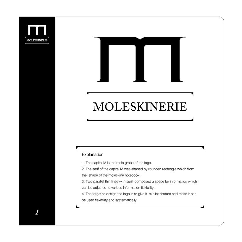
big m by cao qun cao qun from china
designer's own words:
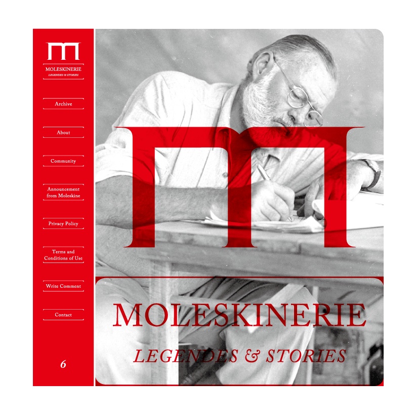
1. The capital m is the main graph of the logo.
2. The serif of the capital m was shaped by rounded rectangle which from the shape of the moleskine notebook.
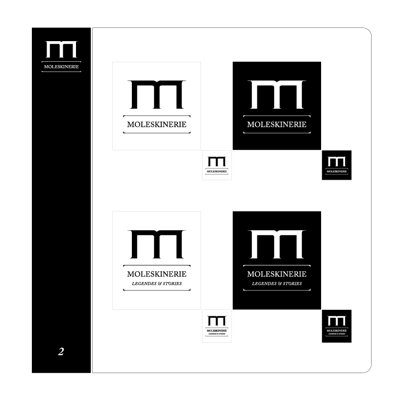
3. Two parallel thin lines with serif composed a space for information which can be adjusted to various information flexibility.
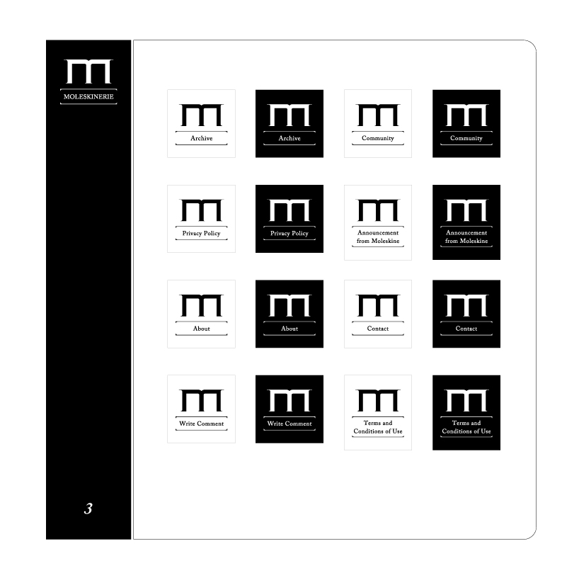
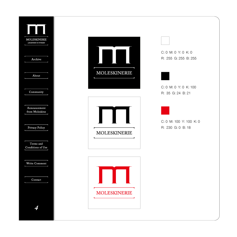
4. The target to design the logo is to give it explicit feature and make it can be used flexibility and systematically.
shortlisted entries (2162)