Becks inflatable world by anke van rossum from netherlands
designer's own words:
Beck’s outlet,
Concept
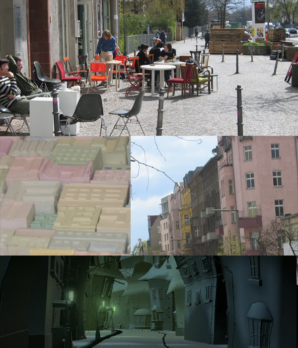
The concept for my Beck’s outlet is inspired by my work-period in Berlin. I experienced Berlin for about two months.
The road from my apartment to my atelier was very exciting. I think it’s the ideal spot for a ‘Beck’s’ stand. In that kilometre you can have entertainment 24 hours a day. In the morning you drink a coffee in a cafe and visit some small shops. In the afternoon you have the delicious day menu of the lunch-café, you do your grocery and check out the new exhibitions. When the evening falls you go and have a caipirinha (or Beck’s of course) in the 70 years decorated cocktail bar. Later you stop by the internet-café to look at some sites. Via a illegal ‘birthday’ party you go to a club and dance the night a way. On your way home you stop at the corner where the best mini-pizza’s are sold 24 hours a day.
This and more all happens in one street. It’s a really nice and casual atmosphere where the people who live there are friendly, self-assured and relaxed.
I think it’s the lifestyle in which Beck’s can relate. That’s why my two designs for the Beck’s outlet are inspired by a street which is very lively, changeable but relaxed.
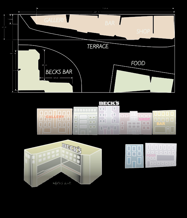
Both designs are based on the same floor plan. This is a short street build out of houses based on the ones in Berlin. It’s scaled down to a height of 4 meters. (1:4) There is a little square where the bar is situated. A terrace can be formed on the ‘streets’ and in front of the long building. In the buildings is room for exhibitions, shops or a food-corner.
I used a colour-palette based on the pastel colours of the buildings in Berlin.
Beck’s inflatable
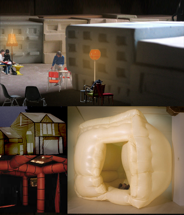
In this stand the buildings are inflatable. They have airtubes who serve as a frame, the material is a (fireproof) transluscent fabric. The colours are pastels and with lights inside they glow up in the dark. It’s possible to enter the buildings where you can drink your Beck’s inside, if you like to.
The furniture are very simple, just some well chosen second-hand chairs and tables. This creates the unconstrained atmosphere on the street.
The buildings backside is very quiet. When you walk by, you can see the silhouettes of the people inside they make you curious to see what is on the other side. Besides it will get noticed, because other stands usually scream with their brands and logo’s.
Mood
 Plan
Plan
 Sketch