becks bar by kevin hubbard from uk
designer's own words:
Your Becks Outlet
The Becks Bar is based on the same core values as the brand itself: purity and quality whilst reflecting the virtues of the bottle the beer arrives in, with a visible narrative that everything can be recycled.
To keep this text precise and to the point I will reference it to the images that make up the other section of this submission.
CONCEPT
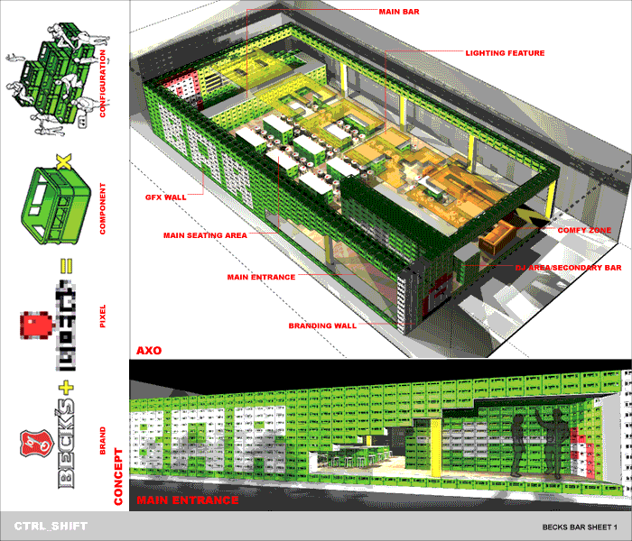
The concept of the bar begins with taking the company logo and pixilation into a series of lo res cubes. This is then translated into the main component of the bar, beer crates. This reflects the fact that 500 000 bottles of Becks are enjoyed everyday, and takes advantage of the returns system employed by the brewery and meaning that the whole design can be recyclable like the famous Becks beer bottle.
By multiplying the component we come up with the architecture of the bar and by reconfiguring the components we can come up with different agreements that allow a series of programs to go on in the space.
AXO
Using the dimensions of a the beer crate as our starting point we came up with a grid that allows the crates to be manipulated into architectural forms, that includes the entrance, the 8m bar, a supplementary bar - dj area, and the tables. Intersected into the grid and beer crates are interventions such as bespoke coloured crates that make up the branding of the bar by creating low-resolution images of the label, signage and the bottle itself. Apertures are created by having the crates floating on 20 mm pressed steel supported by columns hidden behind light boxes, which also provide ambient lighting and give a sense of the crates floating and dictates the bars boundary. These apertures also allow the insertion of shelving storage and the facilities normally associated with a bar.
MAIN ENTRANCE
The main entrance consists of the word “BAR” spelt out in bespoke white crates and subtle lo res image of the Becks bottle viewed through the main entrance, with a white arrow directing you to where the actions at. The nature of the crates allows this façade to be translucent or solid depending on the viewpoint from which you are standing from, creating a dynamic and lively façade.
PLAN AND SECTION
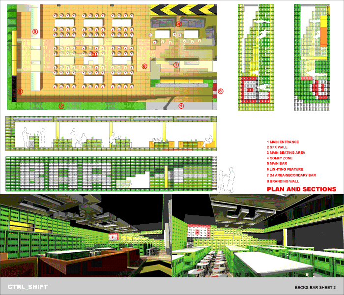
The plan shows the breakdown of the bar into general table arrangement, main bar and comfy/sofa area. It also shows how necessary interventions such as disabled access, storage, and flooring fit into the grid defined by the beer crates. Also of note is the lighting feature, which also doubles up as the main branding of the scheme that is also defined by the grid, which is discussed later.
The sections and elevations show the human scale of the scheme and how the branding, storage and spaces relate together with the light box columns.
LIGHTING
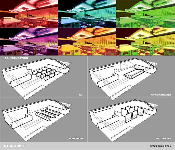
The lighting feature in the bar also doubles up as the main branding of the Becks outlet. This is based on the Becks logo as interpreted through the pixelated grid defined by the crates. Using programmable LEDs the lighting feature changes colour to reflect the activities and ambience this bar provides. Using data acquired from the colour therapy organisation this is-
RED energizing exciting emotional
BLUE calming relaxing healing
GREEN balancing harmonising understanding
PINK soothes nurtures encourages
ORANGE warming energizing fun sociability
YELLOW stimulates confidence helpful
CONFIGURATION
This shows how using the same amount of crates in the main seating area how the space can be reconfigured along the grid to support activities usually associated with the Becks brand. Such as workshops “Becks agendas”, art gallery ”Becks futures” and cinema/theatre reflecting the brands sponsorship of fringe events, which appeal to the main audience of the bar.
FURNITURE
The main seating components will be a stool [shown in the illustrations of the space] that is based on the proportions of the Becks beer bottle top and incorporating the red element of the logo. This provides another level of subtle branding and also due to the nature of the object, adaptable to the different scenarios that will take place. The sofa elements can be acquired second hand contributing to the economy in the location of the area, and then redistributed in the same way when the tenure of the bar ends.
CONCLUSION
The Becks bar will attract its audience by being a place to be seen, through the architecture and the programs it can provide, and the fact that its temporary nature means its resources can be redistributed to a practical level benefiting the company and the environment. We hope you enjoyed the proposal
concept
 design
 configuration