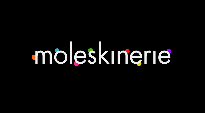
beauty marks by ilija perkovic from croatia
designer's own words:
this logo is a kind of a pun on a word mole, a part of moleskinerie name. moles, or beauty marks, add a lot to our looks, making us distinctive. think marilyn monroe. so, this logo has colorful beauty marks too, making it distinctive, but also playful and contemporary. as moleskinerie is a rather long word, there is an alternate version of logo which breaks the word in three pieces, making it more suitable for placement on smaller surfaces.
logo black
 logo white
 logo monochrome
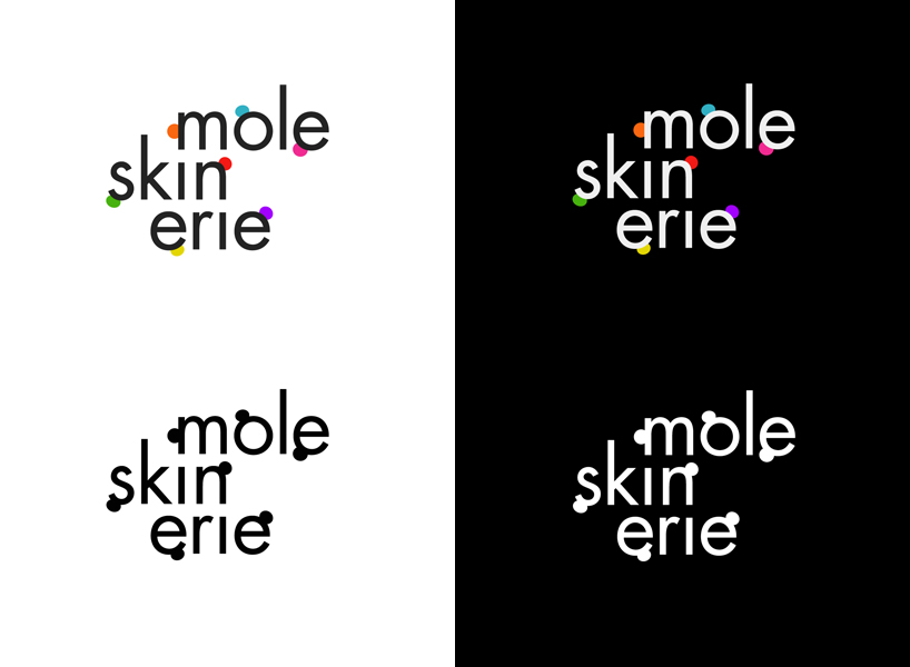 alternate logo
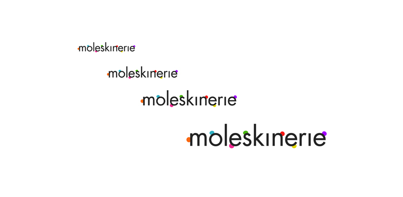 different sizes
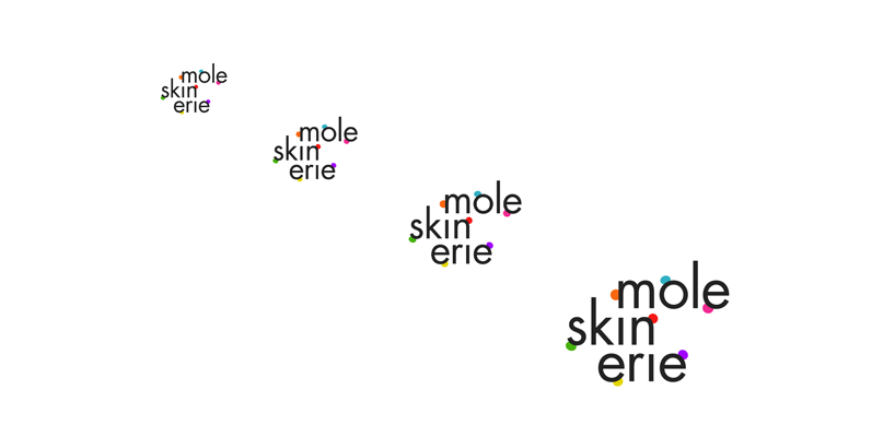 different sizes (alternate logo)
shortlisted entries (2162)