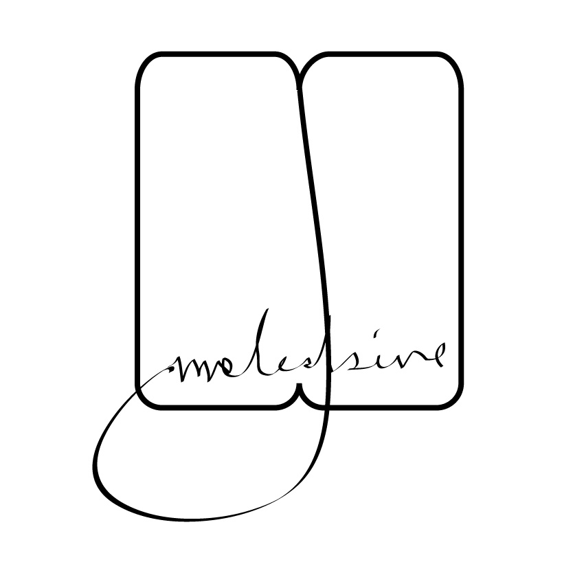
be simple as we see by kukmi cho from korea
designer's own words:
it's about logo. so i just want to make it very simple and symbolic. at the same time want people to know directly when they see it. so try to use minimum skill and inspired from the product directly.
very simple and symbolic using a shpe of the moleskine note and a book mark string.
 the facade from the bottom of the book showing its all representing part such as flexible holeder and a book mark string.
shortlisted entries (2162)