
bazul designers moleskinerie timeless logo by tiago careta from portugal
designer's own words:
started with an exhausting study of the moleskine story and origins, we found that some off moleskine's greater values are: it's history, culture, personality and timeless quality. it's considered by us (users) as a chest where we can keep our histories, visualize our ideas and express our thoughts, while keeping us organized.
moleskinerie is a virtual platform that keeps moleskine users in touch, so we have to admit that it needs a more friendly and modern language. but we couldn't disconnect it from moleskine, since it's purpose is for us to share the same histories we used to share with our moleskine notebook.
so, we decided to mix both moleskine and moleskinerie values to create the new logo.
moleskinerie logo proposal was first updated to drop the serifs that moleskine's logo had, giving it a cleaner and contemporary look, while keeping it's extended type-logo, and inserting moleskine's rounded corners, maintaining it's historical references.
meanwhile we developed a changeable symbol, to represent every different type of products that moleskine produces nowadays.
as for the presentation, it was decided to put our creativity into a stop motion presentation, that represents the timeless use of pictures. the video was made in a living room table, with no real studio conditions to show the traditional values and uses of the moleskine book. we used a canon camera on a tripod with a dim yellow lamp light.
every item on the table, meant to give emphases to the values that moleskine represents.
background
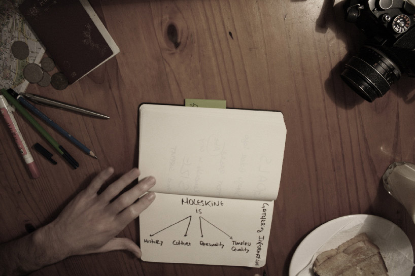 moleskine is…
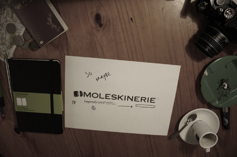 creative process
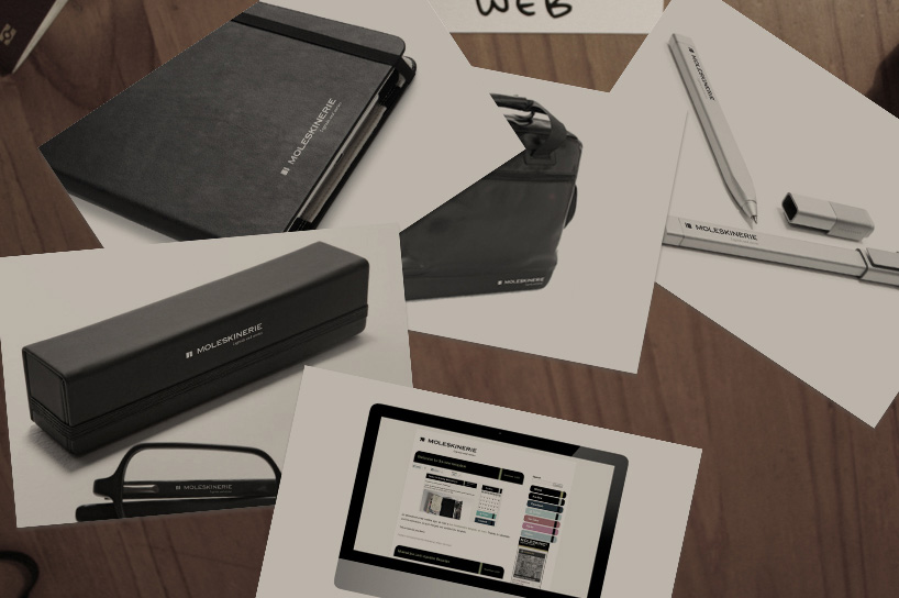 applications
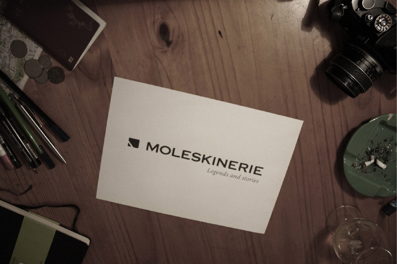 logo and symbol