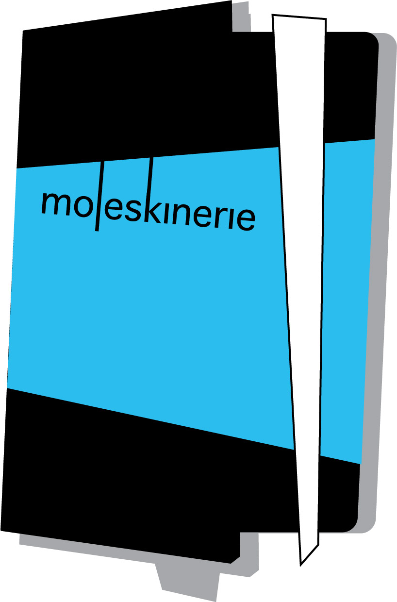
Basic elements mix by riccardo garbellini from italy
designer's own words:
The regular geometry is upside downed to represent the non linearity of a project / thought that will be annotated. The pocket is in foreground close to the white elastic band, the shadow represents the pages together with a place holder. The text is inclined and the L is imitating the place holder as the K imitates the elastic band. The colours pattern recalls the M.
shortlisted entries (2162)