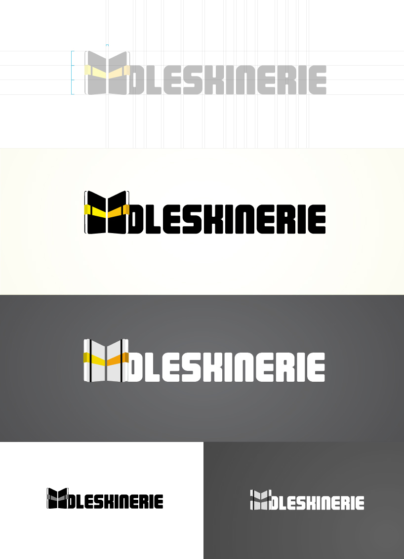
Back to back logo for moleskinerie by dobrescu stelian from romania
designer's own words:
When I was first thinking of the moleskinerie logo I wanted to go for something really simple and clean, a logotype that would convey the brand values and visual identity of moleskine. As I was thinking more and more about it, I kinda wanted to combine a symbol somethere in the logo, but I wasn't sure what to use. Then it hit me: what better symbol than the product itself. So I was looking at my moleskine when things got literally put into perspective. The two moleskines put back to back, as they would be sitting firmly on a table, viewed from a certain perspective, form the letter M. As I started thinking up the logo, I realised that this might be the concept behing the whole moleskinerie project: people posting sketches, drawings, illustrations and ideas put back to back with other people's work. I thought to myself that this was a strong idea, so I did the logo and here it is. Hope it gets appreciated.
Moleskinerie logo entry