Attributable but unique by rosa elena celestino from italy
designer's own words:
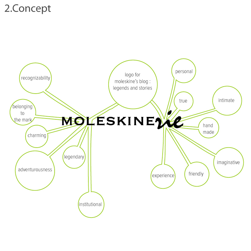
The term "moleskinerie" translated into Italian should mean "something related to moleskine", in this case a blog to share all the personal experiences of people who use Moleskine. For this reason, the logo design concepts were considered highly related to the brand Moleskine and the meaning that this book is for everyone. Along with these we have tried to represent the values pertaining to the sense of "blog". In addition, we wanted to give the logo visual brand moleskine, without this seemed a plagiarism. The single word "moleskinerie" institutional matrix is represented with a corporate logo that echoes the "Moleskine" flanked by a character that reflects the personal, emotional, friendly and intimate experiences narrated. So, the representative character you have chosen is a character that looks like handwriting, because handwriting (as well as the section of the drawing) is a unique and distinctive signs for each one of us.
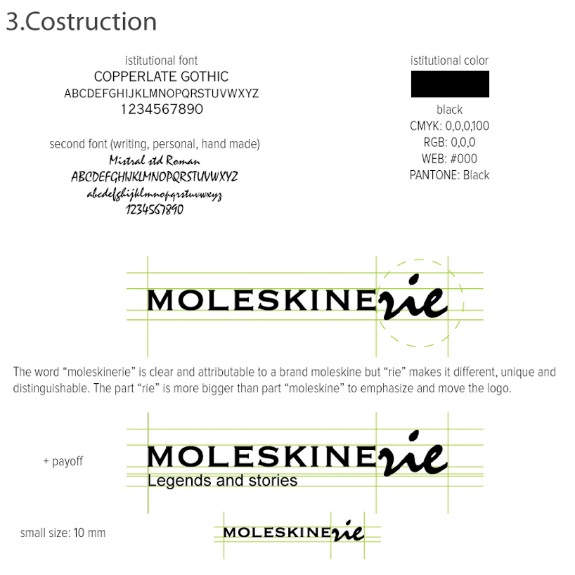
So the word “moleskinerie” is clear and attributable to a brand moleskine but “rie” makes it different, unique and distinguishable. The part “rie” is more bigger than part “moleskine” to emphasize and move the logo.
logo
 concept
 costruction
 example