as much stories as legends by carlos espósito from brazil
designer's own words:
the design of this logo stems from three concepts: the explicit relation of the word moleskinerie to the moleskine brand, the look and feel of a moleskine notebook, and the unique sensation of drafting a logo by hand, including the typography, and having that a-ha moment. which, of course, is best done on a moleskine. then you may have to transpose it to the computer, but that's another story.
the graphic interpretation of the shape of a moleskine notebook frames the logo, and also expresses the "moleskine-rie" relationship, aided by the "elastic band". the actual proportion of this shape is nothing close to the actual notebook, and yet, it's impossible not to relate to it.
the lettering has some angled tips that bring a calligraphic character to the logo. some letter forms are rather playful, like the "e" and the "k" - being also very unique - , which bring a strong character to the logo. at the same time, it is rigorously constructed, proportioned and spaced, which makes it no-nonsense and professional.
the enclosing shape and the lettering have such a strong identity that the logo can easily support several color variants, just like the moleskines, which would be nice to have on the site to better relate it to the products. apart from green - the "official" color - blue, red, yellow, orange and violet are presented here. they work just as well, as would any other color, provided it is more on the vibrant, medium-light side.
the logo
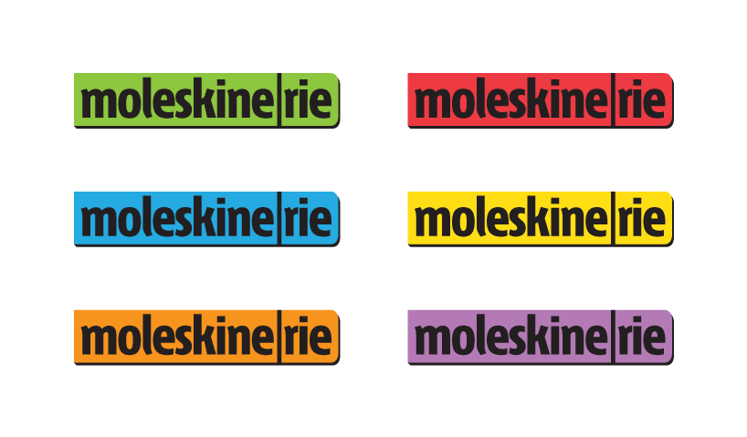 color variants
![]() logo with tagline
logo with tagline
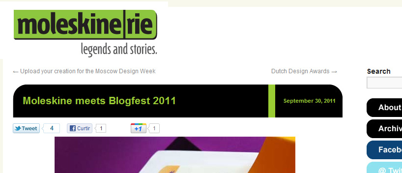 logo applied to the current website