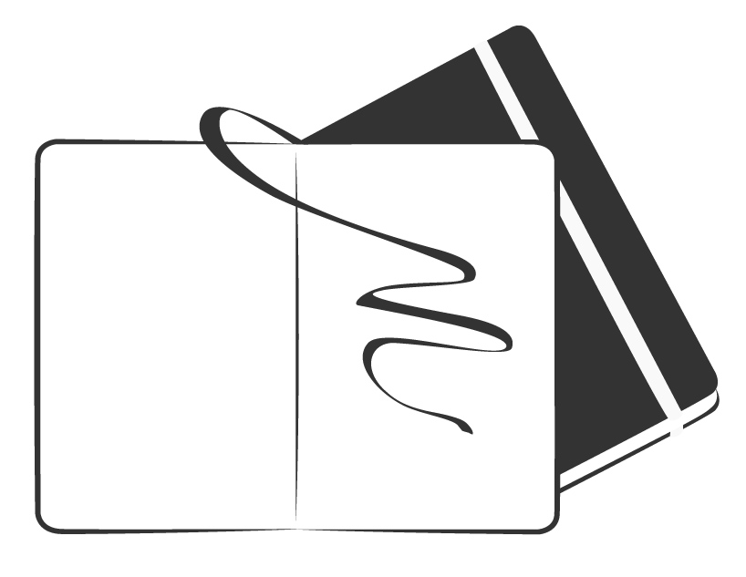
An M Better by Lion Wolff from germany
designer's own words:
I tried to design a very plane logo and therefore I included only the two representative features of the moleskine notebook - the elastic band and the ribbon bookmark. additionally the ribbon bookmark writes a "m" letter that stands for the brand moleskine.
shortlisted entries (2162)