a simple golden line by alessia fantasia from italy
designer's own words:
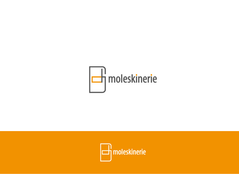
the concept of my work is based on the idea that moleskine is so irresistible that it’s impossible to take the pen off the paper.
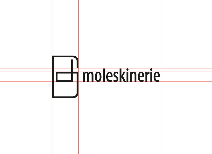
for this reason i designed a stylized moleskine with one solid unbroken line and i also used the golden ratio to create a well-proportioned and elegant work.
the simplicity of this logo makes it very versatile and easily recognizable.
color version of my logo
 golden ratio in my work
 guidelines for text layout
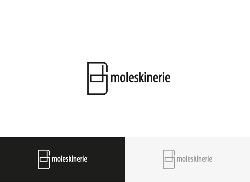
 black/white/gray version of my logo
my logo animation
shortlisted entries (2162)