a new moleskine world by Martina Remondino Remondino from italy
designer's own words:
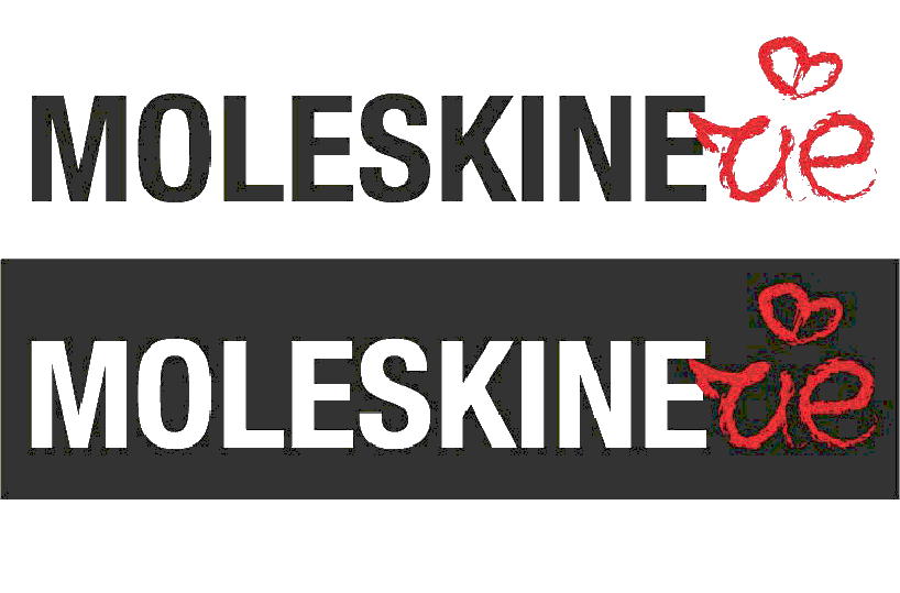
the first logo was designed with the idea of maintaining a link with the logo moleskine, following the business concept of aesthetics, quality and attention to detail and whole, using a similar font but more minimal. Since moleskinerie a site dedicated to users, the graphic gesture that ends with the word -rie was carried out manually to simulate an inscription on its notebook.
the second proposal consists of a logo and text, as if to create a new identity for the new product. using the gestalt laws was created with a game between figure and background: the m contains the r.
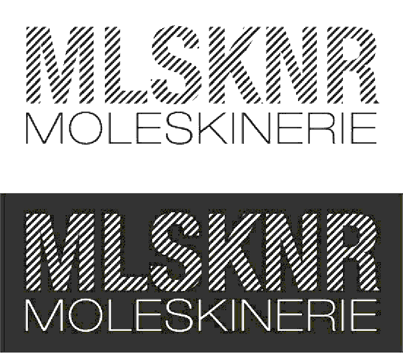
the third and latest proposal comes completely from what was the original logo: a play of lines close together have reduced the word moleskinerie using only the consonants while remaining faithful to the values very dear to the company.
old and new
 where is the r?
 the line is there or not?