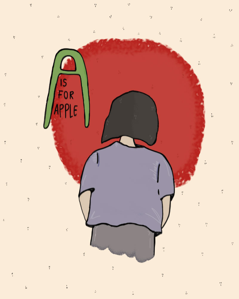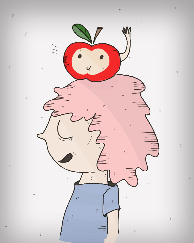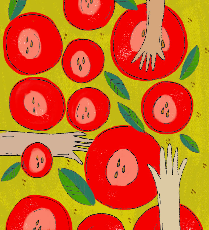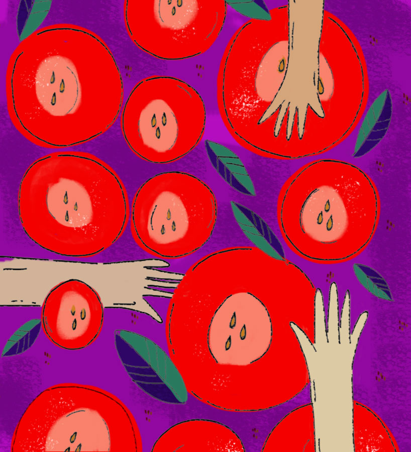
A is for Apple by Melissa Mejía from argentina
designer's own words:
A group of 5 Illustrations, not a series of them. First I started deconstructing the apple concept, I wanted to go in a different direction, first by thinking the Apple picking/production/commerce/community instead of thinking about the fruit itself. After that I did a bunch of sketches related to the things I read or inspire me, specially with paper and pencil, after that, I translate the sketches to Photoshop and try to find a set of colours that were not only based on red/green, so I play with color that were more out of my confort zone (grays and blues) to experiment and do something more vibrant.


shortlisted entries (104)