A BRAND NEW LOGO! by chema pastrana from spain
designer's own words:
moleskine is worldwide known for its paper-based products, as well as for its clean design and its fantastical attention to detail.
for its marvelous blog, this logo attempts to concentrate all that personality in one single, recognizable symbol: a clean envelope that forms the 'm' of moleskinerie. Distinction, simplicity and character: moleskinerie in a shot.
the logo is completely versatile:
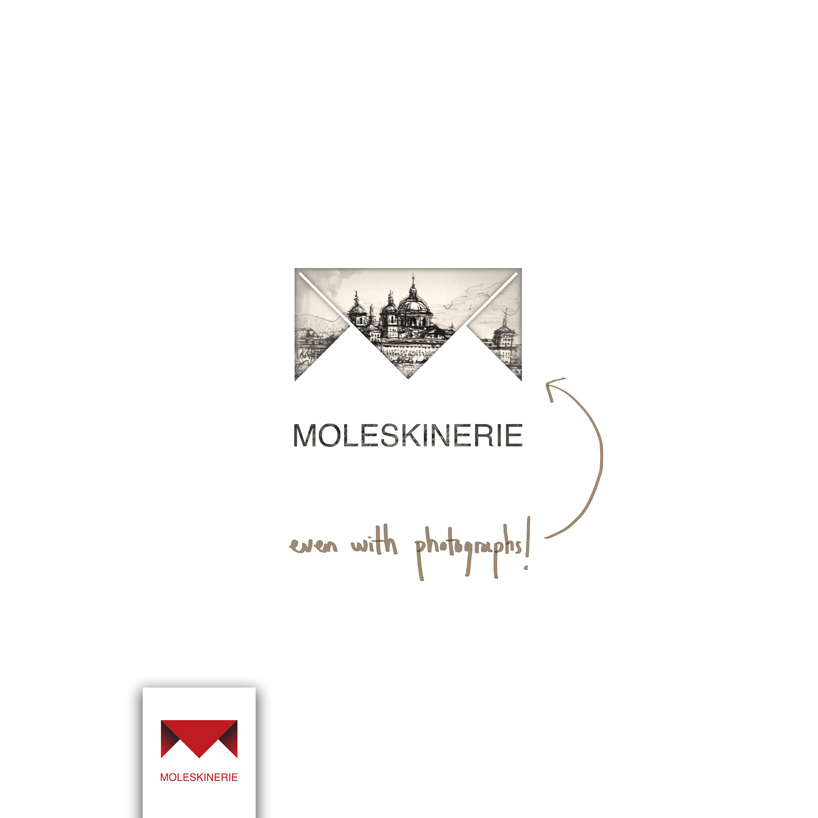
it can be reproduced on any medium, in any color, with any kind of background, including photographs.
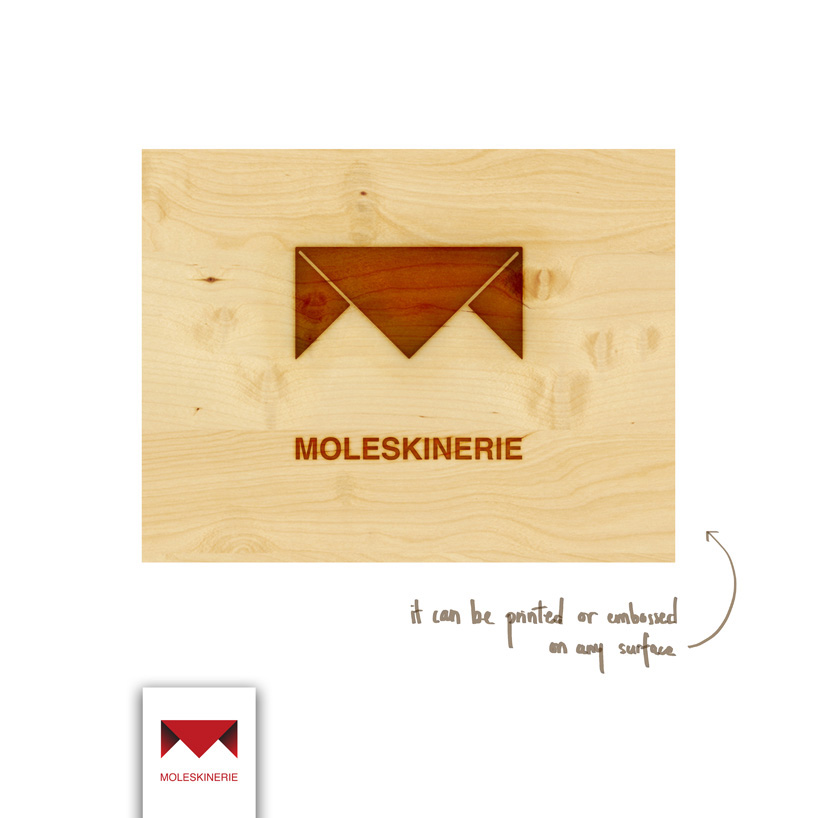
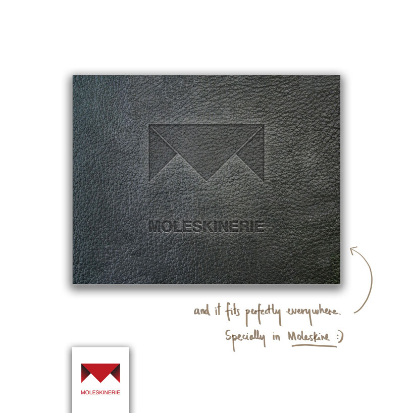
it can be embossed (most beautifully on the moleskine notebooks).
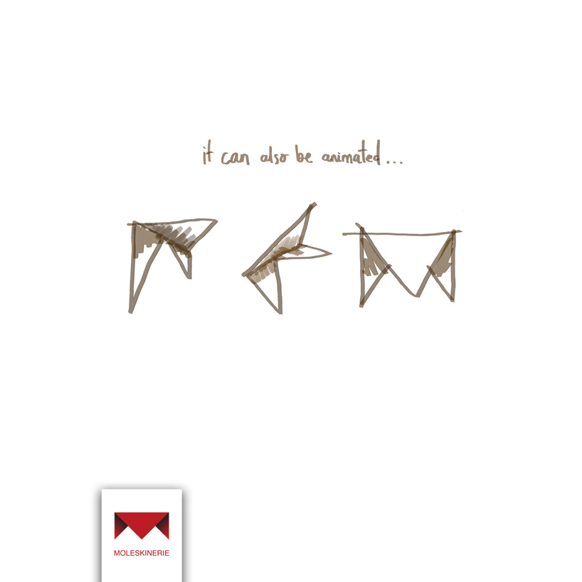
and it can also be animated for its use in the web.
In order to achieve so, there are three variations of the logo: the fresh red logo, the 'negative' one and the simplified version (this one for embossing).
1
 2
2
 3
3
 4
4
 5
5
 6
6