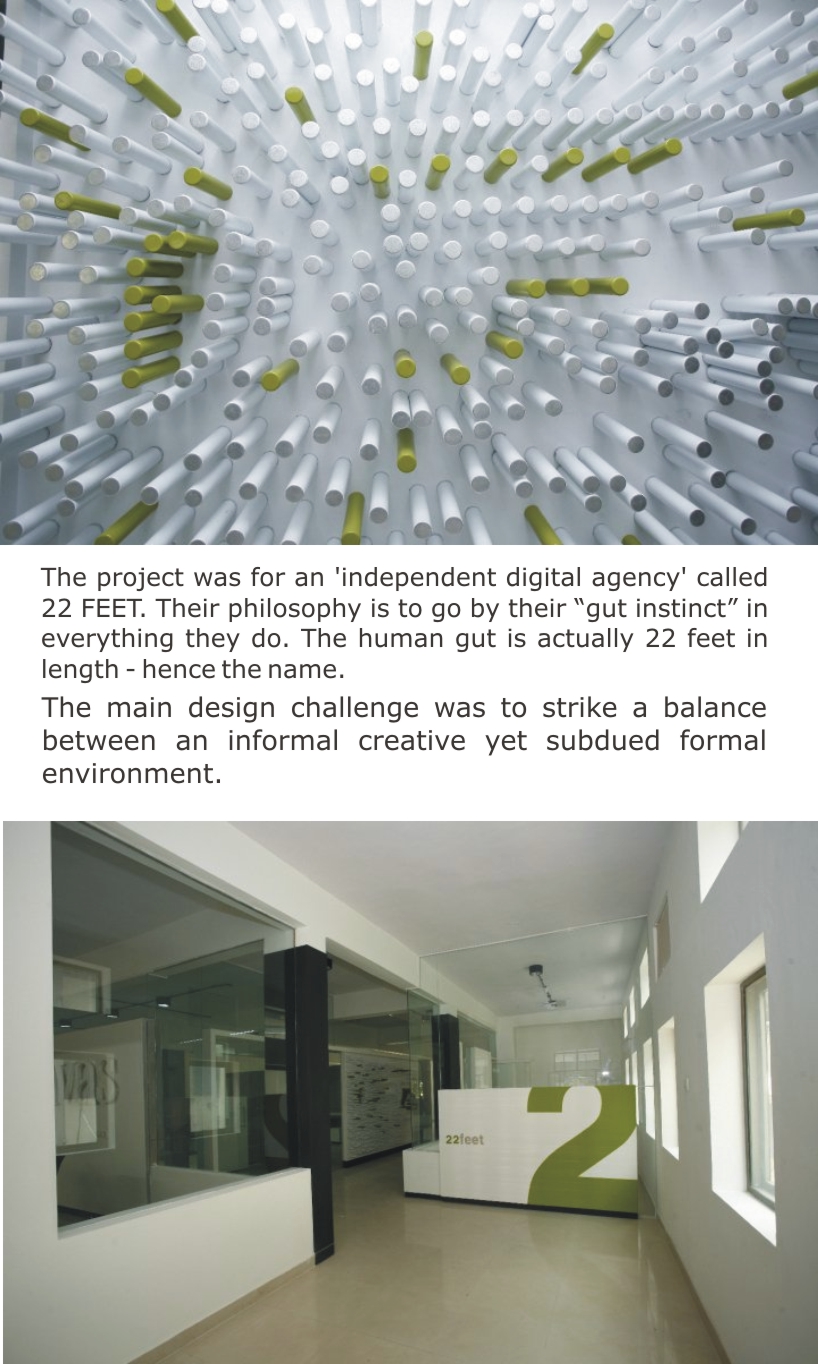
22 feet by kamat & rozario architecture from india
designer's own words:
22 feet is an 'independent digital agency' that specializes in web and mobile designing, advertising & marketing. Their philosophy is to go by their “gut instinct” in everything they do. Apparently the human gut is actually 22 feet in length - hence the agency name.
The requirement was to create an office space which could have areas for work as well as for play. The client did not want a formal office. Neither did they want a space that was overwhelmingly casual. Our challenge was to strike a balance between, being very creative, yet subdued. The design had to reflect the agency’s philosophy.
We were given a large space to work with. A closed area within this space - in fact, a 22 foot long volume was envisaged, where several thoughts are churned and processed, just like the idea of the gut. This became their main work area or studio. The client needed something low maintenance so that they don’t have to spend too much time or effort cleaning or re-painting it. This led to the idea of doing IPS finished grey walls and black tables. These enclosing grey walls stop short of the ceiling in order to bring in as much natural / reflected light as possible. The work area had open, continuous tables with corresponding open shelving. The random up-down shelving on the wall as well as the work tables are inspired by the idea of the coiling 'gut'. Each person gets a ‘white cube on wheels’ which serves as lockable storage. The cube slides neatly under the tables and can easily be moved to wherever its owner shifts. The play areas are the corridors and residual spaces.
A small discussion / reading area, was created by making an enclosure using storage cabinets. One part of the storage cabinets pivots down to become an expandable coffee table. Creating informal, common-use spaces always encourages casual dialogue among co – workers and in turn makes the work environment more cheerful.
The site being in an industrial layout was surrounded by workshops that manufactured a variety of metal items. One of them was a can manufacturing plant. This inspired the idea of the Can Wall.
The client wanted the play areas to appear different each day. The simplest way to do this was to make the play areas interactive in nature and leave the rest to the user. The green & white interactive fun wall of the office- or the Can Wall- employs deodorant cans to form an ever-changing composition left to the imagination of the inhabitants. The cans were obtained from the waste of the next door can factory and powder coated to the suited colour. The cans are simply held to the metallic white wall using concealed magnets and can be moved around to make patterns. The grey walls and the hint of green seen here and there are inspired by the agency colors. i.e: grey, white & peppy green.
1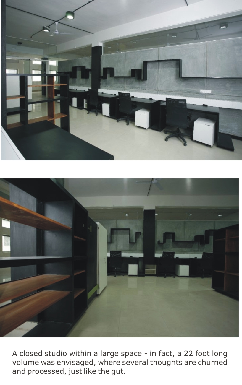 2
2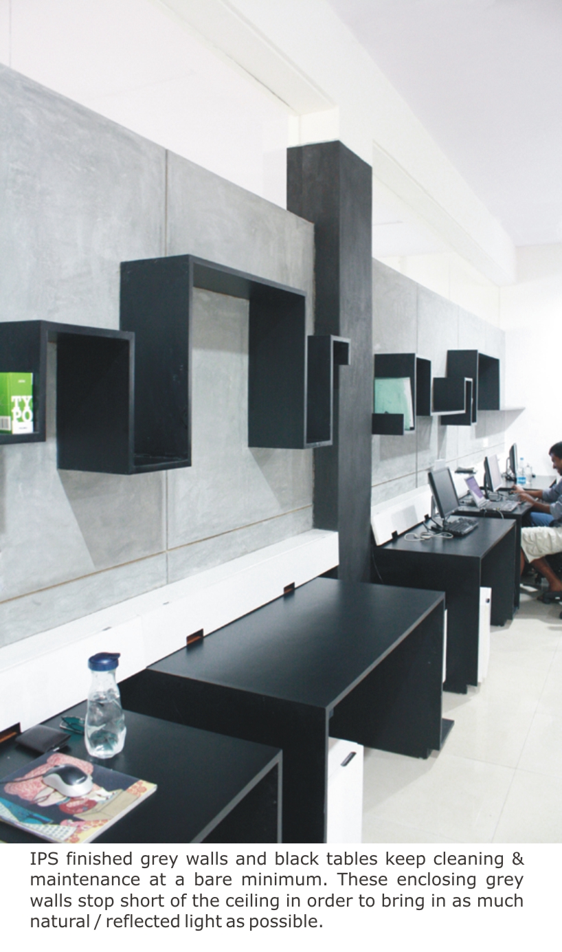 3
3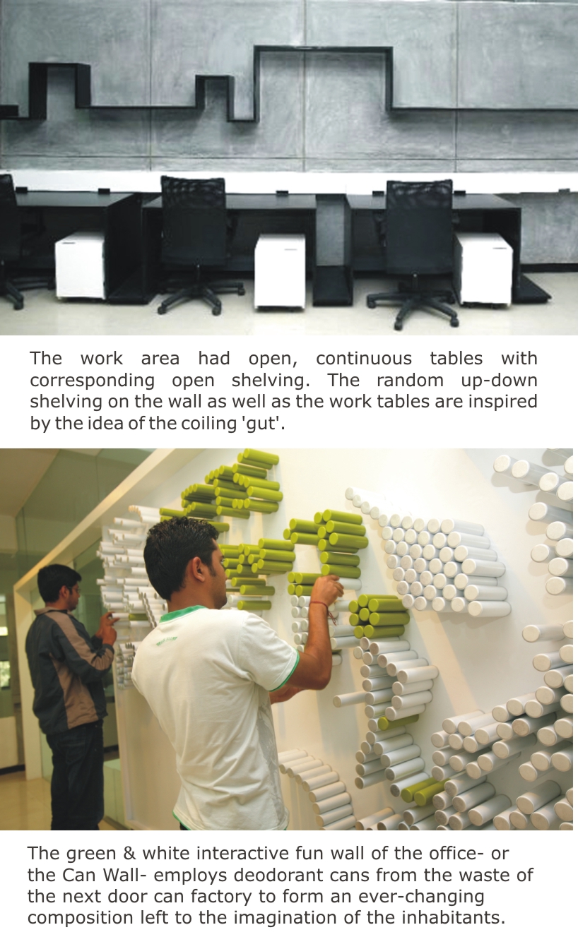 4
4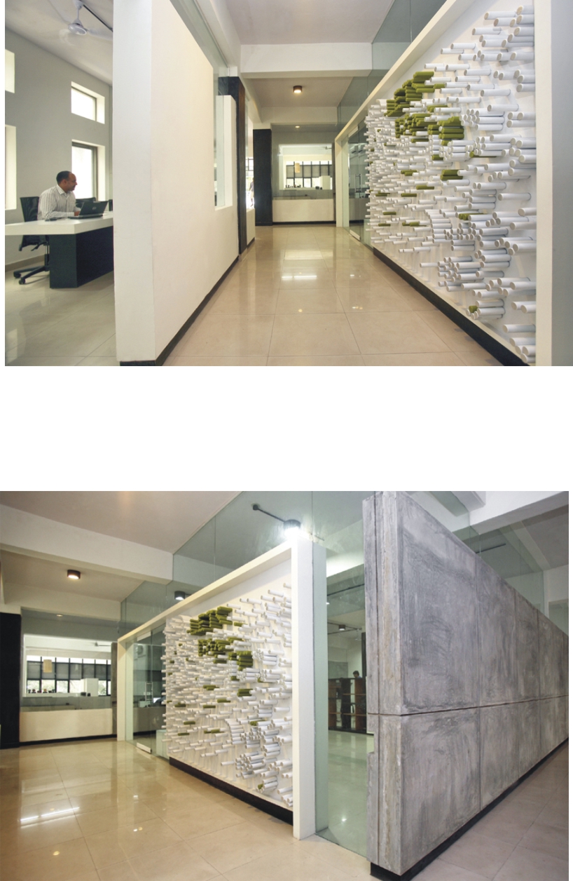 5
5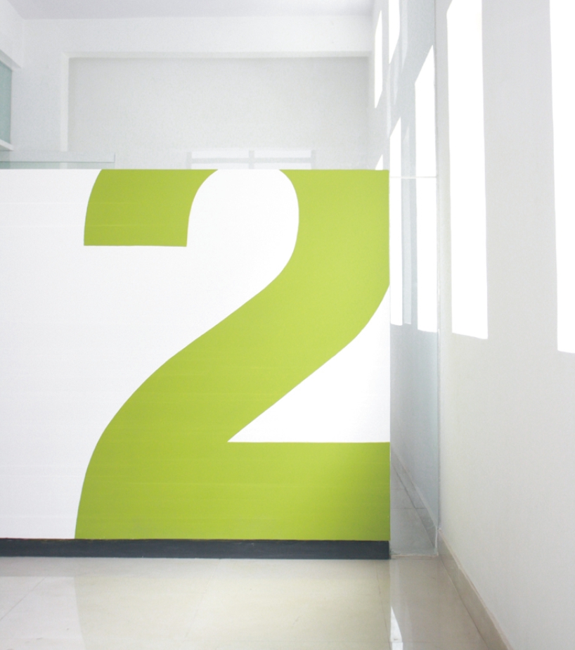 6
6