KEEP UP WITH OUR DAILY AND WEEKLY NEWSLETTERS
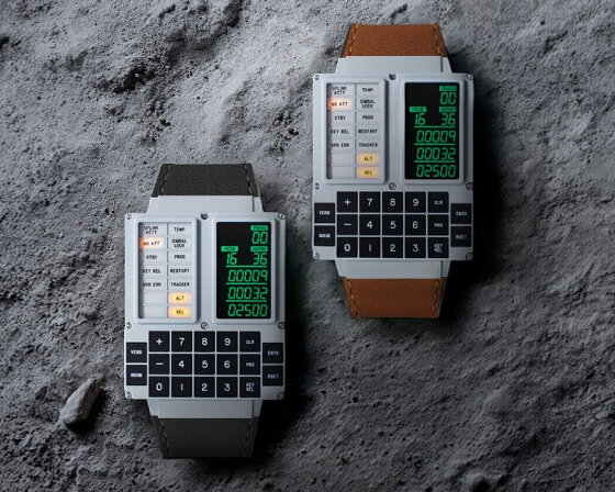
material-wise, the design team uses CNC micro-machined stainless steel for the case with a military-grade ceramic coating.
connections: +460
explore designboom's top 10 design products of 2024 submitted by our readers.
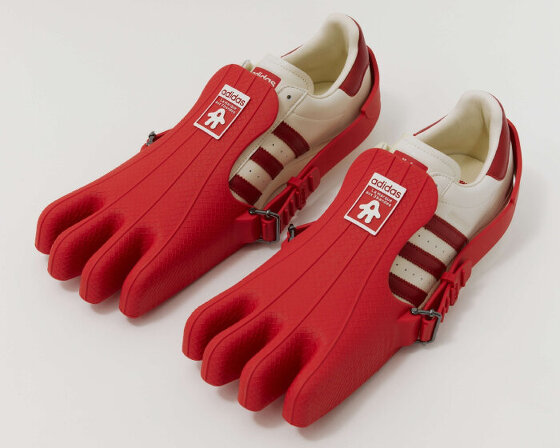
the removable four-toed ‘gloves’ of the superfinger superstar can also be used as bags or be attached to other shoes.
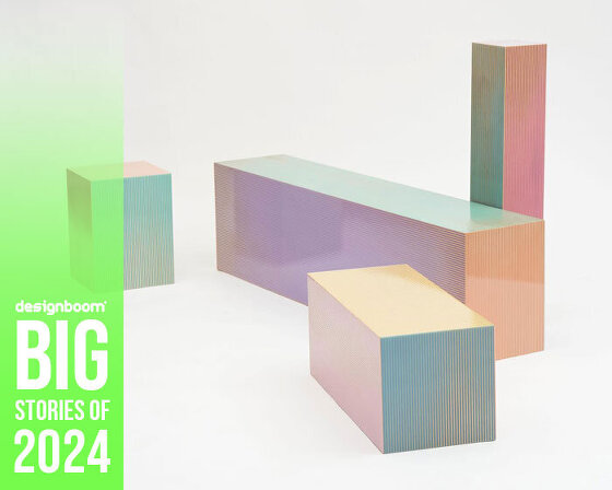
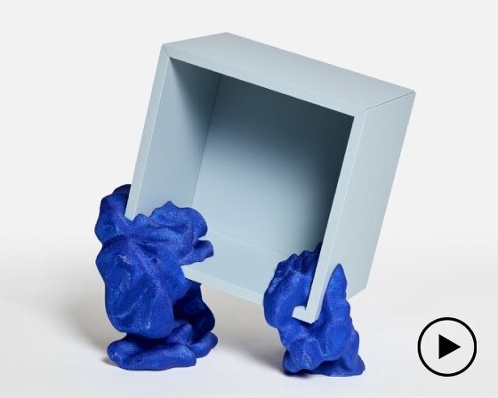
by upcycling mass-produced furniture, YET architecture and BDM architects blurs the lines between standardization and personalization.

 ‘tide’ on show at the magis stand at the milan fairgrounds during milan design week 2011 image © designboom
 image © designboom
 3/4 profile image © designboom
 up close of where the units separate image © designboom
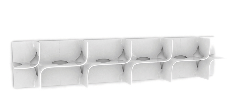 possible horizontal configuration image courtesy of magis
 possible vertical configuration image courtesy of magis
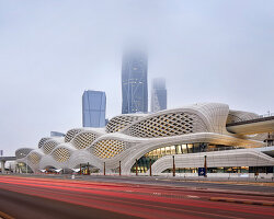
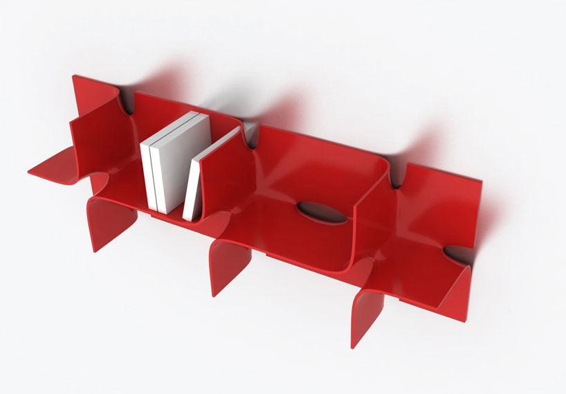 image © zaha hadid
