type / dynamics installation at the stedelijk museum amsterdam
all photos by gert-jan van rooij courtesy of LUST
type / dynamics: jurriaan schrofer / LUST
on show now until 4 mar 2014
stedelijk museum, amsterdam, NL
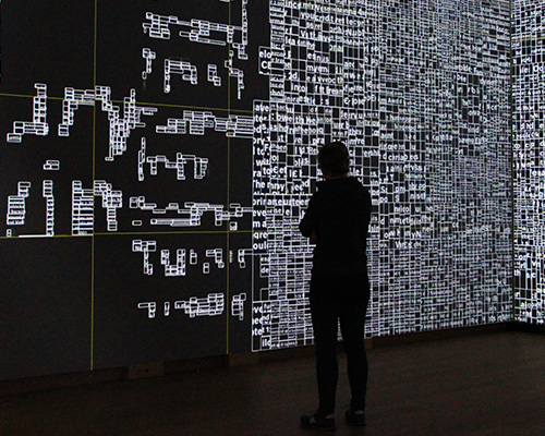
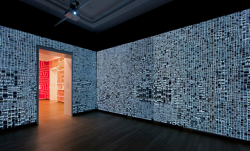
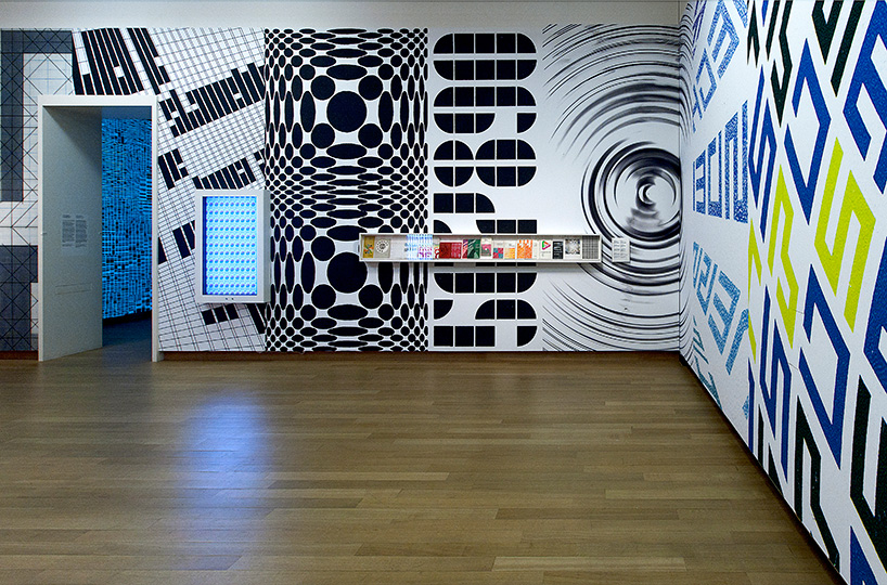
the exhibition type / dynamics: jurriaan schrofer / LUSTsees two galleries at the stedelijk museum adorned with large, innovative typographic installations. gallery 0.29 contains a selection of the work by graphic designer jurriaan schrofer. the second gallery, 0.28, features an interactive work by LUST, who were asked to use cutting-edge media to create an installation that plays off, reacts to, and dialogues with schrofer’s work. the visual dynamic of schrofer’s typographic art suggests that his designs were created on the computer but they predate the digital era: schrofer designed everything by hand. for LUST, though, the computer is an indispensable tool; they derive inspiration from exploring the possibilities of design for new media and technologies.
video of the type/dynamics installation by LUST
jeroen barendse from LUST told designboom more about the exhibition:
DB: how did the exhibition come about and how long was it in the making?
JB: we were approached by the stedelijk museum to make a new interactive work as a reaction to the work of the graphic designer, photo-book pioneer, art director, teacher, arts administrator, and environmental artist jurriaan schrofer (1926-1990). the exhibition was inspired by the publication of the doctoral thesis by frederike huygen that appeared in october 2013.
the curator of design of the stedelijk museum, carolien glazenburg, approached us in april 2013, after which a process of conceptualizing the exhibition started. a large part of organizing the exhibition was also administrative like finding budget. fortunately the fund for creative industries and microsoft were so kind to contribute. we sketched out a lot of different ideas over the months, but the last two months really everything got finalized, up to the day of the opening.
in total about ten people worked on it in at different stages of the project, from conceptualizing, sketching, designing, to hardware testing and programming. LUST’s design methodology is process-based, founded upon the development of an analytical process which leads eventually to an end-product that designs itself. we are deeply interested in exploring new pathways for design at the cutting edge where new media and information technologies, architecture and urban systems and graphic design overlap.
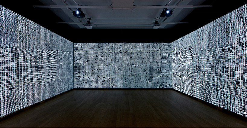
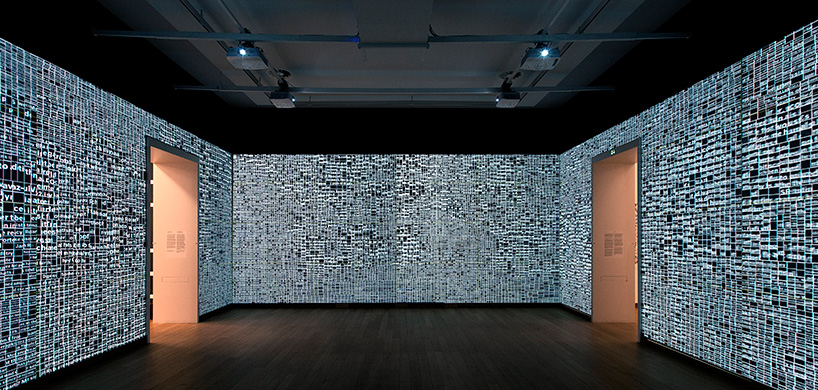
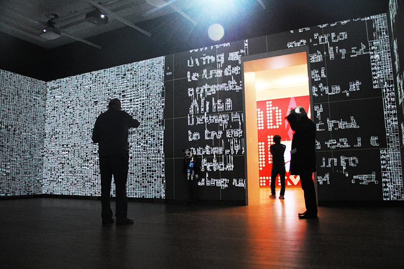
the installation visualizes information that continuously surrounds us and is always accessible. by searching for real-time locations currently in the news, like ‘ground zero’, ‘reichstag’, or ‘tiananmen square’, the installation can locate the panorama images from google street view, abstract them into grids and fill the grids with new information. as a visitor to the space, you are literally ‘transported’ to that location and surrounded by all the news associated with that specific location. instead of a photographic representation, the place is represented purely typographically with a host of new items currently being talked about at that location. nothing in the gallery space stands still; all information is dynamic.
DB: how did you arrive at the final solution for the interactive space?
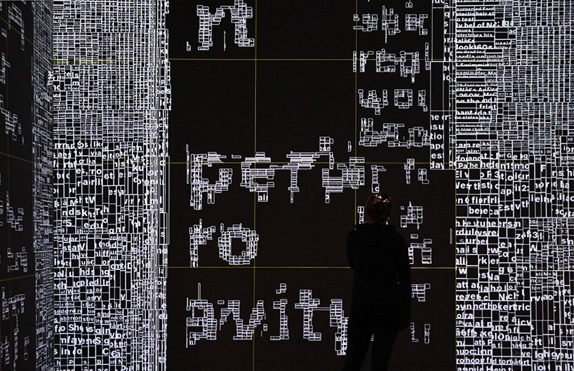
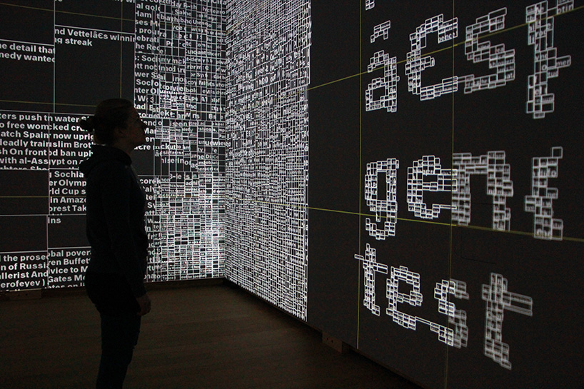
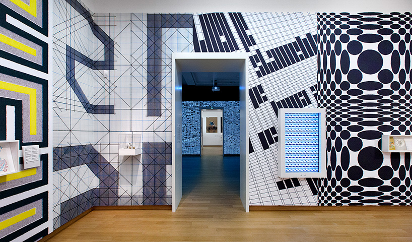
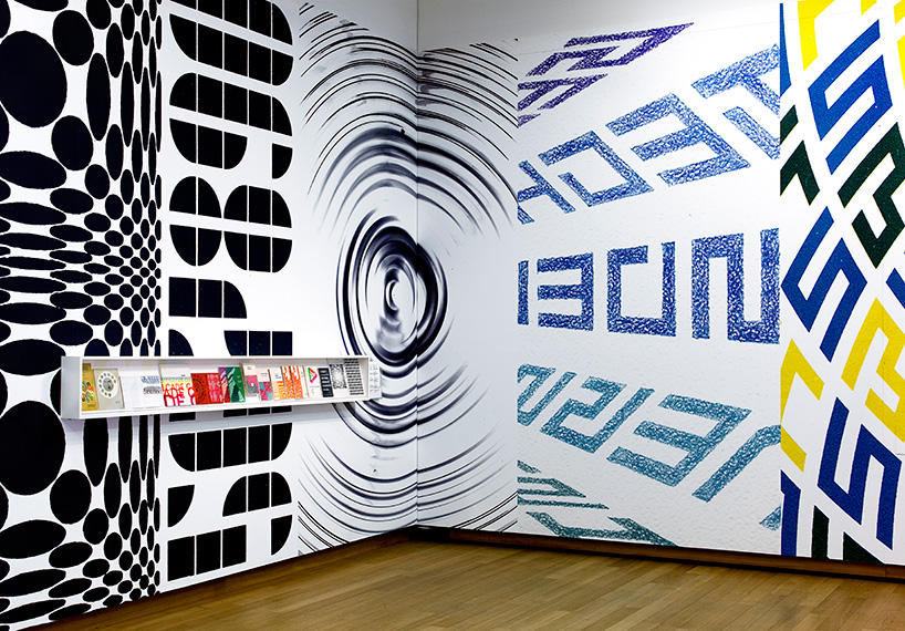
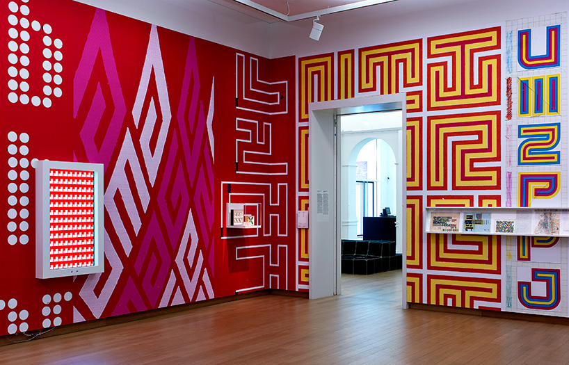
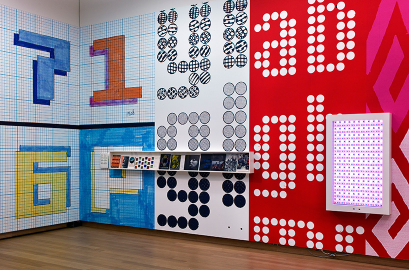
JB: the exhibition ‘type/dynamics’ consists of two identical galleries of the same conceptual theme. in the first gallery the walls are covered with enlarged detail images of schrofer’s work. originals are located in vitrines with an emphasis on sketches. also located in this gallery are two vertical screens that each present more than thousand works by schrofer interactively in relation to the visitors’ viewing position. the second gallery presents LUST’s free interpretation of schrofer’s work. sensors track the visitors’ movement, while the projections subsequently respond to the position and number of visitors in the space, as well as their distance from the gallery walls. visitors acquaint themselves with a specific topic by literally walking towards an item of interest. the typographic grid closest to the visitor then opens up and becomes more readable, while new typographic layers open up for further exploration.
at the very beginning of the project we decided to treat the two galleries in the same fashion, leaving the space empty and using only the walls for information.
for the LUST gallery, we wanted to really make use of the space and have visitors interact with that space. when we arrived at the idea that the space could represent a ‘real’ space or location by re-appropriating google streetview images and have them actually surround you, we felt we had a concept that could tie a lot of ideas together. a visitor could ‘jump’ from location to location. we decided to abstract the images into grids, which we could then fill with information and news about the location you are actually surrounded with. we wrote some algorithms that a few times per day look for locations that are mentioned frequently in the news, locations were things are going on. the program than looks if that location has streetview images and transforms the images. by moving closer to the walls, the visitors open up new layers of information, a process that in theory could go on endlessly, always going deeper into a certain topic. for us these kind of experiments are important in order to investigate how you can interact with information in different ways, away from the touch screen. how can you use the idea that we are continuously surrounded by information in different ways?
DB: how did you realize the final installation?
JB: the main program runs on a single, custom-built computer that drives eight HD projectors. this program is written in JAVA on top of RNDR, our in-house framework for creative coding. the RNDR framework is developed to support the creation of complex interactive installations that require processing power.
the tracking setup consists of four small (intel NUC DC53427HY) computers, each of which is connected to two kinect sensors. the observational data that we acquire from the kinect sensors is sent to a processing unit that fuses the data into a single observation of the space. using this setup we can accurately track multiple individuals through the entire space at responsive rates. at LUSTlab, the R&D lab at LUST, we developed software tools that enable us to build multiple sensor setups for large spaces with relatively little effort.
(technical details: 8 projectors, 10 kinects, 7 NUCs, 1 quad-core I7 haswell computer, 2x 52 Inch LED screens)
DB: what criteria was used to select the pieces of schrofer’s work?
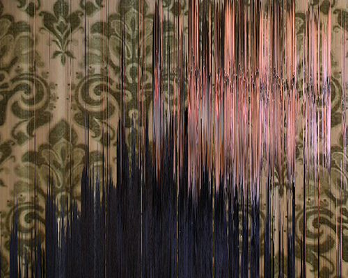
the final works were mainly selected by carolien glazenburg, but looking at schrofer’s work we knew that we wanted to show as much as possible of his sketches, because they are very fascinating. he meticulously sketched things by by hand things we are now used to create by coding. in the work you can see that he uses similar ideas, only is tools to execute them are very different. especially in the two screens, that are hung like posters on the walls we were able to show a lot of different variations of works, including the sketches. for the wallpaper we choose his more typographic works, since they are the most graphic and dynamics and we felt they tied the two rooms together.
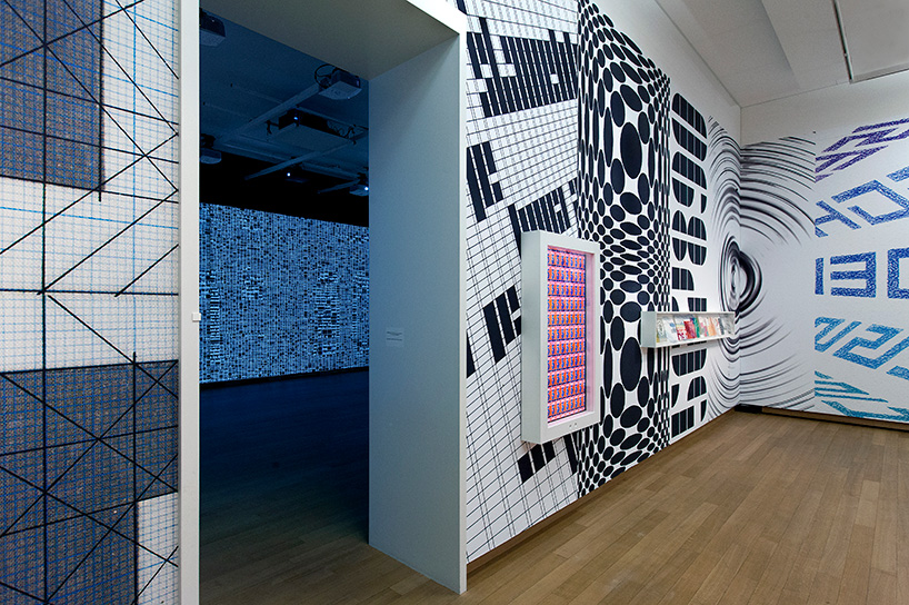
jurriaan schrofer room at type/dynamics exhibition
DB: how has jurriaan schrofer’s work influenced your own work?
JB: before the exhibition, we knew of jurriaan schrofer, but his work was little known to us. while working on the show, we discovered along the way that we actually did know a lot of his work, had some of his books in our bookshelves. if you look at his work now, lots of it is still really fresh, especially his typographic experiments. jurriaan schrofer’s oeuvre consists primarily of printed matter that is designed manually. in the 1960s, however, he experimented with new techniques, offset printing for instance, as a means to achieve ‘moving typography’. throughout schrofer’s work, dynamics, or movement, is the common thread. starting in the 1970s schrofer, then a design researcher, explored patterns and structures inspired by the op art movement. he meticulously investigated strange perspectives, depth of field and typographic symbols. although LUST and schrofer are quite divergent, there are nevertheless similarities. typography is very important in the both of our work, especially that space where typography encompasses text and image simultaneously. furthermore there is a similar use of small elements or modules that together form a bigger structure or pattern.
where jurriaan schrofer looked for new ways to express dynamics and movement in printed typography, the ‘type/dynamics’ exhibition tries to show the dynamic qualities of information and typography. the concept that design is endowed with a form that is unfinished or changeable has been self-evident in contemporary design for quite some time. nowadays attention is paid more to the design of rules, or creating the framework in which something can happen. in a database for instance, content does not have an innate form, but rather receives form at the moment it is shown via the interface. in fact, the same information can be represented in an endless number of ways. the interface allows for content to be shown as data, as information, or as knowledge; ultimately content appears as loose data without a context, as data in a context, or as interpreted information. this data can even change per week, day, or minute. what is evident through this process is a very different approach and attitude towards design than the questions of schrofer’s generation.
DB: what has the reaction to the exhibition been?
JB: different generations have reacted differently to this exhibition. we got a lot of great feedback from younger generations who immediately make the installation their own, exploring it, trying to understand what is going on. the reactions from older generations are more diverse, some think its great and immediately understand what we try to achieve with something like this, but especially some designers who knew jurriaan schrofer personally were surprised that there was not that much of his work on show. but the idea of this show was also never to make an overview show of all of schrofer’s work, instead we wanted to place his work in a new light and show how a designer could approach the idea of dynamic typography nowadays. that is also why our installation is formally maybe not so much related to his work, but the ideas behind it –using typography as building blocks, modular elements that form bigger structures, and trying to establish a new vocabulary– are things that we feel are still very valid now, we just use different tools.
in a time when data can be accessed and can manifest itself in all kinds of ways, typography should no longer represent just formal aspects of information. instead typography can itself be the carrier of content. a letter is the smallest content entity, but even this letter can contain the whole dataset for the content it represents. LUST sees interaction design as the new literature. it is not only about the interactive aspect of the effect, it is also about the narrative possibilities; narrative structures that go beyond linear or non-linear. this new literature is also about literary aspects like references, analogies, structures, points-of-view, time – all contributing to the complete narrative of an installation. a visitor does not need to grasp all possible readings of a work at once; instead multiple story lines unfold over multiple readings. all aspects from content to movement, interaction, data collection and collaboration contribute to this new literature. the spatial experience of the installation can be compared to that of the ‘aleph’, from the book by jorge luis borges. there is a point where you can see everything that has ever happened on earth in a single moment. the moment is so overwhelming that at once you see everything – then you don’t see anything at all.
happening now! partnering with antonio citterio, AXOR presents three bathroom concepts that are not merely places of function, but destinations in themselves — sanctuaries of style, context, and personal expression.
