new truman’s pint glass and bottle
michael-george hemus and james morgan were not even ten years old when production stopped at the truman’s brewery in 1989 but after several years of working and living among last the remnants of the truman’s brand the pair became increasingly fascinated by what was once the largest brewery in the world. earlier this year their enthusiasm manifested in them re-establishing the brand, with the launch of the ‘truman’s runner’.
re-establishing an icon for three centuries the black eagle brewery in east london was home to truman’s. despite not brewing a drop of beer for the last 21 years the building has been at the very centre of the rejuvenation of east london over the last decade, providing a creative hub and home to over 200 companies as well as being long-standing venue for london design festival events. the brewery is just one of the places where you can still see the name of the former brewing powerhouse and anyone familiar with east london will no doubt have seen pubs that still bear truman’s insignia, as michael-george hemus explained to us:
‘my first two offices were in the truman’s old brewery and many of mine and james’ favourite pubs were old truman’s pubs (golden heart, carpenters arms, ten bells and the royal oak). these pubs were particularly important, because they carried the hallmarks of what made truman’s great – each has a beautifully crafted interior and are classic examples of great british pubs from an era before the identi-kit interiors you see across most of britain today.
the sense of quality and history displayed by the places that truman’s left behind means that there is a generation of east londoners who, despite being too young to drink truman’s before it was shut, have a real affection for the name. we became part of this group and naturally it led to us wondering what exactly had happened to truman’s. the more we thought about it the more we realised that there was a love for the name across generations and the reason that it did not exist was not a lack of demand for its beer but more the incompetence of the property developers who had bought it in the 70s and then run it into the ground. we decided to try and undo one of history’s mistakes and bring back our local beer.’
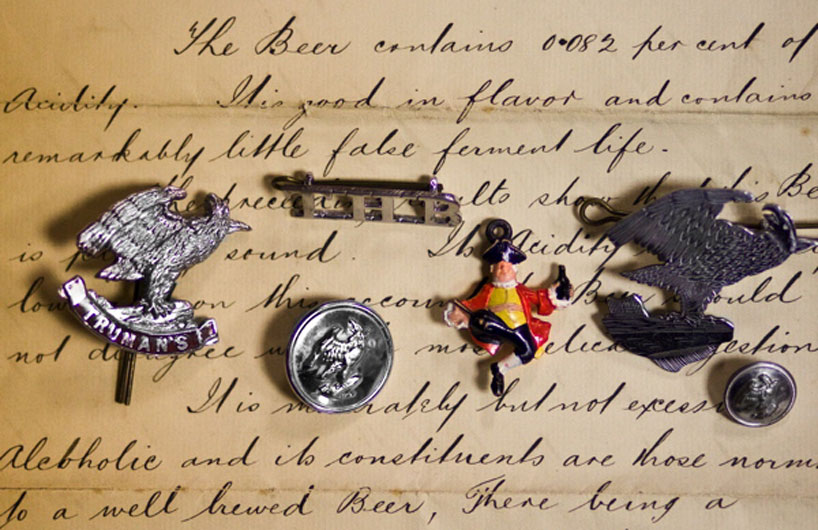 promotional truman’s badges and buttons from yesteryear
after around two years of negotiations hemus and morgan signed an agreement to buy the name of truman’s from its owners and wasted little time in re-establishing the brand and launching a classical british bitter. designboom asked michael-george how the new truman’s beer image was developed, how it’s been received and what is planned for the future…
evolution of the brand ‘truman’s is almost 350 years old so the brand has developed and changed a lot over time. for us to know what to keep and what not to, we had to study the evolution of truman’s. there were three parts to this process – visiting the old pubs, researching in the london metropolitan archives and scouring eBay.
the old pubs were the logical starting point because it is through them that truman’s name has survived. our new identity had to retain and reference some of these characteristics otherwise people would not understand that it was the same truman’s.
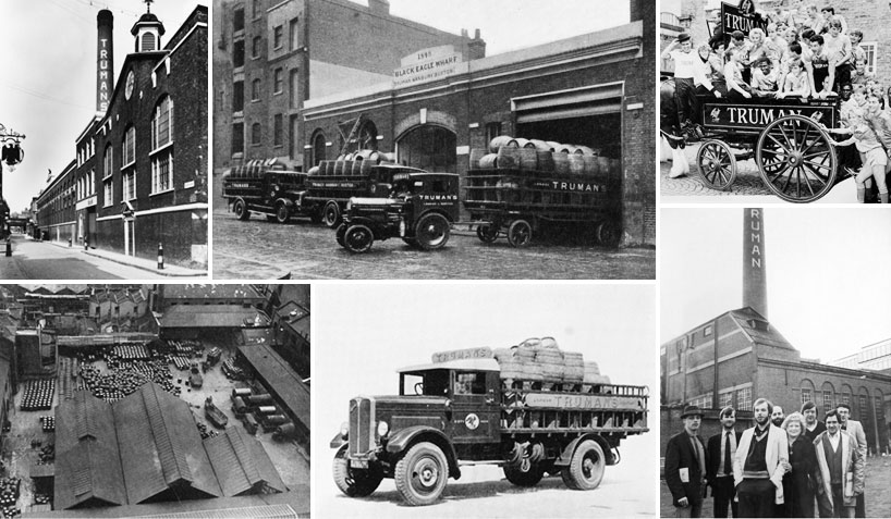 various photos showing the truman’s brewery on brick lane, east london and its trucks
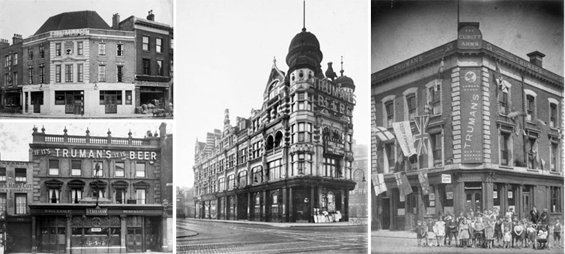 truman’s pubs and beer wholesalers in east london
the LMA (archives) was a treasure trove of truman’s. when truman’s was shut down, everything that was not burned (grand metropolitan – the people that bought truman’s in 1970 – decided to torch as much paperwork as they could before they moved out) went to the the archives. it was full of old photos, magazines, letters and recipe books.
however the LMA archive didn’t provide much of an overview of the two times truman’s was rebranded in the 70s and 80s and eBay became an important source for this, since it’s the only place where you can see and buy a variety of marketing materials from that time.
from the collection of posters, beer mats, bottle labels, key ring, old bottles, branded ashtrays we found online we were able to piece together the brand progression during the second half of the 20th century and get an idea of how older generations might remember the brand.
the final step was to create the new identity. with the help of graphic designer micha weidmann we came to the decision that with a few tweaks the truman’s eagle and most commonly used typeface should form the core of the new truman’s brand.’ 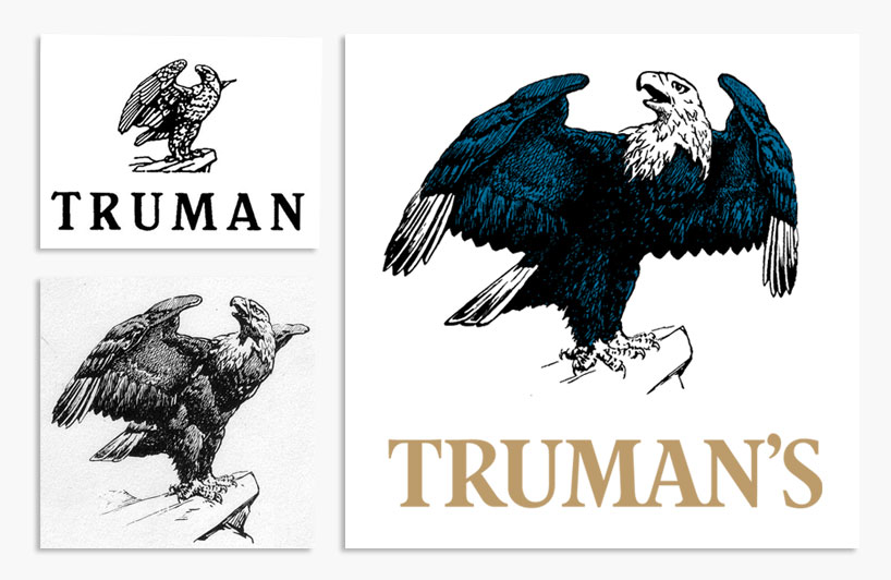 left: the eagle motifs and truman’s logotype which the new logo references. right: new truman’s logo designed by micha weidmann
truman’s eagle ‘along with the name, the eagle is the clearest link between the old identity and the new but you would have to look very carefully to realize it. the new eagle illustration is based on one of the original eagle motifs, the one which we felt was most iconic.
micha reworked the eagle so that a second wing was more visible giving it a more distinctive outline. the position of the eagle’s head was also altered to give it a more self-assured and serene appearance. we wanted its gaze to be obama-like, looking into the distance with confidence.
adding the blue tint to the eagle helped update the brand while the illustration-style made it seem quite traditional at the same time. a key part of our branding strategy is to use the eagle in its blue color as often as we can, only substituting it for a mono-color version when absolutely necessary.’
logotype ‘the logotype was based on the previous truman’s logo that we found many examples of in the archive. micha redrew the typeface slightly. perhaps the most recognizeable element is the bespoke ‘R’ which is specially drawn for the logo. we’ll limit the use of this typeface to the logo only so that it can retain it’s impact.’
tag-line ‘another important element of the branding is the tag-line ‘established in 1666, closed in 1989, re-established in 2010.’ the reason we have included this line on our communications is because some people weren’t aware that truman’s had ever shut down, since its signs can be found dotted around pubs and buildings in east london. this line tells the story of the brand as quickly as possible and let’s people know that truman’s is available to buy again.’
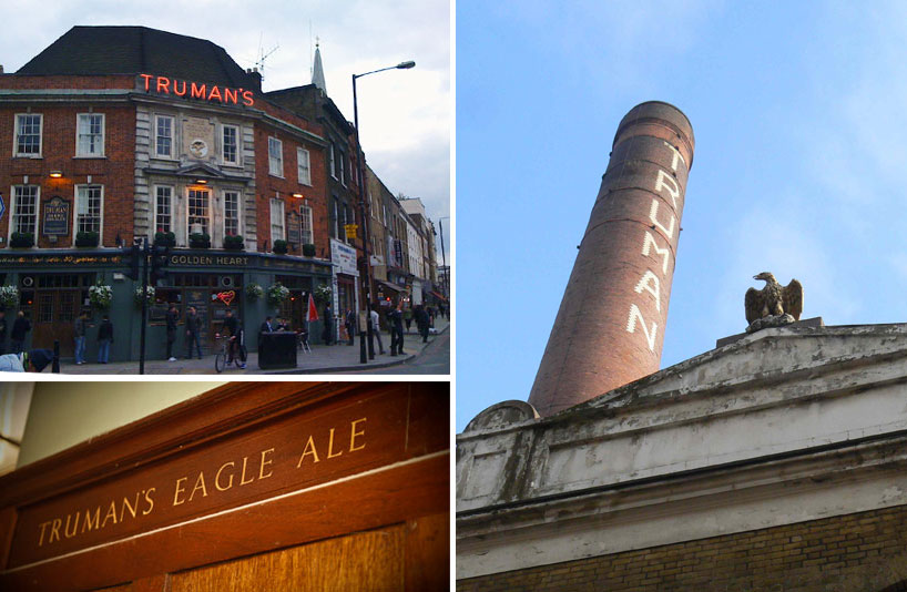 truman’s lasting presence can be seen across east london
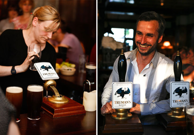 left: new tap badges. right: micha weidmann
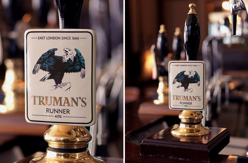 ceramic tap badge
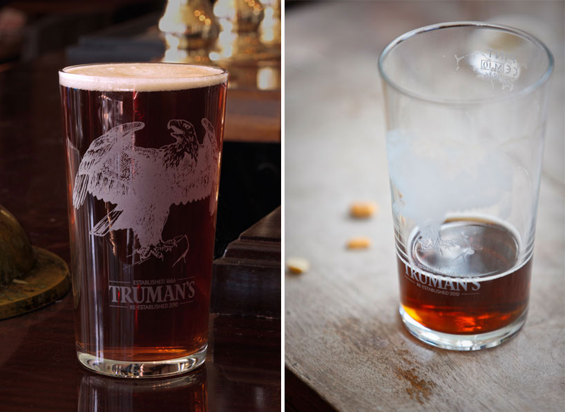 pint glass
application of the new identity ‘we have deliberately gone for a pared back identity. most ale brand identities are riddled with heraldry, gothic writing, and awash with uncomplimentary colours. we intentionally kept the information displayed on each medium as minimal as possible. the tap badge forms the basis of this – the glasses, beer mat and bottle labels all take their cue from the tap badge.
the badge is very white, unlike most beer brands. then we have kept it to just the truman’s logo, runner, 4.0% and ‘east london since 1666’. getting across the main facts is key and its difficult to do in a pub as it is a space is always full of stuff and information. the bottle label follows the same thinking and the beer mat is even more focussed, designed solely to communicate that truman’s shut down and is now back.
the other thing they all do is push the eagle to the front. our aim is very much that truman’s can be represented just by the eagle in the future, with no need for the logotype. for that reason it is as big as it can be on the glass, badge, mat and label.
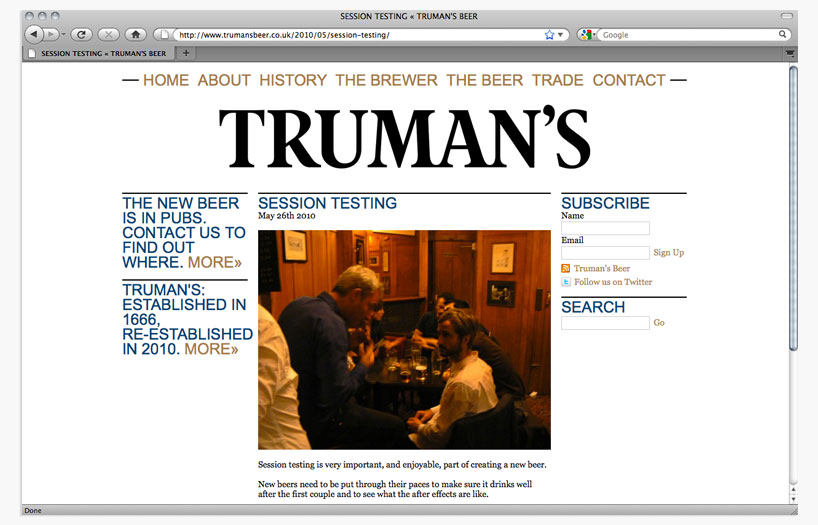
the truman’s website displays a crucial aspect of our vision for the re-established truman’s. it is designed to highlight that we are a small operation aiming to meet modern expectations with traditional high-quality. many beer brands have websites that its customer’s are likely to visit only once. with our site we’re trying to create a place which people check more often for new developments and tales from the past – a sort of online ‘local’. the front page is a blog because we want people to feel like there is always something going on so always a reason to come back and see us.’ 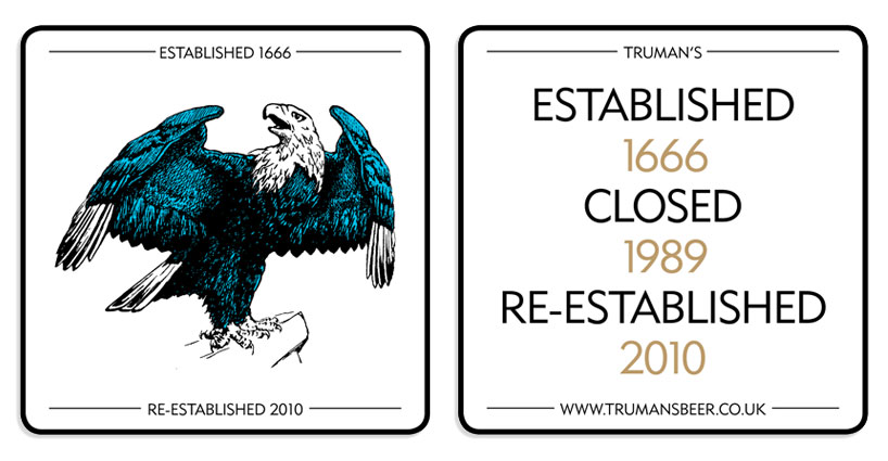 beer mat designed by micha weidmann
reaction and future plans ‘east london is home to a very diverse population, and it’s hoped that while the subtlety of the new brand image appeal to wide range of tastes. the response so far has been great – people like that the brand is available to buy once more, since it is something many people are familiar with but have not been able to experience.
at the moment the beer is only available at select number of pubs in east london – but we’d love to see it sold anywhere that has the potential to stock it. at this early stage it was never feasible to build a new brewery from the off so brewing elsewhere was our only option. tom knox and nethergate helped us produce ‘truman’s runner’, their experience and enthusiasm has played a big role in achieving what we have so far.
in the future it is hoped that brand can expand to the point where a new brewery can be built on the olympic site and to re-establish an east-london beer as soon as possible – as east london was once the home of world brewing and deserves to have one to call its own.’


