TOP 10 reader submissions of 2015 – product design
product design has to keep up the rhythm as new materials emerge, production forms evolve, and business plans change. objects fill our lives making them easier to handle and sometimes more aesthetic. we received several thousand submissions from our readers, with designers, artists and architects from across the globe sending through a diverse range of works that we have shared with our audience over the last 12 months.
we believe that maintaining an open dialogue with creatives is extremely important, and we are happy to showcase the high level of original projects of our readership. from a water mobility device that references reptiles to juicers made of hand-blown glass, we highlight 10 product design projects from our reader submissions of 2015.
fujiyama glass by keita suzuki
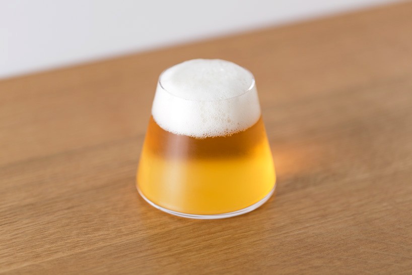
image © of kenta hasegawa
the ‘fujiyama glass’ by keita suzuki of product design center, is an elegant truncated cone that when filled, portrays the snowcapped peak of mt. fuji. meant specifically for beer, different brews and froths change the scene. the miniature mt. fuji radiates gold with pale ales, gleams in sunrise with amber ales, and looms in darkness with dark lagers. anywhere in the world, the ‘fujiyama’ promises a brief reunion with the mountain, and with japan.
bamboo tube products by samy rio
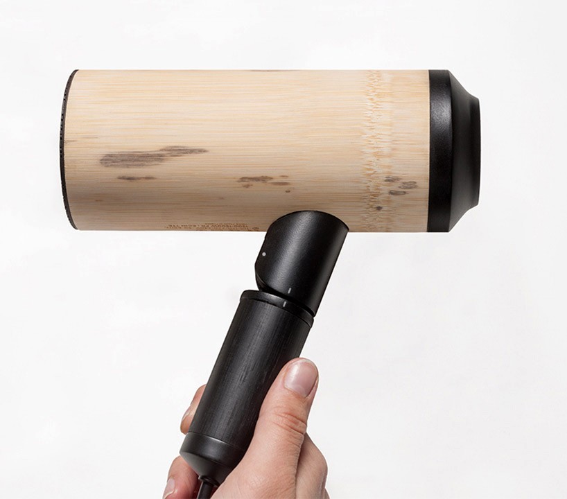
image courtesy of samy rio
bamboo, due to its natural characteristics and abundance, is practical as a substitute for products traditionally produced in plastics or metals. the wood requires considerably less processing, and is in fact, already a semi-finished product for the get-go. by rethinking the design and manufacture of products, it’s possible to create in a controlled, sustainable cycle.
french industrial designer samy rio completed a phase of experimentation surrounding the possibilities of bamboo in terms of plasticity and technical ability. the internal layout of revised objects are completely redesigned, allowing for greater reparability and easier disassembly. through research, rio created a hair dryer. bamboo is an efficient alternative for the product due to its strength and high resistance capabilities. it can be easily disassembled to replace or fix any broken pieces, and it also creatively gets rid of the need for a switch. in the foldable model, the dryer starts by unfolding the handle. in the other version, a simple rotation of the bottom section of handle starts the unit.
OP-vase by bilge nur saltik
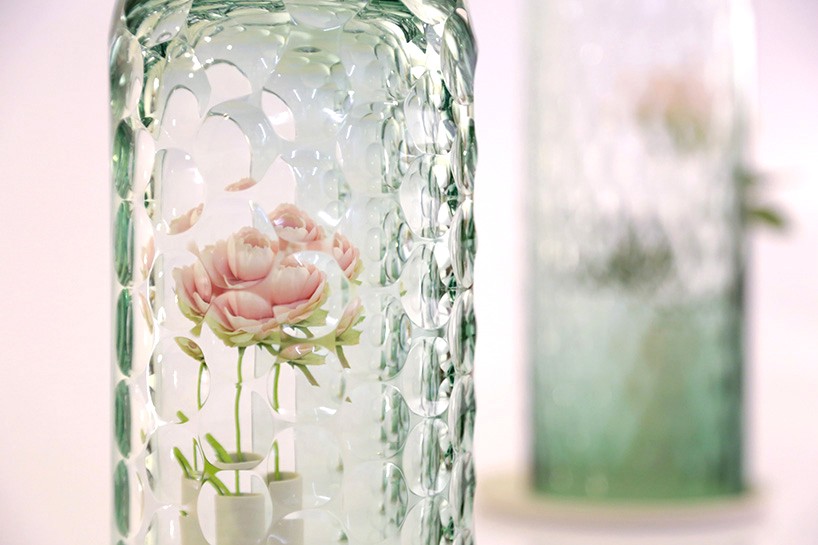
image courtesy of bilge nur saltik
‘OP-vase’ is a series of vessels conceived by turkish designer bilge nur saltik, presented at ventura lambrate during milan design week 2015. the capsules seek to create the impression of a bouquet with only a single flower through visual distortions, multiplying colorful petals throughout the spherical space. the glass shield’s kaleidoscopic properties have a magnifying effect, creating the impression of numerous abstracted botanicals.
the collection is composed of three vases in different sizes, each with their own unique pattern of cuts made from thick, hand blown glass, and formed with exacting precision to create the desired optics. tinted in blue and green, the shields not only augment the image of the flower, but add a subtle colored hue in addition to their own.
you can buy it directly from the designboom shop here
reptile by jet capsule
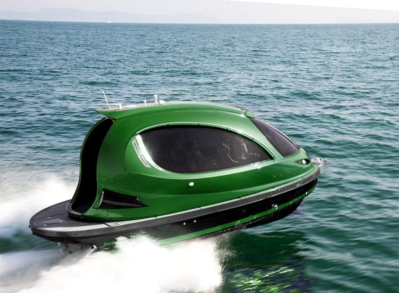
image courtesy of jet capsule
italian brand jet capsule introduced the ‘reptile’ in 2015. the unit now features a complete carbon fiber shell and reinforced hull. it’s about 500kg lighter than standard versions and total weight remains under two tons–stock 2495kg. the ‘reptile’ is painted with tri-tone mixed green, a bold color not often seen on the water. an improved engine, the illmor MV8, has a peak power of 570 HP at 6000 RPM.
increased power of the motor and decreased weight give the capsule heightened maneuverability and a maximum speed of up to 50 knots. in addition, the hull underwent slight modifications to increase stability for high-speed cornering. all seats are equipped with anti-shock suspension systems and the interior can be customizable with italian alcantara or leather. the ‘reptile’ is tailor-made and assembled in italy.
kiss lid by jang wooseok

image courtesy of jang wooseok
korean designer jang wooseok created the controversial ‘kiss’ coffee cup lid, bringing a human touch to the action of drinking. users experience the sensation of kissing via the full lips and protruding nose which makes for awkward incidental contact, just like the real thing! (only not, because you’re probably just drinking coffee.)
rush-weaving series by gaa
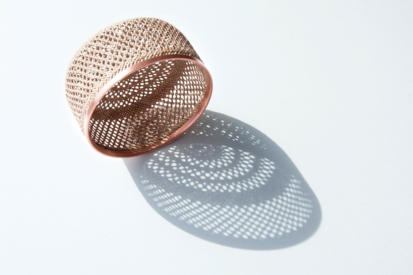
image courtesy of gaa
rush-weaving artisans have continually seen a decrease in business due to the pervasiveness of industry. with mass-produced options readily and cheaply available, individual craftsmen and small collectives have had to take steeply discounted pay to make ends meet. the taiwan yuan-li handiwork association is dedicated to keeping traditional crafts — and the people who have dedicated their lives to them — afloat.
finland-based designer chia-en lu, founder of gaa, worked with the association to produce her first product, the ‘rush-weaving series’, a collection of simple, modern baskets; each is handmade in taiwan by master craftswoman xueyun wen. the woven patterns are local to the area and have passed down generation-to-generation for more than 280 years.
you can buy it directly from the designboom shop here
juicer by elinor portnoy
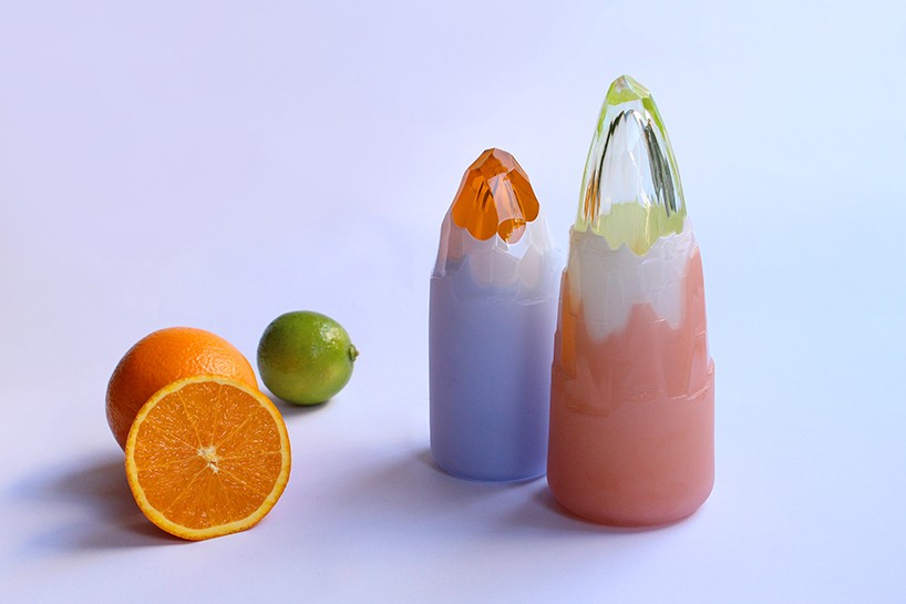
image courtesy of elinor portnoy
the kitchen counter isn’t merely a working station, it’s also a display open to admiration, judging, and comment by friends, family, and guests. appliances and tools have the potential to be decorative, sculptural elements; much like a bookend on the shelf, or a paperweight in the office. ‘juicer’, by royal college of art student elinor portnoy, is an exploration into the form and function of a kitchen tool.
each ‘juicer’ is composed of multiple layers of colored glass, handblown by a skilled artisan at RCA. using a cold-working method, portnoy was able to peel off layers, forming it into the perfect shape for squeezing fruits. colors were drawn from different fruits and their vibrancy makes ‘juicer’ feel as much like an art object as a functional one. the inner portion is bubbled — to reduce weight — and the outer layer is sandblasted to create a strong, reliable grip.
intertidal deployment object series 2 by something like this design
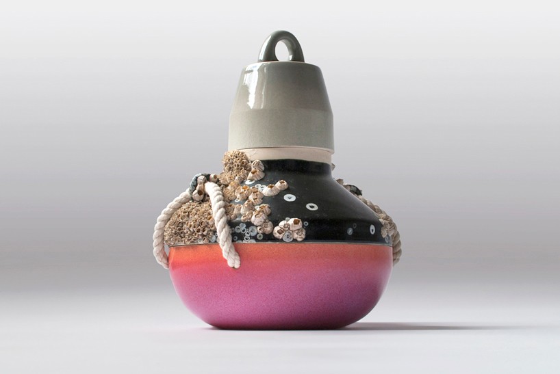
image courtesy of something like this design
generally, the integration of natural materials is done so for the elements’ innate beauty, vivid colors, or practical and functional values. that’s not the case with the ‘intertidal deployment object series 2′ by something like this design; who created a collection of ceramic projects adorned with, of all things, barnacles. the studio, a collaborative effort between trygve fast and jessica swanson, was particularly interested to work with the sea-growing organism for their unique complexity and raw-appeal.
exploration of the concept takes form as a modular system of interchangeable forms that can be submerged into an ocean environment one section at a time. once marine life has grown, the piece(s) can be removed and collectively assembled into a finished product. through consultation and collaboration with the oregon institute of marine biology, the project was educated in the vast vocabulary of nautical hardware and equipment, as well as the technical constraints of barnacle growth.
auxiliary tools by gareth ladley
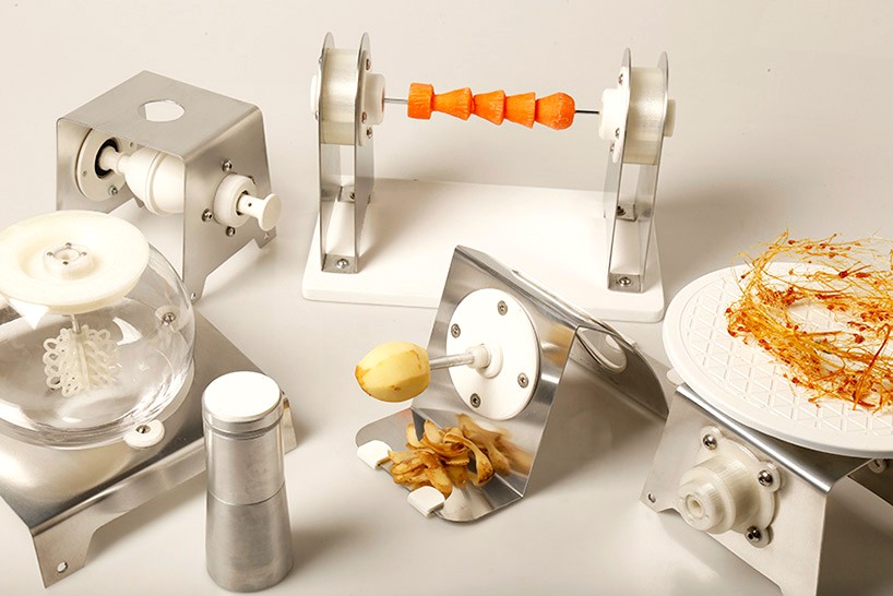
image courtesy of gareth ladley design
a chef’s greatest tool is their knife, with a nice piece of steel and a mission, a master handler can complete dozens of tasks. secondary to the sacred-status blade is a wide-range of other products, all handled by an equally diversified kitchen crew. every piece of equipment and every body present is crucial to the efficiency of the establishment, and gareth ladley thinks there’s room for one more: an in-house designer.
to showcase the concept, ladley created a range of tools with additional insight provided by chef diarmuid rogan and his crew. included are: an egg spinner for in the shell scrambling, aerator for froths and similar needs, spinner for plating, and a custom-made lathe for peeling and sculpting. at the heart of the line, is a single handheld power source that plugs into all devices. it’s the hope of ladley that by using only one element equipments that would ordinarily sit idle — done by hand rather than by machine — will be used as they should be.
fuzzy logic project by marta santambrogio

image courtesy of marta santambrogio
in 2014, european parliament passed a notion that will force automobile manufacturers to make all electric vehicles audible for pedestrians by 2019. for those unfamiliar with the issue; it’s entirely possible that an electric car could follow a person walking, at less than five feet distance, and that person would have no auditory awareness whatsoever that there’s a vehicle less than an arm’s length away. as is now known, having silent vehicles isn’t plausible, but the cadence of a million car horns and busted exhaust manifolds is hardly better.
musically-inclined designer marta santambrogio offers a different solution. a silent vehicle is basically a blank canvas, on which anything can be projected, so why not turn them into music making machines? the car becomes a mobile speaker, traffic transforms into a musical experience. as long as the populace doesn’t have an affinity for speed metal or riff raff — the daily commute could quite possibly be a pleasant experience.
to test the concept, known as the ‘fuzzy logic project’, santambrogio and a small team of collaborators packed up and took off to india: the mecca of noise pollution. tuk tuks, the ubiquitous symbol of modern india, were the chosen subject of experimentation. given the fact that every day more people drive the tiny vehicles than the populations’ of germany and the UK combined — nearly 150,000,000 — changing the tuk tuk, was by extension, changing india itself.
PRODUCT LIBRARY
a diverse digital database that acts as a valuable guide in gaining insight and information about a product directly from the manufacturer, and serves as a rich reference point in developing a project or scheme.
