designboom interviews the creatives behind TOG’s 2015 collection
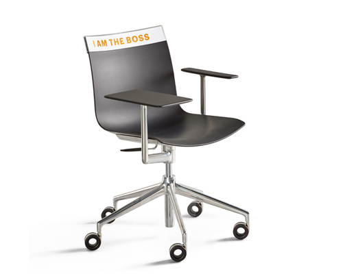
‘boss boss’ by philippe starck
image by nicole marnati
in 2014, a new brand of furniture was born. TOG — ALLCREATORSTOGETHER — evolved out of the desire to bring together the best of humanity and craftsmanship, in combination with the industry’s best technological developments, to produce functional high-quality pieces that don’t offer a particular style; but rather freedom to personalize each one so that they are as unique as their individual owners.
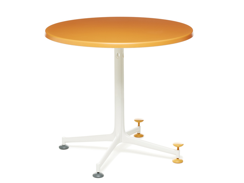
‘oca puccin’ by philippe starck
image by nicole marnati
mass produced in italy, the customization of TOG’s ‘naked’ furniture is an intrinsic part of the company’s existence, whereby customers can choose from a range of colors, shapes and other options, in store or through digital platforms, to create bespoke designs. for 2015, TOG continues this mission, bringing forth new product families by sebastian bergne, antonio citterio, sam hecht and kim colin of industrial facility, amborise maggiar, philippe starck.
on show at the 2015 salone del mobile, designboom interviews the creatives behind TOG’s 2015 collection, to find out more about their collaboration with the company, and the particular conceptual and technical challenges they faced during the development their product(s).
‘polo treto’ by philippe starck
image by nicole marnati
philippe starck on working with TOG
designboom: could you please describe your collaboration with TOG and the particular themes and reflections you have brought forth in the design development of the furniture pieces?
philippe starck: because we have less and less money, we all seek industrial products, which are the only ones that can guarantee both high quality and longevity for the right price. in the meantime, we are all different and thus, want to own unique products. this is a paradox of today’s society: we economically need objects that are massively produced, but we want unique objects for ourselves.
TOG is the first company to build a bridge between these different worlds, to solve this paradox, this equation: combining the best of the mind, of engineering, of technology, of the industry with high quality, a affordable prices; while still encompassing a lot of imagination, inventiveness, humanity and of individual creativity.
designboom: what are the main characteristics of your design for TOG, and what did you want to achieve with this body of work?
philippe starck: TOG is a necessity as it is the only company that answers the question of recognition, unity and difference. us, TOG designers, work together to meet this goal, which is reachable via customisation at different possible stages. this means you can order a piece of furniture that is already different, by choosing colours and shapes directly from the factory. the second possibility is to finalize your dreamed chair directly in store. thanks to the new 2015 collection, the third possibility is to receive a piece of furniture in which you can insert your own pictures, drawings, pieces of art, personal messages — to express your individuality in a very simple way, just as if you were putting a picture in a photo frame. the last possibility of customization involves the participation of people who are geographically and culturally far away from you. this would enable them to bring a special, unexpected dimension to the customised piece of furniture and that would reveal the mystery of their culture and craft.
because TOG is above all a philosophical, ethical and political company, the most important thing when creating a product that is ‘ethically TOG’ is to remain coherent. it means being able to: offer the longevity we need from today’s production, open the doors of imagination, offer both a material and cultural solidity, all at the right prices. it would have been unacceptable to propose such a useful and personalized product at an exorbitant price, as we can sometimes see in the design field.
designboom: what were some of the conceptual and technical challenges you faced in the production of your work with TOG?
philippe starck: ‘boss boss’ is a very good example of customization possibilities, of one’s statement of their individuality and inventiveness at their office, whether at home or in a company. thanks to an armrest equipped with a rotary shelf, the chair symbolizes a new proposition for office space organization. in fact, the person is no longer settled down opposite to a wall, completely isolated from others. we know that one of companies’ major issues is the lack of communication between people. with ‘boss boss’, you can turn over, move, gather with people around you and thus gain malleability and flexibility; that are both necessary to urge on group creativity.
‘maria maria’ is about a paradox. we wanted to make a hand made chair, like something you would find in the countryside, simple with proper natural materials while showing the parameters of nature. in the meantime, both the plastic back and armrests insure comfort and, just as in the ‘boss boss’ chair, the backrest can be the window where you can show your sentimental, philosophical, political or humouristic identity.
‘oca puccino’ is a humble and necessary service made for waiters. I have always felt ill-at-ease when I see a waiter struggling and almost getting on his knees to adjust a table leg with a little piece of wood for example. I see a form of humiliation in this situation. ‘oca puccino is about the ennoblement of this action: the adjustment of the chair through a decorative and intelligent device.
‘light rock’ is one of the biggest monolithic injected plastic pieces of furniture in the world. it is a technological achievement as well as a timeless, traditional, iconic club armchair. but made out of plastic, it becomes a mental game and a window to the imagination.
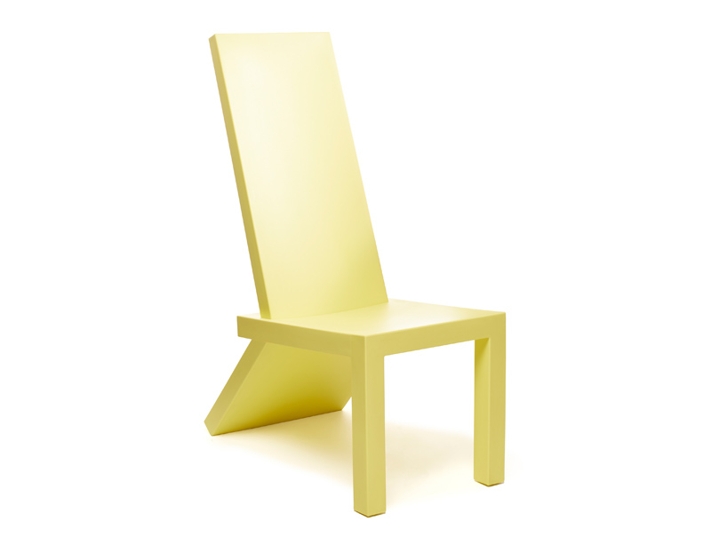
‘rita veld’ by philippe starck
image by nicole marnati
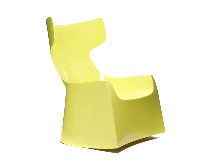
‘lightrock’ by philippe starck is a sculptural rocking chair — a high-tech masterpiece
image by nicole marnati
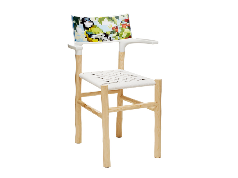
‘maria maria’ by philippe starck
image by nicole marnati
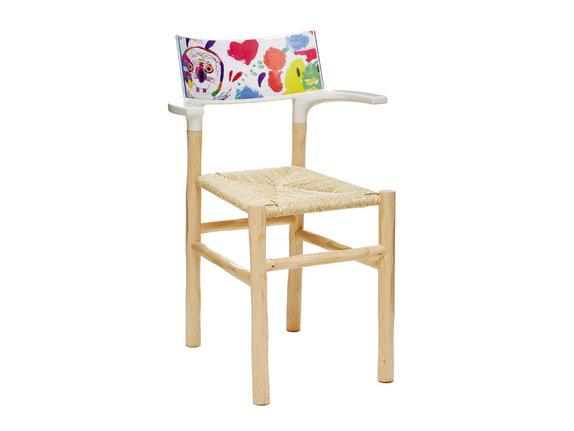
‘maria maria’ is a handmade wood and natural fiber woven chair with a backseat that can be customized
image by nicole marnati
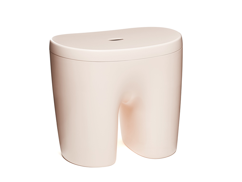
‘shorty’ by sebastian bergne
image by nicole marnati
sebastian bergne on working with TOG
designboom: could you please describe your collaboration with TOG and the particular themes and reflections you have brought forth in the design development of the furniture pieces?
sebastian bergne: in my projects for TOG this year I was particularly interested in creating objects that have a strong sense of familiarity and meaning, while at the same time having an abstract multi functionality. furniture that does not relate to a specific historic typology is perhaps more flexible and allows people to project their own creativity on to it, so that they can use it in their own way.
designboom: what are the main characteristics of your design for TOG, and what did you want to achieve with this body of work?
sebastian bergne: shorty can be many things. an extra seat, a storage box, side table, plant pot or even a champagne cooler. in the end he is a useful character to have around and helps you to live your life in the way you want. iron seems to be a symbol of strength and structure that has been bent by the power of the creative mind. it balances a discretely minimal form with a strong sculptural presence whether used singly or combined in endless possible combinations.
designboom: what were some of the conceptual and technical challenges you faced in the production of your work with tog?
sebastian bergne: ‘iron’ is a large rotational moulded piece with very flat and angular surfaces. this proved a challenge to achieve in production but thanks to the experience we have available in the TOG team, it was possible. on the other hand is not so difficult to produce, being a classic injection moulded piece. we had more of a design challenge improving the stability and safety of the piece when used as a stool, whilst maintaining its softness.
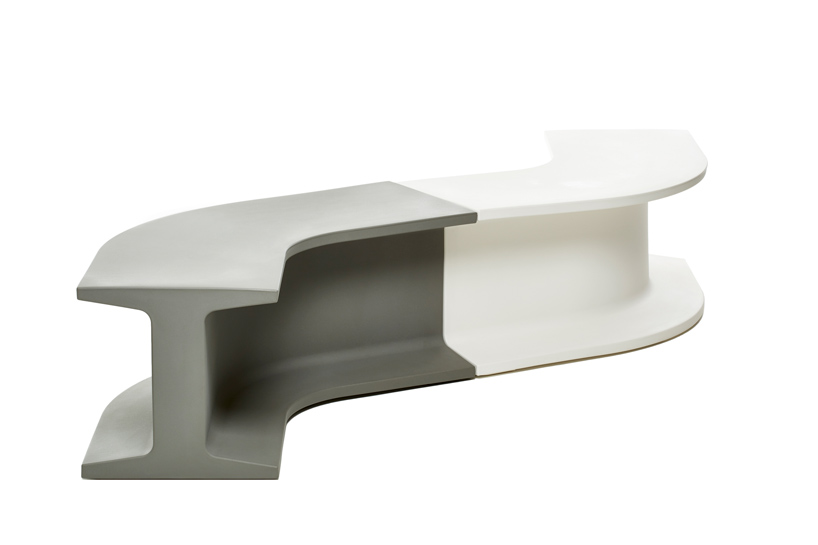
‘iron’ by sebastian bergne
image by nicole marnati
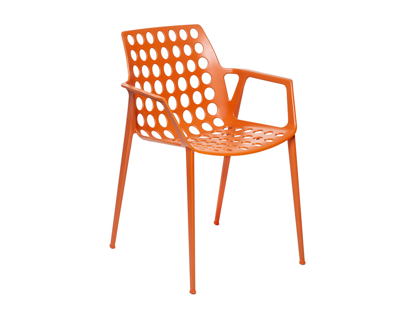
‘alu betty’ by antonio citterio
image by nicole marnati
antonio citterio on working with TOG
designboom: could you please describe your collaboration with tog and the particular themes and reflections you have brought forth in the design development of the furniture pieces?
antonio citterio: I accepted the collaboration proposal with TOG since it presented itself as a brazilian company with an interesting industrial plan: the idea is to manufacture in south america, europe and china, as a truly global group.
designboom: what are the main characteristics of your design for TOG, and what did you want to achieve with this body of work?
antonio citterio: the idea at the base of the design was to obtain a competitive product thanks to a strong investment in the industrial manufacturing process, that would pave the way to mass production.
designboom: what were some of the conceptual and technical challenges you faced in the production of your work with TOG?
antonio citterio: all products present some challenges. in the case of TOG, the high level of technical expertise and consultancy offered by the company helped us to reach a final design solution in a relatively limited time.

‘alu betty’ by antonio citterio
image by nicole marnati
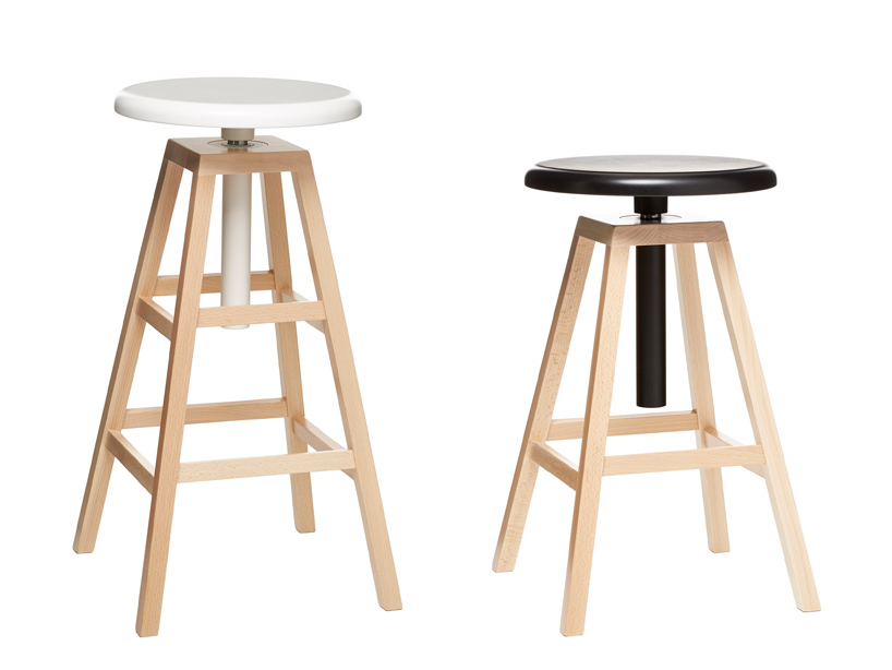
‘figure’ by industrial facility
image by nicole marnati
sam hecht and kim colin of industrial facility on working with TOG
designboom: could you please describe your collaboration with tog and the particular themes and reflections you have brought forth in the design development of the furniture pieces?
sam hecht and kim colin: for our TOG designs for 2015 – the ‘figure’ project – we are interested in conveying a lightness of touch in how something appears, how it is used, and how it rests in a room. the design is a clash of archetypes – the utility and simplicity of an artist’s four-legged figure painting stool – and gas-lift technology commonly found in office chairs. the result is further ease and practicality. it can be used in a multitude of settings from the casual home, collaborative work in the office, and also bars and cafés.
designboom: what are the main characteristics of your design for TOG, and what did you want to achieve with this body of work?
sam hecht and kim colin: simplicity, practicality and ease of adjustment. it is a stool that can move from sofa height to desk-height. from desk-height to bar-height. and from bar-height to counter-height. for the home, it means the bar stool can also act as an extra chair.
designboom: what were some of the conceptual and technical challenges you faced in the production of your work with TOG?
sam hecht and kim colin: with figure, there is not only a clash of archetypes (the wooden stool with a gas-lift mechanism) but also a clash of materials. wood is not commonly thought of as a material that can withstand the stress and strains of gas-lift adjustment. normally the seat is adjusted by a wooden screw. it meant that there were some technical challenges in connections between parts – but they were easily overcome. also, the adjustment control could not be a lever – instead it is a large button integrated into the understructure. all in all, an item for the everyday.
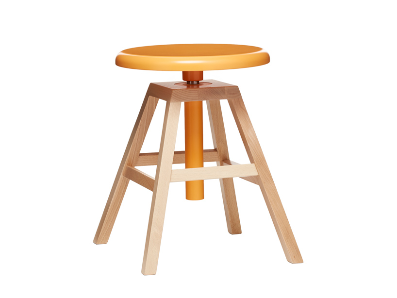
‘figure’ by industrial facility
image by nicole marnati
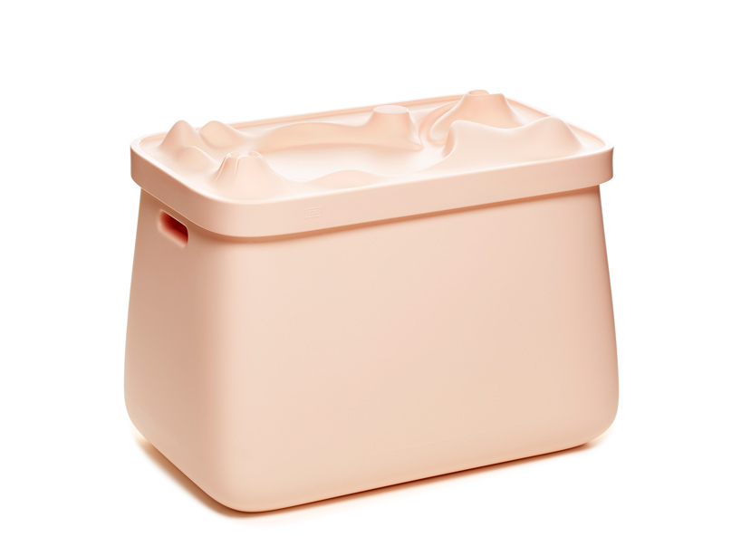
‘pays sage’ by ambroise maggiar
image by nicole marnati
designboom: could you please describe your collaboration with TOG and the particular themes and reflections you have brought forth in the design development of the furniture pieces?
ambroise maggiar: my design for TOG is focused on the children furniture for now. I have been working on a collection of double meaning objects trying to put together the absolute functionnality and fantasy. the idea comes from the fact that if you want a child to enjoy learning, you should combine these moments with playing times. then children’s rooms are small, so a two-functions object allow you to save space, physically and mentally. I tried to make not only amazing furnitures for children but also practical products for parents.
designboom: what are the main characteristics of your design for TOG, and what did you want to achieve with this body of work?
ambroise maggiar: ‘vodo masko’ was born after looking through a wonderful catalogue of african art. my brother alexis who is an african art specialist at sotheby’s gave it to me. the kifwebe masks from congo are absolutely stunning. when you don’t use it, just hang it on the wall. ‘apolo chapo’ comes from the trick of the rabbit getting out of the magician hat. ‘ castable’ is about working/studying/learning while being prepared to fight a dragon coming out from the dungeon at any moment. ‘pays sage’ reflects the poetic 1968 slogan “sous les pavés, la plage”. under the concrete, you will find a countryside. with all these projects I tried to keep in mind that both children and parents needs, and their expectations of contemporary furniture.
designboom: what were some of the conceptual and technical challenges you faced in the production of your work with TOG?
designboom: conceptually, I had no limit. TOG appreciated my proposals and moved forward. technically, since the very beginning we have chosen the right technology in order to design the products in the best possible way, (not the opposite process). most of them are rotomoulded. the huge benefit is a one-piece object, suitable for both indoor and outdoor use, with huge dimensions in a reasonable priced mould. my products are almost indestructible and recyclable because they’re made of polyethylene. the limits come from the slowness of the process and a possible lack of sharpness of the shapes (– not quite necessarily a default when it comes to children furniture).
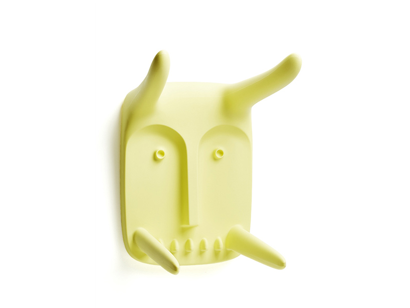
‘vodo masko’ by ambroise maggiar
image by nicole marnati
TOG is proud to invest in traditional italian manufacturing and the latest technology, such as 3D printing; and in the near future, customers will be able to download open source designs involving them more in the creative process. TOG is ‘open-source’ and ‘community driven’, and the brand acts as on these ideas, embedding collaboration and play into its business model. the entirety of TOG’s 2015 collection can be viewed at the 2015 salone del mobile in hall 12, booth B03-C04 from april 14th to 19th.
milan design week 2015 (164)
PRODUCT LIBRARY
a diverse digital database that acts as a valuable guide in gaining insight and information about a product directly from the manufacturer, and serves as a rich reference point in developing a project or scheme.
