studio modijefsky joins booking.com’s city campus design
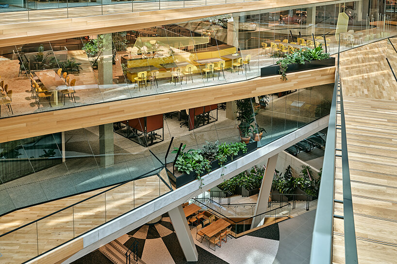
As part of the newly completed Booking.com City Campus in Amsterdam, The Netherlands — led by UNStudio and HofmanDujardin — Studio Modijefsky was invited to carry out two projects within the headquarters: the Connectors, three areas that double as meeting rooms and spaces to unwind on the 6th, 7th and 8th floors, and the interior of the 5th-floor restaurant. The studio was joined by other firms and designers to fill in individual areas of the complex. Together with HofmanDujardin, the different teams embarked on a collaborative approach to match the travel giant’s ambition for an inclusive and diverse environment spanning 65,000 sqm.
all images © Maarten Willemstein
three-floor connectors inviting play and mental reboots
Positioned on the Booking.com City Campus’s southeast edges, the Connectors take shape as bright spaces imbued with direct sunlight and framing expansive views of East Amsterdam. ‘Their dual function reflects the fact that an office is no longer just a place to work; it is somewhere to be at your best,’ notes Studio Modijefsky (see more here). What might have been plain meeting rooms close to staircases have been transformed into dynamic spaces that challenge employees to break out of their routines: to reboot by switching off their minds and moving their bodies instead. But these aren’t gyms: fun is the goal here.
Employees are just a hop, skip, and jump from a positive and physical mind state by filling the Connectors with unusual but enticing tools for movement, play, and interaction. In addition to the interior design, Studio Modijefsky was asked to curate the styling for the Connectors. Each Connector has objets trouvés sprinkled throughout. These are both aesthetic and functional in purpose, inspiring employees with beauty and tactility to simply admire or play with.
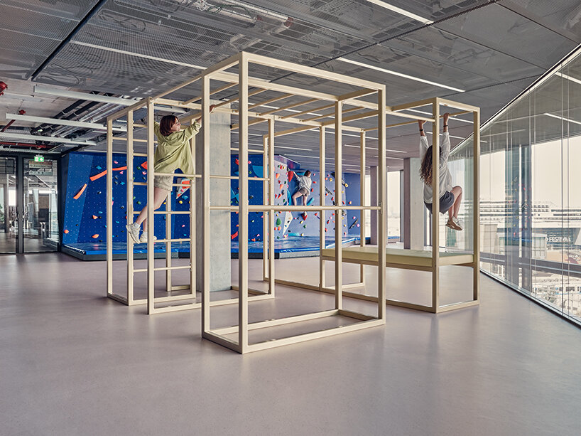
7th floor Connector: Cape Town | dynamic spaces that challenge employees to break out of their routines
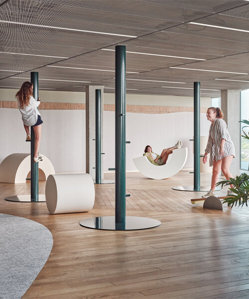
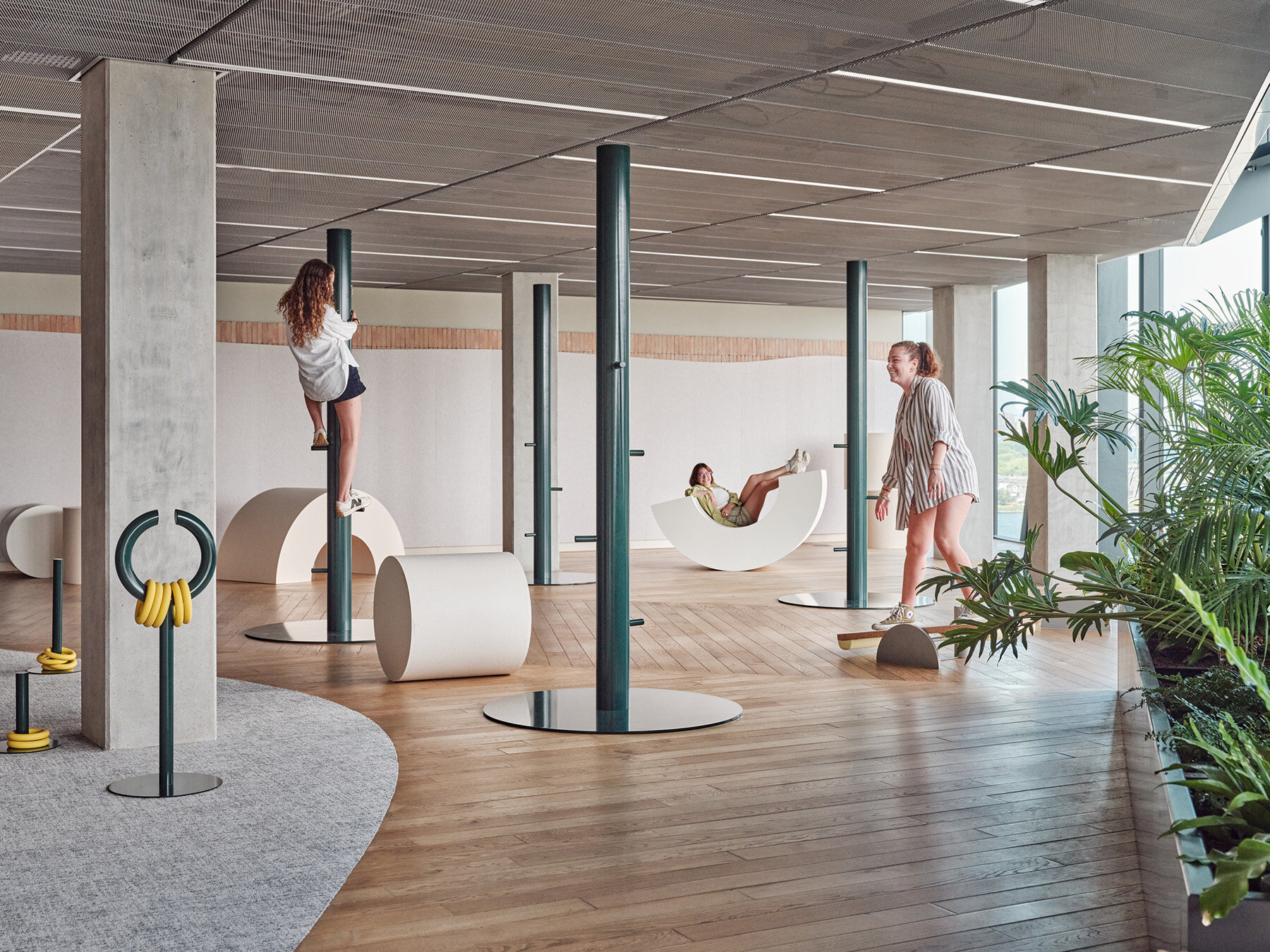
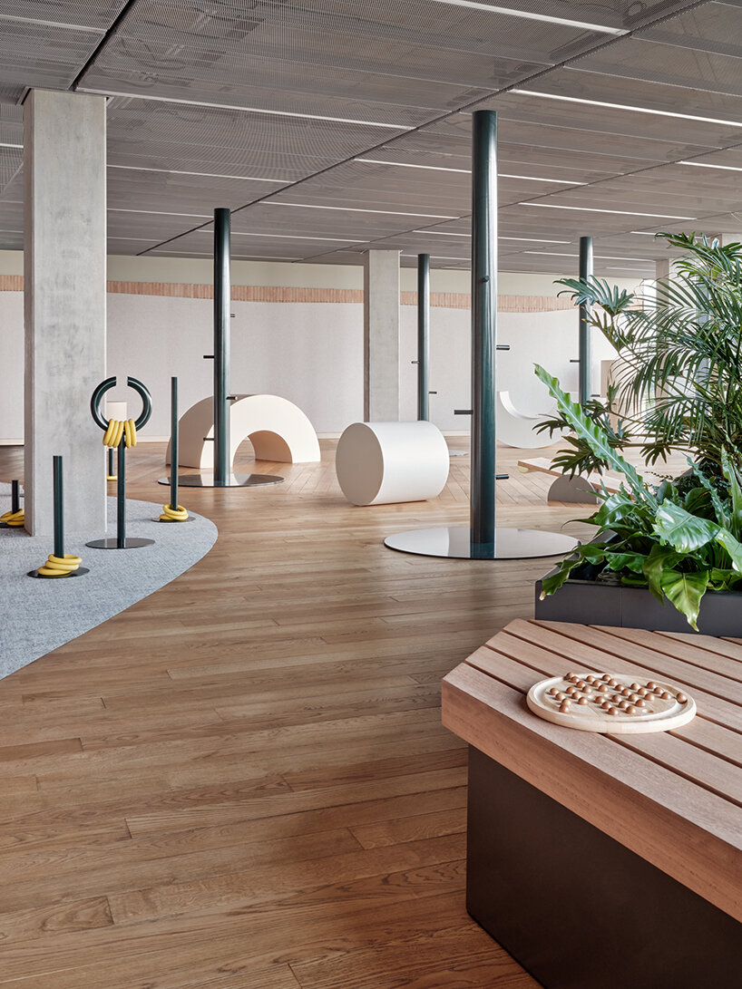
As with every area on the campus, each Connector is named after a different travel destination, which has been recreated with a haptic texture palette and clean lines. Starting with the Tuscany Connector on the 6th floor, Studio Modijefsky alludes to the Italian region’s iconic landscape of golden fields marked by tall green cypress trees, rolling hills dotted with hay bales, and picturesque villages filled with terracotta houses.
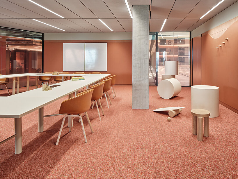
These elements are recreated along a curved line outlined by parquet flooring. Walls in both parts of the Connector are finished with warm earthy colors and layered textures mimicking the region’s sloping hills. Bricks made from construction waste material and recycled felt panels are also used in the meeting area, where deeper-colored terracotta shades take over the floor and wall claddings. Foil in the windows blends in with the surrounding hues and obscures the view of the play area, giving the meeting room a more intimate character and enabling the Connector to fulfill its functions simultaneously.
recreating an urban playground
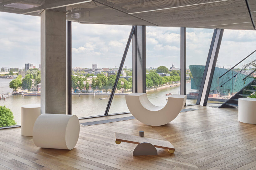
The tools for play include geometric seating elements that can be interpreted however users want as they stand, stretch, roll, balance, or lay upside down on them. The shape of the playground area furniture returns in the meeting room, where half-circle units join to form the big round meeting table. Further tests of one’s balance await on a slack line and custom-designed balancing tools that stimulate the imagination and promote creative movement. ‘If you’re feeling more playful there are rings to throw and seating elements resembling bales of hay to sit, jump or lie on. A further Tuscan touch is present in the vertical dark green poles, inspired by cypress trees, which grow from the floor until the ceiling, and you can climb, hang on and jump between,’ shares the studio.
framing expansive views of Amsterdam
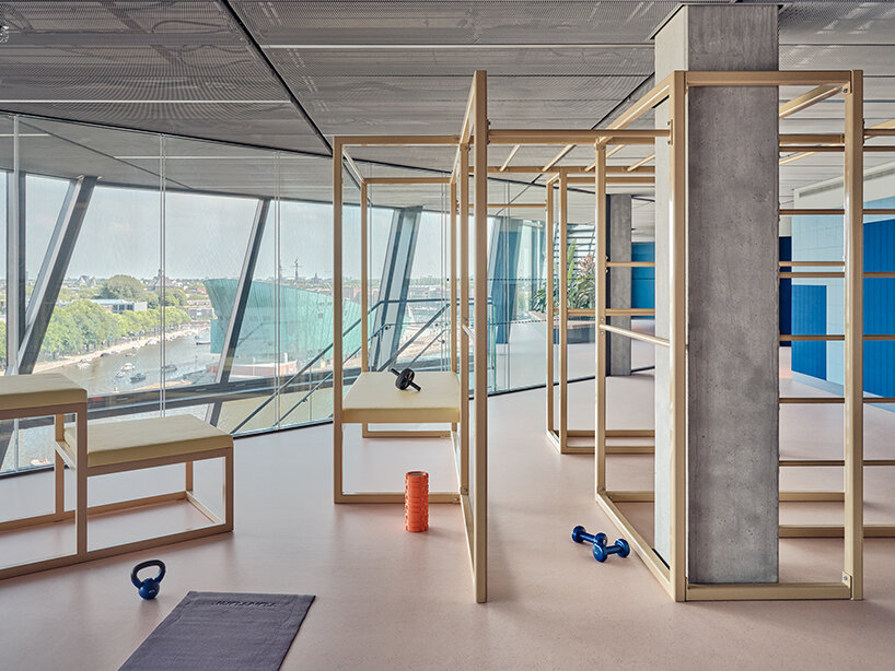
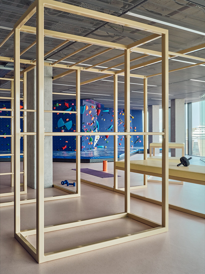
Moving to the 7th-floor Connector, Cape Town, users are transported from tranquil Tuscany to the buzzing South African metropolis. This urban playground is the most physical of the three Connectors, with a punching bag and a bouldering wall looking right over Amsterdam and the water surrounding the building. Comprising a colorful landscape of geometric apartment blocks, concrete playgrounds, painted facades, and bright city lights, this setting alludes to water never being far away in Cape Town and the energy of the city pulsing everywhere one looks. Employees can let their energy loose on a bouldering wall, benches for pull-ups, and a gymnastic structure made of a grid of bars that they can climb and play in, do pull-ups, or hang upside down.
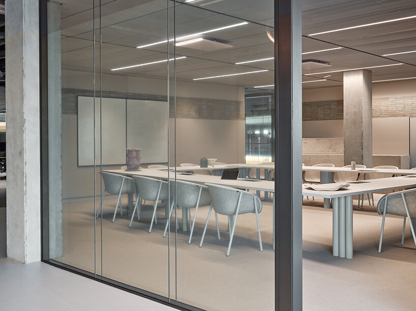
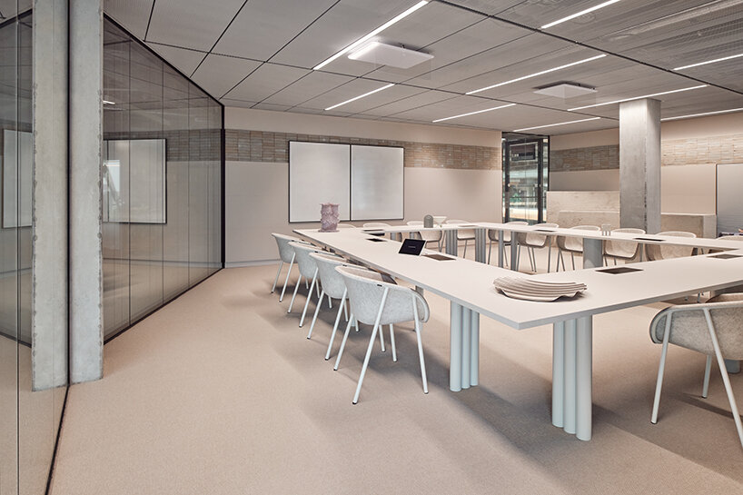
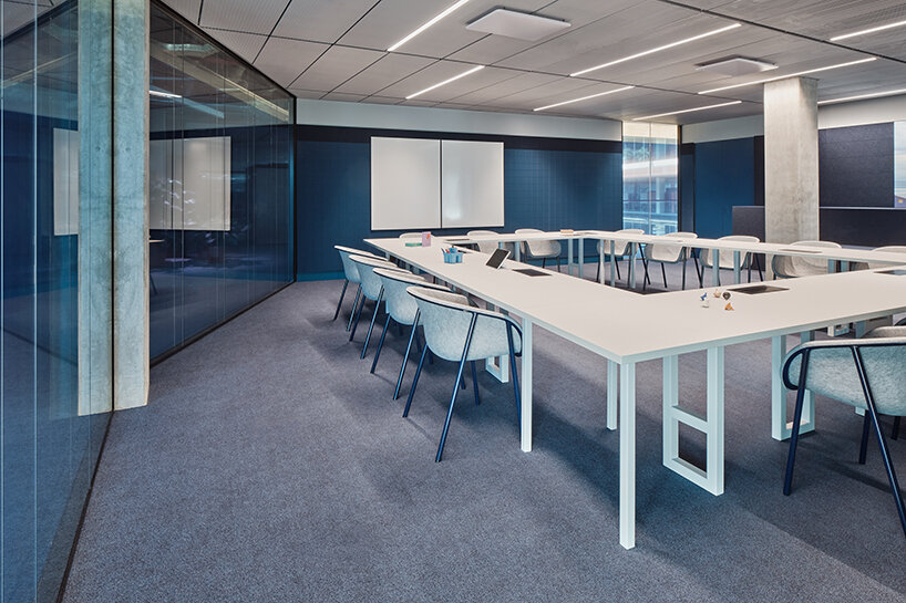
Peach rubber flooring with dark blue and red accents forms a canvas for the bright yellow gymnastic structures and purple blocks — coupled with recycled blue marine felt and sustainable wooden waste panels. Thick structural-plywood walls with colorful grips, the gymnastic bars on one side, and a giant checkers board integrated into the wall on the other side of the space awaken the senses for play and amusement. Ping-pong and football tables pop up in the middle of the area, while the deep blue palette is extended into the meeting room. Here, orthogonal modules compose the meeting table, while the wooden waste panels turn into steps, serving as a platform for anything from informal conversations between colleagues to accompany presentations. Pinboards, screens, and toolboxes are seamlessly integrated into the design to support creativity.
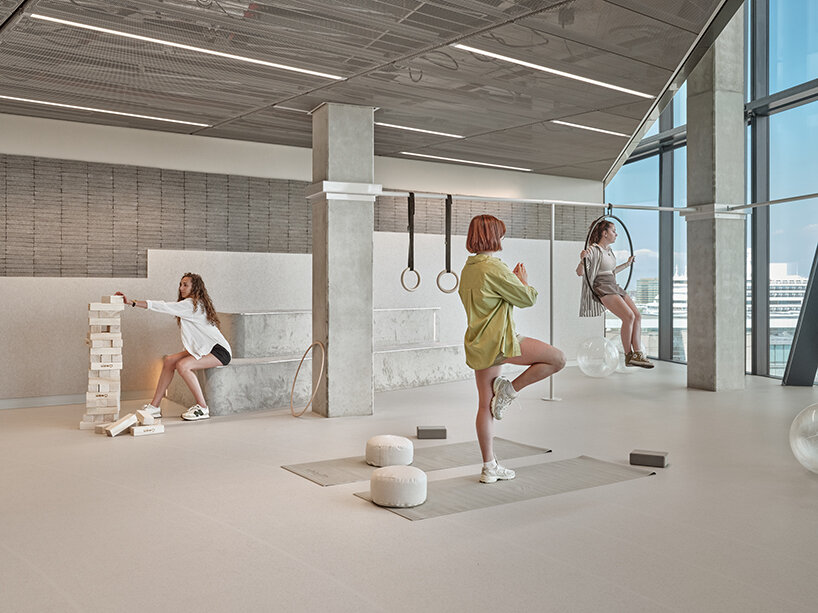
The third and final Connector on the 8th floor at the Booking.com campus captures the unique feeling of floating in the Dead Sea while drinking in its dreamy landscape. ‘The focus here is letting go and transcending to a meditative state while putting your body to work,’ clarifies Studio Modijefsky. Calm and comfort emanate throughout thanks to pastel colors, graceful round shapes, and linear patterns, with an undercurrent of playfulness represented by skippy balls. White lines make abstract water ripples on the floor, simulating a circular wave emanating from the sea surface. Soft rugs and rubber flooring recur throughout the interior.
terracotta hues engulfing the 6th Connector, Tuscany
While the Dead Sea Connector might look less physically demanding than Cape Town, it challenges one’s body to move in new ways; an aerial hoop and a series of rings, poles, and gymnastic devices inspire employees to find a new way to unwind or try more advanced exercises. The flooring is paired with recycled felt panels and anthracite bricks made from waste materials. Together they form a palette of soft-hued colors laid out linearly on the walls. Large curved smooth shapes mold steps as seating that connect the playground with the meeting room. A sense of calm reigns here as well, with a high degree tactility area including a sculpted oval table.
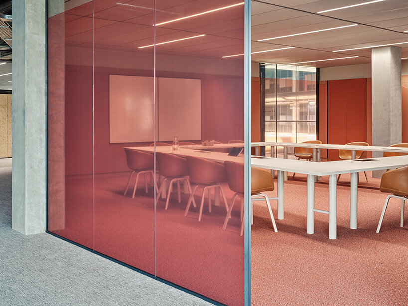
using see-through separators for more seamless connections
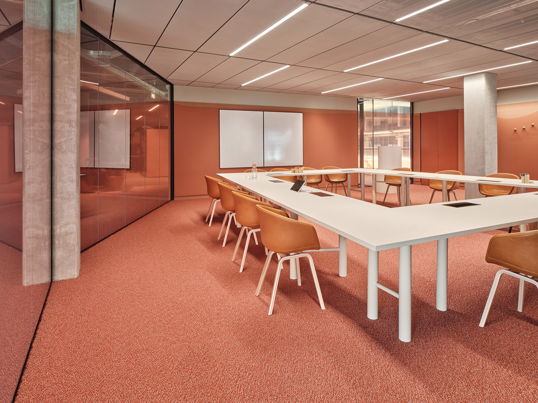
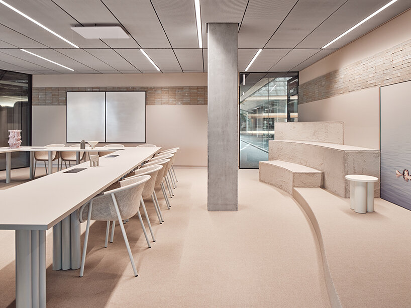
using recycled felt panels and anthracite bricks made from waste materials
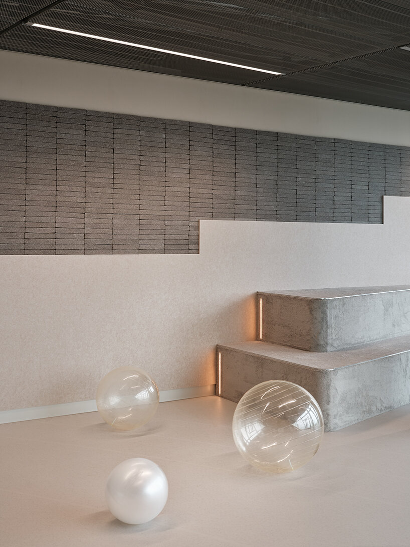
an undercurrent of playfulness represented by skippy balls
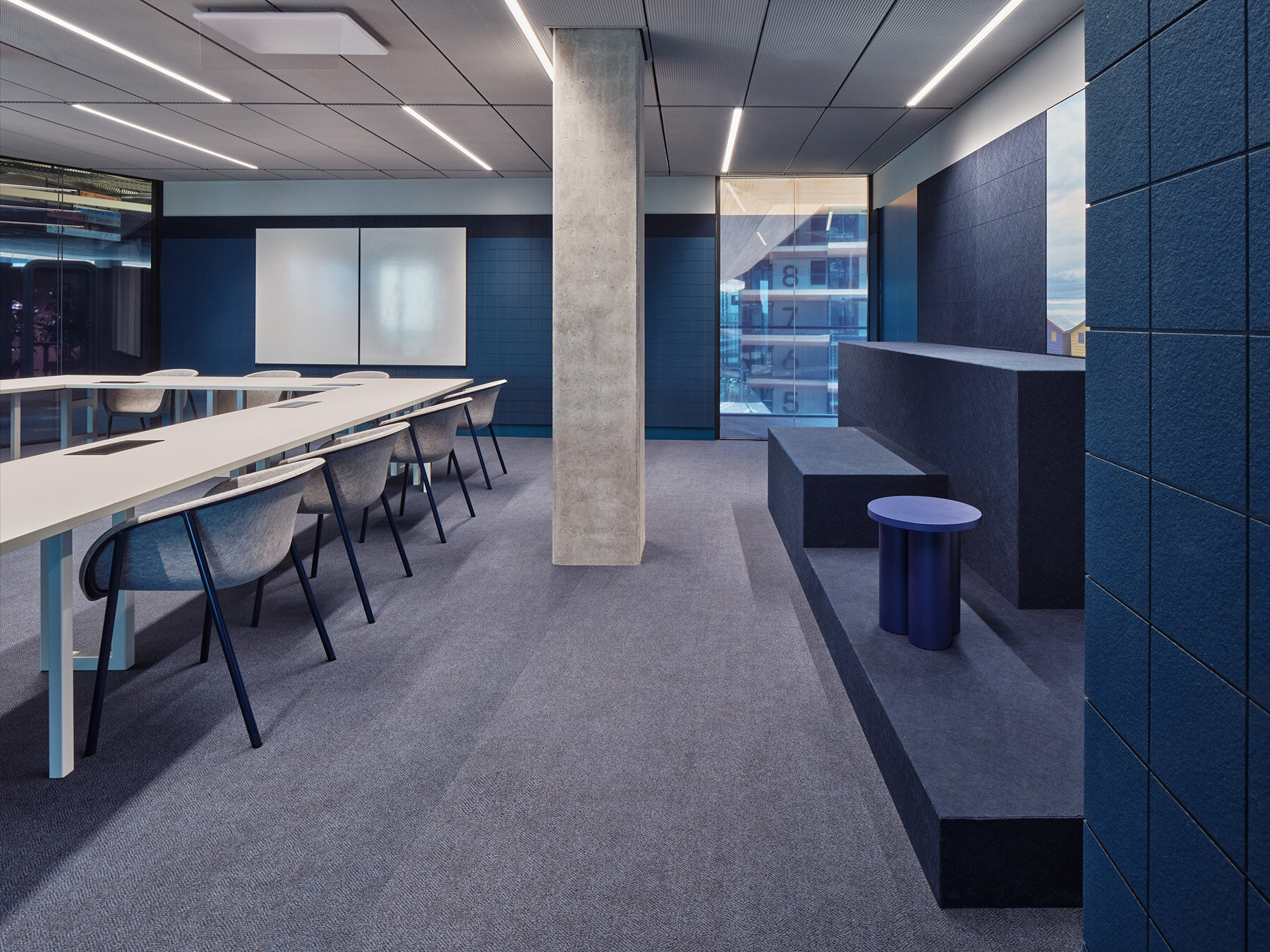
Studio Modijefsky’s island-themed restaurant five
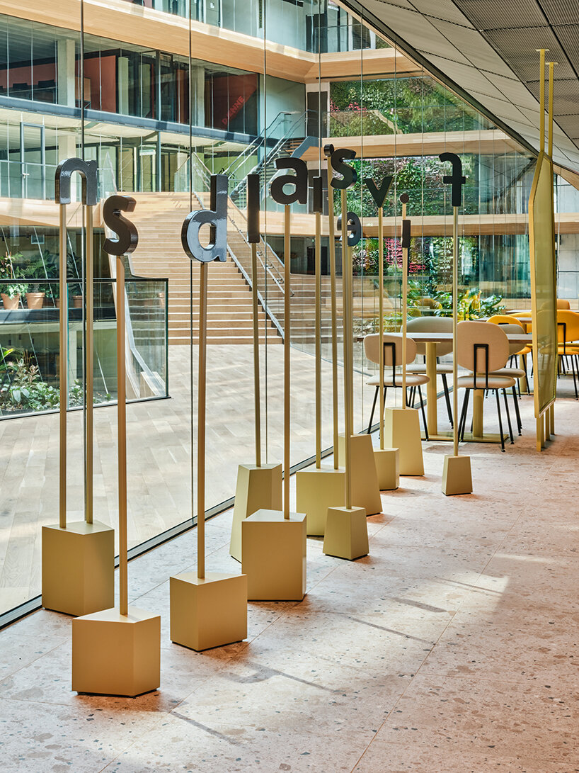
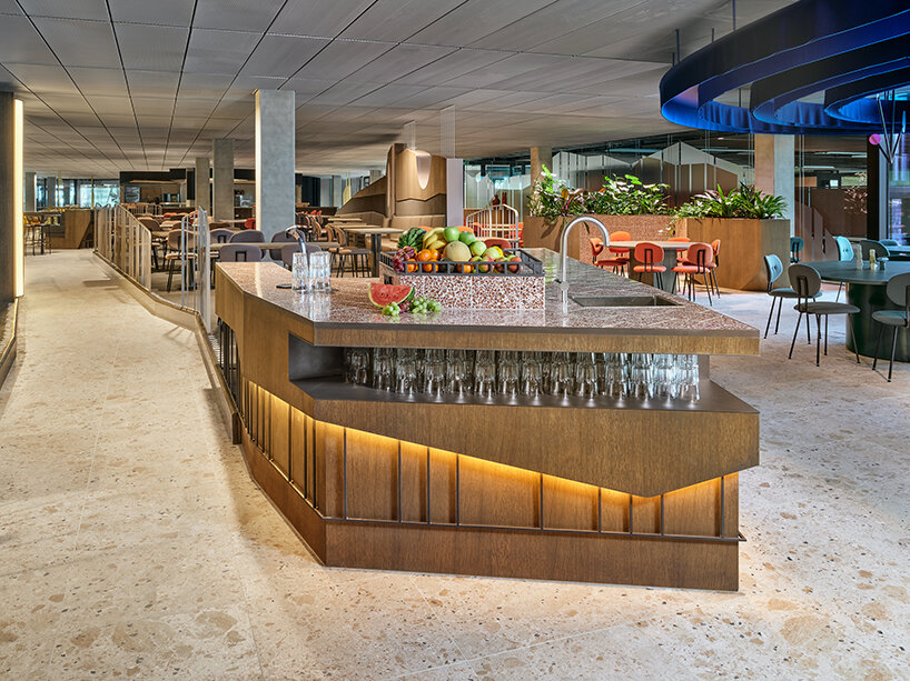
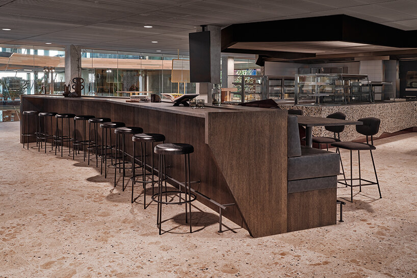
Among the three restaurants hosted within Booking.com City Campus, Studio Modijefsky led the interior design of the 5th-floor Chef’s Restaurant, where every season, an expert cook is invited to create a special menu to be served here. The first is Joris Bijdendijk, of Michelin-starred restaurants Rijks and Wils. To set the Chef’s Restaurant apart, the team envisioned a spatial design concept that translates the joy of traveling into a collection of islands, each offering a destination for a new experience and atmosphere: View, Fire, Canyon, Flight, and Treasure Islands. Studio Modijefsky also created the dining space’s name and logo.
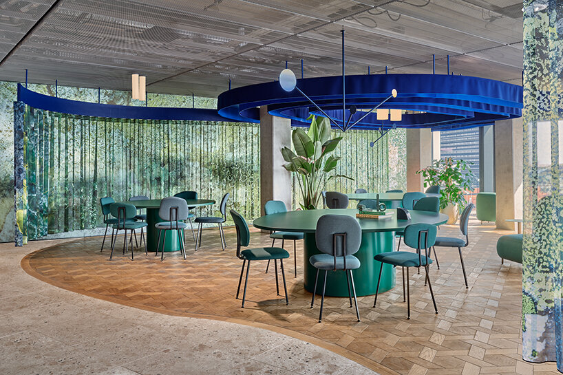
Treasure Islands dining space by Studio Modijefsky at Booking.com City Campus
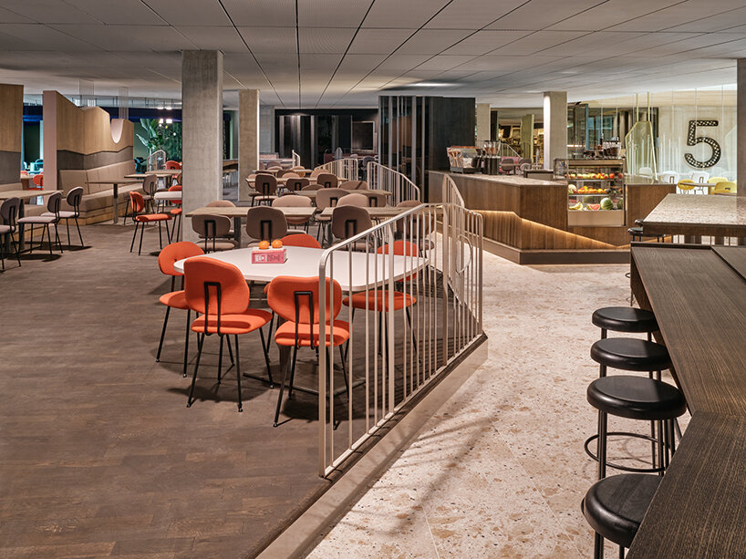
‘Together, [the islands] offer more than a spot to drink a coffee, enjoy a business dinner, or a really good lunch: they enable employees to truly disconnect from work, daydream, and take themselves back to cherished moments in faraway countries or fantasize about new destinations,’ explains the studio. Just as importantly, the islands break up what was originally a large, open plan into smaller, more intimate, and welcoming zones. Spatial interventions – a wall, a curtain, a lowered ceiling, and an elevated floor – establish new areas without blocking sightlines, so a glimpse of the next adventure is always in view. Diners can choose somewhere that matches their mood, whether they’re looking to enjoy a break surrounded by greenery on a remote island or get close to the action near the sizeable open-plan kitchen. Each island zone plays with flooring, lighting and partitions, color, texture, and material to create a distinct environment and atmosphere.
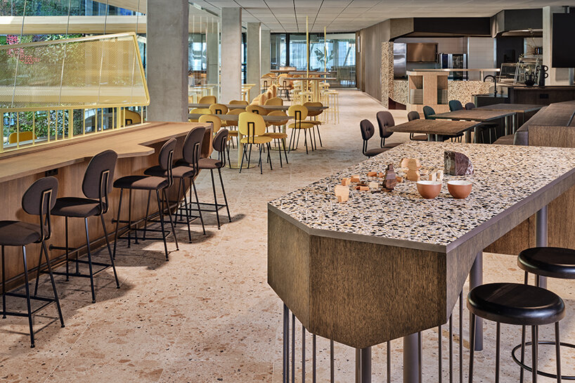
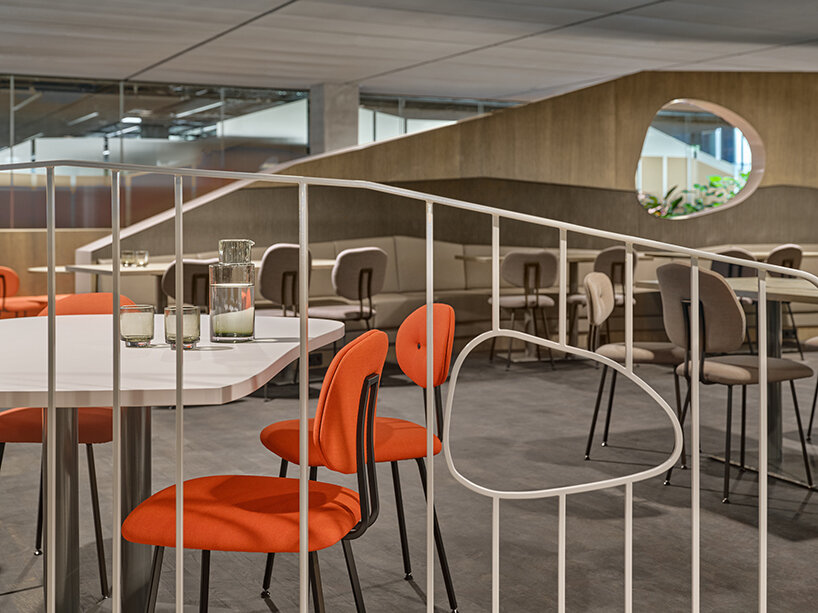
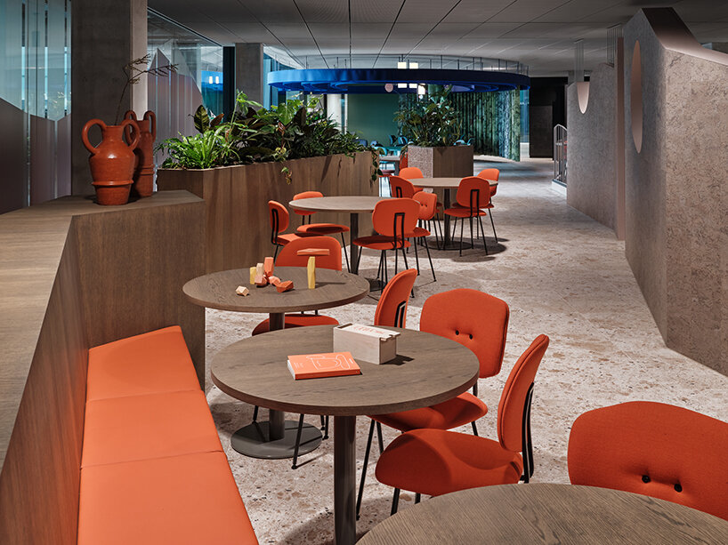
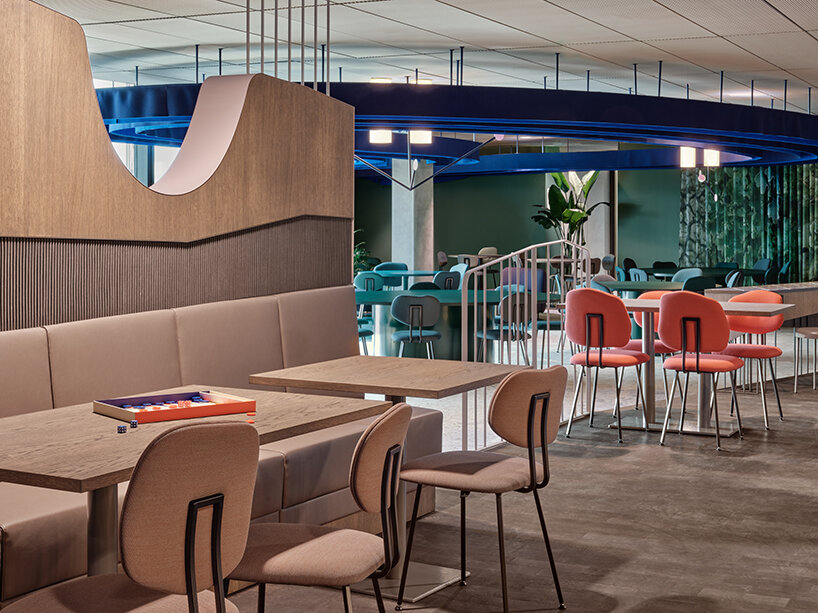
All the islands of the archipelago are subtly linked to form a natural flow between them: hues slowly merge from one to another; a texture introduces itself in one zone before popping up elsewhere; and materials pass by when one moves to the kitchen and reappear where one sits down to eat. Chairs by Maarten Baas are spread out like pebbles to add a playful note and give the color palette of each zone an extra boost. A natural stone floor acts as the sea of the archipelago that all the islands float in.
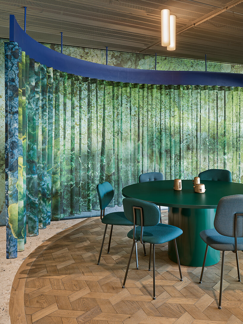
plants, wavy moss curtains, and warm wooden tones combine to create a sanctuary
a deeper look into the five different dining experiences
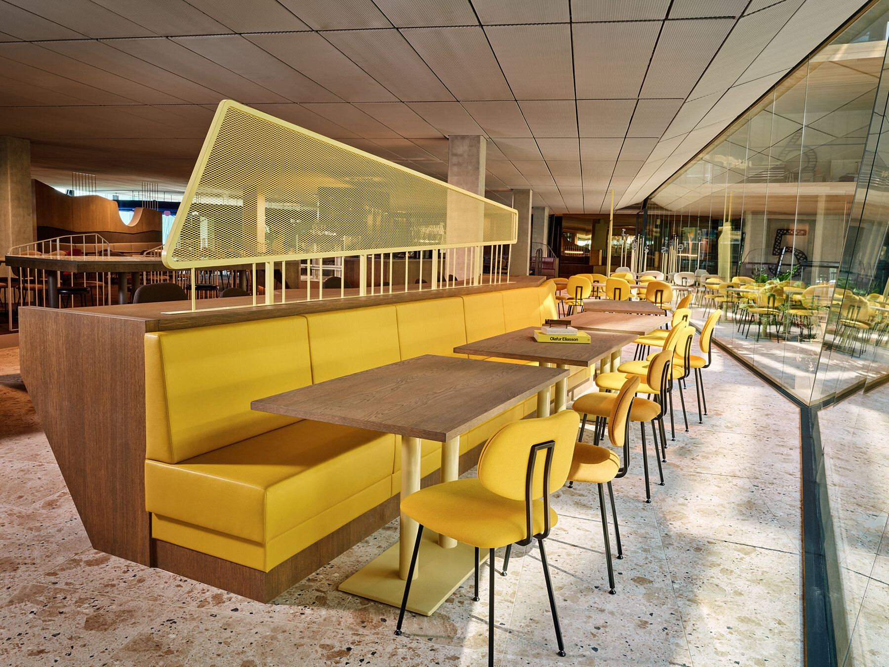
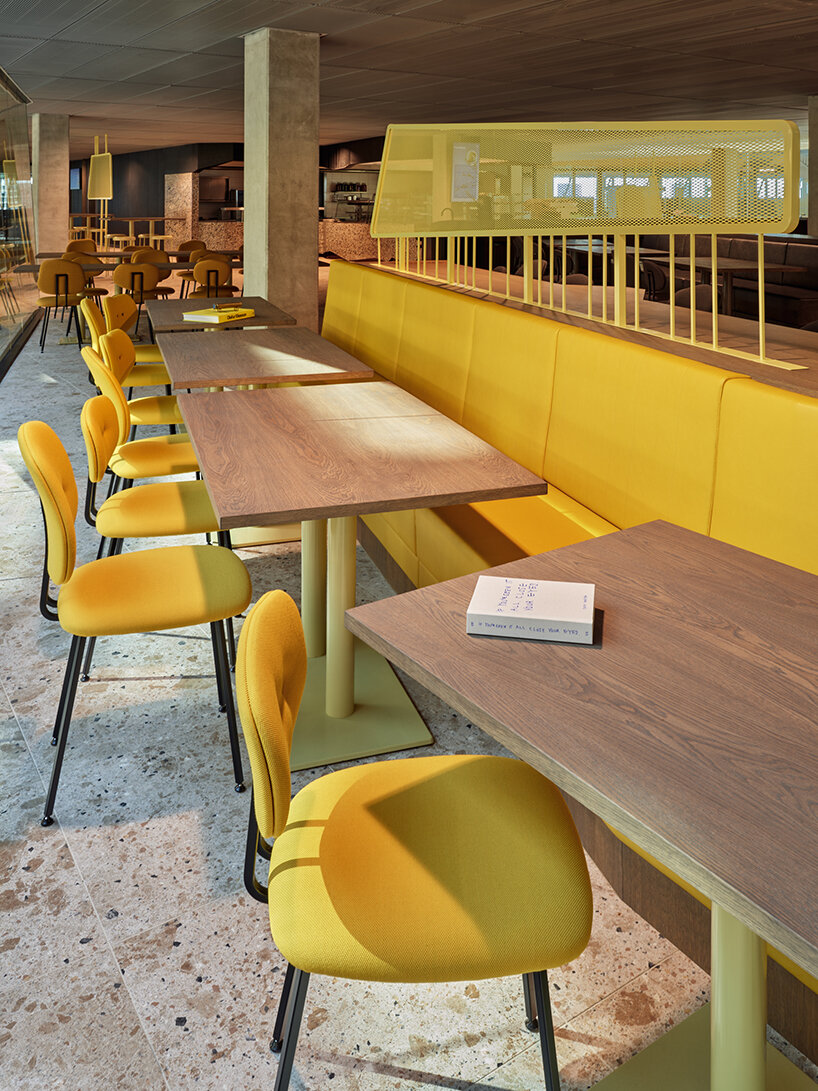
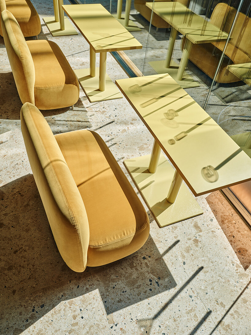
The View Islands by Studio Modijefsky are the first to appear to see when entering the Restaurant Five at the Booking.com City Campus. As the name suggests, this zone invites diners to sit, relax and enjoy the views in and outside the building. A bright material palette engulfs the space with yellow-dyed upholstery, special powder-coated shades, ash grey wood for the custom-made benches and table tops, and terrazzo tiled tops for the healthy snack bars. An open layout, with various low and high seating, lets employees make the most of the views over the atrium on one side and the city waterfront on another. Colored metal frames and panels form a semi-transparent partition between the path and seating zones to give people privacy while eating and frame the view outside.
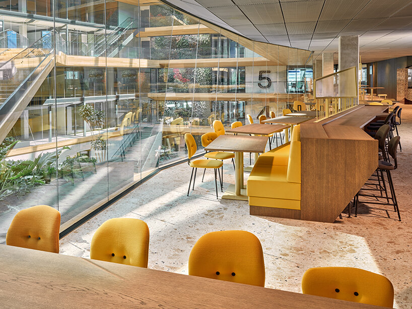
yellow-hued View Islands
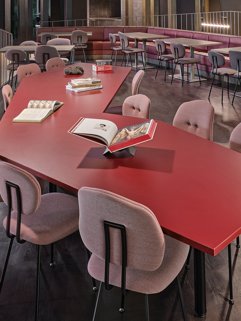
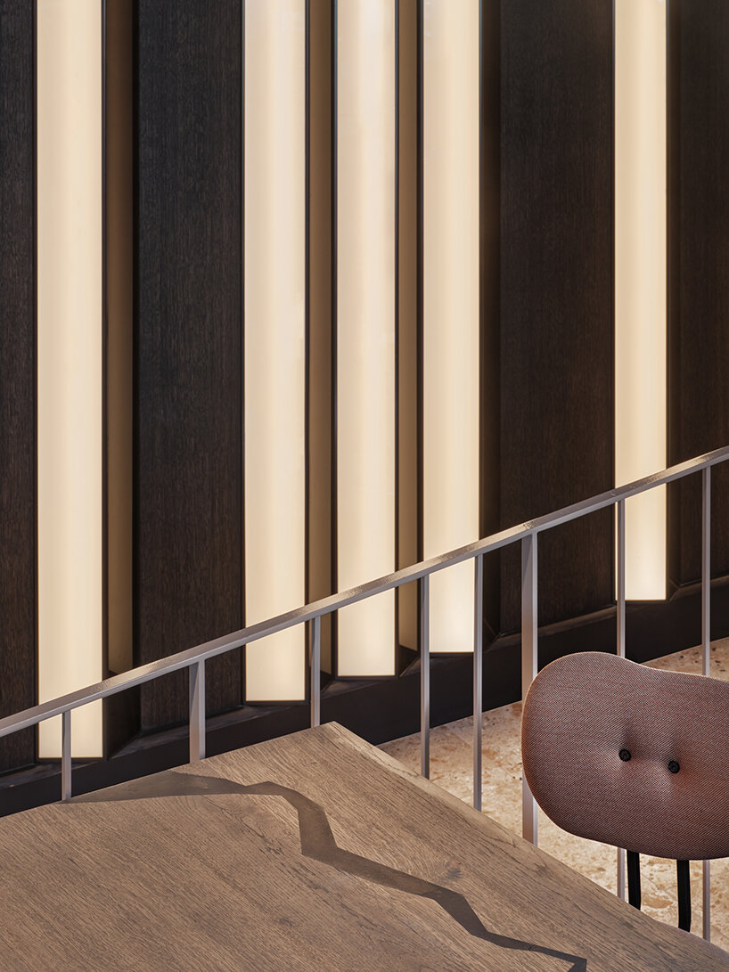
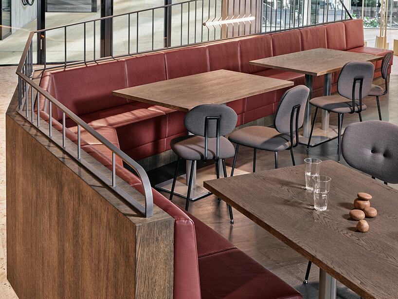
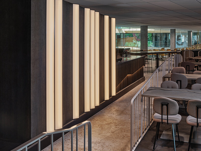
If the View Islands seem too sedate upon entering, raised flooring will take diners to the more dynamic Fire Islands. These form the center of food preparation and presentation around the sizeable open-plan kitchen. This is where diners can sit at what we believe is the largest chef’s table in Amsterdam to marvel at the culinary artists bringing the Chef’s Menu to life. If it’s fully occupied, there’s still a good view of special seating spread between curving railings, lit by vertical and uneven custom-made lighting. Fire is present in the interior (not literally) in burned dark and red tones that spread across morass wood, travertine stones, soft eco-leather, and glossy ceramic textures. The coffee bar is a fire island in itself. A volcanic edge is added to the smooth wooden walls by rocky dark red group tables and irregular shapes, while reflective zig-zag shapes resemble the texture of black lava.
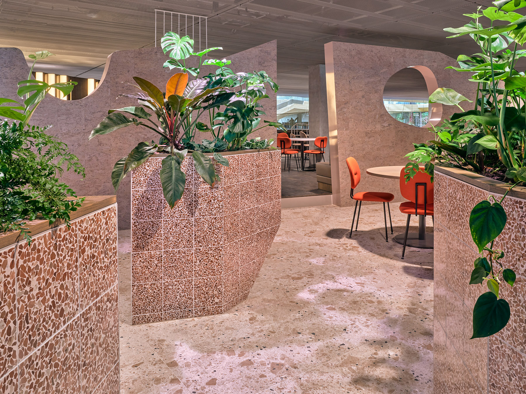
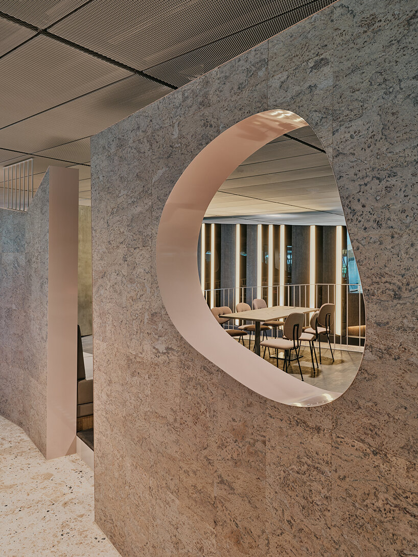
Next to the Fire Islands, you’ll find the calmer Canyon Islands. These are marked by a canyon wall that follows the outline of the elevated floor. Openings in the wall allow people to glimpse and pass through to the more intimate islands on the other side. The passage between the two zones is marked by transforming the rough shapes and surfaces of the Fire Islands into smoothness and greenery, where rocky hills sculpted out of cork are balanced by recycled and eco-leather in two shades of beige. The color palette evokes sand and desert rocks, with glossy pastel pink and bright orange accents. A touch of tranquillity is provided by a gradient of earthy colors and plants that merge into the ravine landscape. Colored printed foil on the glass window façade offers a smooth transition from the office to this stony zone of the restaurant.
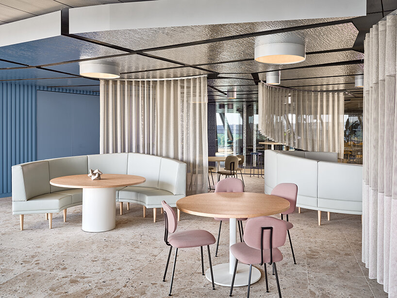
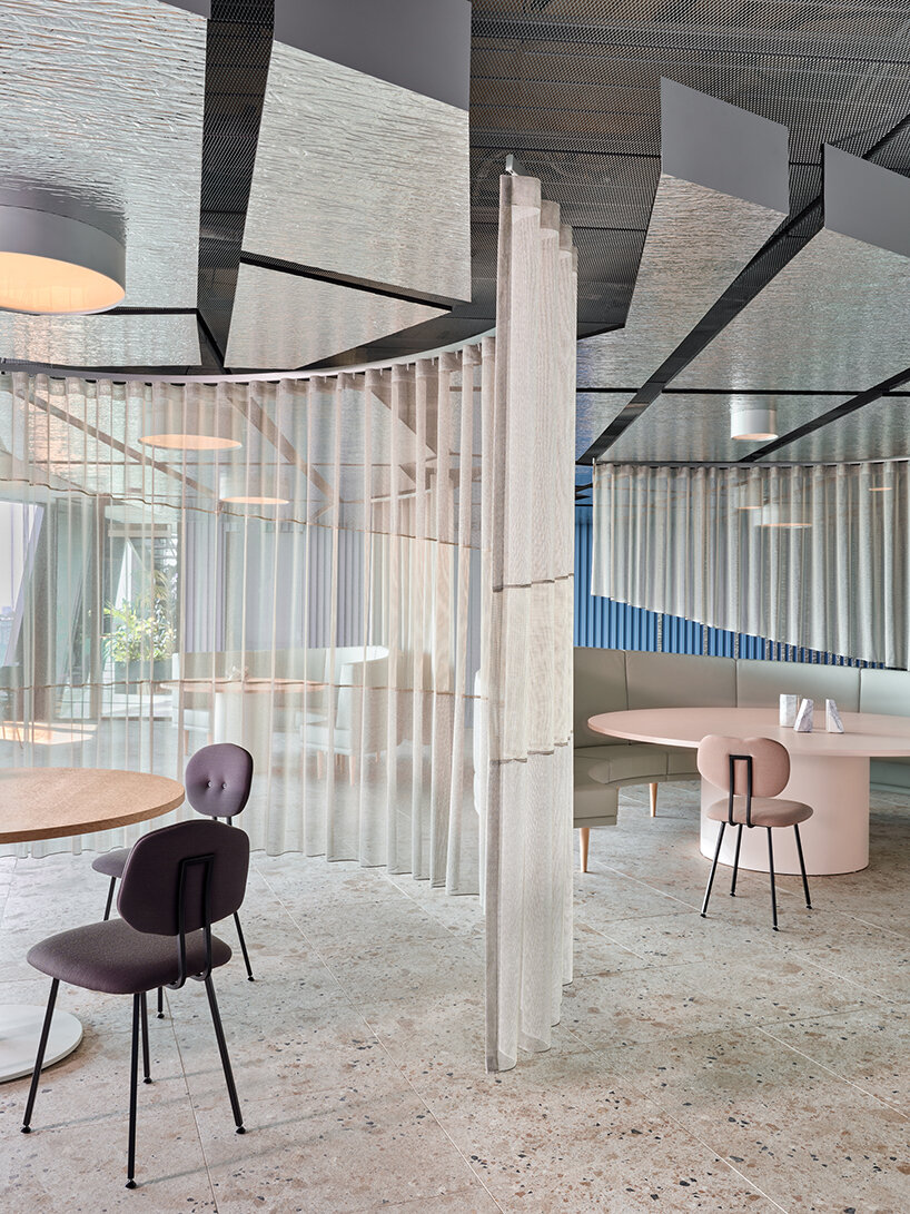
Flight Islands alluding to the sky and water indoors
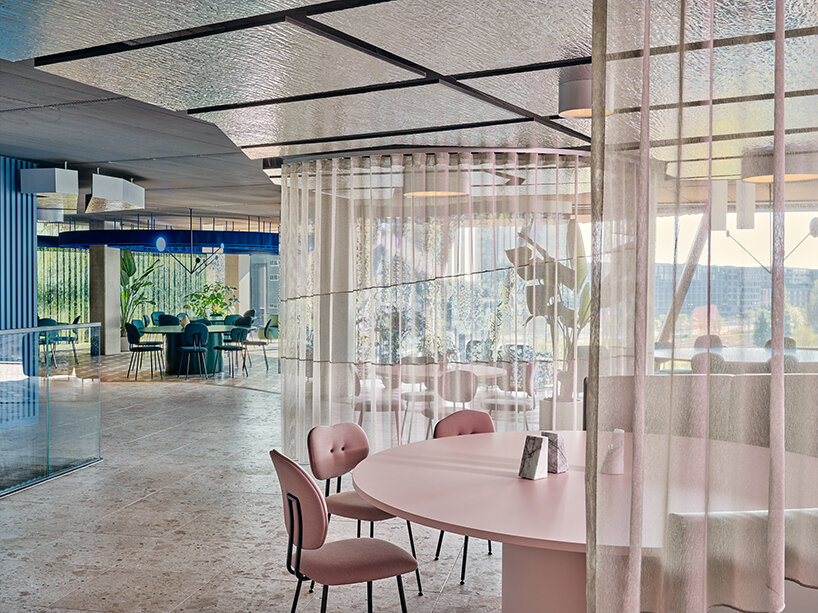
This corner of the restaurant brings the outside view of the sky and water indoors. You float through the Flight Islands surrounded by soft blue tints, distinctive shades of off-white leather, clear natural burl wood veneer, and silver wooden coatings. The colors of the sky are recreated by blue triangular wooden slats on the walls, while see-through asymmetric drapes flow like clouds – and define paths around the circular seating elements. Transparent curtains, reflective materials, and a blue palette form an irresistible invitation to sit on top of the world and escape the daily grind. A reflective ceiling, with integrated circles of light, extends and enlightens the space by mirroring the glittering water outside and lengthening the lines of the curtains into infinity.
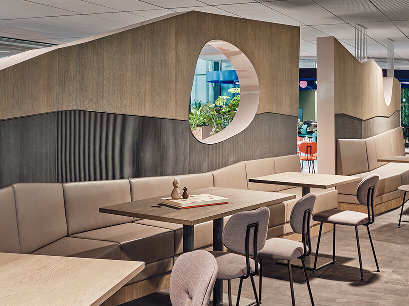
Canyon Islands, marked by a wall that follows the outline of the elevated floor
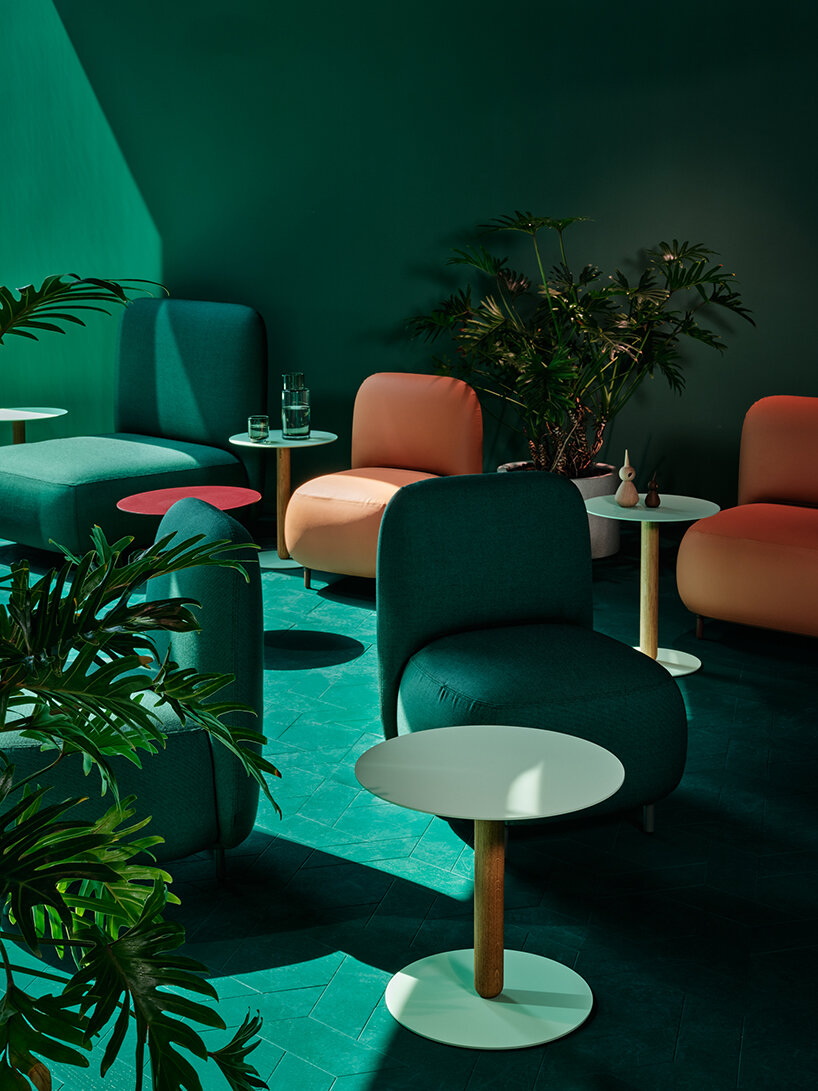
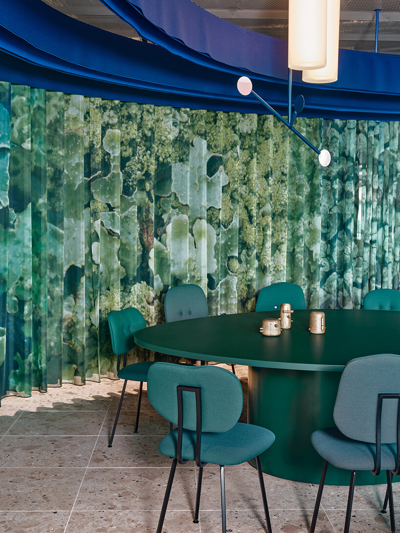
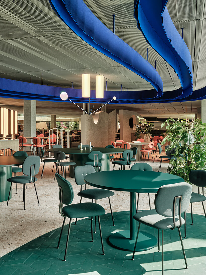
The remote Treasure Islands is a final surprise to be discovered on the outer edges of the Studio Modijefsky-designed restaurant at the Booking.com City Campus. These hidden gems reward intrepid explorers with a peaceful refuge flooded by natural sunlight. Plenty of plants, wavy moss curtains, and warm wooden tones combine to create a sanctuary where employees can escape it all, even for a few minutes. The print for the moss curtains was designed by Studio Modijefsky and is repeated on the glass wall that separates office life from the green paradise of the Treasure Islands.
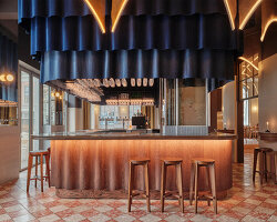
This is not somewhere to just have a meal but to relax and sink into comfortable seating. Blue-felt waves run across the ceiling, playing off the mossy curtains and forming hypnotic circles. They form part of the organic lines that set the boundaries of the ceiling and the floor. They establish a serene atmosphere enhanced by mobiles, tropical plants, and lounge furniture from hexagonal dark brown and green oak flooring. The effect is even stronger at night when custom light objects hanging from the ceiling seemingly transform into a field of fireflies casting a warm glow above the seating and tables.
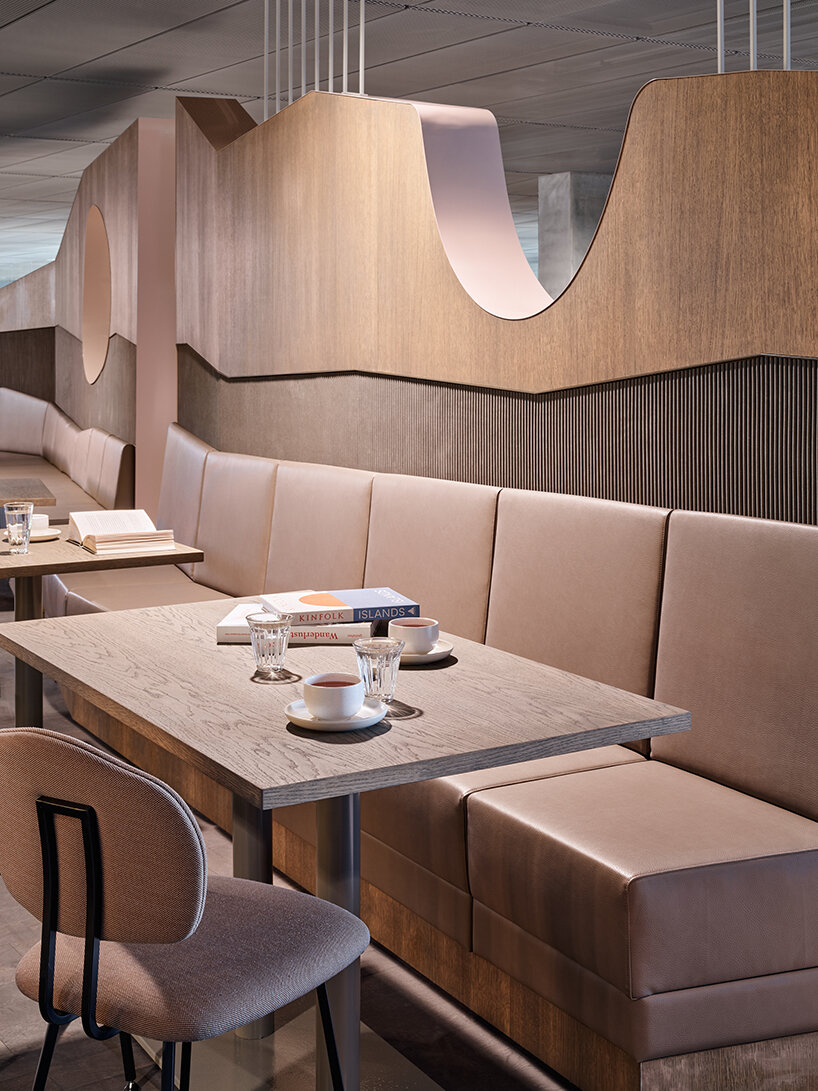
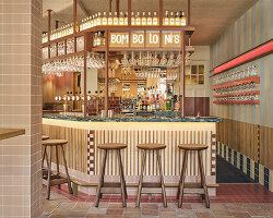
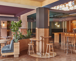
shades of beige combined with wood
projects info:
part of: Booking.com City Campus
location: Amsterdam, The Netherlands
architecture: UNStudio | @unstudio_architecture
lead interior architecture: HofmanDujardin | @hofmandujardin
photography: Maarten Willemstein | @maarten_willemstein
completion date: June 2023
— first —
name: Connector Spaces floors 6,7,8
interior design: Studio Modijefsky | @studiomodijefsky
team: Esther Stam, Natalia Nikolopoulou, Nancy Katri, Agnese Pellino, Martyna Nicolson, Christel Willers
program: Office environment; meeting rooms & spaces to connect
areas: 335 sqm (6th floor), 375 sqm (7th floor), 305 sqm (8th floor)
— second —
name: Restaurant Floor 5
interior design, name, logo: Studio Modijefsky
team: Esther Stam, Natalia Nikolopoulou, Nancy Katri, Agnese Pellino, Martyna Nicolson, Christel Willers
program: lunch and dining
area: 1,543 sqm
