spin’s new identity for the university for the creative arts
spin have designed a new visual identity for the university for the creative arts, a specialist arts institution in the south east of england. it’s four campuses at canterbury, epsom, farnham and rochester offer a fabulous range of creative subjects. their primary focus is on practice-based and industry-orientated learning experience.
tony brook, spin’s creative director told us more about the project…
designboom: how did the project come about?
tony brook: spin was invited with a number of other studios to be part of a tendering process. there are some projects that just light a fire in you and this is definitely one of those. I was particularly taken by the enthusiasm and engagement of the everyone we met to the process. I remember walking round the campuses on a site visit for the first time and feeling envious of the students, it made me want to go back to college!
DB: what goals did you set yourself at the start of the project?
TB: we set out to capture what we saw as the core concern of the institution, this undiluted passion for making.
DB: …how did you aim to achieve them?
TB: by entering into the fundamentally collaborative nature of the project, it it’s how we work anyway but it was key to making a strong apposite response. there was an awful lot to take in, the UCA has four campuses with distinctive histories and cultures, there was a good deal of consultation that needed to be done. it was during these discussions that it became clear the university felt that their existing identity didn’t reflect the spirit or philosophy of the place moving forward. the biggest single take out was that creativity runs through the soul of the buildings and the people and that any solution really must reflect this.
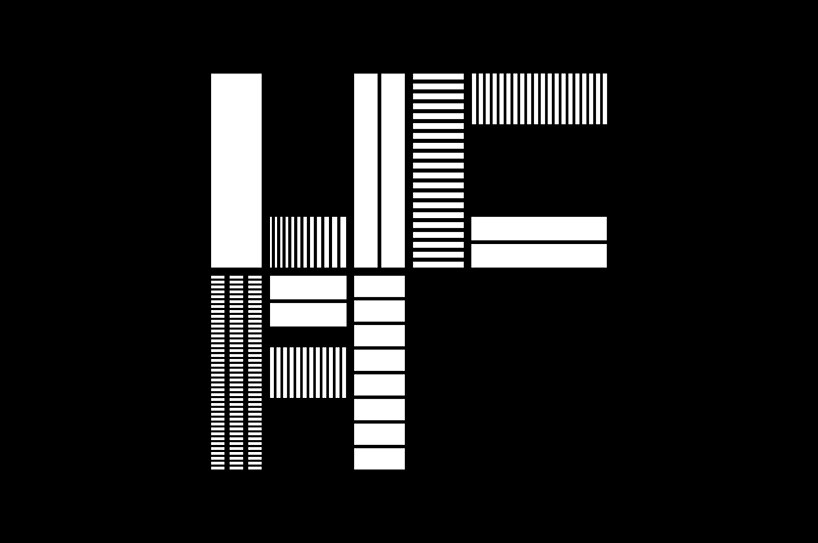
logo
DB: what aspects of your solution are you happiest with?
TB: the stencil concept. it is flexible and responsive and can grow year on year, it is a living thing!
DB: what applications of the identity are you most pleased with?
TB: I think the prospectus is particularly pleasing, especially the functional aspects of it. I think it works hard and delivers the content simply and clearly.
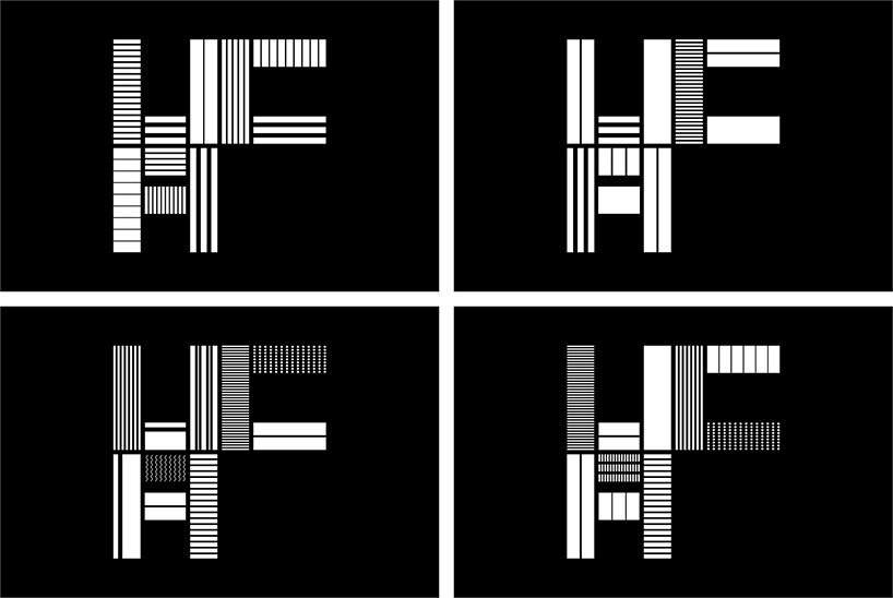
logo variations

X symbol
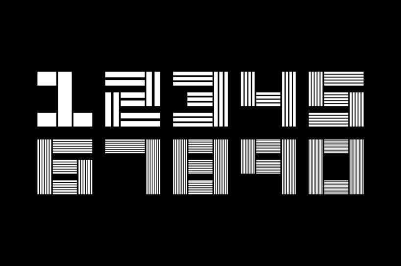
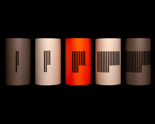
numerals
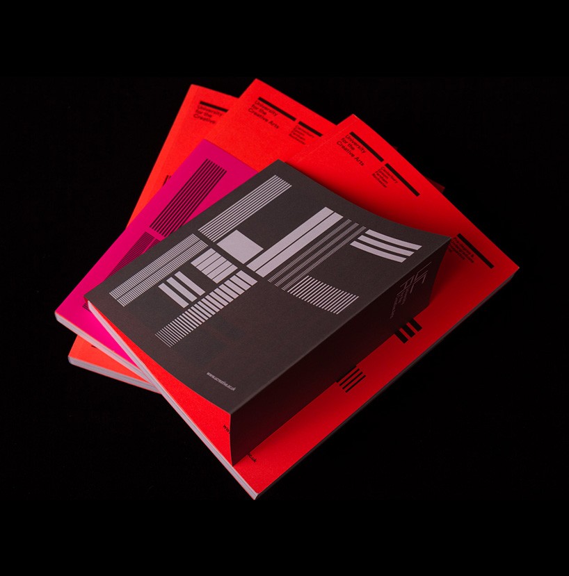
prospectuses
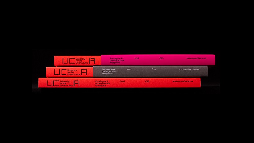
prospectuses
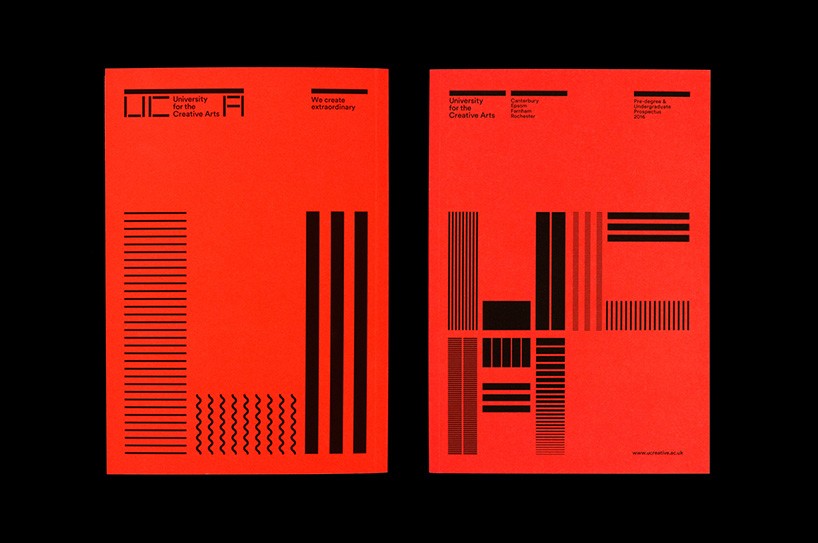
prospectus – without outer sleeve
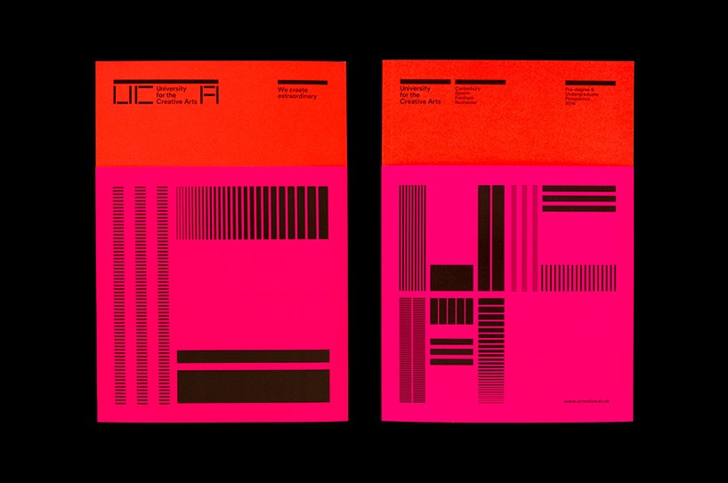
prospectus – pink outer sleeve
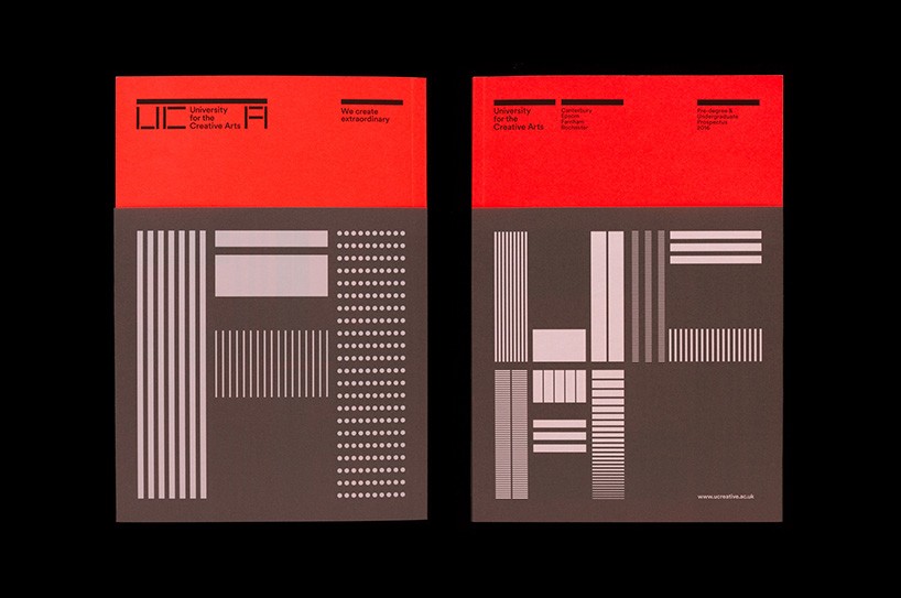
prospectus – grey outer sleeve
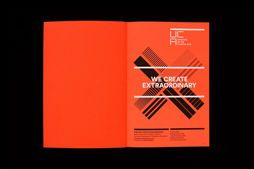
prospectus – inside pages
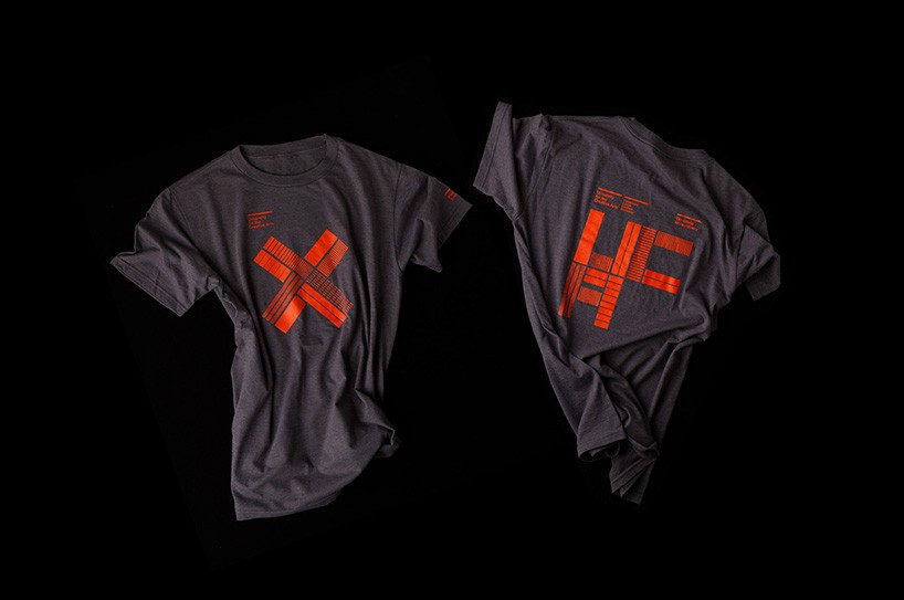
t-shirts
