samuel ross teams up with the balvenie in milan design week 2025
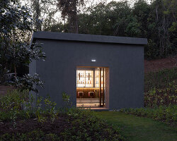
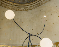
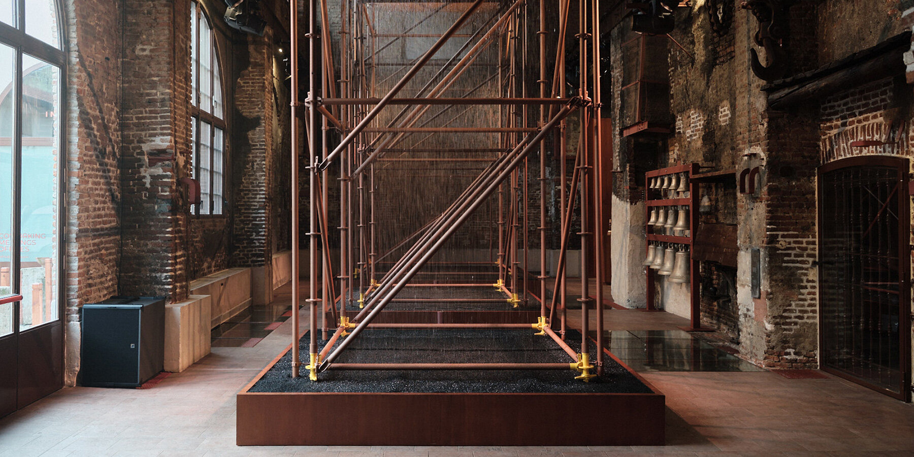
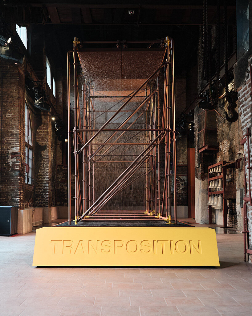
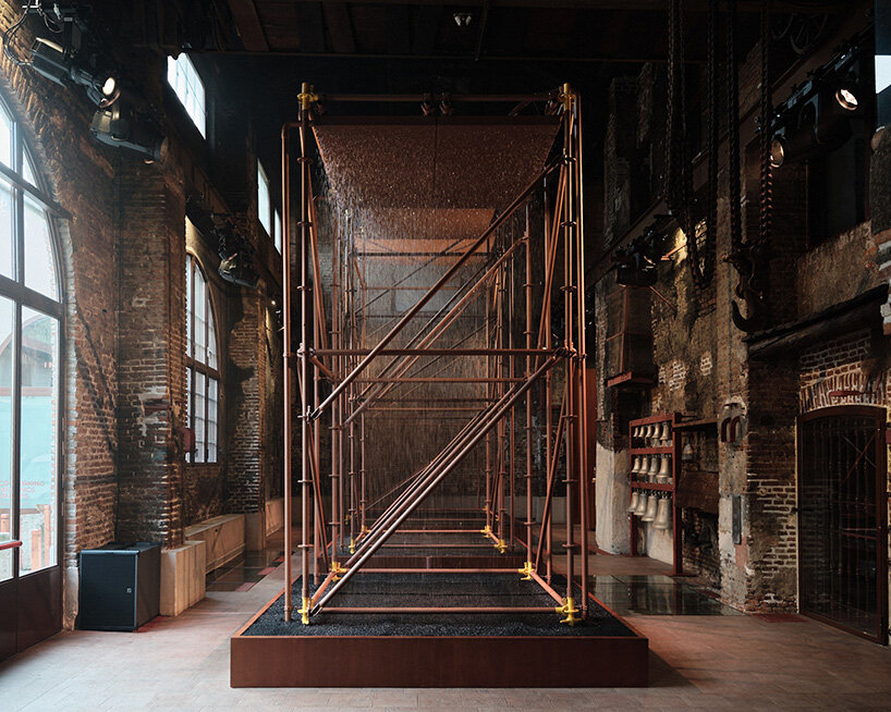
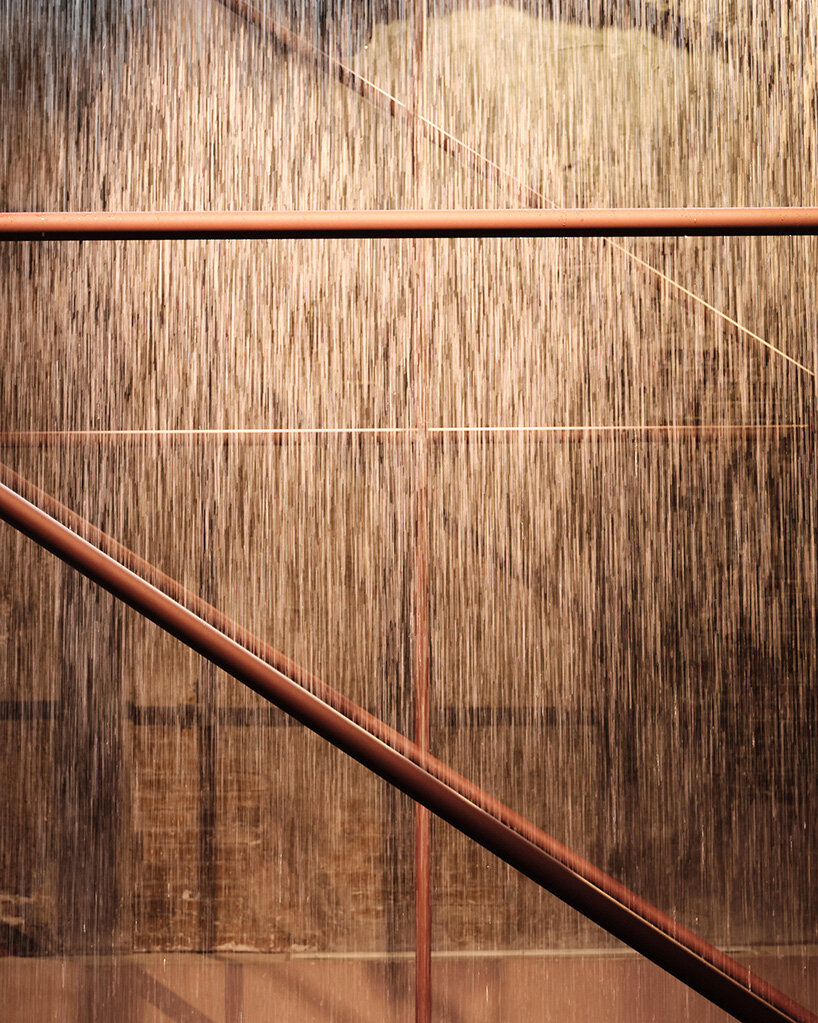
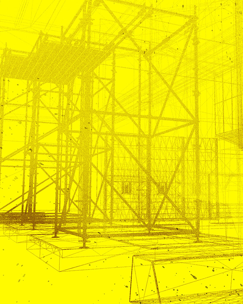
The Balvenie debuts an immersive experience titled TRANSPOSITION in Milan, conceived in collaboration with the award-winning artist and designer Dr. Samuel Ross MBE and his experimental studio SR_A. Unveiling today, April 8th, 2025, and on view until April 11th within the Historic Foundry in the city’s Isola district, the site-specific installation transforms industrial craft into a future-forward hospitality landscape. Mist, shadows, souns, and copper sculptures come together to capture the essence of whisky making. ‘We used scaffold structures to funnel the water and why you’re seeing these amber, faux-industrial colours throughout. Rawness is where emotion lives.’ Ross tells designboom.
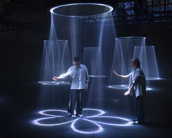
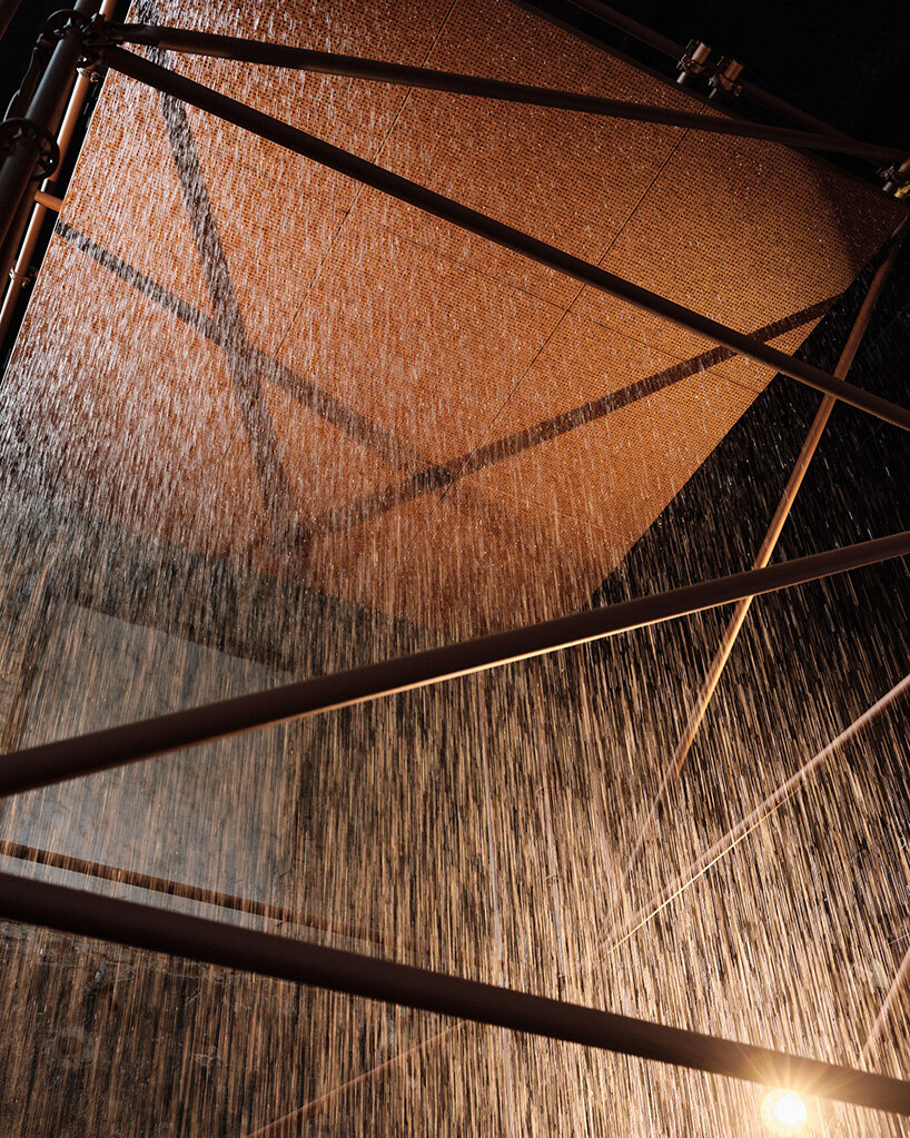
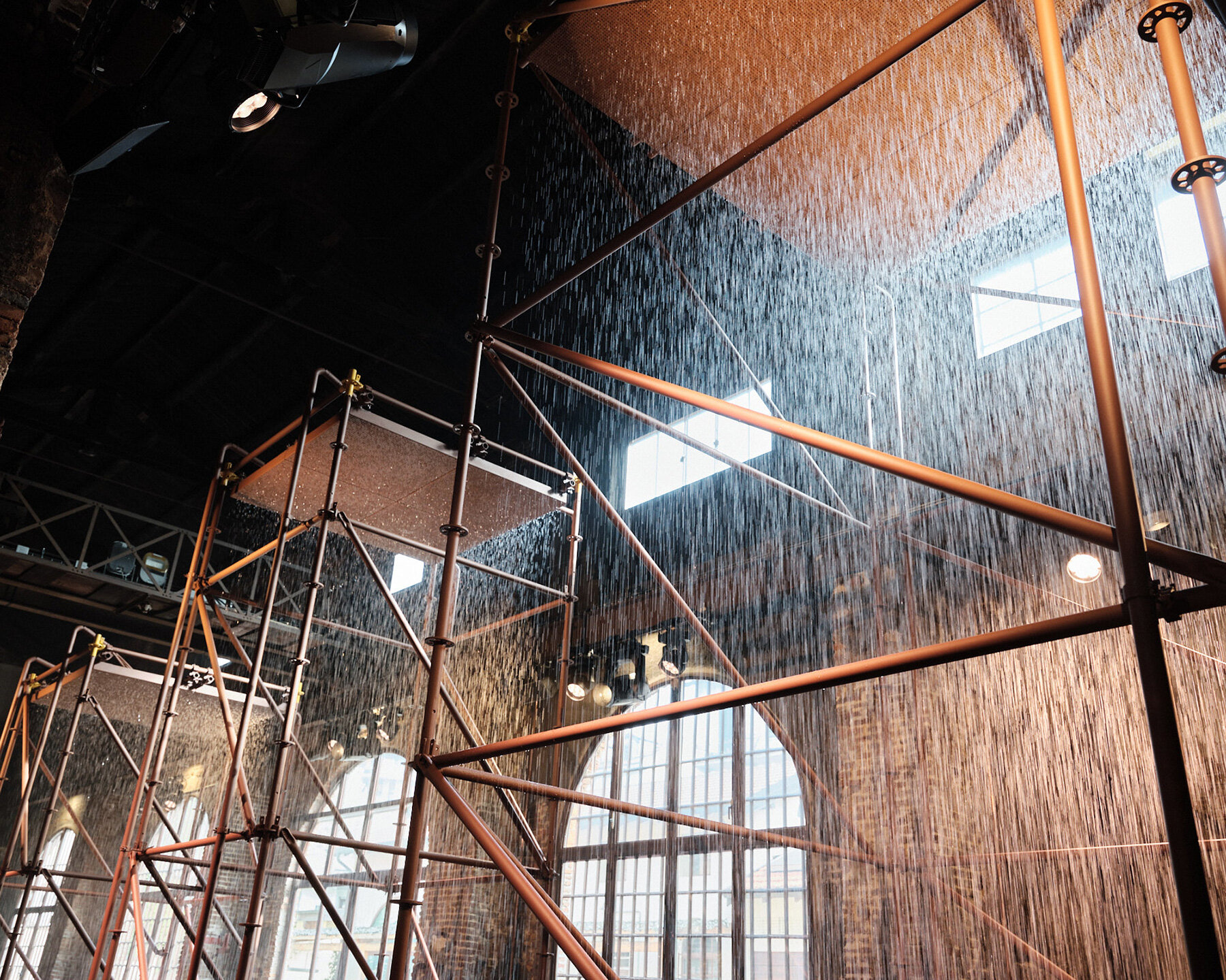
Samuel Ross is known for working with industrial materials in unconventional ways, and that approach really comes through here. The space is designed to shift as you move through it. Mist and light form what he describes as ‘vertical rivers,’ and the layout encourages different perspectives, so each visitor’s experience is a little different.
‘I think about that kind of loop of sustained consumption and production, but also the loop of water being constantly reintroduced and pronounced to develop these different profiles,’ he explains. ‘It’s almost like this harmony between industrial process and the redistribution of organic material — liquid such as water being reintroduced again and again and again. It’s not just the visual itself, it’s the impact of temperature, the sonics coming into play. It’s more how we take that industrial process and open it up into a true physical environment.’ On the occasion of Milan Design Week 2025, we sat down with Samuel Ross for a conversation on TRANSPOSITION after experiencing it firsthand.

all images by Francesco Stelitano, unless stated otherwise
TRANSPOSITION installation echoes whisky distillation process
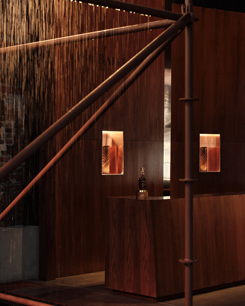
Through TRANSPOSITION, the British artist, together with the SR_A team, explores the tension and harmony between industrial craft and natural elements — all through the lens of whisky making. Milan’s Historic Foundry space is atmospheric and layered. There’s mist drifting through the air, dramatic lighting, three sculptural copper pieces, and ambient sound of pouring water, all designed to echo elements of the whisky distillation process. The experience is meant to engage multiple senses at once, not just sight or taste.
The project draws inspiration from The Balvenie’s long history of craftsmanship, especially the Fifty Collection, which includes whiskies aged for decades. Ross responds to that legacy by creating a sculptural environment that feels both grounded in tradition and forward-looking. ‘You’re seeing roughly 51,000 litres of water regurgitate and churn through copper pipes. Each of the structures increases by 15% in scale, reflecting an intensification of the process,’ he shares. Read on for designboom’s interview with Dr. Samuel Ross MBE.
mist, shadows, sounds, and copper sculptures come together
designboom in conversation with Samuel Ross
designboom (DB): What does the word TRANSPOSITION mean to you in the context of this installation?
Samuel Ross (SR): For me, transposition is a reflection of my visit to The Balvenie distillery in Dufftown and thinking about the inception of how the company was actually born, the family taking water from a very particular mineral well, thinking about the pH levels and the acidities of that well, and then being able to take it through the process of fermentation, distillation, placing it within the still, into casks, and turning the casks.
That’s the prospect of water turning into a whisky nectar, a full transformation. And that’s really where the title TRANSPOSITION came from. It’s rooted in the journey of how the production of whisky established The Balvenie and how those techniques have been kept intact over time.
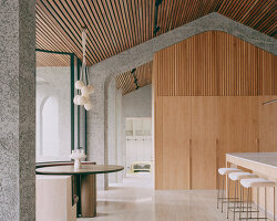
the space is designed to shift as you move through it
DB: You’ve described the use of mist and light as forming ‘vertical rivers.’ Can you elaborate on the role of movement and atmosphere in shaping the visitor’s experience?
SR: With spatial design, it’s always a game of performance and meaning, of delivering emotion. And within Transposition, the actors are a reflection of the whisky itself. You’re seeing roughly 51,000 litres of water regurgitate and churn through copper pipes. Each of the structures increases by 15% in scale, reflecting an intensification of the process. It’s really about delivering a sense of performance through installation, making it emotionally resonant for visitors. And making sure there’s enough meaning built into that experience.
mist and light form ‘vertical rivers’
DB: And the three towers — why that form specifically?
SR: There’s a bit of a double meaning in those triptychs. Firstly, they reflect the three key stages of the whisky-making process: the mineral water is brought in, it’s cleaned, it’s infused with hops and barley, and then it’s placed into the casks. The second meaning is more poetic, the rhythm and contemplation of water changing form. The light hitting the falling water, the temperature of the bulbs shifting from cold to neutral to warm, it’s all designed to capture transformation. But for me, above all, it was about reflecting the process itself.
there’s mist drifting through the air and ambient sound of pouring water
DB: In what ways did the whisky distillation process shape your approach to materials, and what’s the significance of the yellow hue in the installation’s visual identity?
SR: Firstly, the material focuses on patinated copper, lacquered and aged oak, referencing the whisky casks. The copper also connects directly to the distillery and the steel used to hold the hops, the barley, and the fermented water. As for colour, the industrial use of colour is almost a signature of my practice. Whether it’s in work housed within the V&A, the Met, the White Cube, or Friedman Benda, this integration of industrial colour has become part of my language. It’s an equalizer. These are colours and accents we’re often exposed to, but placing them in an artisanal context brings a certain provocation.
Think about The Balvenie — how sensitive a whisky cask is. And yet, the production process is Victorian in nature: industrial, physical, laborious, dangerous. Out of that comes this delicate, nuanced liquid. There’s a clear tension between the industrial and the artisanal, and I wanted that tension present in the installation. That’s why we used scaffold structures to funnel the water and why you’re seeing these amber, faux-industrial colours throughout. Rawness is where emotion lives.
echoing elements of the whisky distillation process
DB: The Balvenie is known for its emphasis on traditional craftsmanship. How did you approach translating that legacy into a contemporary spatial form?
SR: Delicate communication and translation. The beauty of working with a storied maison like The Balvenie is the depth of their expertise. They operate as both a maison and an atelier — which gives you a lot of context to interpret, to stretch and to shape. But fundamentally, everything had to return to the whisky. Every sculpture, every visual choice is an interpretation of the context in which whisky is made and, ideally, enjoyed.
the project draws inspiration from The Balvenie’s long history of craftsmanship
DB: What role does ritual play in the installation’s experience?
SR: Ritual is embedded in whisky making itself. The time involved, the repetition — turning the casks, maintaining them, refining them, every generation repeating those actions. That carries its own ritual. When I was on site, speaking with artisans, watching the casks being built, and hearing the iron plates being applied to the wood, it almost felt like a dance. I wanted to transpose that energy into the installation through the perpetual turning of water. That momentum feels contemplative, even meditative.
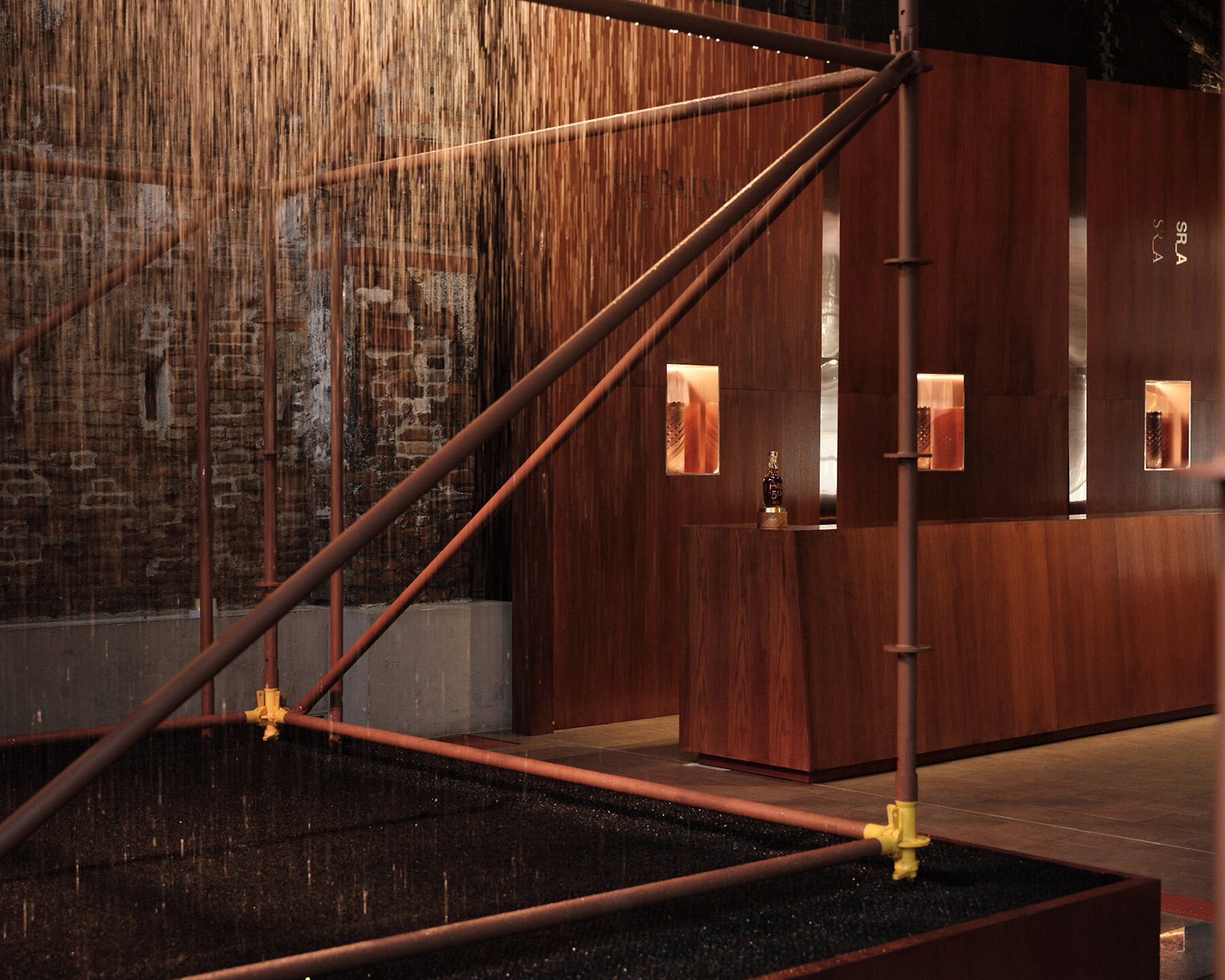
at the center of the installation is a copper bar
DB: You’ve worked across fashion, industrial design, sculpture, and architecture. What stays consistent across these formats and what shifts?
SR: With time, the language starts to settle in. My first institutional survey is currently on at the SCAD Museum of Art in Savannah, and it’s the first time anyone’s been able to view my work, garment, sculpture, painting, in a cohesive space.
That cohesion comes only after time. You wrestle with materials, techniques, context. Whether it’s blending volcanic ash with turmeric and decimated plywood, or pushing a new abstraction that still references British sculpture of the ’60s and ’70s, eventually, a language forms. But to get there, you have to fundamentally live as an artist. That’s the only way the stories and coherence start to emerge. Everything, for me, still begins with paper, and charcoal. I’ll work in relative isolation before collaborating with architects or fabricators. It’s still very old school. Still a vocation. I really do believe the best way to think is by hand.
Samuel Ross is known for working with industrial materials | image courtesy of Samuel Ross Studio
DB: You often work with industrial or infrastructural aesthetics. What draws you to that language of form?
SR: My language is shaped by where I grew up. I spent the first 18 years of my life in relatively industrial, working-class areas — whether it was inner-city Brixton or boot towns in Northamptonshire. I was always surrounded by factories or the echoes of industry. When I studied design — graphic and contemporary illustration — and later became a product designer, that comfort and familiarity with mid-century industrial aesthetics naturally came through. It became part of my vernacular. Place really does shape aesthetic sensibilities. You don’t always choose what you’re drawn to — you’re pulled toward what feels most intuitive.
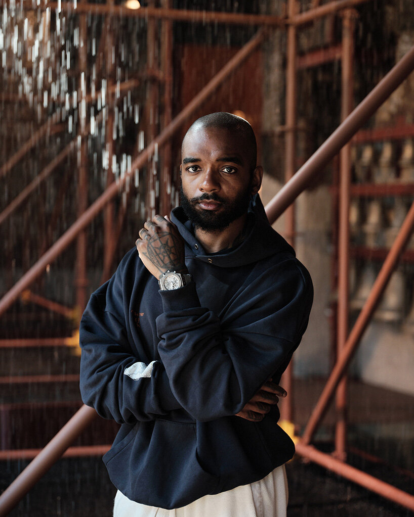
Samuel Ross in front of the TRANSPOSITION installation
project info:
name: TRANSPOSITION
designer: Samuel Ross | @design.by.samuelross, SR_A | @sr.asr.a
brand: The Balvenie | @thebalvenie
location: Historic Foundry Isola District, Milan, Italy
event: Milan Design Week 2025
dates: April 7th – 11th, 2025
photographer: Francesco Stelitano | @frankstelitano