KEEP UP WITH OUR DAILY AND WEEKLY NEWSLETTERS
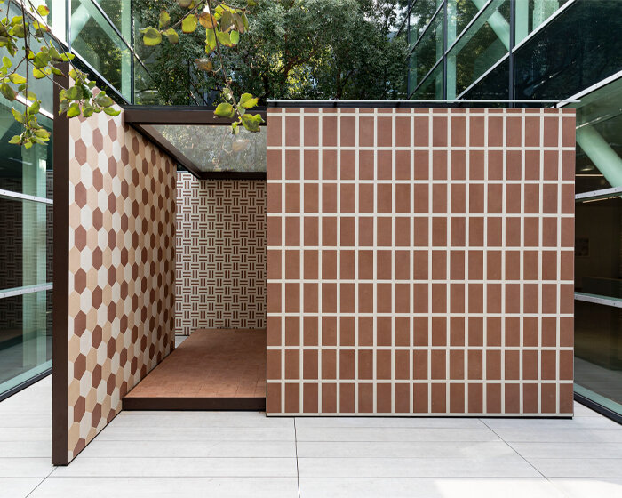
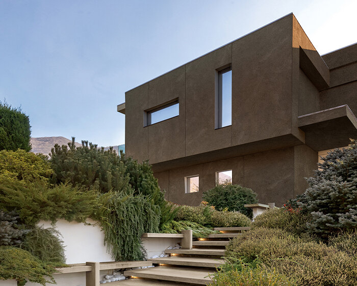
happening this week! florim ceramiche spa creates porcelain stoneware ceramic surfaces for all architecture, building industry and interior design needs, overseeing many brands in europe, america and asia including floor gres, rex, cerim, casa dolce casa – casamood, FLORIM stone, and CEDIT – ceramiche d’italia.
PRODUCT LIBRARY
the removable four-toed ‘gloves’ of the superfinger superstar can also be used as bags or be attached to other shoes.
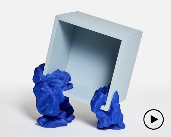
by upcycling mass-produced furniture, YET architecture and BDM architects blurs the lines between standardization and personalization.
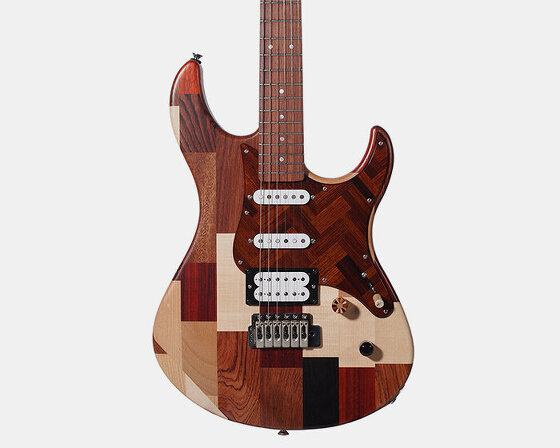
yamaha design laboratory's concept project upcycles rare woods originally intended for marimba tone bars and pianos.
find out more about this year's maison&objet, as well as the must-see exhibitions, and cultural events in the run-up to paris design week 2024.
connections: 20
