red antler tells us more about the new foursquare identity
last month the mobile app foursquare unveiled its new visual identity and a complete overhaul of the application itself, which shifted its focus onto discovering new places related to your personal interests and tastes. as part of this process foursquare did away with certain features such as check-ins, which migrated to a new, separate app called swarm that allows you to see where your friends are and what they’re doing in real time.
to carry out all of this work foursquare worked in collaboration with the new york-based design studio red antler. together the two companies worked hand in hand through every step of the process from strategy, to design, in order to understand all aspects of the new services and user interface.
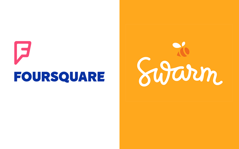
the new foursquare and swarm identities
‘we wanted outside help and started asking around for recommendations. red antler was very highly recommended. we did our homework, we kept hearing great things, and eventually we called them up and got started.’ – dennis crowley, foursquare co-founder and CEO
to learn more about the project, designboom spoke to the red antler team: emily heyward (partner & head of strategy), simon endres (partner & creative director), JB osborne (partner & CEO) and mike mcvicar (designer).
designboom: how did red antler become involved in the project?
JB osborne: red antler specializes in branding for startups, and over the last seven years we’ve been fortunate to work with some of the top companies emerging in tech today. in early 2014, foursquare’s co-founder and CEO dennis crowley approached us to help navigate the changes they were making to their product and to collaborate on the launch of swarm.
emily heyward: we were immediately excited by the opportunity because we’ve been both fans and avid foursquare users since the app’s early days. also, working with foursquare has been a dream of ours since red antler was founded, so of course we jumped at the chance to collaborate.
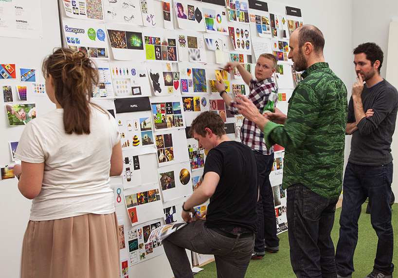
foursquare and red antler team members worked together for the entirety of the project
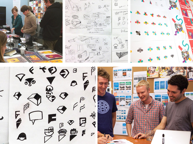
development of ideas for the foursquare and swarm identities

evolution of the ‘F’ symbol that’s described as ‘a mix of map pin and superhero emblem‘
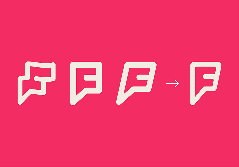
the new logo suggests several things related to foursquare’s characteristics: a flag, a superhero badge and a speech bubble

radiating ‘F’ logo
designboom: what were some of the biggest challenges you had to overcome during the design process?
simon endres: coming into this project, we knew straight away that we were dealing with an existing brand that has a core set of passionate users. any change was going to be contested. from the kickoff to the final brand development, we formulated an extremely collaborative and iterative process with the foursquare team, making sure that everyone came along for the ride.
in terms of the brand identity, we needed to signal a significant shift in order to make an impact and communicate to both existing and potential users that this is an entirely new and transformed foursquare. it’s a powerful tool that could go up against the likes of yelp, so a half-way solution was not an option. this took some time for everyone on the team to get used to.
mike mcvicar: early on in the process, many of our concepts for the rebrand were “evolutions” of the old foursquare brand. every time we stepped back and looked at these directions, they didn’t feel right. the new app is such a giant leap forward in every way that we had to create a brand that was equally as bold.
simon endres: exactly, and in the ecosystem of search and discovery platforms, foursquare had to look and feel substantially different. this is not always the most comfortable solution, but we pushed through to carve out a unique personality that the brand could own for the forseeable future.
mike mcvicar: dennis also really challenged and inspired us with this bold vision. he encouraged us to let loose and create something that had little to no vestiges of the previous brand. it was hard work, and we tossed many concepts into the bin, but we ended up with a brand that we all feel truly captures the spirit and power of the new foursquare.
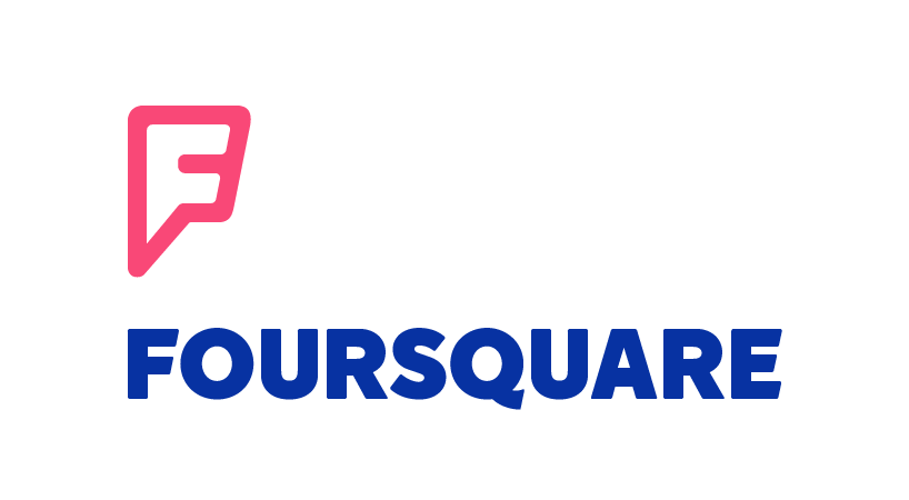
the ‘F’ mark combined with the new foursquare logotype
designboom: what uses did you have to consider when designing the new logo?
simon endres: the app is at the core of the experience, so that was always our main focus. we also gave significant consideration to how the brand would behave in broader contexts. making sure that foursquare’s new identity could communicate and make an impact on a store window or at counter level was also important. at red antler we love exploring the multiple touch points through which brands can create dialogue and build engagement. we work across many different mediums and formats so that each moment contributes to the brand experience and forms a deeper connection.
mike mcvicar: while it was super important to create a cohesive brand system, at the end of the day, the new foursquare had to boil down to a single mark to be used as an app icon – because it’s a powerful platform like facebook and twitter, it had to equally stand up as an iconic mark that would be recognizable even at 16 x 16 pixels in size.
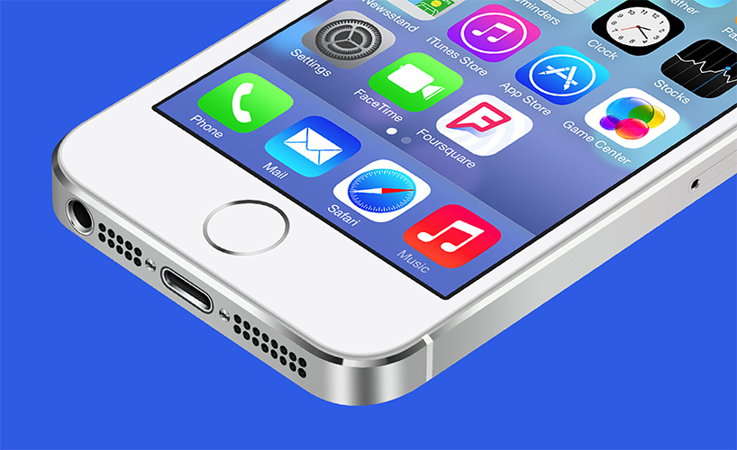
iPhone application icon
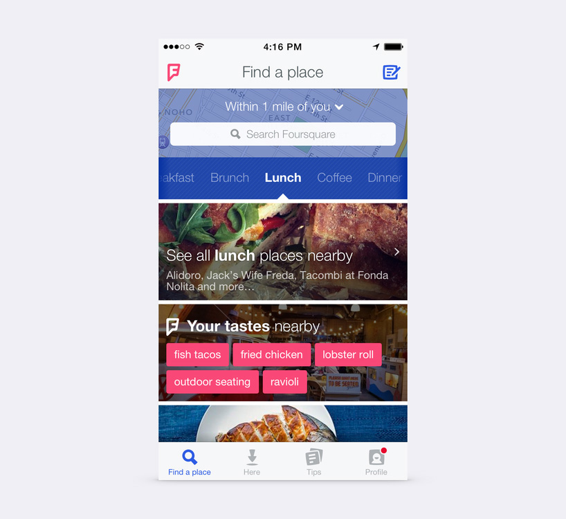
screen shot of the new foursquare app
the new foursquare app
designboom: which aspects of the final design are you most satisfied?
mike mcvicar: the ‘F’ monogram really hits on a lot of core concepts of the brand. it’s a flag or pin which signifies exploring, discovering and conquering new places. it looks like a superhero icon which speaks to the almost magical power users have to find the best things wherever they are. finally, it has the form of a speech bubble which signifies the personalization of foursquare and its ability to make suggestions about the things you love.
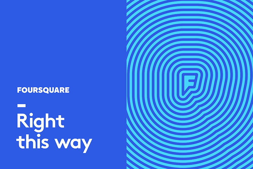
foursquare advertising – brown pro is the main font – body & headlines (helvetica can be used for web and mobile as an alternative)
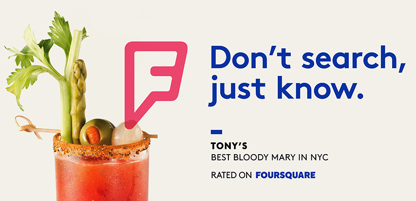
foursquare advertising

foursquare advertising
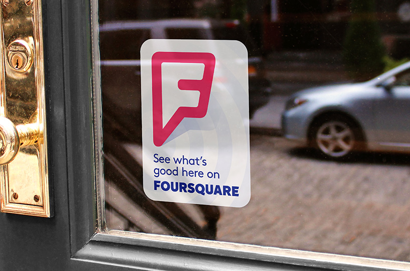
foursquare location sticker
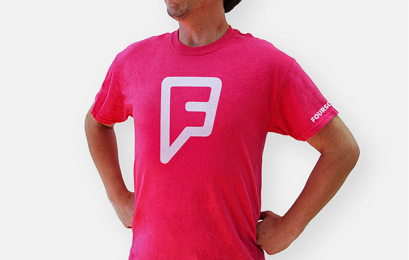
foursquare t-shirt – emphasizing the ‘superhero’ quality of the new ‘F’ mark
designboom: what is next in terms of the visual identity for foursquare?
emily heyward: the truth is that foursquare is by far the smartest, most effective, most fun way to discover new things around you. and now the brand’s visual identity reflects its level of sophistication and efficiency, with swarm taking on a tone that feels a bit younger and more playful. ultimately when people think of foursquare, they’re going to think of discovery instead of check-ins, and the app’s evolution along with future new features will continue to drive home that shift.
simon endres: there are so many possibilities for the new foursquare brand. I’m looking forward to seeing how it can take on a life of its own, whether through new marketing efforts, or just seeing it out in the world being used and seen by millions of people.
swarm logo
swarm iPhone app icon
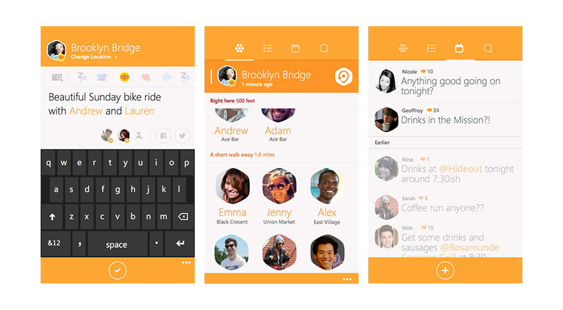
screenshots of the swarm app interface

swarm advertising

swarm advertising
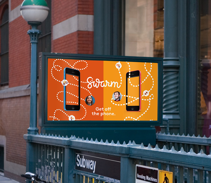
swarm advertising
more branding case studies:
louvre abu dhabi logo by studio philippe apeloig »
airbnb rebrand gives its community a sense of belonging »
NYCFC – creating an badge for new york’s newest sports team »


