R2 design interview (lizá ramalho and artur rebelo)
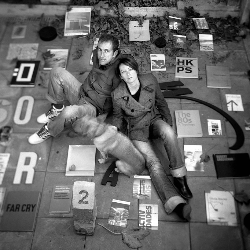
lizá ramalho and artur rebelo are the founders of R2, a design studio located in porto, which develops projects such as books, visual identities, signage systems, posters and exhibitions.
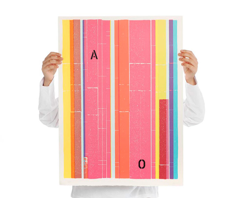
antonio ole poster
photo © filipe braga
DB: how did you come to work on the type of projects you do now?
R2: the studio began to take off when a young theatre company in porto, teatro bruto, asked us to design their promotional materials. these early projects were particularly important because they gave us room for experimentation and provided visibility for our work, particularly the street posters.
from there we got commissions from other fields like contemporary art and architecture, and then began doing more complex publishing projects, including catalogs and books. we were then challenged by artists and curators to design exhibitions too. we worked regularly for the berardo museum in lisbon and a few years ago they asked us to design their signage system.
artur and I are very interested in space and in the relation between two and three-dimensions and we started doing graphic design for architecture more recently, as was the case of our intervention on the ceilings of casa do conto. where instead of stylizing angels and other figurative motifs as requested by the client we made a typographic intervention. we proposed a different approach and suggested that different authors, architects and critics, familiar with that space, would write a passage about each of the rooms. we composed the texts according to the nature of the spaces and the stories written about them, integrating them as concrete reliefs on the ceiling.
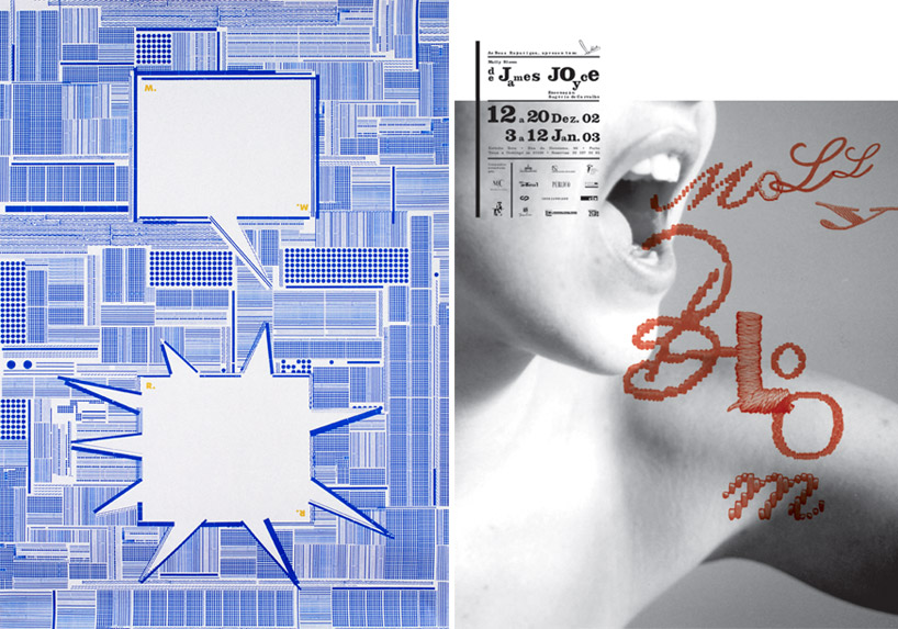
left: reason and madness poster
right: molly bloom poster
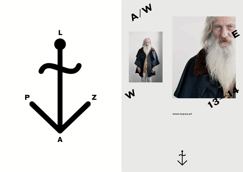
la paz logo and campaign image
DB: what have been your most rewarding projects?
R2: molly bloom from james joyce, a poster and a program we developed for a play, for a small theatre company called as boas raparigas, in 2002. despite the fact that we had strong financial constraints and tight deadlines, we managed to respond to all different issues with a high quality level and we got international recognition trough this work.
another key project was the first intervention we made at the ermida nossa senhora da conceição. in this environmental project we managed, through communication design, to capture more public and challenge people with our work. vai com deus appealed to a very wide audience and exceeded the target defined in the design brief. when we finished the intervention, we discreetly observed the passersby, and it was great to see their reactions. the strangeness of the installation left no one indifferent, which was very positive. there was a strong relationship with the space: the typography emerged from the walls as if it formed part of the building. the ephemeral quality of the content — frequently expressed orally but hardly ever written — express on a medium as permanent as stone, confers the project a certain peculiarity.
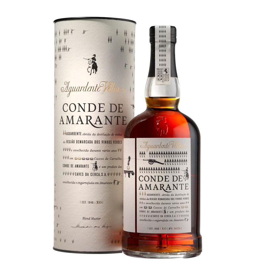
conde de amarante
photo © filipe braga
DB: what is the attraction of designing identities for you?
R2: we create identities of all kinds, from small business, to large companies — as is the case of osvaldo matos —for art galleries, museums, architects and other institutions and or even for individual artists. it’s like telling a story with variations and adaptations to different media and supports – concrete, paper, screen… the way we look at the world is reflected in approaches to identity and are matters that concern us, from theoretical and practical standpoints.
recently, we were fortunate to be working on several identity projects all very different, but all very interesting. one of these was la paz, a portuguese brand that evokes a real context, with roots in traditional national clothing, taking advantage of this savoir faire, but with a contemporary look. the approach to the clothing is reflected in the brand’s external communication. the relation with the ocean and the fisherman is translated by the imagery were the principal model is a fishing net maker. we changed the logo and designed several communication materials, giving it a specialized look, which could correspond to the brand’s vision.
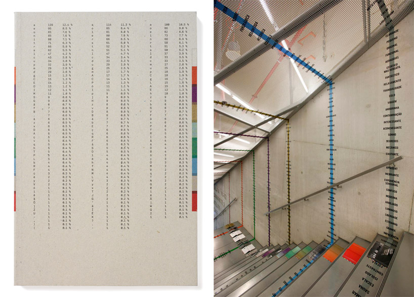
percursos inacabados – book and installation
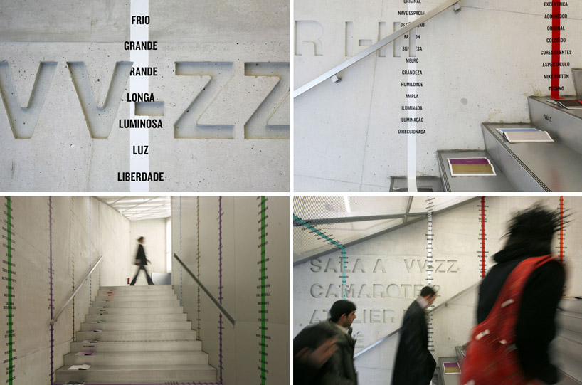
percursos inacabados – installation
DB: what mistakes or ‘traps’ should a young designer avoid when working on an identity system?
R2: ignoring the essence of the entity’s identity and falling into re-producing existing models. the designer must help the entity with is external vision and knowledge in communication design, using these resources to make identity projects of a structural nature. adding value to the projects, contributing within its potential to complement and enhance the institution.
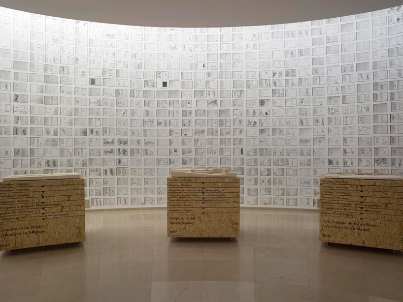
eduardosouto moura exhibition
photo © filipe braga
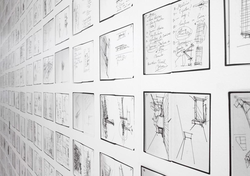
eduardosouto moura exhibition
photo © filipe braga
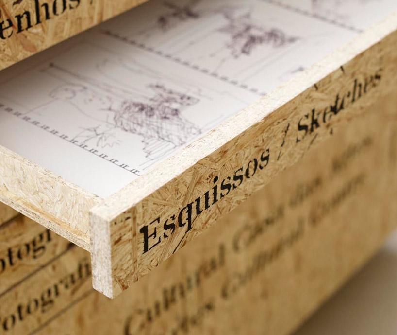
eduardosouto moura exhibition
photo © filipe braga
DB: what do you enjoy about wayfinding and environmental design programmes?
R2: the relationship of communication design with space is fascinating: we love scale and the relation human body has with our projects. each time we had the chance, we explored environmental design. as example of this is unfinished trajectories, a project we did inside and about rem koolhaas’ concert house— casa da música, located in porto. several artists, designers and architects were invited by guta moura guedes to intervene in a different space of this amazing building. we choose to do a visual essay based on visitors’ emotions and other viewpoints, suggested by the spaces of the building. the objective was to list, classify, contextualize, build relations and map the respective content on a book. each double page was open on the floor, the content inside the book had continuity, establishing a dialogue with the walls and ceilings of the building.
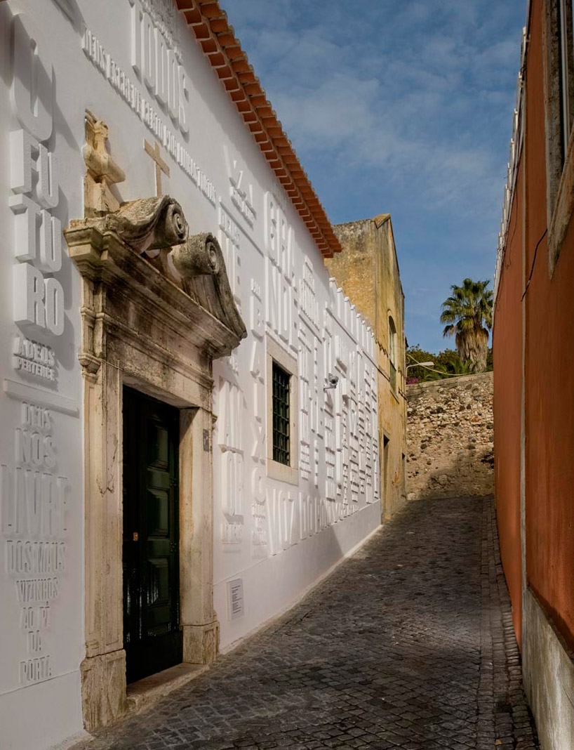
vai com deus
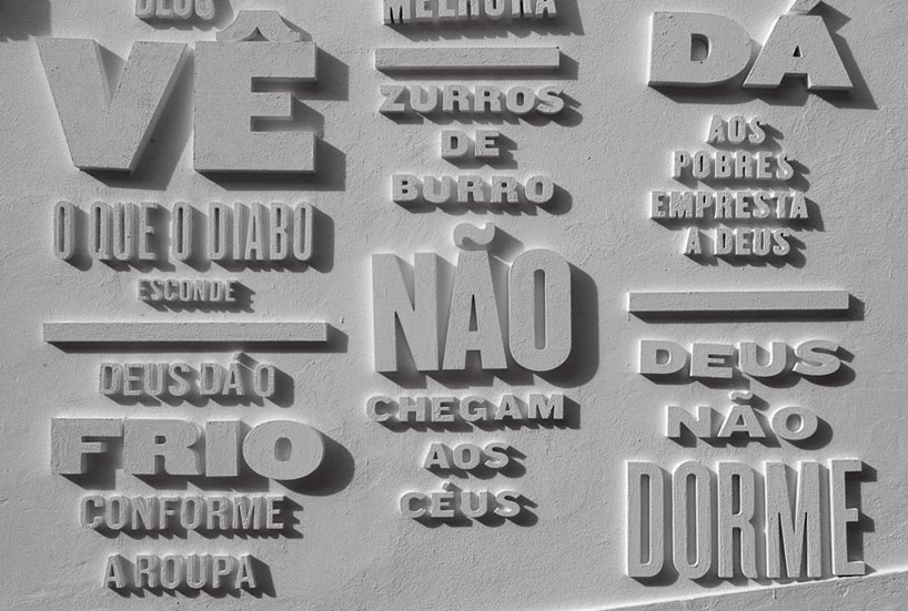
vai com deus
DB: what are your thoughts on specialization vs generalization?
R2: both have strengths and weaknesses. we grew up in the era of pre-internet, in a small country, with a small design scene. we are specialists our approach but essentially we explore different means – static, sequential or interactive as well as different materials, like paper, screen or even concrete. the dominance of different publishing platforms, dimensions and materials allows a broad range of responses.
we love to get out of our comfort zone and explore everything in order to improve our knowledge and take advantages of the different mediums. this constant exercise also helps us to be awake, it demands a flexible mind, but we manage to do it because invest in research and experiments. we consult experts to give us the needed support which stops us from getting repetitive and bored.
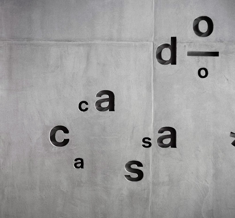
casa do conto
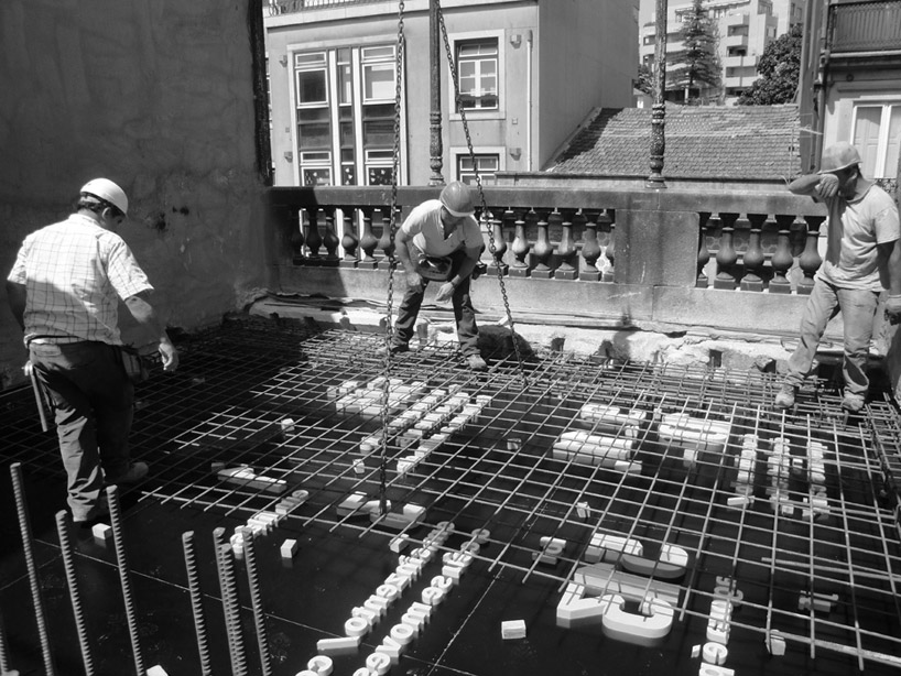
casa do conto
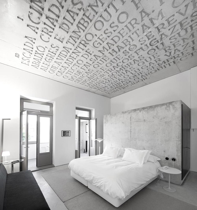
casa do conto
DB: besides design, what are you passionate about and why?
lizá ramalho: too many things, but I never have enough time to explore them. mainly photography and cinema. I’ve always wanted to be a movie director, because I’m interested in telling stories.
artur rebelo: surf, because when I’m in the ocean, I feel more in touch with nature. it gives me the balance I need as it’s such a different experience from my practice.
DB: what is the best piece of advice you have ever been given?
R2: search for inspiration outside. get out of the room and observe reality.
DB: what is the worst piece of advice you have ever been given?
R2: we can’t remember.
