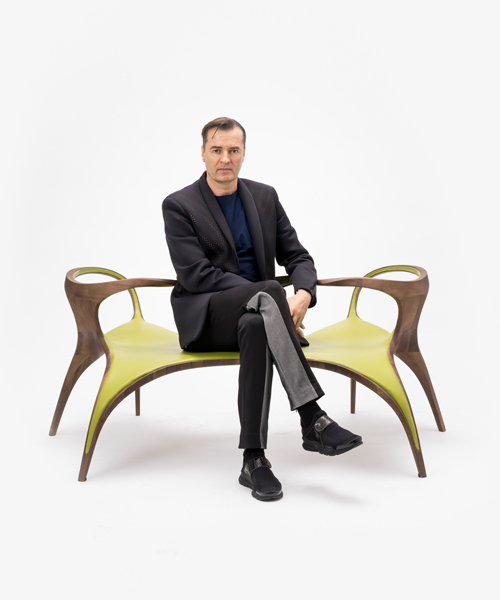
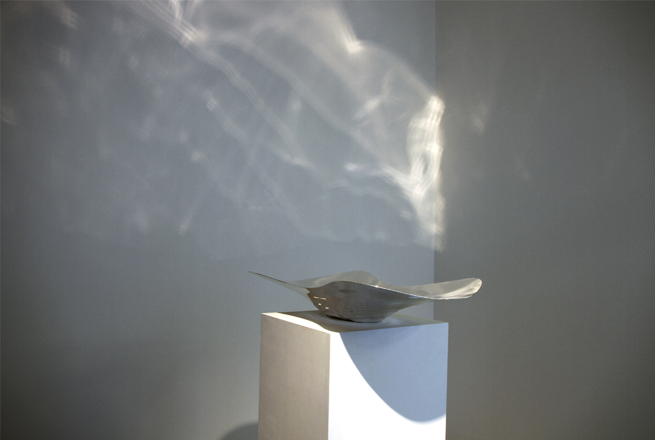
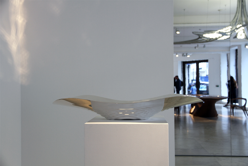
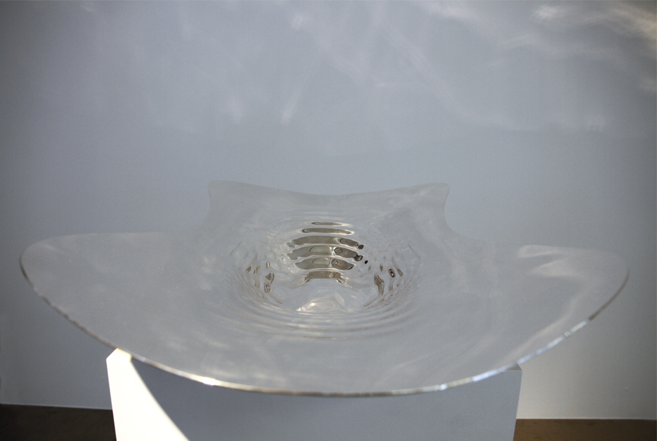
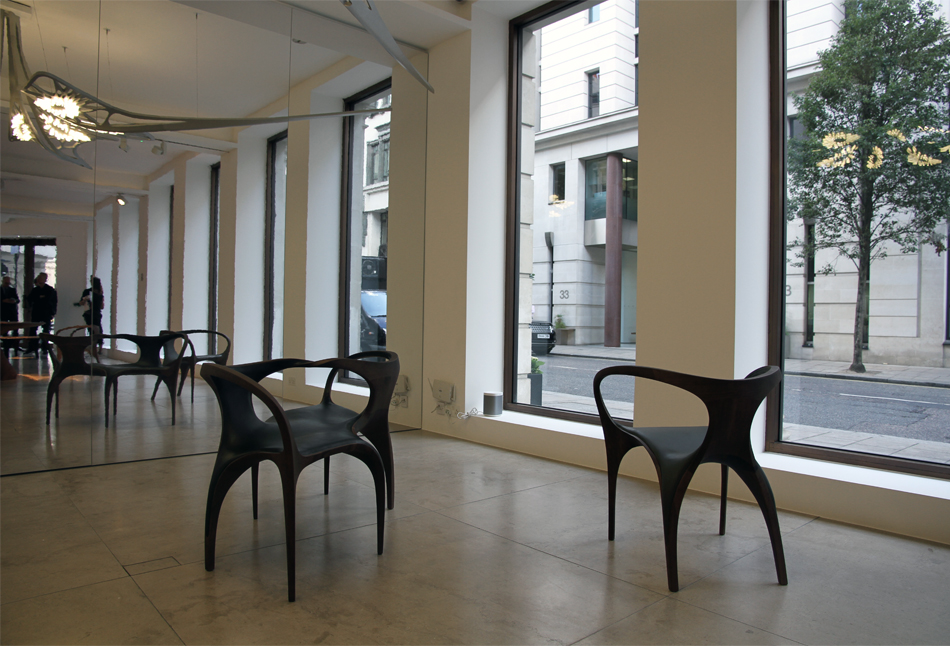
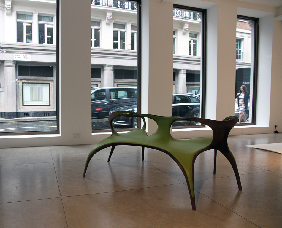
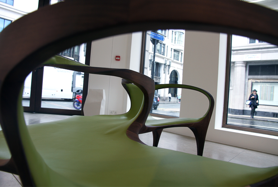
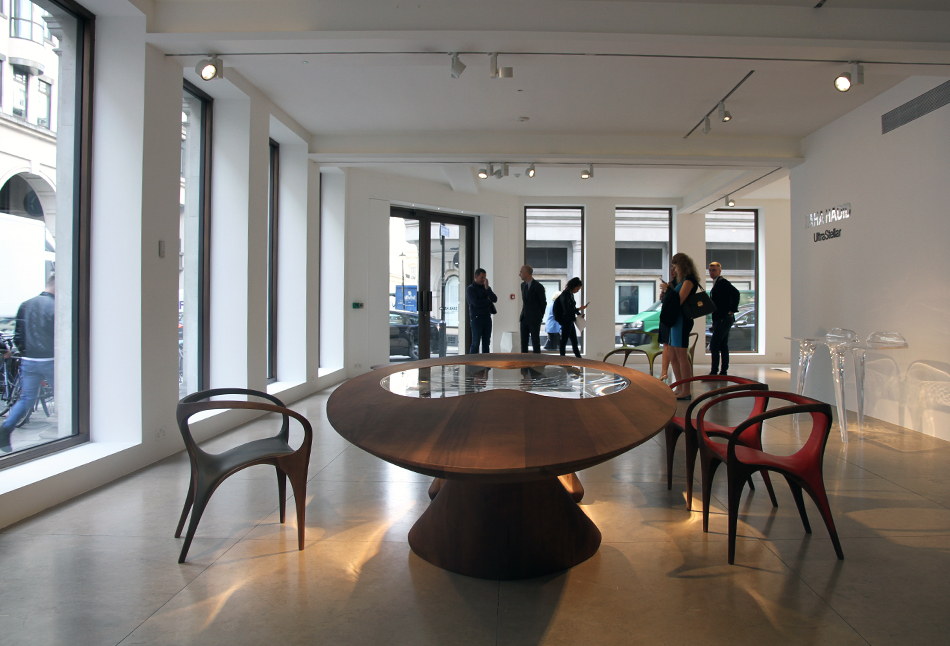
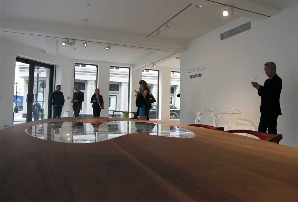
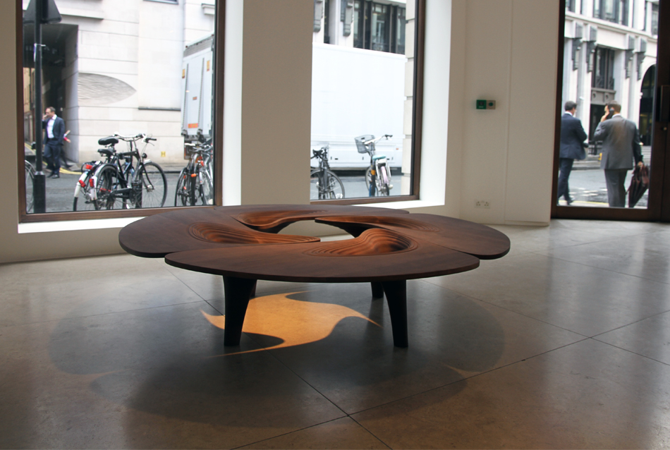
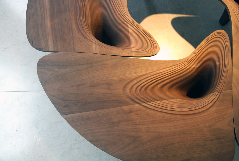
presenting her final furniture designs at david gill gallery, zaha hadid’s ‘ultrastellar’ collection turns traditional materials into fluid and twisting forms. the pieces employ walnut timber, silver, glass and leather to contrast with her previous work for the gallery, which first started in 2007. consisting of a bowl and coffee table, single and twin chairs, dining table and chandelier, ‘ultrastellar‘ not only celebrates the previous nine years of collaborations but also marks the next chapter of the relationship with patrik schumacher now leading the creative direction at zaha hadid architects.
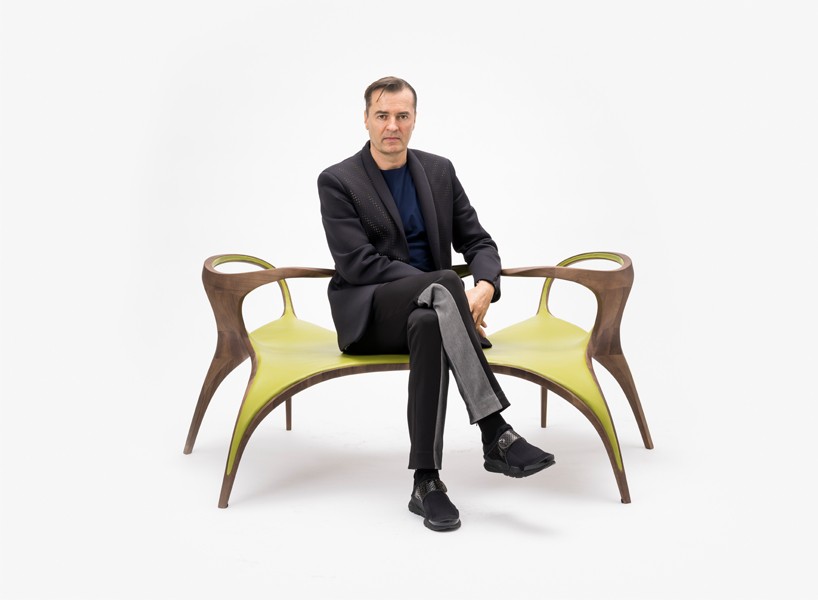
patrik schumacher, director of zaha hadid architects, sitting on the ‘loveseat’
image © martin slivka
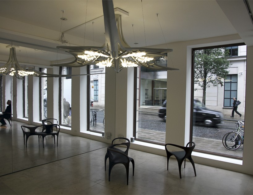
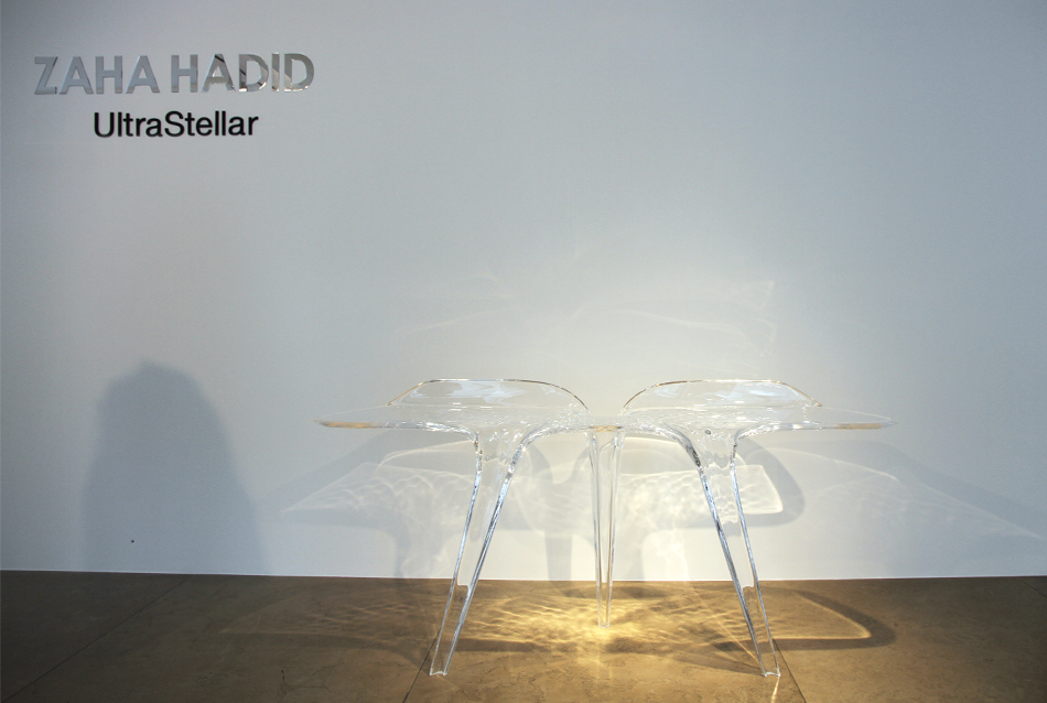
alongside the brand new walnut-crafted twisting chairs, rippling coffee table and curving dining table, zaha hadid’s ‘ultrastellar’ collection features more pieces that build upon past creations. the silver bowl and milled-acrylic consoles extend the 2012 and 2015 ‘liquid glacial’ line, whereas the show’s centerpiece, the aluminum and glass chandelier, finalizes the 2014 prototype as a fully manufactured design.
at the exclusive preview of the ‘ultrastellar’ collection at the david gill gallery in london, patrik schumacher sat down with designboom to discuss the new furniture line, the traditional material usage, and what the future for their relationship with gallery may look like.
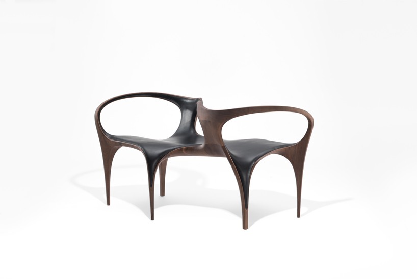
image © martin slivka
designboom (DB): with this collection marking a nine year partnership at david gill gallery, how do you reflect upon zaha hadid architects’ contributions towards furniture and product design with david gill?
patrik schumacher (PS): it has been fantastic in terms of the exposure that david gill can give to our work. this exposure is to really top clients and high-end collectors who appreciate what we have done and what we are currently doing, and he is mediating this wonderfully. this partnership is incredibly important because its unique compared to any other promoters that we have tried to work with. david gill is absolutely at the top end, in terms of being able to put up the show and sale the items. for us, this is important to keep us going, working and building new designs. as well, this partnership pushes us to present something new every time. it requires commitment, quality and large investments to create pieces like the ones we are showing with ‘ultrastellar’.
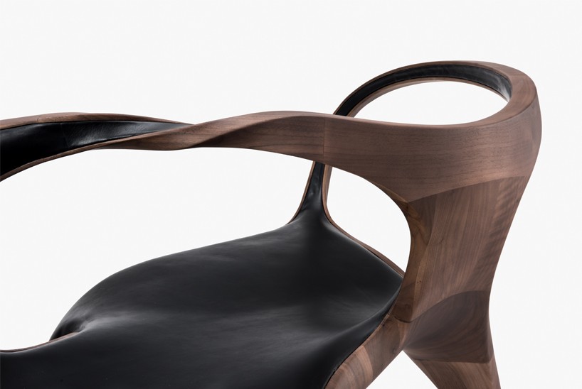
image © martin slivka
DB: for this collection, more traditional materials (such as walnut, silver, glass and leather) have been used. was that a deliberate choice for this collection?
PS: it was started with the intention to use timber and leather. we wanted to move into this, not because it was officially asked for, but because it is beautiful. in consideration, this wasn’t traditional in the 50s and 60s, but in our collection here, there is definitely a reflection of tradition. the materials that we have used for this collection, provide a potential for light, organic lines, and forms.
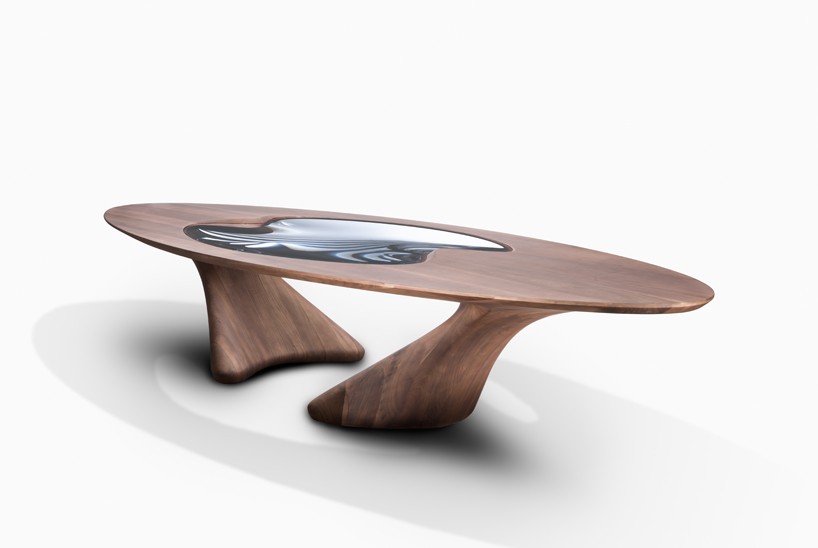
image © martin slivka
DB: the use of walnut timber is pretty unusual, especially when looking at zaha hadid architects’ previous designs. what influenced you to use this specific material, and what were the challenges of crafting it?
PS: it is difficult as you can’t get hardwoods, like mahogany, anymore. sometimes you can get pieces second-hand and re-used hardwood timbers. this wasn’t available to us here, but it could have been done. the idea of using hardwoods was triggered by a visit to china, where we went to a museum for traditional furniture. the building was attached to a timber workshop, where they were re-creating traditional furniture. as well, they had wonderful timber storage in the basement.
furthermore, this idea of hardwoods was also influenced from seeing an exhibition of work by some brazilian designers from the 50s and 60s. it looked at the interiors and products of the art nouveau period and their organic uses. as well, timber is heavy and thick so they provide more strength to tables. our dining table in this ‘ultrastellar’ collection, is stronger and thicker than other tables that use different materials.
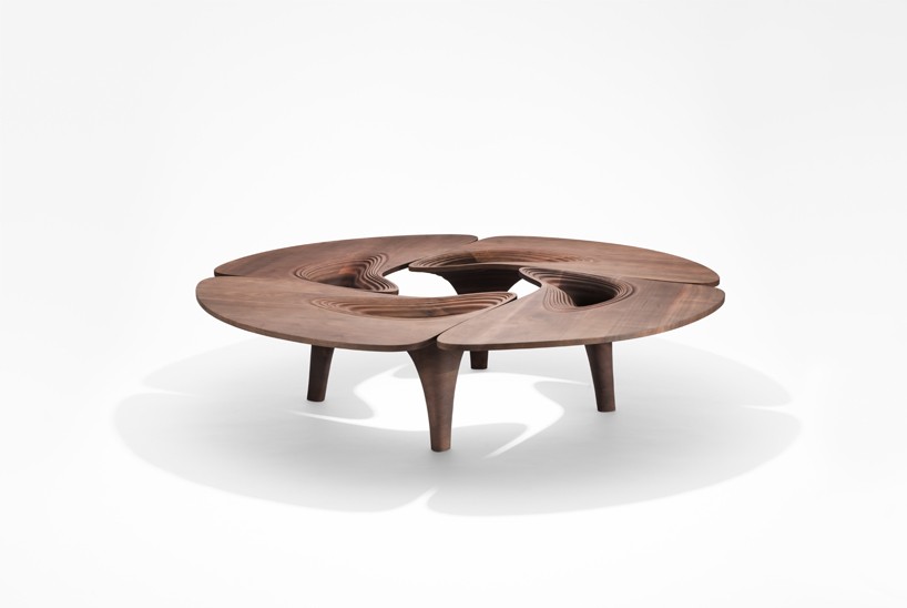
image © martin slivka
DB: this dining table is a great example of the tension lines that are very apparent in the form of the collection, and also the forms of your architecture. can you explain the similarities and differences between ZHA’s approach to furniture/product design vs architectural design?
PS: design is universal, and specific philosophies usually migrate over all of the design disciplines. the modernist and bauhaus movements are good examples of this because it inspired architecture, interiors, furnishings, products, and textures. principles like these have a universal style evolution across all design disciplines. the style that we have here, is something I call parametricism. this is because it offers very parametric possibilities, and gives more degrees of freedom to create complex forms.
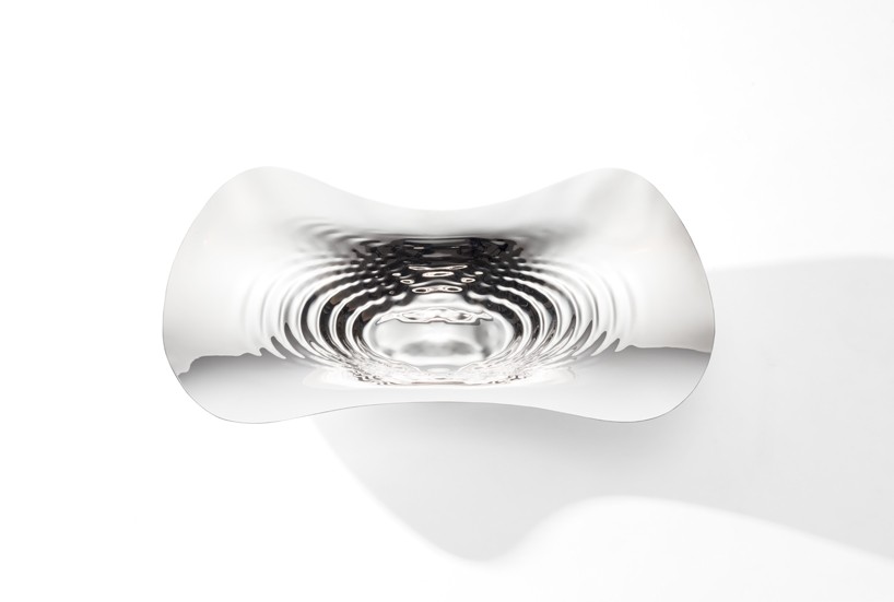
image © martin slivka
PS continued: architecture has always worked with the complexity that the outside and inside are different and that the front and back do not look simultaneous. overall, you need time to synthesis the options. in an interior, you usually have the furniture and objects in front of you. they are closer to the body and you are supposed to touch them. there are more ergonomic and tactile elements involved than in architecture. this is why leather and padded zones become aspects that we must take into considerations. interiors and furnishings are already becoming more visceral and tactile. there are more nuisances of differences, which mean we must take more care of the details. sometimes we even have to consider the certain scents that emanate from the timber. this is very different to urban spaces and architecture.
overall, each discipline has its own specificities, instead of universal principles like the relationship between form and function. for me, the agenda of communication is very important as all design is communication. take the table, this individual piece offers an invitation for a particular way of interacting around it. you can imagine it being used in social scenarios for parties and elegant dinner events. you have different atmospheres and different expectations of users that communicate with the product. this also applies to architecture as buildings create areas for various designated purposes. there are lots of shared principles.
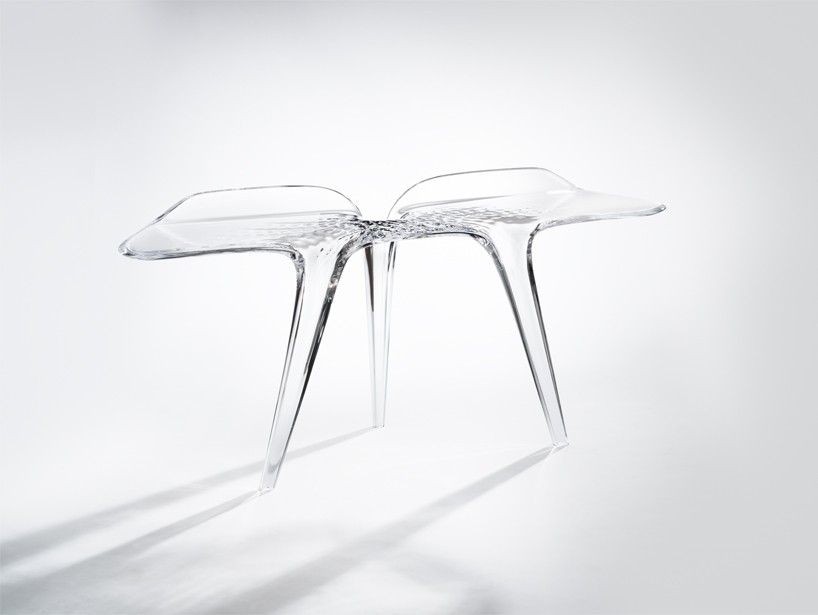
image © martin slivka
DB: as part of your studio, do you have specific sections/departments that are focused on product design and furniture, or do your designers cross over into the different disciplines?
PS: we do have specific sections, but our designers also change across. everyone likes to do a bit of furniture because it’s a quicker process than architecture, and is fun to create. we do have architects involved in collections like this, but we also have some degree of specialization because it is a very specific field. we actually have an interior design department, which includes furniture and product design.
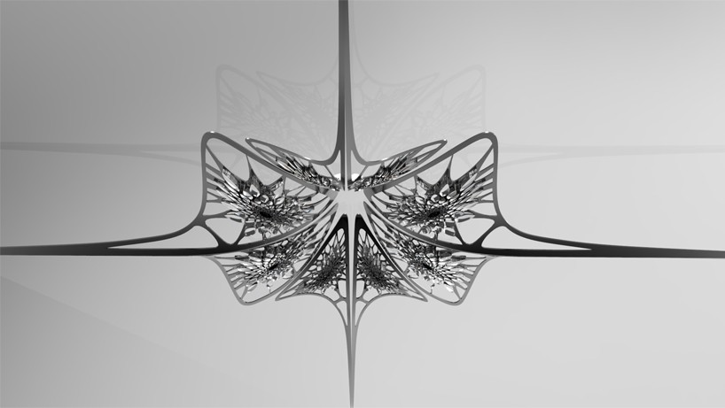
image © martin slivka
DB: the centerpiece of the exhibition is a glass and aluminum chandelier. how challenging was it to manufacture such an impressive object?
PS: well, you have to try it out really. this is through prototyping as you can’t just pre-design it – you have to see it. you need to see the technical elements and how to conceal them elegantly. that is something that you can only do through trials. as well, the visual effects of large objects like the chandelier can only be properly seen through testing and development. the technical functionality of the chandelier has become easier thanks to LED technology improvements. they are so small now, yet offer new, stronger and more versatile viable light options. this opens up a new era for design if you like.
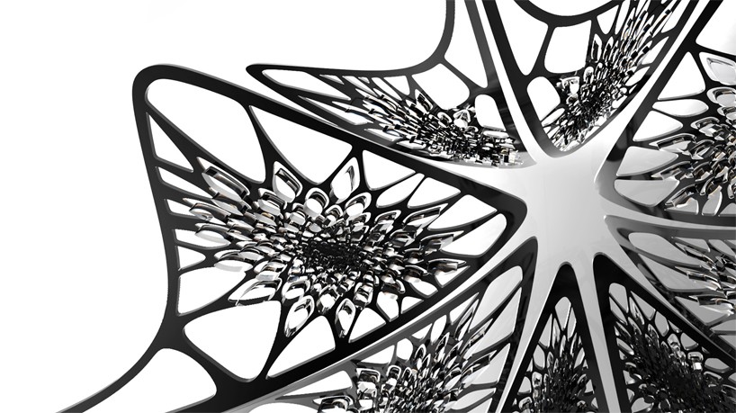
image © martin slivka
DB: modern technologies and pushing the current capabilities of design, is a common feature across all ZHA’s work. how important is the incorporating of new technologies in projects like this and how does this collection reflect this influence?
PS: we have a research group called computation design (CODE), where we focus on more speculative research of new technologies. this is stuff that we cannot yet offer to clients as polished and finished products. included in this is our work for 3D-printed chairs, which is very interesting, but it is not strong enough yet. we can’t print it in one process so we have to glue things together. there is a lot of trial and error in this department.
overall, we specifically use technology-based design that brings out the capacities of the technology. with the 3D-printing, there are very filigree perforations of complex geometries. sometimes we have used other techniques, for example, we have done some benches for the mathematics gallery – they are reopening in december. here, we used molds for concrete castings with a robotic hot-wire cutting. with this, you are constrained by a straight line that cuts through the concrete, but it is 25 times faster than milling so is super-efficient. however, you still have this constraint that you can’t make any form you like, you can only do ones which can be generated using a swiveling line. this may be a limitation but it does give character to the piece and is worth it because it speeds up the mold-making drastically. another technology; curved folding, which uses the robot as well, incorporates sheet materials to cut it, score it and then bend it round curves like origami. we are trying to make chairs, bowls and other pieces by using this process. these are technology driven ideas because we don’t have to make molds or casts, and you can make curved surfaces and three-dimensional forms with sheet materials.
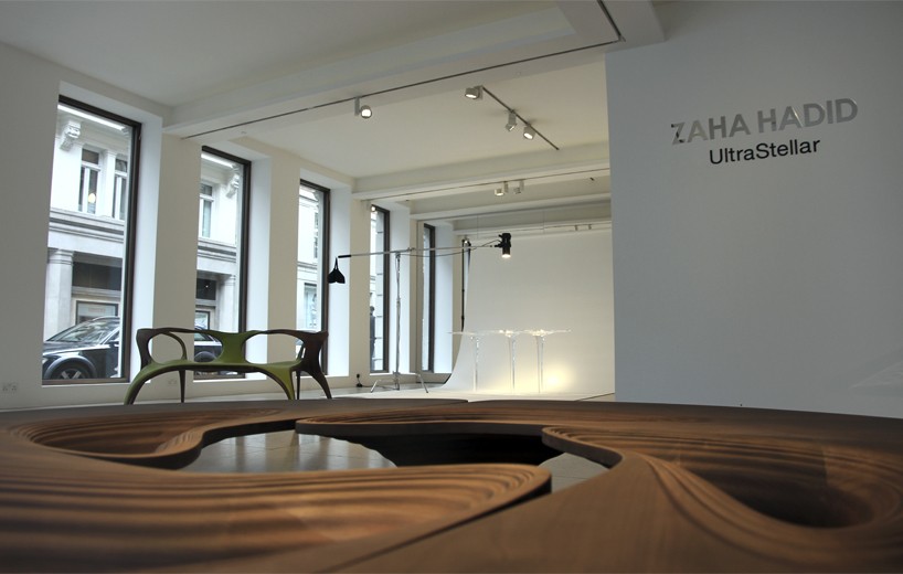
image © designboom
DB: how do you see the relationship between zaha hadid architects and david gill gallery developing under your direction? what emphasis will the studio place on furniture and product design moving forward?
PS: well, first of all, it is wonderful that david gill sees the potential of my work as part of this collection of pieces. they understand and respect my creative contribution. I have not really thought about the next step, but it will be along the lines of being technology driven. as it will be here at this gallery, the products will be limited pieces, but they will be downstream and have mass-market potential. our 3D-printed experiments are an example of this, as it will expand, will scale up. we have talked to david about this chair, and there might be a chance of presenting it. this is independent from economics, because if we get it to work, to be strong enough and printed in one piece, it could be possible to showcase. the thing is, it would be very expensive. it is very expensive to make and so, would be even more to sell. it would only be shown at a gallery collection like this. one that shows original research, and attract the first users, the pioneer consumers. also, the interesting and fun thing of this is the potential for more mass-market usage. that is the way I see our future, after the raw prototypes of this chair, we would present the limited series here at david gill, and then at other partners for future down-scaling.
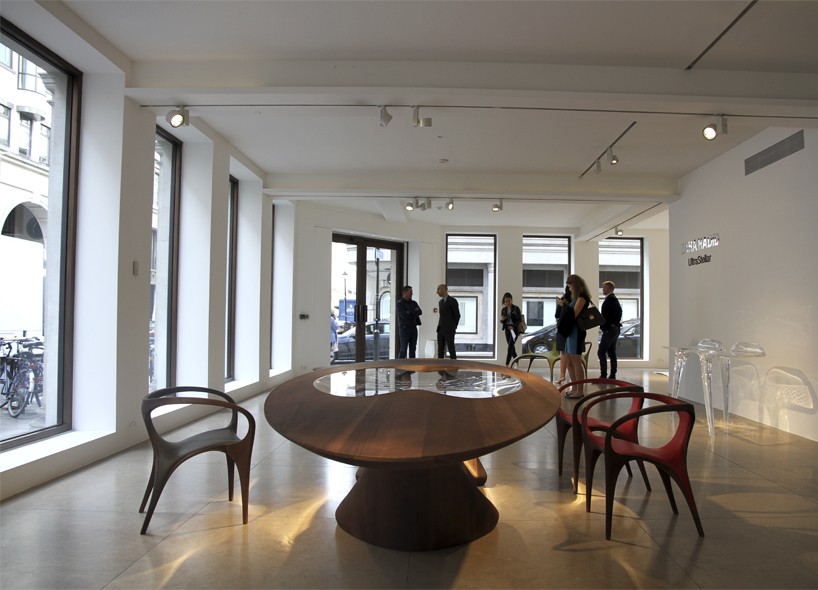
image © designboom
patrick schumacher interview
image © designboom
Save
Save
Save
happening now! thomas haarmann expands the curatio space at maison&objet 2026, presenting a unique showcase of collectible design.
