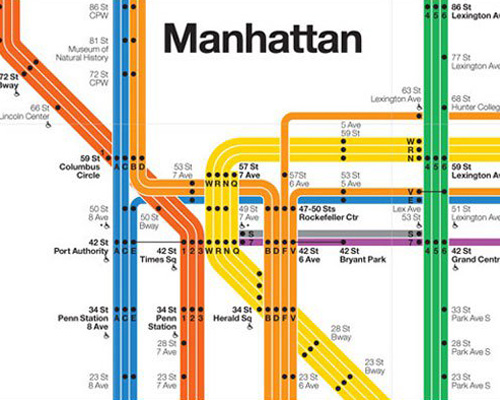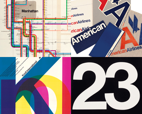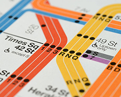
massimo vignelli recently updated his iconic 1972 new york city subway map for the may 2008 issue of men’s vogue. 500 signed prints were made available through the men’s vogue website with all proceeds going to the NY based charity ‘greenworker cooperatives’. while the signed version is now sold out, unsigned maps were also available for free within may issues of men’s vogue at select retailers across the states. designboom recently caught up with men’s vogue editor mark rozzo to ask him about the collaboration with vignelli.

new york city subway diagram, 2008 by vignelli associates, 2008 (courtesy of vignelli associates/men’s vogue)
DB: what does this project hope to achieve?
MR: we quickly decided that perhaps the best way to go about an initial run for the 2008 subway diagram was to create a high-quality art print and make it available as a limited edition. we also felt that, rather trying to turn it into money-making exercise, the real spirit of the venture was about new york and its history and its relationship with design. so it wasn’t much of a stretch to figure out that the proceeds should go to a worthy design-oriented nonprofit. the may issue also features a piece about omar freilla and his green workers cooperatives project in the south bronx (a sustainable-building/recycling initiative that was awarded a jane jacobs medal for 2007); it was only natural that the proceeds should go to this worthy effort that is all about encouraging sustainable design in new york.

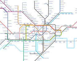
new york city subway diagram, 2008 by vignelli associates, 2008 (courtesy of vignelli associates/men’s vogue)
DB: what are the key differences / refinements between the updated map and the original?
MR: massimo could speak to this better than I can, but what was appealing to me about the project was to see how all of the changes that have altered the subway system over the past 30 years would be reflected in a new vignelli map. massimo acknowledged the original critique of the map – that the geography of new york was abstracted to such a degree that some riders were confused. I got the impression that he might answer that criticism by turning central park from a square into a rectangle, making the water blue etc. but in the end, and very wisely, too, I think, massimo went the opposite direction. instead he actually abstracted the geography even further with the new map, realizing that the problem with the 1972 version was that some people thought they were getting a map of the city instead of a diagram of the subway system. the update is much clearer since the color scheme of the subways has been simplified over the years, the color scheme of the vignelli map has shed its former ‘neon rainbow’ vibe: the colors are fewer and bolder (actually, massimo told me he kind of misses all the crazy colors of the old one!). the other big difference, I think, is the orientation of broadway, which is now strongly implied by a 45-degree angle and provides a focus for the whole design.

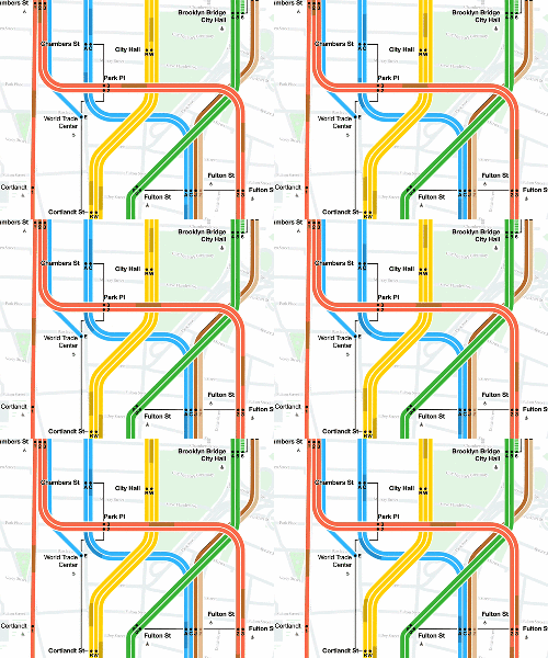
new york city subway diagram, 2008 by vignelli associates, 2008 (courtesy of vignelli associates/men’s vogue)
DB: the limited edition copies sold out in a flash, what do you think your readers appreciate about vignelli’s map?
MR: I think it suggests the degree to which the original 1972 map has become such an icon – a highly collectible one, too. there’s an appreciation of the old map that goes beyond aesthetics; it’s rich nostalgia for people who either lived or visited new york in the 1970s (a very heady time for the city, of course) or who (like me) moved here long afterwards and always wondered about what it would have been like to live here at that time. it’s a way of connecting with those feelings and to own an amazing piece of original design at what is really quite a reasonable price and to share in this very fun moment of the map’s re-creation. who knows… maybe we’ll do a second printing…

new york city subway diagram, 2008 by vignelli associates, 2008 (courtesy of vignelli associates/men’s vogue)
DB: did you always intend to produce the free copies for the may issue of men’s vogue?
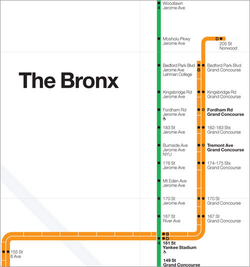
new york city subway diagram, 2008 by vignelli associates, 2008 (courtesy of vignelli associates/men’s vogue)
DB: do you imagine people might use the free edition?
DB: can we expect any similar projects / collaborations with (graphic) designers in the future?
MR: we’re always looking for new ideas and projects. we do a limited edition page in each issue, and they’re often collaborations with designers and craftspeople that we brainstorm with. for instance, our previous map project was with redstone studios, a small enterprise that practices painstaking, hand-drawn cartography. we approached them about doing their first-ever globe, which they did – a beautiful specimen. one of the redstone globes was acquired by the new york public library for their maps collection. it would be great if they got a vignelli map too! read more about massimo vignelli’s updated NYC subway map for men’s vogue here
http://www.mensvogue.com
http://www.vignelli.com
http://greenworker.coop
designboom interview: massimo vignelli (2006)
