the new responsive W by experimental jetset has replaced pentagram’s blocky logotype
experimental jetset have created a new identity for the whitney museum of american art in new york, based around the concept of a ‘responsive W’. the ‘W’ is combined with the typeface neue haas grotesk and in some cases a single image of an artwork – such as in posters or pamphlets for exhibitions.
 new whitney museum identity by experimental jetset
 chart showing the variations of the flexible W
‘in 2011, we were approached by the whitney museum of american art to design their new graphic identity who asked us to create a new graphic language, a sort of graphic ‘toolbox’, for the whitney’s in-house design team to work with. the reason for this redesign was the fact that, in 2015, the whitney will move from its current location (the ‘breuer building’ at madison avenue) to a new location (a museum designed by renzo piano, situated at the beginning of the high line). in preparation for this upcoming relocation, the whitney decided to redesign their graphic identity (and to launch this new identity well in advance, in 2013).’ – experimental jetset

variations of the new logo…
‘two years ago, museum staff began a thoughtful internal dialogue regarding the whitney’s graphic identity and selected the design studio experimental jetset to develop an approach which embraces the spirit of the museum while serving as a visual ambassador for our new building. the result is a distinctive and inventive graphic system that literally responds to art—a fundamental attribute of the whitney since its founding in 1930. this dynamic identity, which the designers refer to as the ‘responsive W’, also illustrates the museum’s ever-changing nature. in the upcoming years it will provide an important point of continuity for members, visitors, and the public during the transition to the new space.’ – whitney museum of american art in new york
 membership materialsphoto by jens mortensen
 member calendarphoto by jens mortensen
 summer guide 2013photo by jens mortensen
 book platephoto by jens mortensen
 admission ticketsphoto by jens mortensen
 stationeryphoto by jens mortensen
 materials for kids membership programphoto by jens mortensen
 tote bagphoto by jens mortensen
 carrier bagphoto by jens mortensen
 puzzle gamephoto by jens mortensen
read an extensive explanation of the design process here »
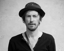
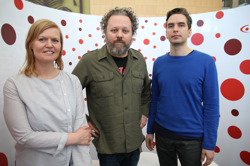 marieke stolk, danny van den dungen and erwin brinkers of experimental jetsetportrait © designboom
update: marieke stolk, danny van den dungen and erwin brinkers of experimental jetset were speakers at the 2014 design indaba conference where they discussed their graphic design practice that emphasizes a particular sensibility towards typographic solutions. among the works they presented on this occasion was the new graphic identity they conceived for the whitney museum of art. see designboom’s interview with the dutch trio here.
dubbed ‘the conference on creativity’, the design indaba conference is all about how design, creativity and innovation can positively impact the world. so much more than a ‘how-to’ conference, this is a forum fueled by inspiration that breeds ideas, ingenuity and innovation. the conference is an opportunity to listen to the world’s foremost creatives, entrepreneurs and trendsetters. it’s the not-to-be-missed creative event in africa.