loading video...

nendo designs minimalist new identity for japanese brand TOKYU HANDS

 a modern identity for ‘hands’ by nendo


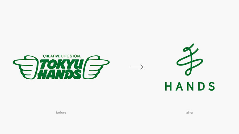
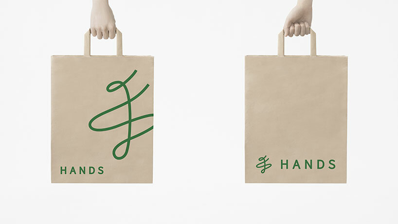
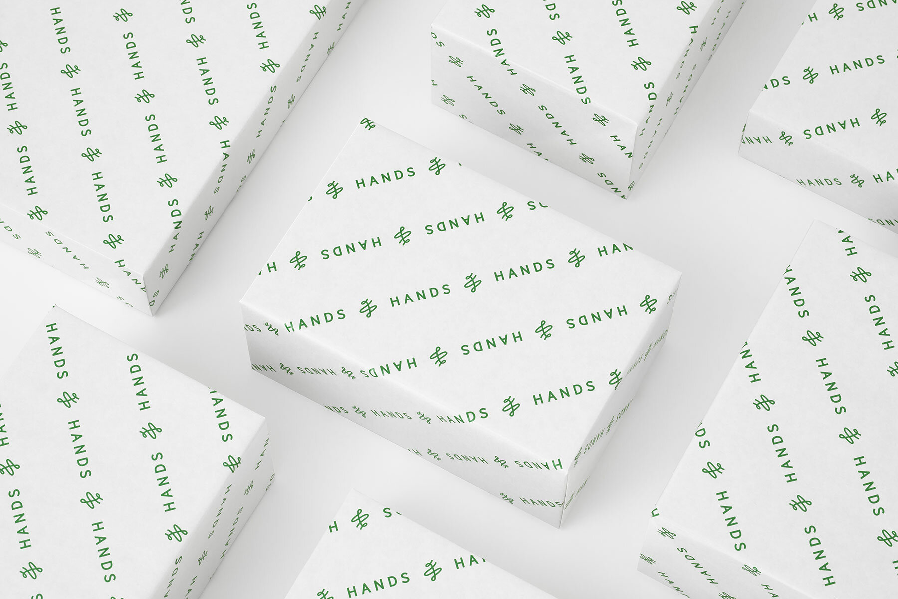
Tokyo and Milan-based design studio Nendo presents its reimagined brand identity for the Japanese DYI department store HANDS. The renewal project marks the latest modernization for the retail company, which was first established in 1976 as TOKYU HANDS, and has since opened sixty-three locations in Japan and worldwide. The brand retains its familiar mononym nickname, along with the deep green color with which it has been associated for nearly half a century, but is now recognized by a minimalist new logo.

tokyu hands nendoimages by Masahiro Ohgami, courtesy Nendo


evoking ‘japaneseness’ around the world


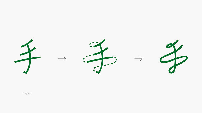
Developing the new brand identity for HANDS, the designers at Nendo follows the company‘s philosophy of ‘creating lifestyles with one’s own hands.’ Thus, the new project makes use of the Japanese character meaning ‘hand’ as a foundation. The character is translated into a cursive-style logo, resulting in an image which aims to reflect a ‘Japaneseness’ across the world.


The team notes that this single stroke writing further ‘expresses the hope of connecting the past and the future,’ while at once evoking the image of ‘people dancing with excitement. With this news, the company will replace its previous logo, which has long been recognized by its bold ‘hand wings’ motif. The original, text-rich identity was designed by HAND’s Yasuhiro Hamano. 

tokyu hands nendothe japanese character meaning ‘hand’ is transformed into a single-stroke logo

tokyu hands nendo
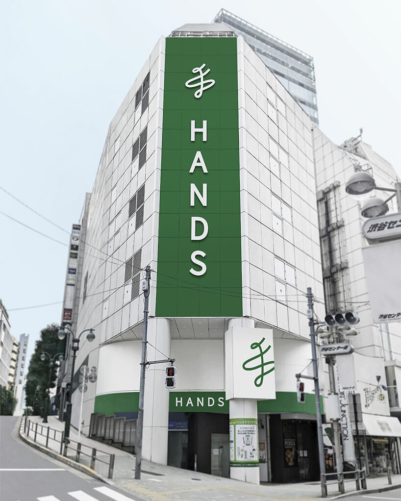
the store has sixty-three locations in Japan and worldwide nendo designs minimalist new identity for japanese brand TOKYU HANDSNendo has maintained the company’s iconic nickname and green color

tokyo-hands-nendo-logo-rebranding-designboom-05a

the new logo replaces the previous ‘hand wings’
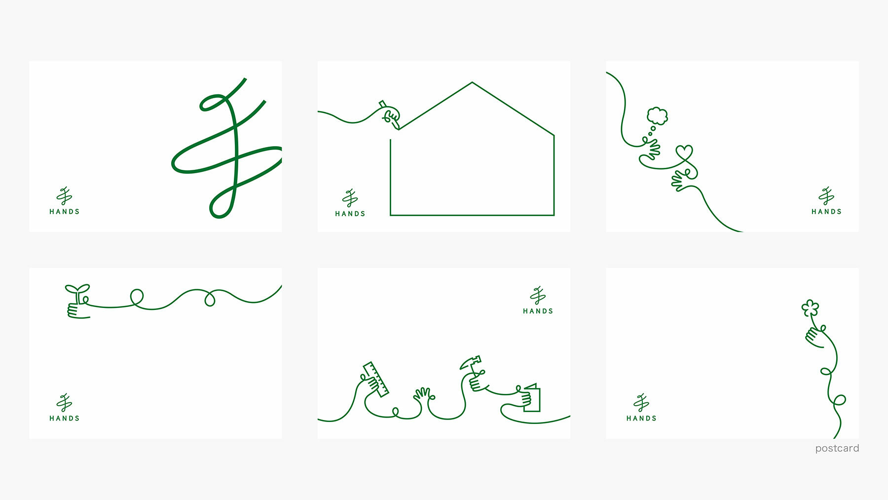
nendo designs minimalist new identity for japanese brand TOKYU HANDSthe minimalist design delivers a modern identity to the nearly fifty year-old company

tokyo-hands-nendo-logo-rebranding-designboom-07a

the designers at Nendo employ a calligraphic, single-stroke language

KEEP UP WITH OUR DAILY AND WEEKLY NEWSLETTERS
suscribe on designboom
- see sample
- see sample
suscribe on designboom

happening this week! holcim, global leader in innovative and sustainable building solutions, enables greener cities, smarter infrastructure and improving living standards around the world. 

PRODUCT LIBRARY

a diverse digital database that acts as a valuable guide in gaining insight and information about a product directly from the manufacturer, and serves as a rich reference point in developing a project or scheme.

X
5