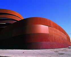
from now until october 29th 2016, design museum holon in israel presents the first large-scale retrospective exhibition of japanese studio nendo. extending from the grounds to the upper and lower levels of the museum, and featuring pieces from the beginning of his career until present day, the show provides an immersive experience that surveys the prolific practice of nendo’s founder oki sato.
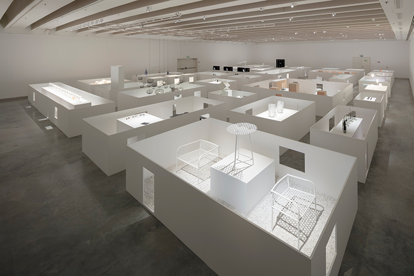
the exhibition marks the first large-scale retrospective exhibition of the japanese studio
all images by takumi ota unless otherwise specified
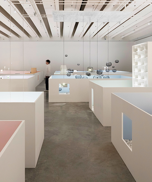
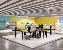
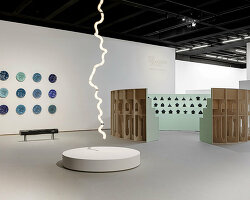
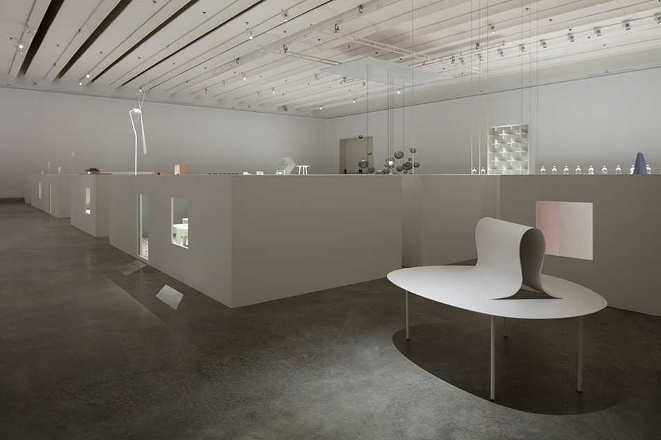
curated by maria cristina didero, ‘the space in between’ creates a conceptual village of design objects and installation pieces within the gallery rooms. visitors walk through a labyrinth of open-top display cases, each providing a window into the creative process of the studio. the exhibition design, a collaboration between nendo and takeshi yamamura / yamamura sanzlavina architects, features more than 70 works are divided into six categories of ‘in between spaces’ — a theme that riffs off nendo’s own methodology of finding ‘gaps’ in existing ideas to be made into new concepts. ‘design is something that you feel and enjoy,’ oki sato describes. ‘I want my pieces to talk for themselves. it is the small and the normal things that make it really special. whilst normal and small there is something very interesting, something always hidden in the gaps and space in between.’
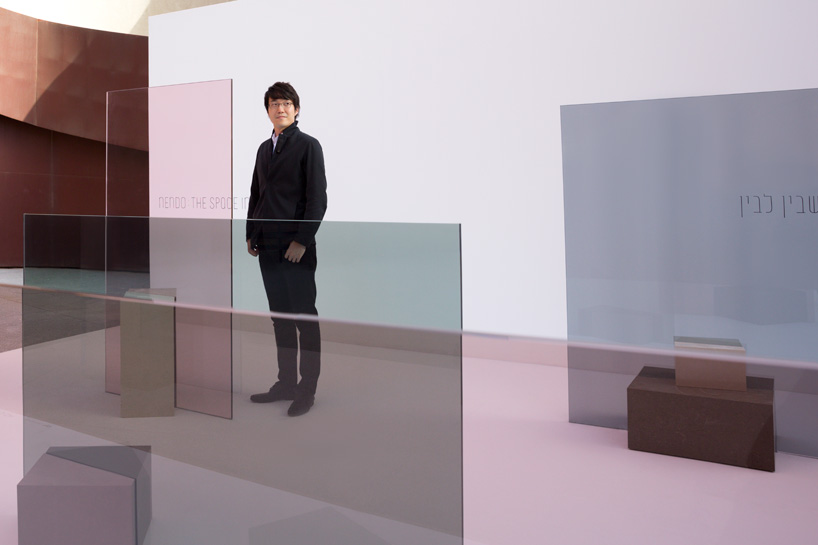
also as part of the exhibition, a site-specific installation has been realized in the design museum holon’s courtyard. ‘in the shade’ comprises a sequence of five free-standing screens built from panes of colored glass by glas italia and held in place by caesarstone pedestals. each podium has been positioned to appear as if it is penetrating the glazed surface. viewed from the side, the installation evokes the feeling of being ‘outdoors’ while what lies behind the screen appears to be ‘indoors’. the overall effect is achieved by separating the inside and outside through the overlapping boundaries between mass and air, light and shade.
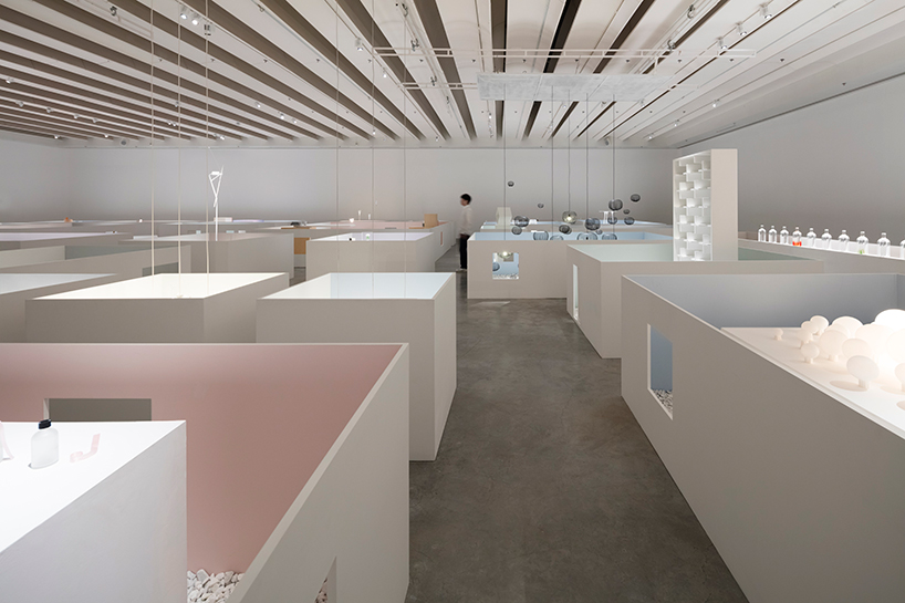
‘the space in between’ extends from the grounds to the upper and lower levels of the museum
curator maria cristina didero says of the exhibition, ‘this presentation investigates the only space in which sato could not intervene, the space in between, but on which he actually powerfully does: what is in-between, what is un-design and the carefully calculated operative-area left to light and air the theme became a narrative expedient to tell the story of his unique career, up to nowadays. t was quite challenging to present such a beautiful talent such as the collective nendo studio. oki sato is truly impressive in his way of surprising us every day with amazing designs that are both simple and sophisticated.’
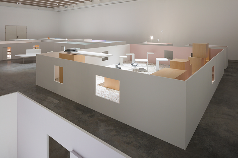
a conceptual village of design objects and installation pieces is sited within the gallery rooms
the six categories of ‘spaces’ show the challenges and related solutions nendo has encountered while interacting with different typologies of objects. these themes include: ‘between processes’; ‘between textures’; ‘between boundaries’; ‘between the object’; ‘between relationships’; and ‘between senses’. the museum describes the categories in more detail below —
between processes: reexamining existing manufacturing processes draws one’s attention to the spaces that exist between these sequential events. one can use these spaces to add a new process, omit an existing process, or change the order of processes. or one can even replace an existing process with a completely different manufacturing process; the result is an entirely new perception of value.
between textures: materials have their own distinct characteristics. these can be varied, from physical traits to qualitative properties of their feel or expression. if one takes a closer look at the gaps between two differing materials, it becomes apparent that there are no clear-cut distinctions, but rather a gradated space in which their respective characteristic features waver ambiguously. it is this space that forms a platform for new ideas and creativity.
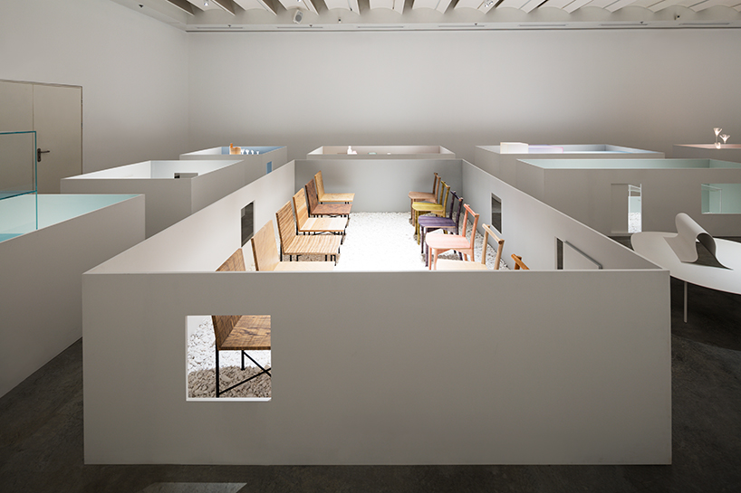
visitors walk through a labyrinth of open-top display cases
between boundaries: there is a multitude of interactions in everyday life; between people and things, things and spaces, the inner and the outer, the self and the other. blurring, erasing, or slightly shifting the lines between these boundaries can challenge and loosen our preconceptions, giving rise to new spaces.
between the object: there are also plenty of gaps or spaces within things. widening, truncating, or replacing these gaps with completely different elements can bring about new functions and meanings from the inside. if there are no discernible spaces, then shifting something ever so slightly can create a similar effect. the ‘layering’ and ‘depth’ of these respective elements, brought about by the use of a series of spaces, can also be of great interest to us.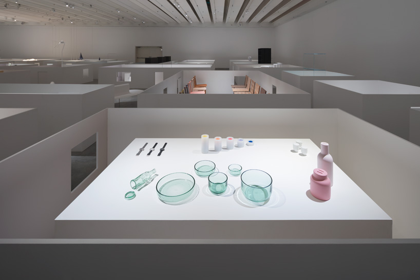
upper gallery view that includes detail of nendo’s tableware made from coca-cola bottles
see more about this project on designboom here
between relationships: whether they are top-down or locational, multiple elements are inevitably bound by some kind of relationship that holds them in balance. breaking such a state of equilibrium can create spaces between existing relationships, and thereby reconstruct them. connecting things that are initially separate. layering things that are initially adjacent to each other. inversing the relationship of structure and finish, or of design and function. creating alternate relationships and states of balance in this way can lead to new and invaluable discoveries.
between senses: transferring the invisible senses such as sound, taste, smell, and time into physical form allows more people to register them at one time.?this also involves exploring the spaces between two differing senses, such as visual and aural, or visual and sense of taste. such designs allow viewers to translate their visual perceptions into a different sensory perception, thereby creating a feeling of satisfaction not unlike when one solves a puzzle or quiz.
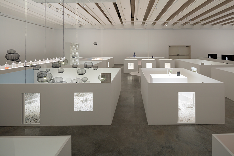
the cases provide a window into the creative process of the studio
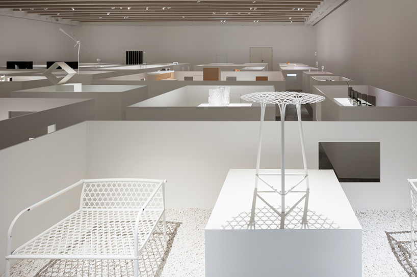
more than 70 works are divided into six categories of ‘in between spaces’
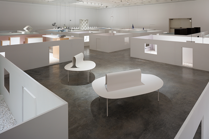
the exhibition has been curated by maria cristina didero
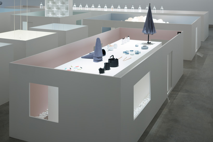
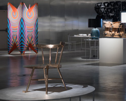
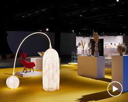
a range of nendo’s product designs are presented—from umbrellas to tableware to lighting to furniture
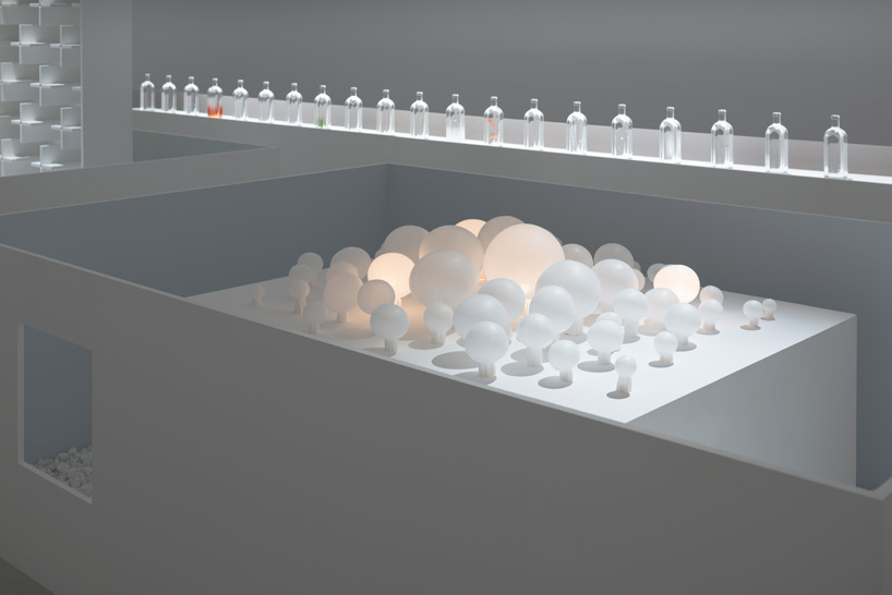
‘smash’ is an installation of long-fibre non-woven polyester bulbs manipulated via hot press forming
see more about this project on designboom here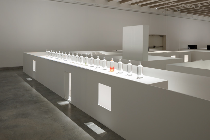
installation view of nendo’s ‘rain bottle’ that references the atmospheric condition
see more about this project on designboom here
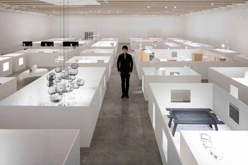
oki sato inside ‘the space in between’ exhibition at design museum holon
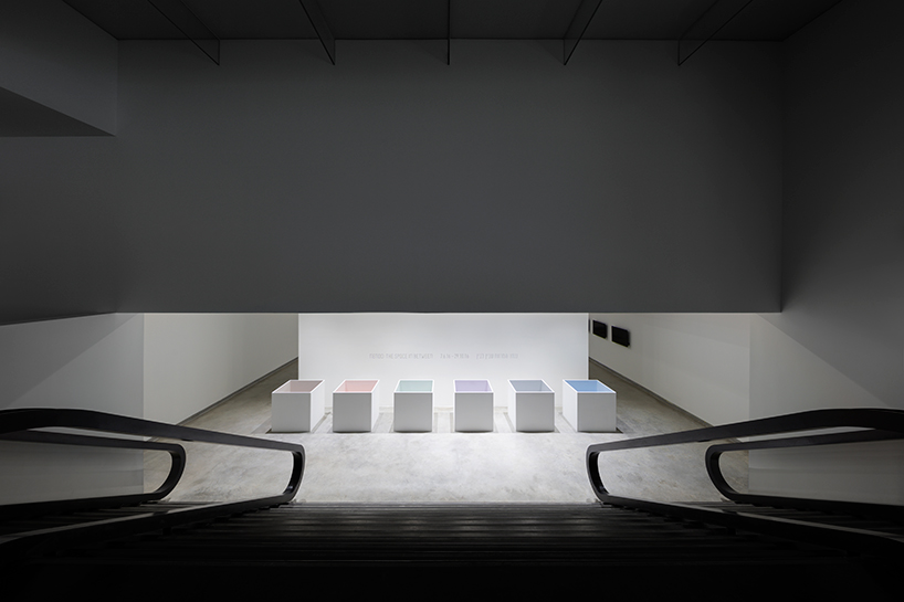
the lower gallery presents nendo-designed pieces on the theme of ‘in between spaces’
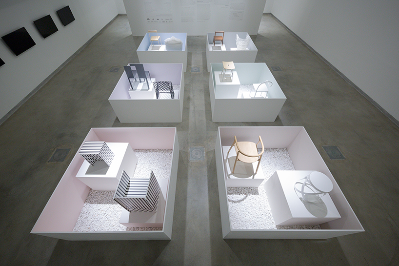
pieces presented within the open top display cases are embodiments of each category
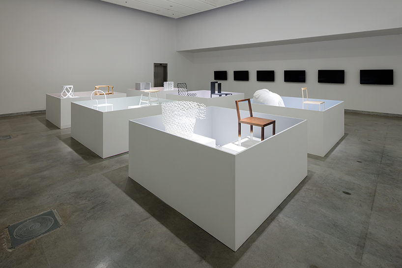
the exhibition provides an thought-provoking and immersive experience for visitors
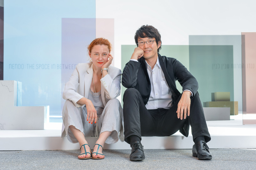
‘the space in between’ curator maria cristina didero with oki sato / nendo
image courtesy of shay ben efraim
curator of ‘the space in between’ maria cristina didero sat down with oki sato to discuss his prolific practice, the secret to his creativity and whether there is a way to find balance between industry and poetry.
maria cristina didero: what is the secret to your creativity? according to one saying, ‘creativity is, above all, the enemy of secrets.’ do you agree?
oki sato: for me personally, there are no secrets to my creativity worth hiding, unfortunately. that said, I feel like it’s probably important to take an interest in the small details that other people don’t find interesting.
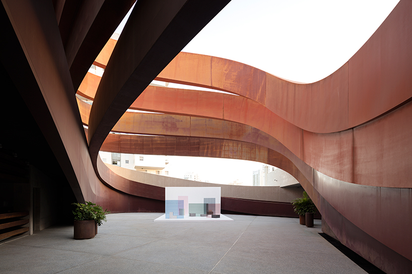
a site-specific installation has been realized in the museum’s courtyard
MCD: do you think it is possible to find a balance between industry and poetry?
OS: of course. I call it the balance between the right brain and the left brain. it’s no good to only be moved by intuition and feelings, or to only find joy in the rational, like concepts and specs. it’s the point at which the two come together that I’m always interested in.
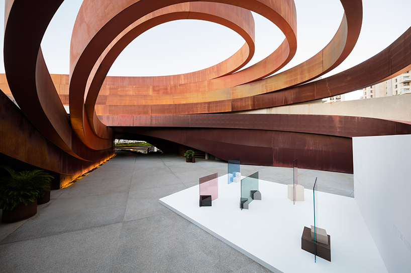
‘in the shade’ comprises a sequence of five free-standing screens built from panes of colored glass
MCD: it looks like your design started as a passion and became suddenly a dependence, a sort of addiction. you are a design-otaku (???), which I understand means a positive design addict. how can you be so creative and productive at the same time, and how do you manage to apply nendo’s way to different typologies of clients?
OS: I think that being a design-otaku is probably the reason that I can be creative and productive at the same time. when I look at things, I’m always thinking things like: ‘I wonder how this would turn out if such-and-such a designer worked on it,’ or ‘I wonder what kind of finishing touches such-and-such a manufacturer would put on this?’ fantasizing about these kinds of things is almost like a hobby for me, and I think that as a result it contributes to my ability as a designer. I don’t find it difficult at all to maintain the nendo way when cooperating with our various clients. that’s because the ‘nendo way’ doesn’t refer to any specific style or signature look, but rather is defined by the way we approach solving problems. it’s characterized by our perspective, in other words. accordingly, we intentionally try to incorporate the client’s style into superficial elements as much as possible, and creating something that is a natural fit in the client’s catalogue is what we consider ideal. that said, it’s true that more and more clients have come to request the whitish, minimalistic elements that you can see in many of nendo’s designs. if that’s what the client wants then that’s fine, but I also feel like it’s moving away from the essence of creativity a bit. I think that it’s certainly possible to incorporate nendo’s way even if a design doesn’t happen to be white
or is more complex.
read maria cristina didero’s full interview with nendo here.
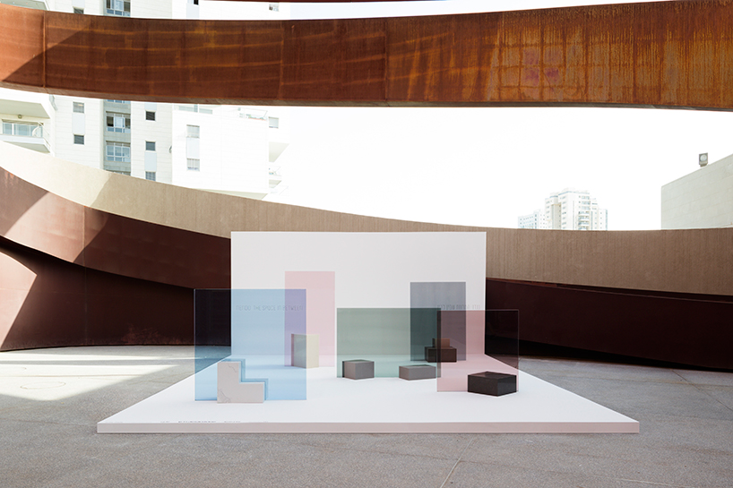
caesarstone pedestals have been positioned to appear as if they are penetrating the glass’ surface
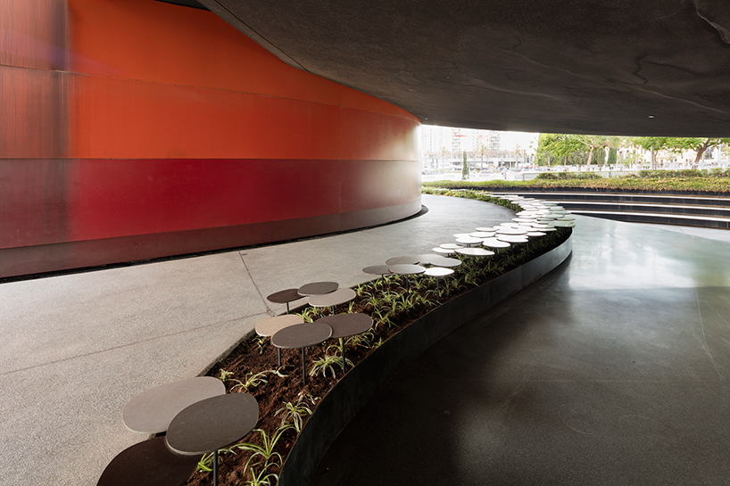
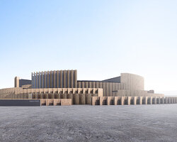
a ‘stone garden’ carries the exhibition outdoors




Save
Save
Save
Save
