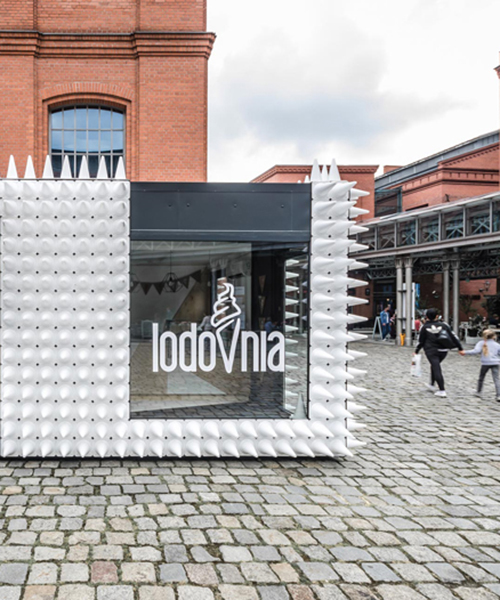
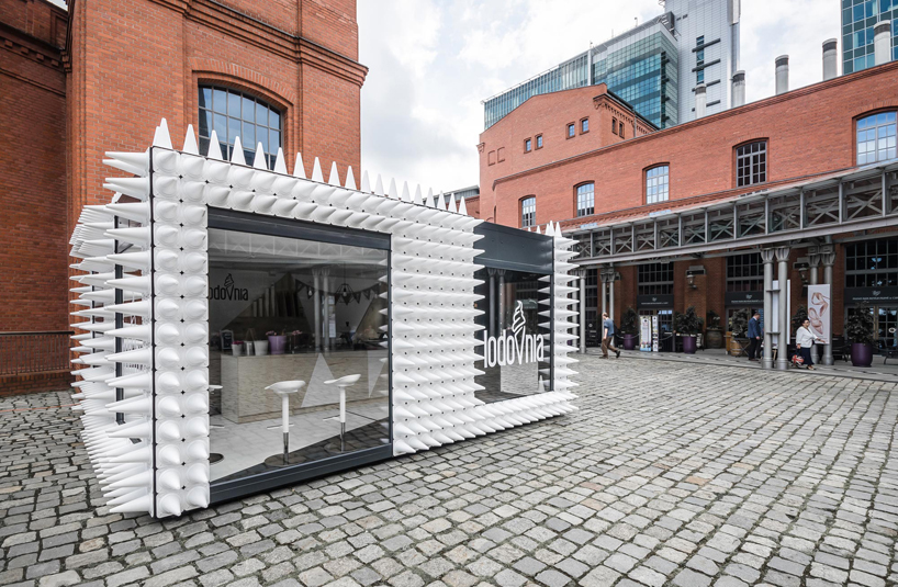
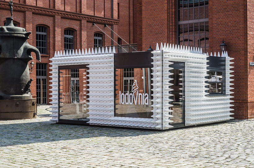
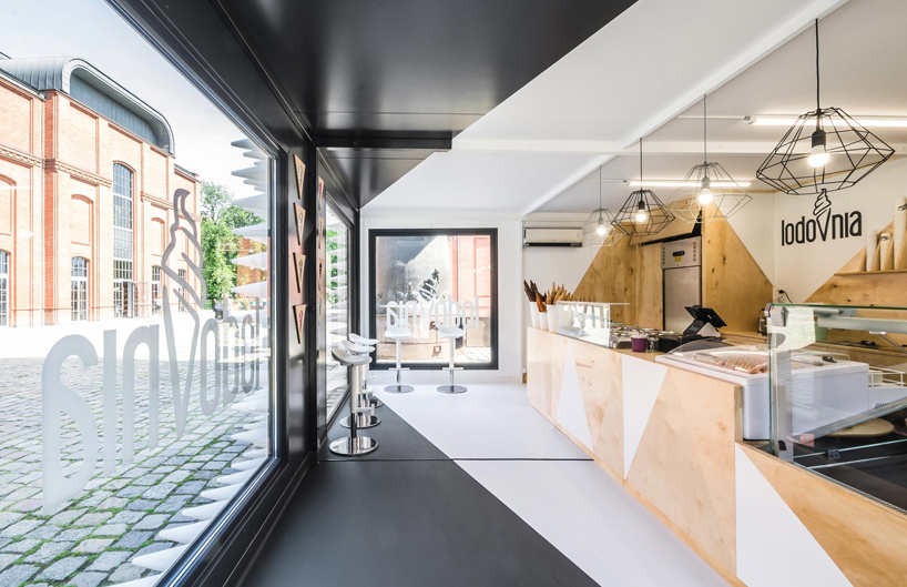
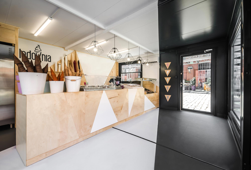
placed at the heart of poznań’s stary browar centre, LODOVNIA is a mobile ice cream shop  with a striking facade designed by polish studio mode:linasince the building took a central spot in the courtyard of art, the team approached the exteriors of the shop as if it were an artistic piece itself. 

mode:lina lodovnia ice cream shop designboom


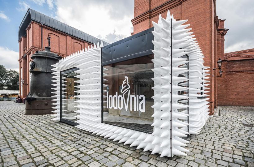
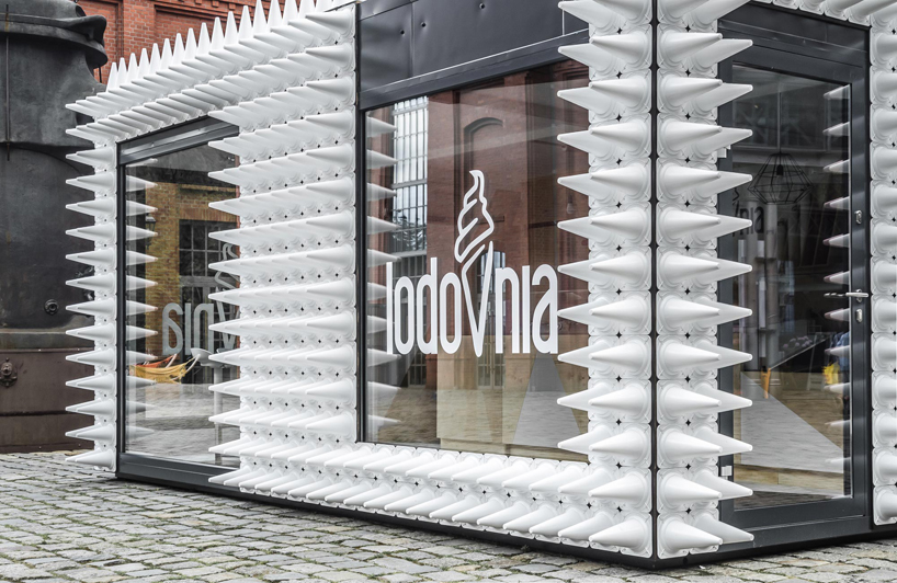
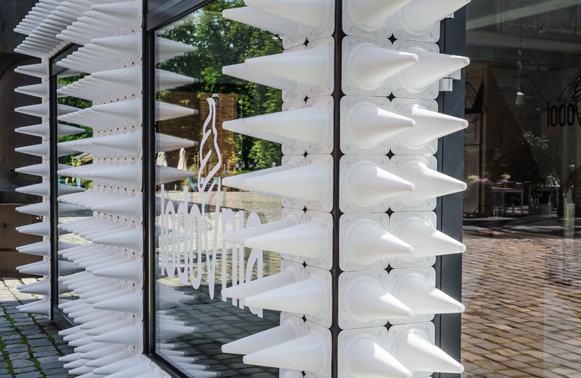
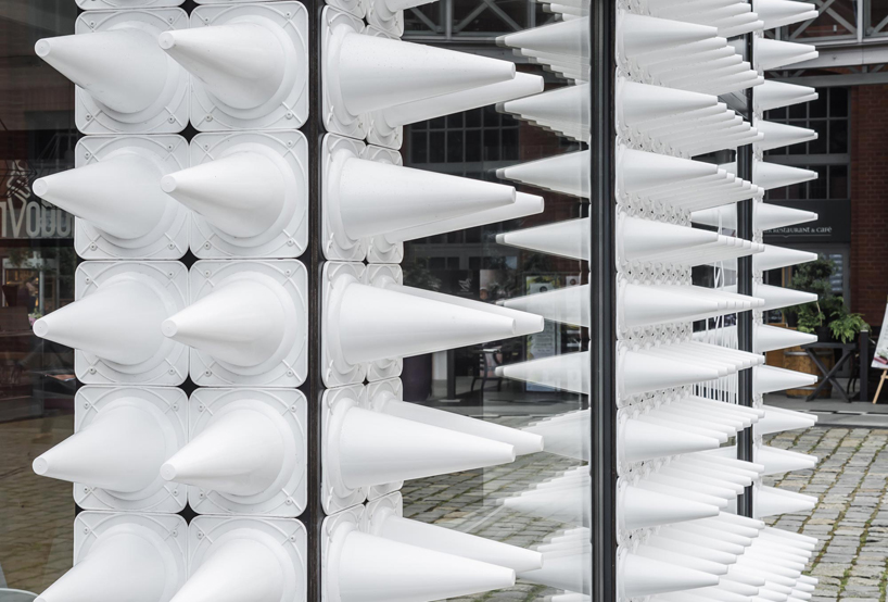
for the outer facades, mode:lina architekci extended the dark walls of  mobile the ice cream shop by using almost one thousand white sport cones, referring to the flagship product of LODOVNIA – natural ice cream in a cone. furthermore, large glazed panels not only allow visitors or passersby to peek in but they also reflect stary browar’s architecture which takes over the surroundings of the shop.

mode:lina lodovnia ice cream shop designboom


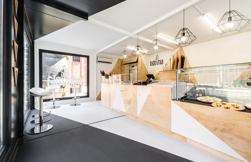
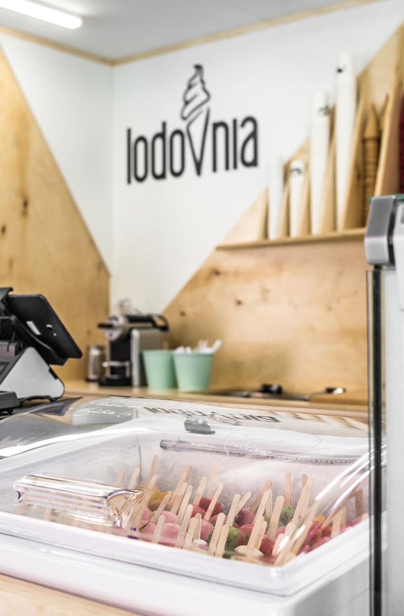
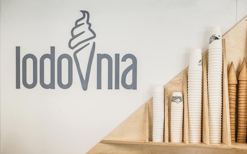
upon entering the ice cream shop, visitors are also met with a black and white interior composition, warmed by triangle-shaped elements made of natural plywood. both the triangles and sport cones further connect with the letter V in LODOVNIA’s logo, making the architectural form consistent with the ice cream store’s visual identity. 

mode:lina lodovnia ice cream shop designboom

mode:lina lodovnia ice cream shop designboom

mode:lina lodovnia ice cream shop designboom

mode:lina envelops ice cream shop in poland with an array of white sport cones

mode:lina envelops ice cream shop in poland with an array of white sport cones

mode:lina envelops ice cream shop in poland with an array of white sport cones

mode:lina envelops ice cream shop in poland with an array of white sport cones

mode:lina envelops ice cream shop in poland with an array of white sport cones

mode:lina envelops ice cream shop in poland with an array of white sport cones


designboom has received this project from our ‘DIY submissions‘ feature, where we welcome our readers to submit their own work for publication. see more project submissions from our readers here.


edited by: lea zeitoun | designboom