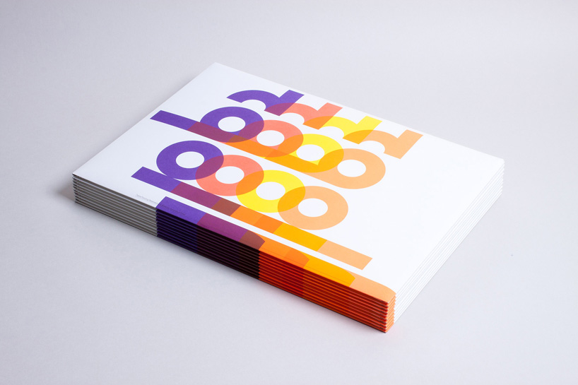
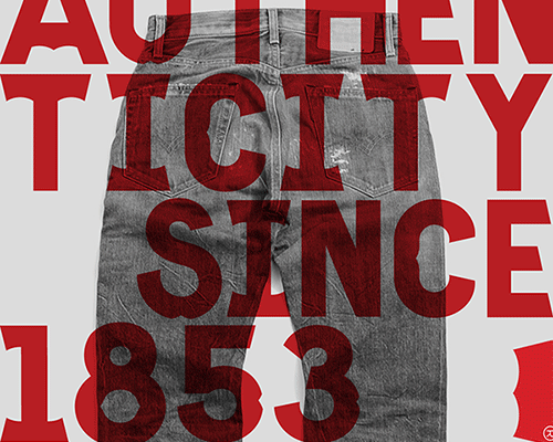
print campaign for printers generation press
designboom (DB) recently spoke to michael c. place (MCP), about his time at the designers republic and the recent projects his studio, build have been working on.
DB: you worked at the designers republic before establishing build, what made you decide to go it alone?MCP: I had been thinking of leaving to set up on my own for about 6 months. I made the decision for a number of reasons, I was a little tired of being in the studio all the time. I felt that time out of the pressure-cooker environment would be really valuable. creatively-wise the job was very fulfilling but I was a little frustrated by not being involved from the very start. typically ian would be the point of contact for a client, then pick who would be best in the studio to do the job. I felt that the interaction with the client is critical in fully understanding the project, and as a consequence of that interaction the end result is much stronger. I like talking to people, it’s an important part of the creative process. I also felt (maybe in hindsight this was being a bit dramatic) that I couldn’t do anything else but graphic design, and that by having my own studio it would prolong my career!
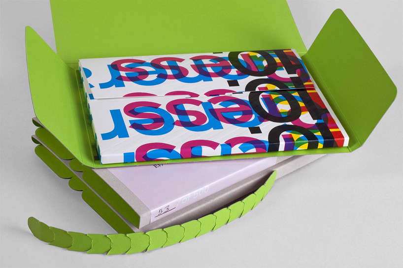 print campaign for generation press
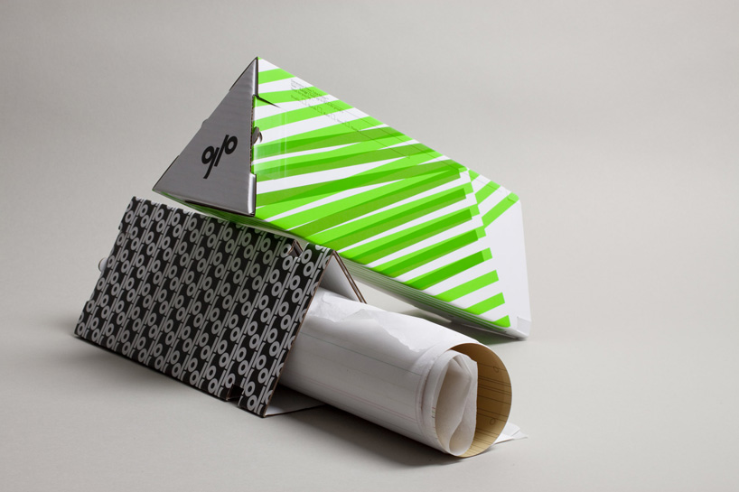 mailer for generation press
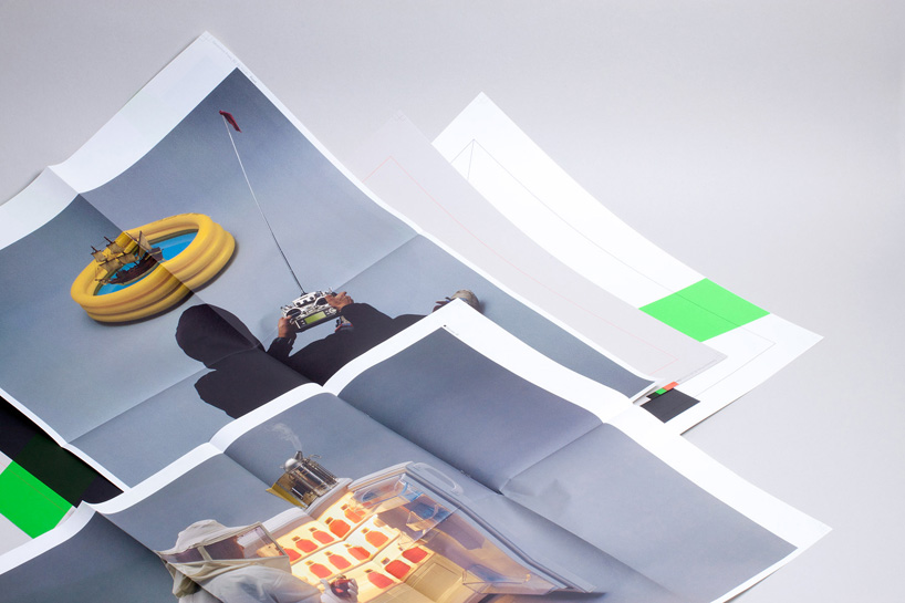 mailer for generation press
DB: how does the build experience differ to your time at TDR?MCP: I learned a lot about running a studio from ian/TDR, and have employed certain things from my time there into how we do things at build. I learned that you need to look after the people who work for you. it’s good to maintain a sense of independence, it’s very small but for instance but we chose to have the studio in walthamstow, not shoreditch/old street/soho where most studios are. the big difference is that I am in control of my own destiny, if it doesn’t work out it’s my own fault. I try to be very approachable as a studio, we don’t have big egos, we aren’t trying to be cool (not that TDR was trying), I really don’t understand people who try to be cool.
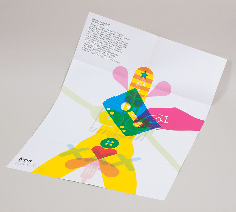 ‘collaboration’ poster for form magazine
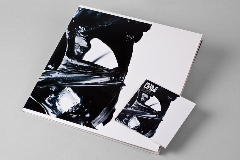 packaging for ‘los angeles’ by flying lotus
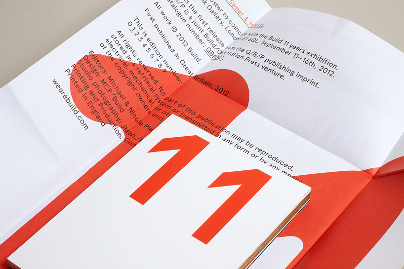 idenitity for ‘blood, sweat & 11 years’ – exhibition to celebrate the 11th anniversary of build
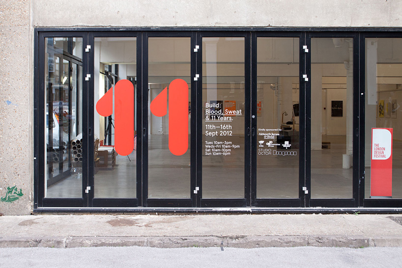 ‘blood, sweat & 11 years’ exhibition
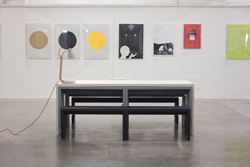 ‘blood, sweat & 11 years’ exhibition
DB: how many people work at build and how do you share your workload?MCP: there are 4 of us, nicky (business director), joe (designer), sophie (studio assistant) & me (creative director). we are a small team, and most peoples perception of the studio is that we are much larger. nicky deals with the business side, the financial side, but is also involved in a degree also in the creative side. she has a very organized brain, which I do not really have. joe works closely with me on projects, most follow a more traditional creative director/designer relationship where I give visual clues and suggest directions which joe acts on, and develops to joe doing his own projects start to finish, and the same for me certain projects are done entirely by myself. this for me works really well, I trust joe to do a great job, and he thinks differently than me, which is great. sophie works more closely with nicky, she does a certain amount of admin, to organizing things like our 11 year anniversary exhibition we did last year as part of the london design festival. sophie is our newest member and has fitted in incredibly well. each person in the team has their own skill set that is used solo, but when added to another team member makes for a very strong team.
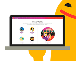
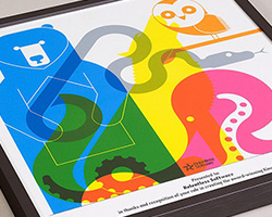
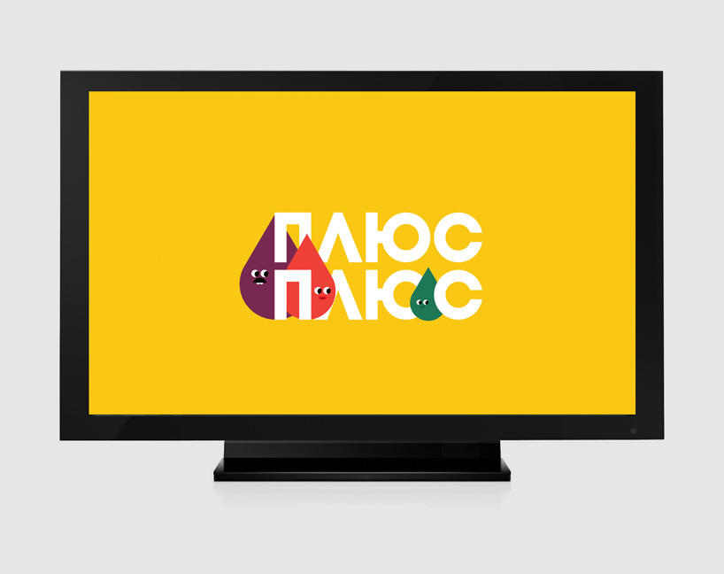 identity and character design for ukrainian kids TV channel ‘plusplus’
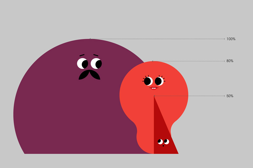 ‘plusplus’ indentity
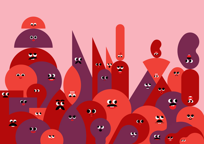 ‘plusplus’ indentity
DB: which have been your most significant and satisfying projects to date and why?MCP: most are satisfying in some way or other, but the one that springs to mind we did last year was the branding of a new ukrainian kids TV channel called ‘plusplus’. it was really satisfying for a number of reasons, the main being it didn’t going well, client feedback was terrible but we managed to turn it round and deliver a brilliant end result that the client really loved. it was one of our biggest projects and the whole team worked incredibly professionally in the face of at time immense pressure. we also worked with some great external people including animators on a fantastic set of teasers and idents. creating a world for clients is something we really enjoy, and the plusplus world we produced was really fun and effective. I also think it was a significant project for us as a studio because of the size of the project, being trusted with something like this was very rewarding.
we’ve also just completed a brand refresh for made, a relatively young dynamic furniture retailer. we were brought in to assess their current brand assets, including logo & typography. it was really satisfying to see what a big impact it had on the business, also seeing ads on the tube and in the press was really exciting. one upcoming project we are also really looking forward to, and was very rewarding to win (from a shortlist) is the graphics/identity for the barber osgerby curated show at the design museum london. we are all big fans of the work the duo produce so we are really excited to start work on that project.
 dsigndot identity
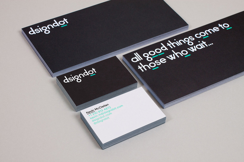 dsigncot stationery
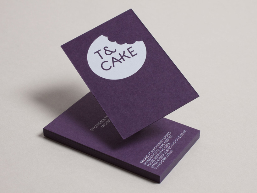 t&cake identity
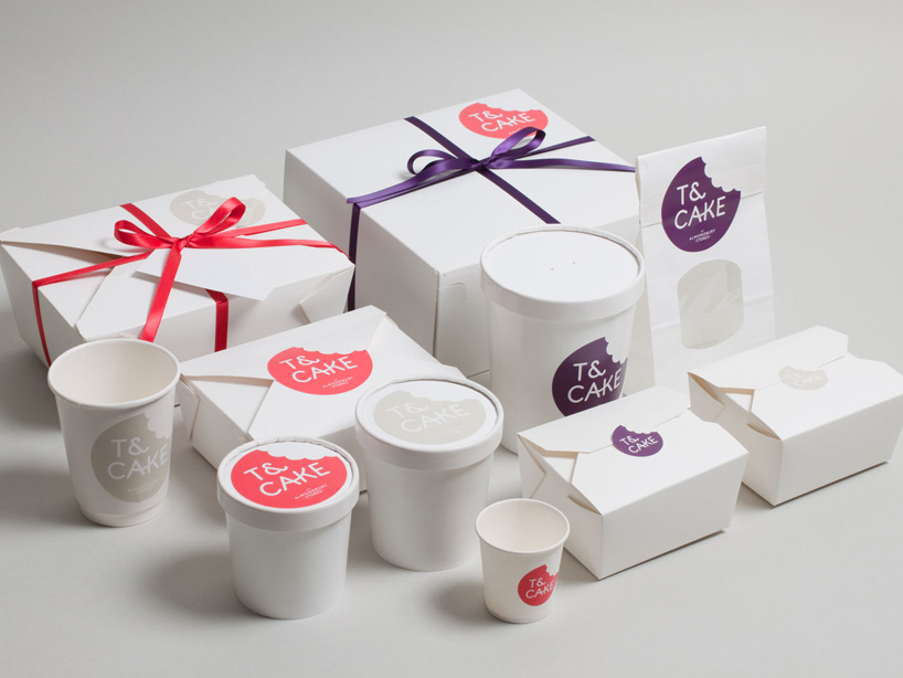 t&cake packaging
DB: what is your favourite type of project and why?MCP: favourites tend to be favourites for different reasons, for example we did the branding for a small modern (licensed) café called t&cake who are based in almondbury just outside of huddersfield, west yorkshire. this was a favourite because the clients stephen & tracy jackson are dream clients. they really understood and valued our expertise, they definitely weren’t pushovers by any stretch but they genuinely understood the value of good design. it was a real pleasure working with them to ultimately help their business. so one favourite type is projects with great clients (I know this seems obvious, but isn’t always the case). we have a lot of great clients, and I’ve always said that design is a real journey, and we enjoy taking that journey with our clients. it sounds really cheesy but we have a lot of clients that have turned into good friends which is fantastic. the other type of favourite is one that spans more than one medium as an intrinsic part of the brief. so for instance we did a project for nokia called ‘wordplay‘, the brief was ‘to show off new language specific versions of the nokia pure typeface (designed by dalton maag) in a fun and engaging way’. the idea spanned identity, print, animation and an app. executing the idea across all those different platforms is something that is really enjoyable, making each work separately, but together they become much stronger.
 made identity
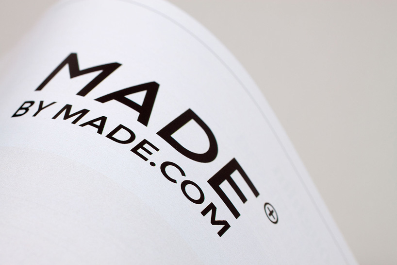 made identity
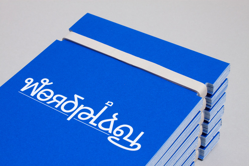 wordplay logo
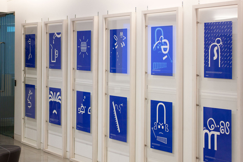 wordplay exhibition
DB: which artists or designers would you say influence(d) you the most?MCP: I’ve only had two full-time ‘jobs’, leaving college I worked for trevor jackson and the designers republic with ian anderson. those two people had a huge impact on me as a designer, both massive characters and very good at what they do. so I think a certain aspect of our high attention to detail came in part from learning from them, we have a small saying at build ‘it’ll do, won’t do’, that’s something we strive to achieve in all our projects.
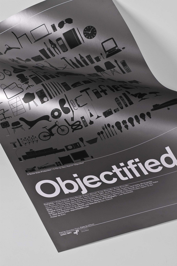 poster for the film ‘objectified’
DB: besides your professional work, what are you passionate about?MCP: I wouldn’t call it a passion, but I collect letraset catalogs, so it’s always a thrill when one I haven’t got come up on eBay. letraset holds a special place in my heart, it was one of my first windows into graphic design when I was about 13 years old. one of my school friends had a catalog that he would bring in, I had never seen one before and remember being very intrigued. it seemed very ‘exotic’, I remember drawing some of the typefaces from the catalog into my school books, calypso was a favorite back then. collecting them now is something I really enjoy, it feeds back into my work. typography is something that is a big part of what we do, not creating type (though we do a fair amount of that) but the use of, and the catalogs feed my interest. I also think letraset is an interesting company, seeing how it fits into this by and large digital world. I’d love to produce/curate a letraset exhibition.
DB: what is the best and worst pieces of advice you have ever been given?MCP: one of my old tutors parting shot to me at newcastle was ‘don’t let the bastards grind you down’ which has always stayed with me. not sure if that’s the best or worst though!
—more visit build’s website and all their recently launched online shop.
