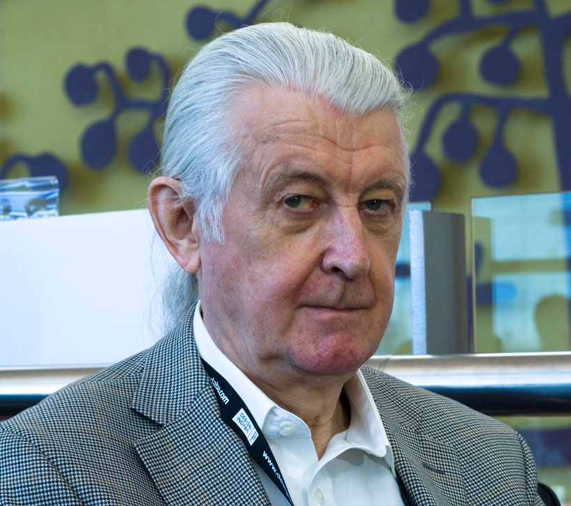
matthew carterportrait © designboom


one of the most famous typography designers, matthew carter (1937) presented at design indaba conference in cape town.   readers of periodicals, typographers, and users of computer design and word processing programs have all come into contact at one time or another with his work. he is a type designer with more than forty years’ experience of typographic technologies ranging from handcut punches to computer fonts.


after a long association with the linotype companies he was a co-founder in 1981 of bitstream inc., the digital type foundry, where he worked for ten years.he is now a principal of carter & cone type inc., in cambridge, massachusetts, designers and producers of original typefaces.


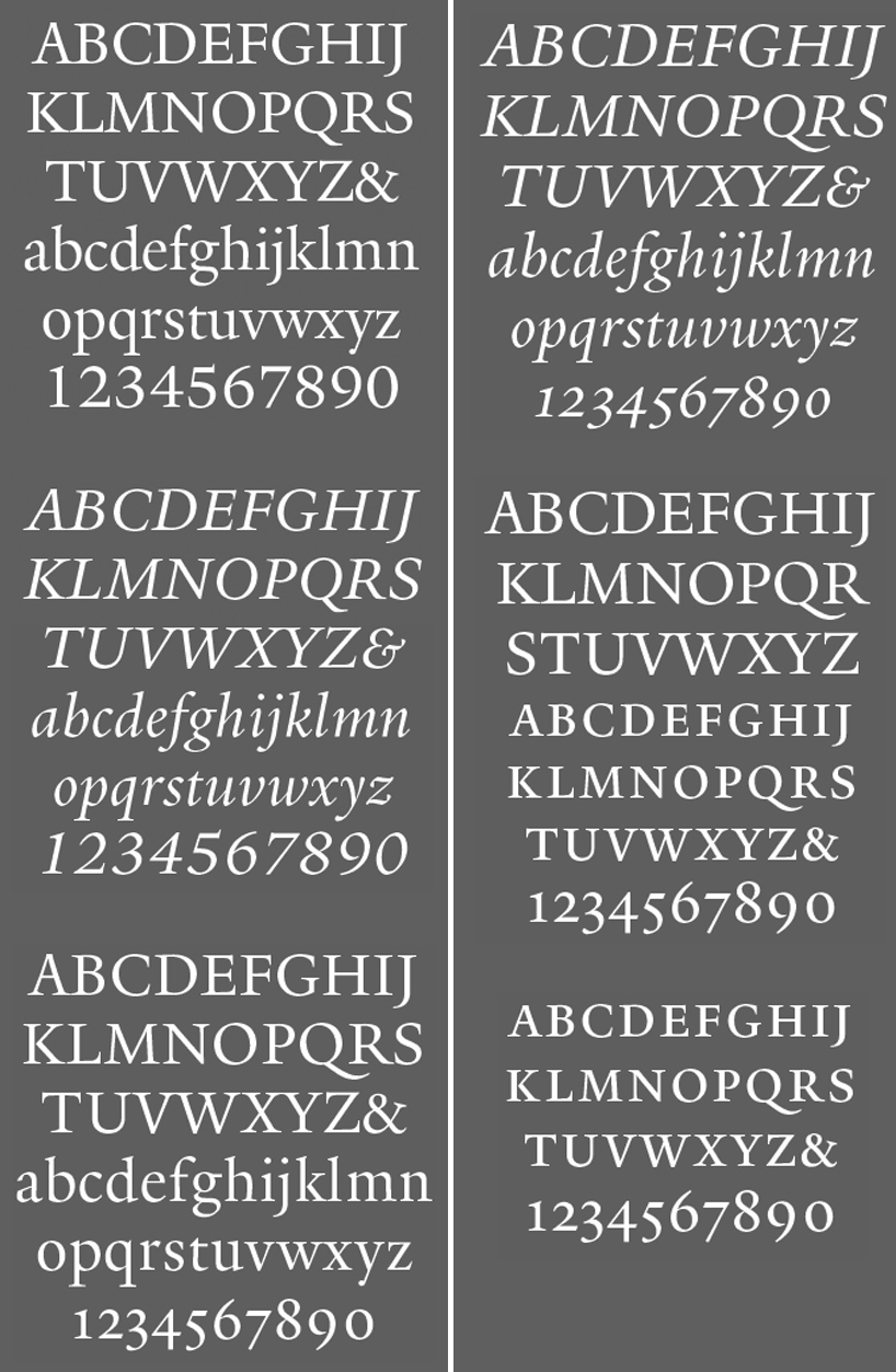
carter’s type designs include itc galliard, snell roundhand and shelley scripts, helvetica compressed, olympian (for newspaper text), bell centennial (for the u.s. telephone directories), itc charter, and faces for greek, hebrew, cyrillic, and devanagari, an alphabet used in india. for carter & cone he has designed mantinia, sophia, elephant, big caslon, alisal, and miller.


carter & cone have produced types on commission for apple, microsoft (the screen fonts verdana and georgia), time, newsweek, wired, u.s. news & world report, sports illustrated, the washington post, the boston globe, the philadelphia inquirer, the new york times, businessweek, and the walker art center.


‘typefaces have an emotional content. people get upset if the magazine is redesigned and they don’t like the new typeface.I get asked commonly, ‘what’s your favorite typeface?’ and  I don’t have favorites in that sense. what I react to is a really good use of typeface or a really bad use of a typeface. it’s a very subjective reaction.


if somebody thinks it’s good for an intellectual journal, fine. if somebody thinks it’s good for a children’s book, fine. ‘matthew carter


matthew carter at design indaba conference 2013 in cape townyale font


matthew carter at design indaba conference 2013 in cape town

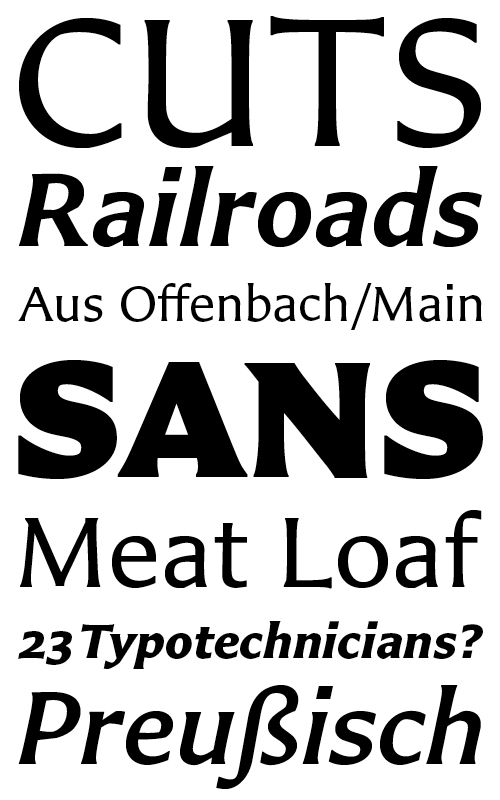
the designer’s sans-serif typeface, ‘carter sans’, partly influenced by fellow typographer berthold wolpe.


‘carter sans’ shows a modern approach to the construction of its capitals. their squarish proportions are perfect for making grand proclamations. these letters are most at home when carved into the stone of a 19th century cathedral, or cast in lead, coated with black ink, and rammed into paper by a big, sturdy, iron printing press.


‘I’ve survived into the digital age because I regard it as the best medium for making type that’s ever existed.the current letterpress revival is a simple reaction against the computer but I’m fairly sympathetic. I would never get involved in letterpress printing or bookbinding, but ut I think it’s very healthy.

in the past, many people came to ‘the business of type design’ from other disciplines such as calligraphy or cutting letters in stone. now the opposite is true. anyone who’s got a computer and FontLab can at least try their hand at designing type. it’s much harder to learn how to cut a quill pen or how to cut letters in stone.’


matthew carter at design indaba conference 2013 in cape town

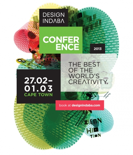
design indaba conference 2013matthew carter has been one of the speakers at the 3-day design conference in cape town, south africa. the design indaba conference, which took place at the cape town international convention centre from february 27 to march 1, featured forty protagonists from the architecture, art and design world.