mens health ‘heart’ – a paper anatomical heart created for an article about heart disease in mens health magazine. photography: owen silverwood kyle bean interview


in the first of a new series of articles looking at how paper is used in contemporary design and illustration designboom talks to british designer kyle bean about his work.


DB: please could you tell us briefly about your background and how you came to have your studio in it’s current format?


KB: I was born in exeter and grew up in different places along the south coast of england, as a child I always liked making models and drawing so it’s clear to see my progression. I studied illustration at the university of brighton where I put my model making skills to good use and since graduating I have continued to work in a similar manner, often creating tactile illustrations and bespoke set pieces for a variety of clients in the editorial, advertising and fashion industries. I split my time between working from my studio at home in brighton and london to meet clients, photographers and directors who I collaborate with.  I generally work alone or with a photographer. occasionally, if a big project comes up I have a coupleof assistants who help me with the making.


whats a typical day at your studio? it’s good if you are working from home to set yourself a bit of a routine to stop you from procrastinating so I like to start work at 9am each day. I catch up on my emails to start the day and then jump straight  into making something.  occasionally I go for walks in brighton, it’s a great place for getting inspiration  as there are so many eclectic shops. I tend to stop working around 6:30pm but sometimes a tight deadline can make that difficult to achieve.


could you tell us a bit about your design process? if it’s an editorial brief, with an article to read then I print off the article so that I can annotate and distill the text down to a simple visual concept. the material I use to create the piece usually plays a pivotal role in communicating the right message so I’m also thinking about that simultaneously with the overall visual. of course paper is a material I often like to use, mainly for its versatility and graphic finish. once I have the idea for the project I set about making a sketch for clients approval, then sourcing the materials for the job. once the concept is approved then I start the making.


‘peugeot – paperwork’ design & art direction for 30 second animated TV commercial. directed by joseph mann produced by james bretton at blinkink agency: euro RSCG

making of video for ‘peugeot – paperwork’ video created by jake hopewell and joshua hine


you work a lot with paper what do you like most about these materials? it’s the versatility that I am attracted to. I work with a lot of materials, but paper is by far the most accessible.  it comes in so many varieties of colour, texture and thickness that it has the ability to look totally different from one project to another.


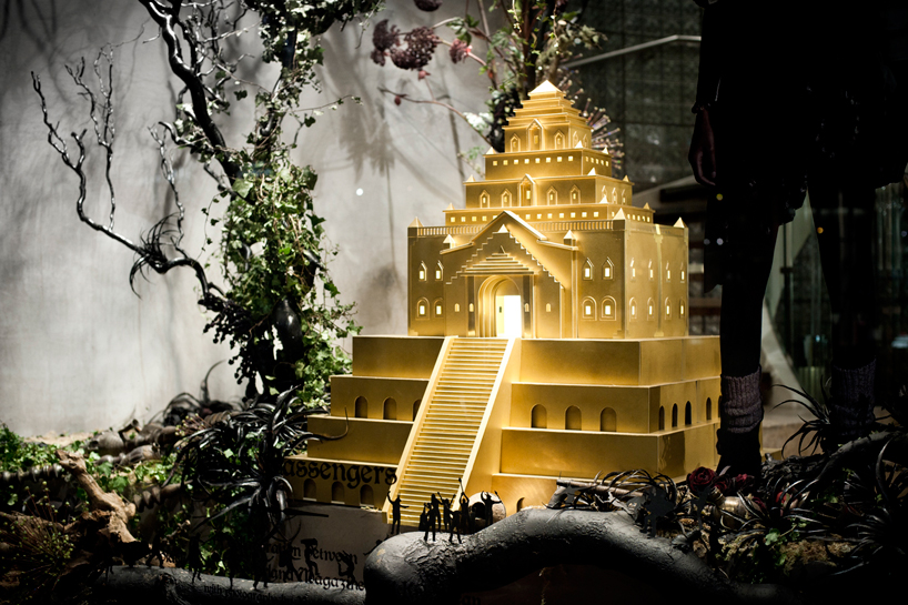
which of your card or paper based projects has been the most challenging to execute?scale wise, making the golden paper temple for diesel and the fairytale castle for selfridges  were pretty time consuming. technically, the paper anatomical heart I created for men’s health because it was hard to re-interpret an organic shape into something geometric.


which artists or designers would you say have influenced you the most? I love seeing people who have a clear passion in their craft. theo jansen makes kinetic sculptures that are awe inspiring. I have always loved the visual tricks in m.c. escher’s work and the way fritz kahn drew fun  parallels between the human body and the everyday machines that we rely on. cornelia parker is another artist who’s interests resonate with me.


there’s been a rise in the number of artists and designers who are going back to rendering their work by analogue means – why do you think this is? there is always a back and forth between people wanting to really push the limits of technology and those who prefer to work in ways which are more analogue. its an interesting debate and for me personally, since science and technology is often a massive source of inspiration in my work, which could be seen as quite ironic. a lot comes down to personal taste, I remember at college naively thinking that in order for me to  study illustration for a degree I was probably going to have to create imagery solely using adobe photoshop and illustrator because that is what I was seeing in books and on blogs at the time. it worried me a little as I love making things physically with my hands. I was prepared for anything and I certainly learned a lot by experimenting with computer software.  I suppose a lot of people are probably having similar experiences to me, whereby they want to find  an outlet for their need to make things by hand in what seems like a computer dominated industry.


how much does the use of the computer feature in your work? despite the fact that the most significant part of my projects are made by hand, computers are an important part  of my design process. I research on a computer, I communicate to clients, create design mock ups using photoshop  and crop/prepare the final photographs on the computer. I do try to keep retouching to a minimum.  despite the fact that my models and illustrations are made by hand, I’m still spending about half of my time  on a computer and that’s enough time for me.


what’s next for you professionally? I am contemplating ways to develop a project more down a product or packaging design route.  I would also like to do some more display work, as the majority of my work is smaller scale editorial.  I’m also starting to think about preparing for an exhibition at some point, it would be good fun to show some of my physical work alongside prints.

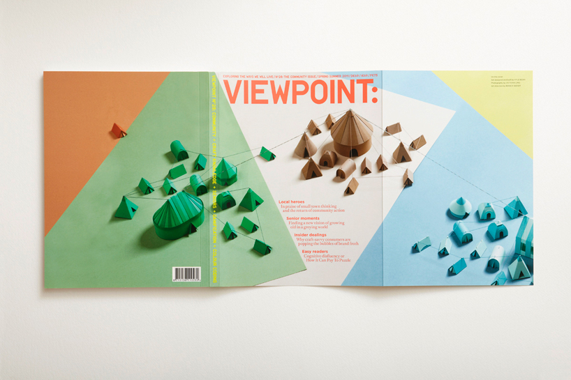
kyle bean interview viewpoint ‘communities’ cover

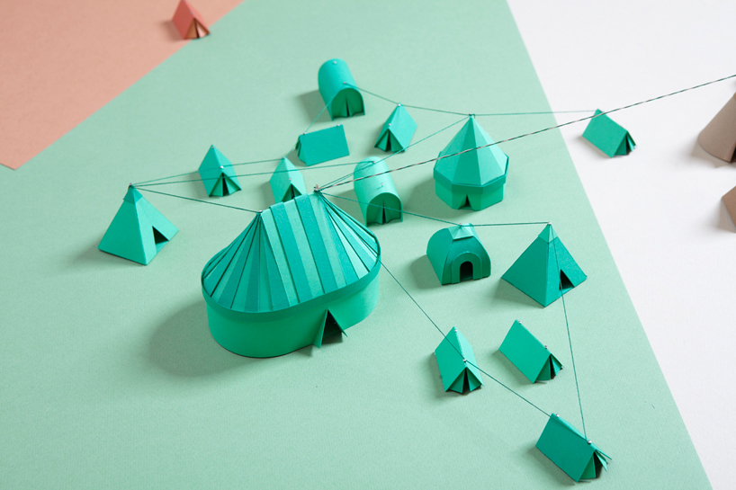
kyle bean interview viewpoint ‘communities’ cover – detail

kyle bean interview diesel black gold windows design and art direction for window and in-store displays for diesel’s flagship london store on new bond street. photography: lex kembery.
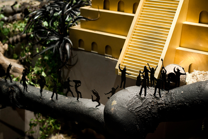
kyle bean interview diesel black gold windows – detail

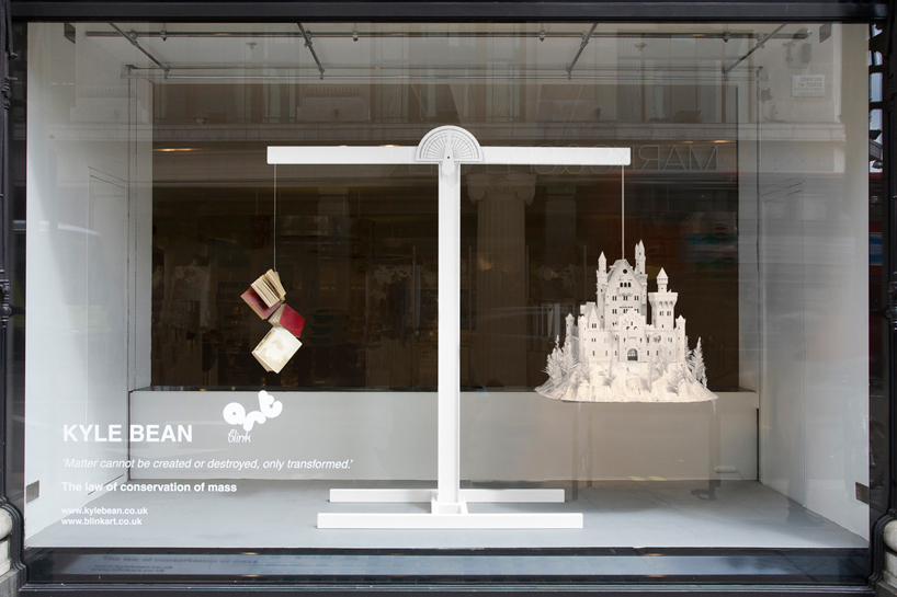
kyle bean interview selfridges: transformation a series of 5 window displays inspired by the law of conservation of mass: ‘matter cannot be created or destroyed, only transformed’.
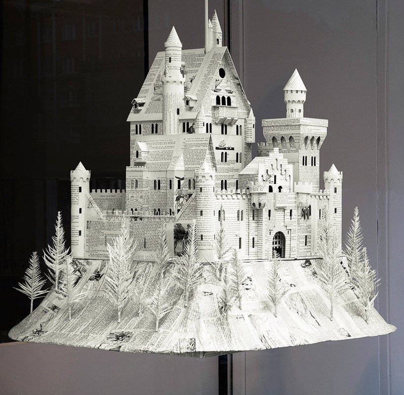
kyle bean interview selfridges: transformation – detail

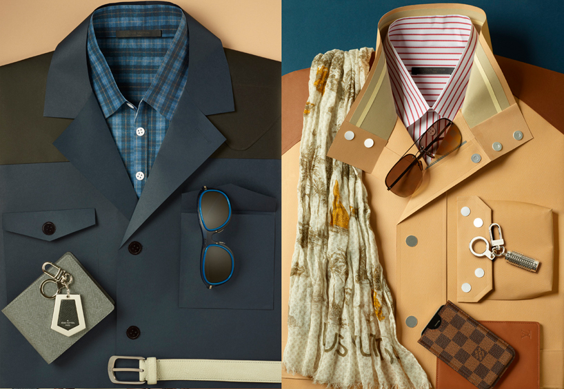
kyle bean interview louis vuitton suits paper suits created for a series of images showcasing LV accessories. photography: lacey.
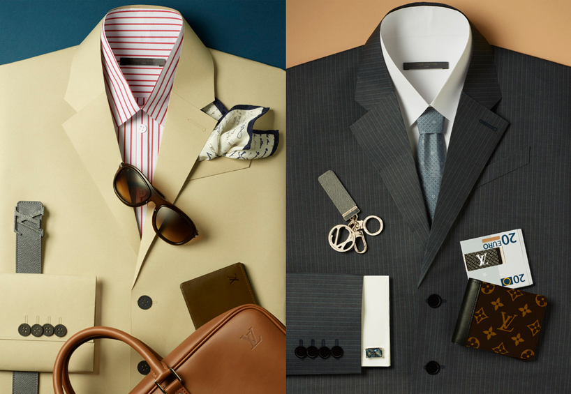
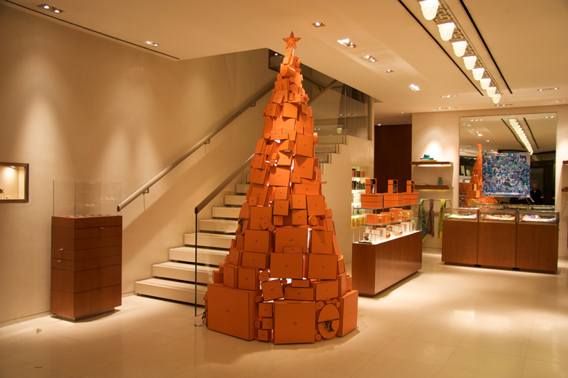
kyle bean interview louis vuitton suits photography: lacey. kyle bean interview hermes pour liberty a set of models for a display at liberty made entirely out of hermes packaging
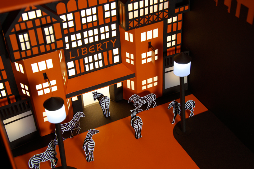
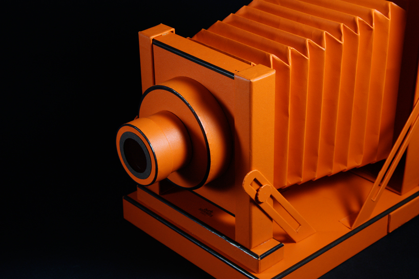
kyle bean interview hermes pour liberty

kyle bean interview hermes pour liberty

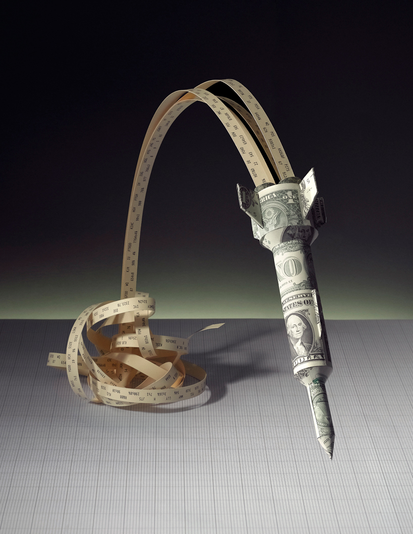
kyle bean interview wall street rocket scientists editorial illustration for scientific american. photography by owen silverwood
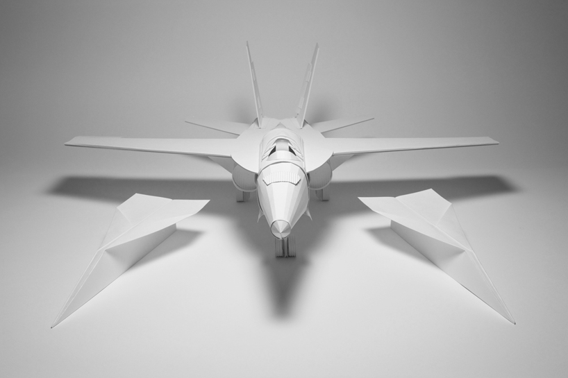
kyle bean interview paper plane

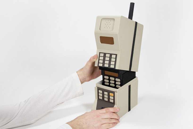
kyle bean interview mobile evolution matryoshka ‘doll’ made from mobile phone typologies
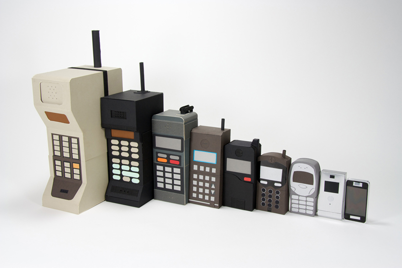
kyle bean interview mobile evolution

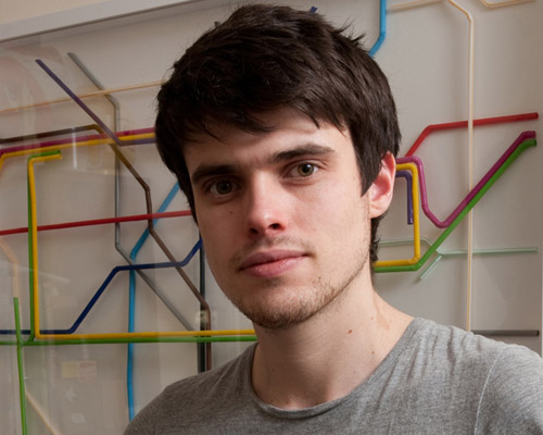
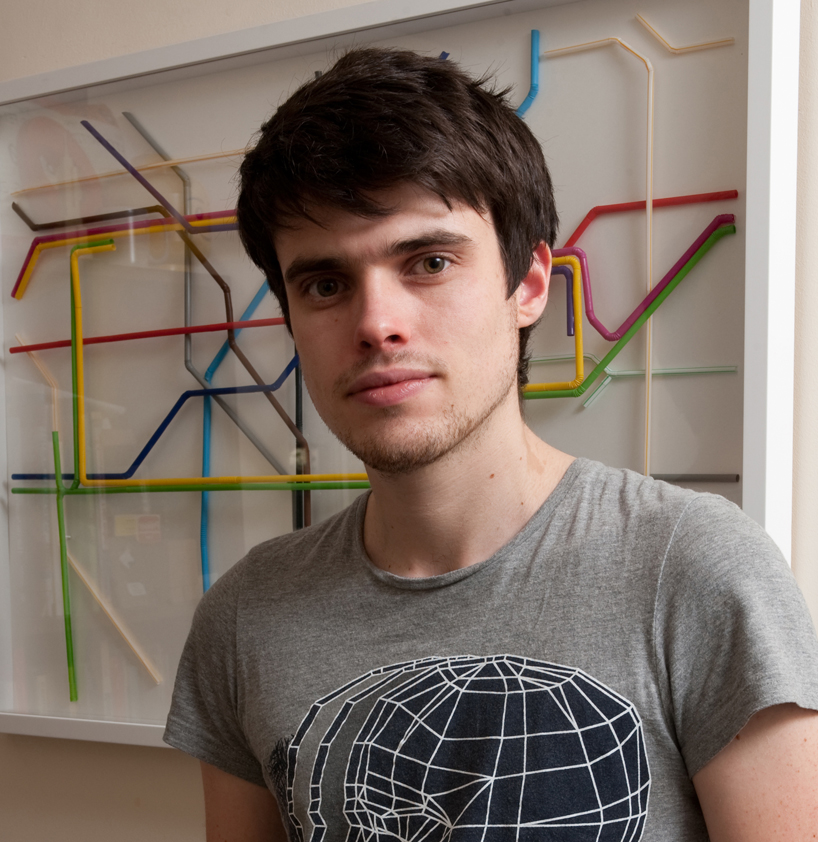
kyle bean interview kyle bean