yesterday the brooklyn nets unveiled their new identity designed by JAY Z (part owner of the team).
— following text from the net’s press release
the new primary logo – created by brooklyn’s own JAY Z – retains the shield from its previous iteration, and adds that iconic brooklyn ‘B’ to the basketball that has been part of every logo since the franchise’s 1967 inception as the americans. the dodgers had their lettermark, and the nets have added another model for the borough to bear. ‘brooklyn’ of course, is spelled out below. nets CEO brett yormark called this ‘the new badge for brooklyn’ and JAY Z believes the design’s boldness demonstrates confidence in the new direction.
 primary logo
the new brand identity reflects the new york city subway signage of 1957, when brooklyn last claimed a major league franchise. saying the brooklyn nets are now part of the conversation, yormark praised the cultural icon and nets investor for his taste-making abilities, as the lone NBA team to wear black and white as its primary colors.
the brooklyn nets have arrived. as a born-and-raised brooklyn resident, whose parents still live here and work minutes away from the barclays center, it’s a day i’ve been waiting for since the proposal was first floated in 2003. and it’s a day that brings a new look to professional sports, a timeless one grounded in city history: the signage of new york’s unparalleled subway system.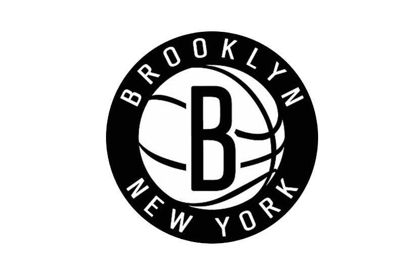 secondary logo
the secondary logo, of the ‘b’ inside a basketball, surrounded by the words ‘brooklyn new york’ immediately popped an image into my head: ‘planet brooklyn’ it’s hard to explain the pride native brooklynites feel for their home (‘BK’, ‘bucktown’ the ‘brooklyn zoo’), how outsiders don’t get it and never really will; one measure might be trying to think if you’ve ever met someone from brooklyn who said they were from ‘new york.’ another could be the lines i once wrote in a spoken word poem:
‘I like to sport attitudes like I’m better than you because I’m from brooklyn … and that’s just how we do.’
you can find more information about he brooklyn nets here and brand new have reviewed the new identity here.

variations of the logo
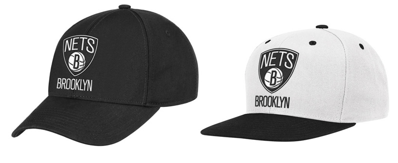
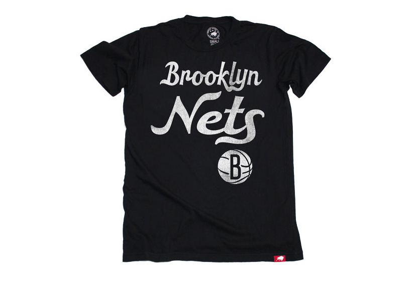
the nets are the only team in the NBA to use a color scheme of black and white (although grey is used in the merchandise)

— DESIGN-AEROBICS – GRAPHIC DESIGN 2012 ONLINE COURSE – STARTS MAY 17
GRAPHIC DESIGN 2012
duration may 17 – july 17, 2012
make graphic design work for you. with this course you’ll enhance your understanding of the basics and learn more about current and emerging developments within the field.
• brush up on the basics of graphic design such as composition, color, typography and representation • further your knowledge of print and on-screen applications • gain practical knowledge that you can apply to real-world problems • have the opportunity to enhance your portfolio by developing several design projects related to the theme • our instructors will help you verify your ideas so you can optimize them as much as possible during the course • you also have the opportunity to share your work with other participants on the course

