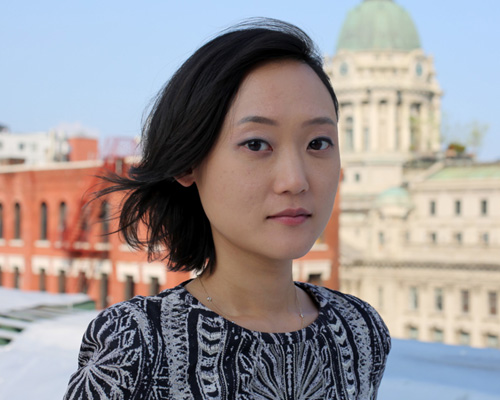
min lew, creative director at base design
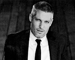
min lew was born in frankfurt, raised in seoul and now calls brooklyn home. as the creative director and partner at base design in new york she divides her time between designing, directing, and managing for wide range of clients that include the museum of modern art, coca cola and the gwangju biennale among others. she currently teaches at the school of visual arts and is also an active board member of AIGA new york.
designboom: please could you tell us about your background and what made you want to become a designer?
min lew: my path to becoming a designer is a combination of culture, education and passion. I was a korean kid living in germany going to an international school. from this cultural collision, I was confronted with letterforms representing the different languages and cultures, plus a mother who insisted that I know how to write all of them properly. this foundation in writing led to my interest in calligraphy. next, I was obsessed with detective novels growing up. I loved the notion of putting pieces of information together to solve a problem. finally, I was an aspiring psychiatrist as a teenager. I was always looking for ‘the why?’ of things, perceptions, and people.
a combination of these three different experiences serves as a metaphor for being a graphic designer. everyday, I try to put together a brand story or find a solution to a problem. I use language and letterforms to help people and businesses articulate their ‘why’ – what they believe in; why they exist; why they matter; and, why the public perceives them in a certain way. after establishing the ‘why’ I can then figure out the ‘how’ of expressing the right message and design.
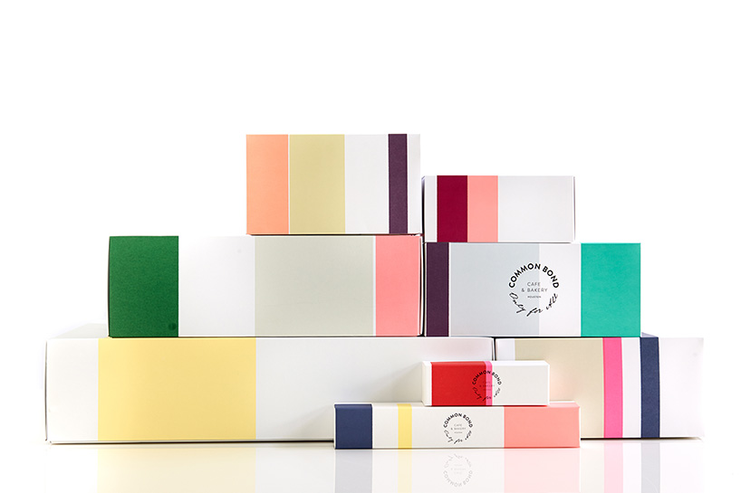
common bond visual identity – packaging.
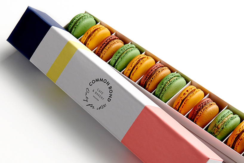
common bond visual identity – packaging.
DB: how would you describe your approach to design?
ML: at base we don’t really have ‘strategists’ or ‘account managers’. all projects are led by creatives and approached in a ‘strategically creative’ way. I believe in this methodology, which has become our signature. strategic thinking, concept, design and language are totally interwoven and presented as one holistic brand story.
DB: what would you say your strongest skill is?
ML: zoom in, zoom out.
fleur du mal visual identity – logo.
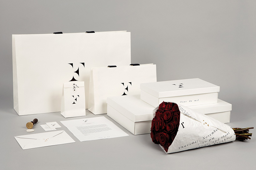
fleur du mal visual identity – packaging.
DB: what is the attraction of branding for you?
ML: branding gives meaning to businesses and makes communication between people possible. the fun is in making the complex simple and the informative entertaining by using ideas, forms, messaging, colors, images, materials, technology and more.
DB: what mistakes or ‘traps’ should one avoid when creating a brand?
ML: up near the top of the base design manifesto is ‘first concept. then design’. young designers often fall into the trap of what I refer to as ‘pixel pushing’, which is when the designer doesn’t have an idea or loses sight of the original concept and ends up spending endless hours in front of the screen. falling prey to pixel pushing makes it very difficult to make decisions and can even drive the designer further away from finding a solution to the problem presented.
neue house visual identity – logo.
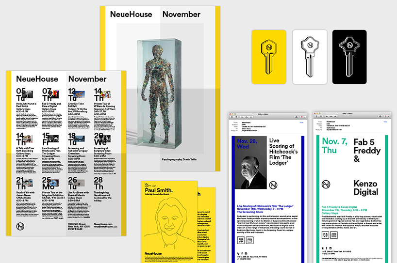
neue house visual identity – various print and digital applications.
DB: what are your thoughts on specialization vs generalization?
ML: a wise friend once told me a quote that’s attributed to general giap of vietnam: ‘when you gain territory, you lose concentration. and when you gain concentration, you lose territory’. I believe both specialization and generalization are forms of growth. one can choose to grow vertically or horizontally.
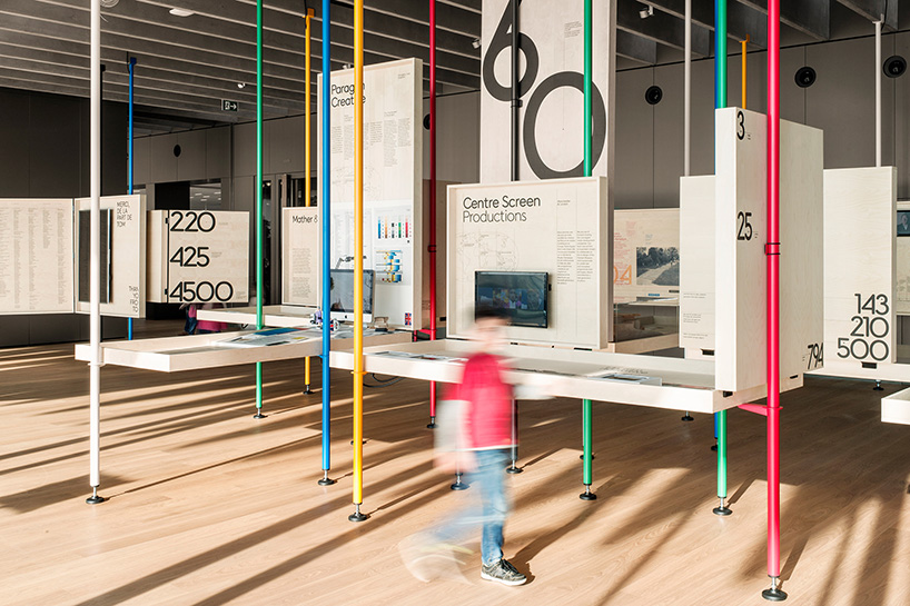
the olympic museum identity – exhibition design.
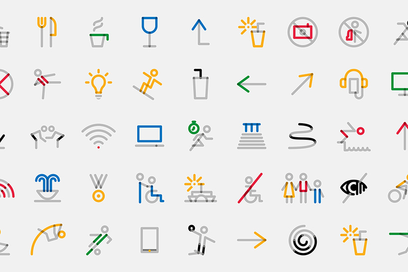
the olympic museum identity – pictograms.
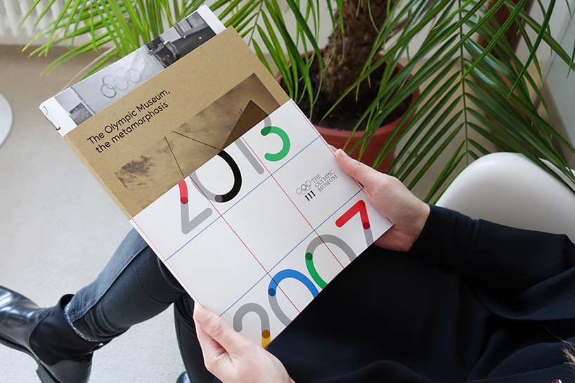
the olympic museum identity – catalog.
DB: do you think it’s important for a graphic designer to be able to draw?
ML: I am terrible at drawing, so perhaps not! however, I do believe it is important for designers to be able write. it forces us to sharply articulate our thoughts and get to the core of things. we are communicators, and the words we use to design become as important as the way something looks. when building identities, words play a crucial role – they give a voice and a personality to the brand. sometimes humorous, other times poetic, wording is really an integral part of design.
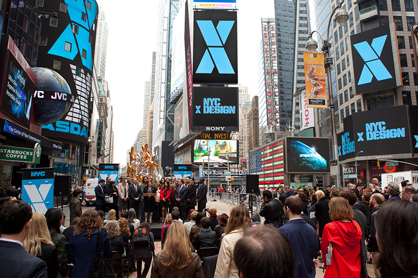
NYC X design visual identity – advertising in times square.
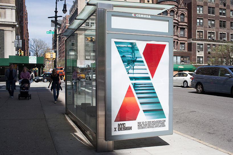
NYC X design visual identity – bus shelter advertising.
DB: how do you think online design resources have influenced design?
ML: what a rich visual world we live in! influences are really important. they can push, challenge, inspire and most importantly, contextualize one’s work when used well. I love that I can see great designs and ideas that transcend geography and time periods. that said, there is an argument for how online resources can fuel homogeneity in tropes and trends and whether or not reference overload takes away the space for originality.
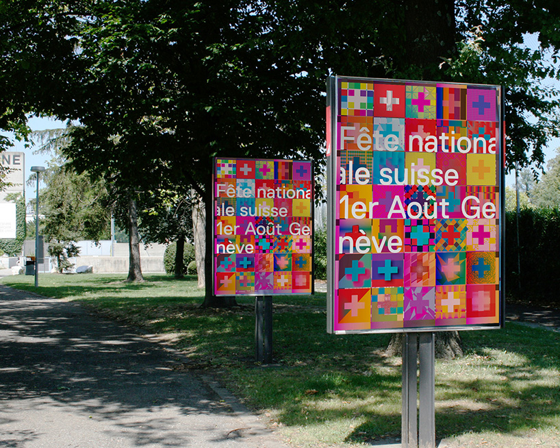
visual identity for geneva fette nationale – posters.
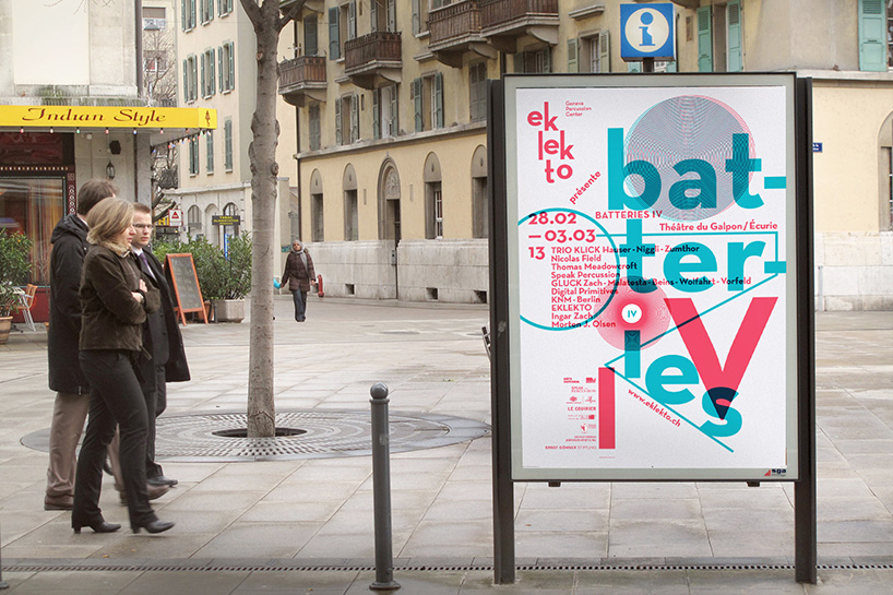
poster for eklekto.
DB: what currently fascinates you and how is it feeding into your work?
ML: I hold a hybrid role of creative director and managing director. on one hand I have been fascinated by ‘how we work’ lately –to produce exceptional work requires vision and rigor. on the other, I am committed to empowering our designers; to nurturing the fantastic talent; and, allowing them to ‘own’ their work. as a result, one of the things we have instituted in the studio is a weekly ‘creative meeting’ on wednesday mornings. the format is one of co-creation rather than show & tell. each week, a different project leader presents their team’s work in-process in front of the studio and seeks input. sometimes, it is a form of a criticism and skews more philosophical debate. at other times, it is a group brainstorming work session and skews more practical results. both are contributing to us maintaining our vision and rigor while leveraging the collective talent of the group.
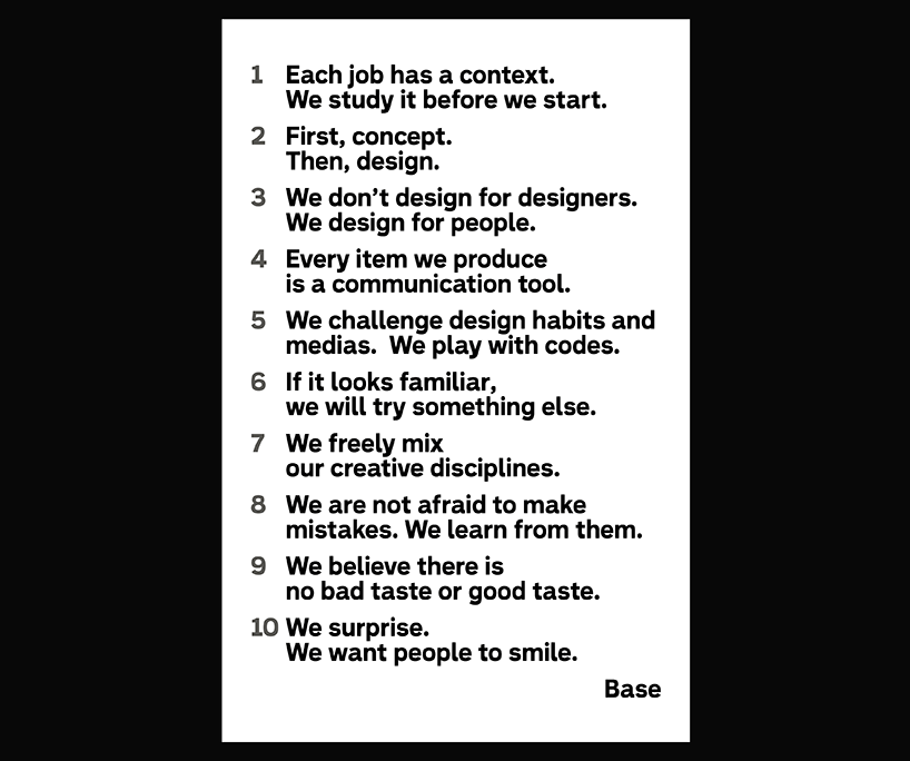
base design manifesto.
DB: what’s your personal motto?
ML: don’t stop – never stop.
