interview with graphic designer susan kare
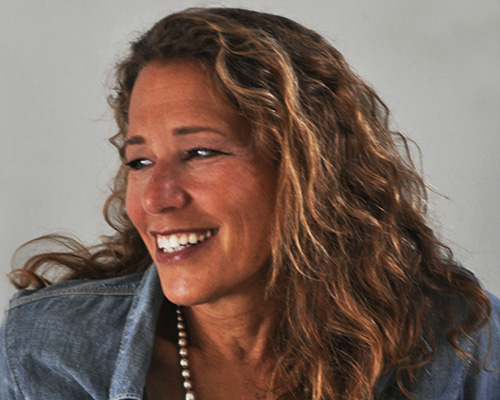
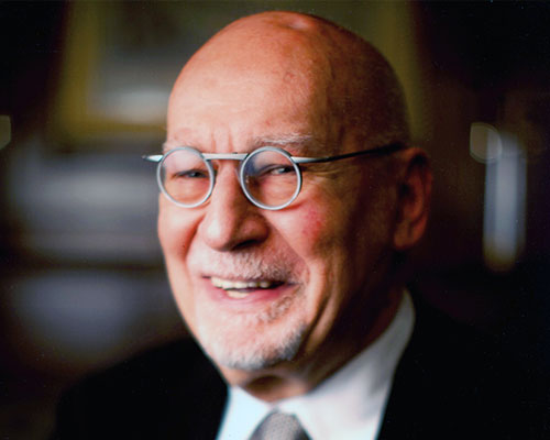
photo by ann rhoney
susan kare has designed thousands of icons for the world’s leading software companies. utilizing a minimalist grid of pixels and constructed with mosaic-like precision, her icons communicate their function immediately and memorably, with wit and style. she began her career at apple, inc. as the screen graphics and digital font designer for the original macintosh computer and was also one of the original employees of NeXT working as its creative director. she now works from her own office in san francisco.
designboom: what originally made you want to become an graphic designer?
susan kare: when I was in high school, I worked at a science museum in philadelphia for a terrific designer, harry loucks, who had worked for charles eames. he introduced me to typography and graphic design and I was so inspired by his work. I was excited just to make labels using different fonts on a photo typositor! subsequently, in addition to returning to the museum job for several summers, I took many pro-bono jobs to get graphics experience, including: posters and brochure design in college, holiday cards, invitations, etc. to build a portfolio since I didn’t go to art school.
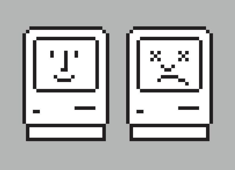
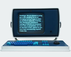
happy and unhappy computer
DB: how would you describe your approach to design?
SK: I think of design as problem solving — so it’s really important to understand all the factors involved in a creative challenge (e.g. the audience, the business landscape) before working on visual solutions. I explore many avenues while brainstorming since there’s never only one ‘right’ answer.
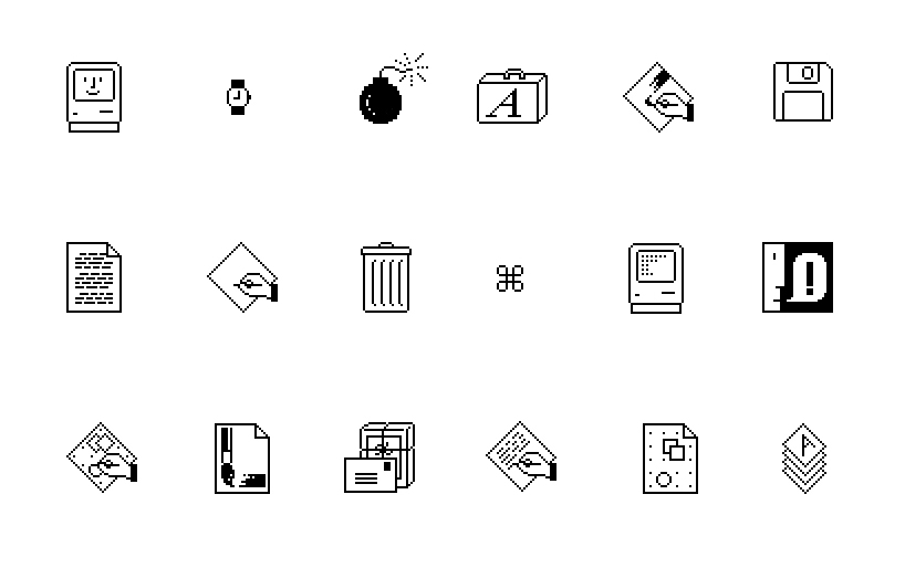
some of the first mac icons
DB: who or what has been the biggest single influence on your way of thinking?
SK: I’ve been inspired by so much work and by so many colleagues, but while working with paul rand (on materials for next computer) a window opened into his process for me. he was such a champion of looking at an assignment in an academic way, then creating graphics that were simple and meaningful. he told me – and he practiced this – that you don’t need to use very many different typefaces, but you need to use them well. I still refer to his books for advice and look at his color choices, and think WWPRD? (what would paul rand do?)

hello graphic from original macintosh launch
DB: what would you say is your strongest skill?
SK: although I work in all kinds of styles, I’ve been making pixelated icons since 1983. I’ve had a lot of practice in thinking deeply about metaphors that make sense and aiming to express those in small grids, especially when constrained by limited screen real estate. give me 16 x 16 pixels and a concept and I feel pretty fearless.
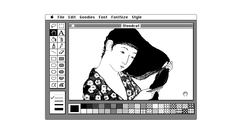
japanese woodcut image in original macpaint user interface
DB: what’s your favorite type of brief?
SK: designing symbols (icons and logos) is my favorite type of project, because in addition to working with imagery it’s challenging and satisfying to help clients articulate their key messages about their company or contribute to a product through visual design. other types of recent projects I’ve enjoyed would be: collaborating with areaware.com on some products for the home with pixellated images, designing clients’ presentations, and painting murals.
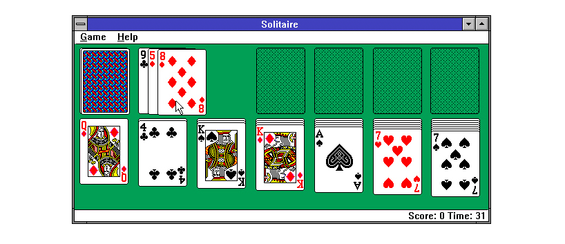
windows solitaire (celebrating its 25th anniversary in 2015)
DB: how do you think online design resources have influenced the graphic design being produced today?
SK: typically, I think it’s more about the craftsman than the tools, but I do think certain readily available resources such as templates and video tutorials raise the baseline level of competence. who doesn’t love auto trace? but sometimes the longer process of trial and error yields insight, ‘aha’ moments, and good results, as opposed to automated processes (e.g. how to make a hipster logo) and over-sharing that can contribute to some predictability and uniformity in visual expression.
on the plus side, I think it’s so useful and incredible (though not particularly insightful!) that the world’s largest art library/clip art library is on your desk. I remember the days of poring through my book and magazine collection, or needing to run to the library to try to find an image.
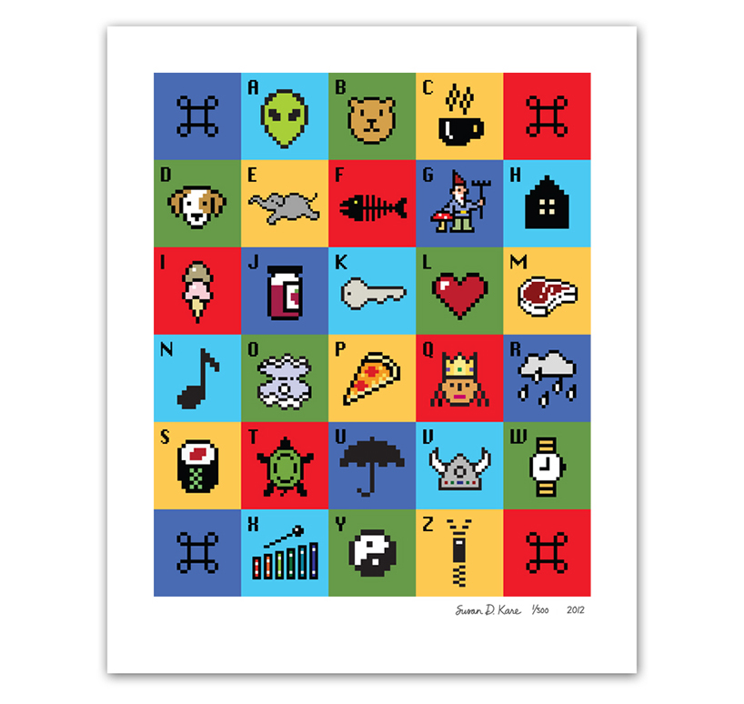
icon A-Z print
DB: what are you currently fascinated by and how is it feeding into your work?
SK: I’ve been fortunate to have spent some time in mexico over the last few years, and have been influenced by some of the palettes and techniques I’ve seen in weaving and painted surfaces. some new additions to my office include a cow skull with enormous horns, an intense red blanket complete with blue swordfish, and a guadalupe mermaid I painted in a coconut leaf. I really do find inspiration everywhere. as an avid runner here in san francisco, I have the opportunity to take a variety of routes and often take photographs of things I notice along the way such as interesting signage, house numbers, cacti, mosaics, etc.
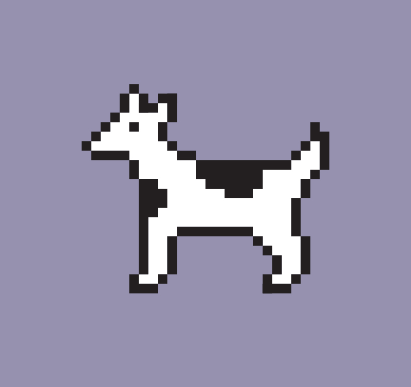
dog-cow
DB: what are you passionate about besides your work?
SK: one non-profit I really care about is surfers healing, which gives autistic kids a one-on-one surf experience and their families a ‘normal’ day at the beach. it’s been quite moving to volunteer and witness their events. I’m also an ardent supporter of the monell chemical senses center an amazing independent, non-profit research center for sensory physiology in philadelphia. my dad was the founding director there 45 years ago, and paul rand designed their logo.
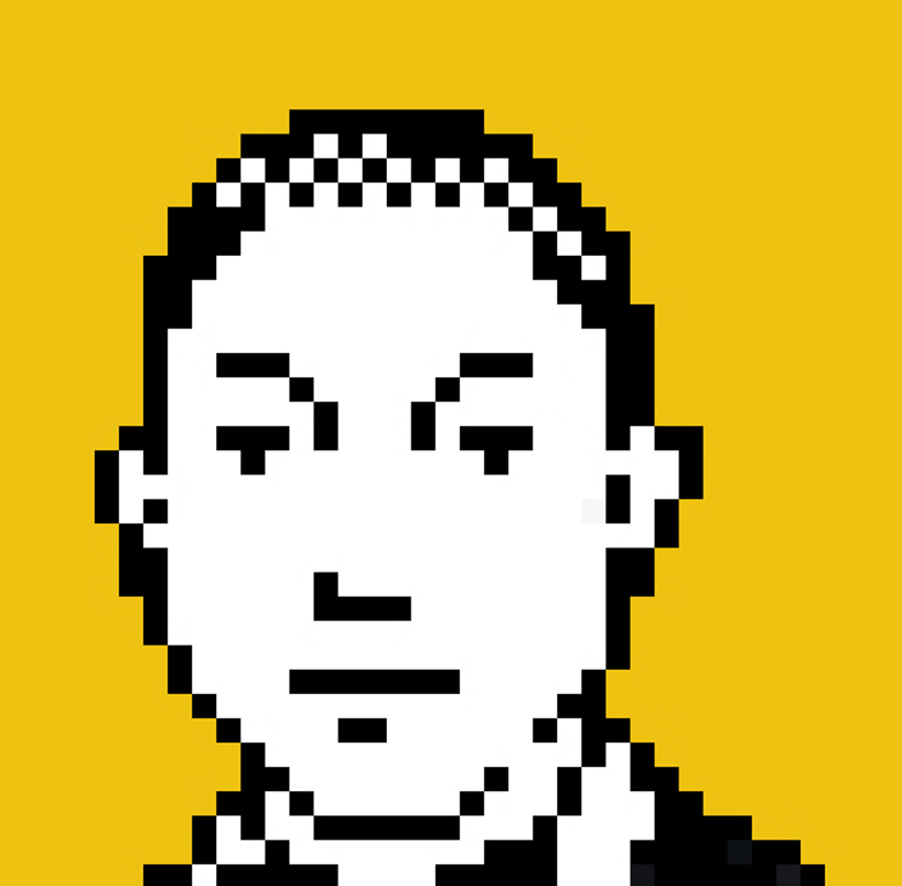
pharrell williams
DB: do you have any self-imposed rules that you live by?
SK: don’t try to be original, just try to be good.
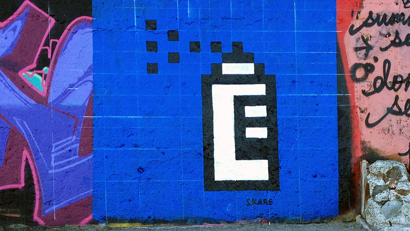
spray can icon mural, marin county seawall, california
photo by harry tannenbaum
DB: what’s the best piece of advice you have heard ?
SK: the secret to happiness is low expectations!
in terms of never being discouraged, I was told growing up that you often need to hear 100 ‘no’s’ before a ‘yes’, so every time you hear a ‘no’, you’re a little closer to your goal.
…and sometimes I’ll repeat mark twain’s saying ‘when in doubt, tell the truth’.
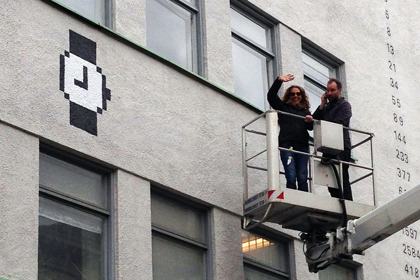
watch cursor mural, gothenburg, sweden
photo by heidi nilsen
DB: what’s your personal motto?
SK: it’s literal and metaphorical: ‘the best surfer in the water is the one having the most fun’.
