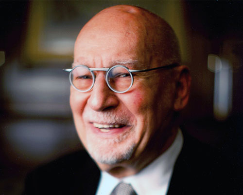
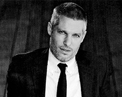
LUST portrait
photo by nadine stijns
LUST is a multidisciplinary graphic design practice formed in 1996 by jeroen barendse, thomas castro, and dimitri nieuwenhuizen, based in the hague, netherlands. LUST’s work includes printed materials, book design, abstract cartography, data-visualizations, new media, interactive installations, and architectural graphics. co-founder jeroen barendse told designboom more about their work.
designboom: how did you all meet and decide to start LUST?
jeroen barendse: thomas (castro) and me met in 1991, when we both studied at the art academy in utrecht. thomas grew up in the philippines and LA and moved to the netherlands especially to study graphic design. at that time, I double majored in graphic design and fine art, since I was not totally sure which path to follow. after two years, we both decided to switch to the art academy in arnhem, and graduated there. we started a magazine and called it LUST – which is where our studio name originates. shortly after leaving university we met dimitri (nieuwenhuizen) while on an internship.
thomas and me started LUST as a practice in 1996 and at that time dimitri had another studio in the same building as us. we often collaborated on media-based projects with him, and after his studio closed we all joined forces.
the three of us share a deep interest in exploring new pathways for design at the cutting edge where new media and information technologies, architecture and urban systems and graphic design overlap.
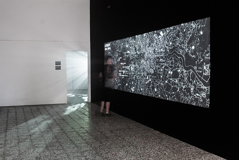
death in venice ‘the shape of death in modernity’ for alison killing and ania molenda, 2014
a research project and interactive exhibition exploring the relationship between modern architecture and death over the last century. the first iteration of the exhibition was held in venice in june 2014. the development of architecture related to death and dying has been, over the past decades, as vivid and significant as the development of other modern ideas that shaped the contemporary city. nevertheless, it is rarely foregrounded in the architectural history of the 20th century.
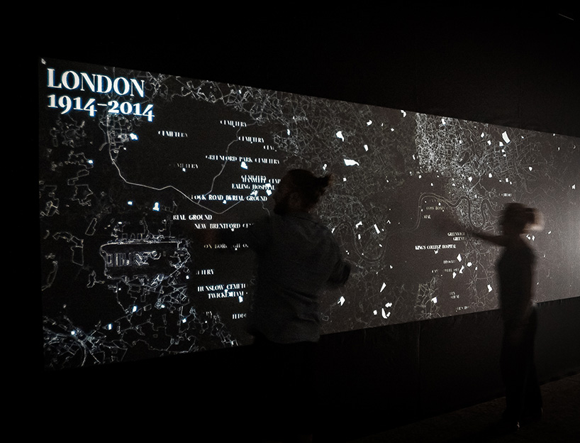
death in venice shows the changing landscape of death in modern britain, the site of early developments in modern western cremation and the modern hospice movement which helped to shape a broader western context. it examines the changes which have taken place in great britain over the last 100 years, taking them as a point of departure to reflect on the current shape of death and the architecture which offers space for it.
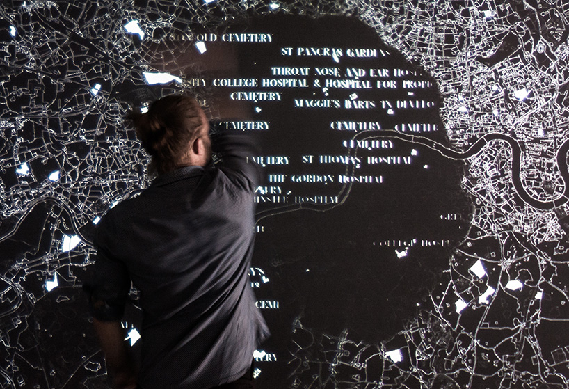
the exhibition is split into three rooms, each offering a different way of interacting with the content. the first room presents an interactive map of london, where the typical content is inverted: common landmarks are hidden while hospitals, hospices, crematoria and cemeteries are highlighted. labels and captions can be uncovered by the user but fade away again with time.
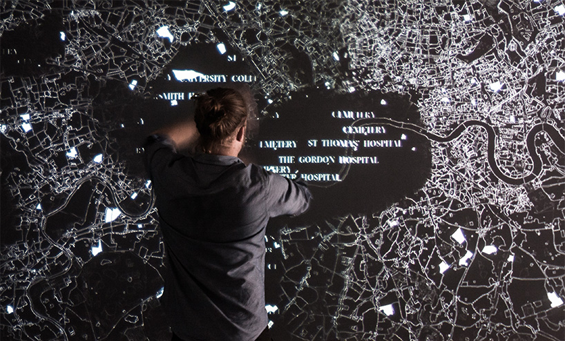
death in venice ‘the shape of death in modernity’ for alison killing and ania molenda, 2014
DB: how big is the LUST team at present?
JB: for several years LUST was just the three of us – sometimes with interns or one other employee, up until 2010, when we set up LUSTlab, a research-based media & technology studio as a laboratory for media and technology, to develop new communication tools, man-machine installations and physical products using digital content.
we currently work from two locations in two teams of about eight people, with a mix of designers, programmers and creative coders. projects have for us always been an outcome of collaboration between the different team members, and that has only become stronger. thats also the reason why we never put individual names under a design.
about a year ago we installed a little theater-like space at the lab, that we use to test out our installations and also hold small events there for colleagues and friends.
DB: how do you divide / share the work that you do?
JB: as in every studio, everybody has his own strength and at the start of a project we try to understand who the project resonates strongest with and which of us ‘clicks’ with the client best – otherwise the project would just become ‘work’.
of course we often have brainstorms when a new project comes in, where we all share ideas and so on to get the project started. LUST works on the visual design and user experience while the lab will usually works on resolving the technical challenges.
stedelijk museum amsterdam: type/dynamics exhibition by LUST & jurriaan schrofer, 2013 – 2014
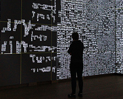
an interactive installation for the exhibition ‘type/dynamics’ at the stedelijk museum in amsterdam. ‘type/dynamics’ interacts with and comments on the work of graphic designer jurriaan schrofer (1926–1990) in an effort to revitalize recent design history. the installation visualizes information that continuously surrounds us and is always accessible. by searching for real-time locations currently in the news, like ‘ground zero’, ‘reichstag”, or ‘tiananmen square”, the installation can locate the panorama images from google streetview, abstract them into grids and fill the grids with new information. see designboom’s article on this project »
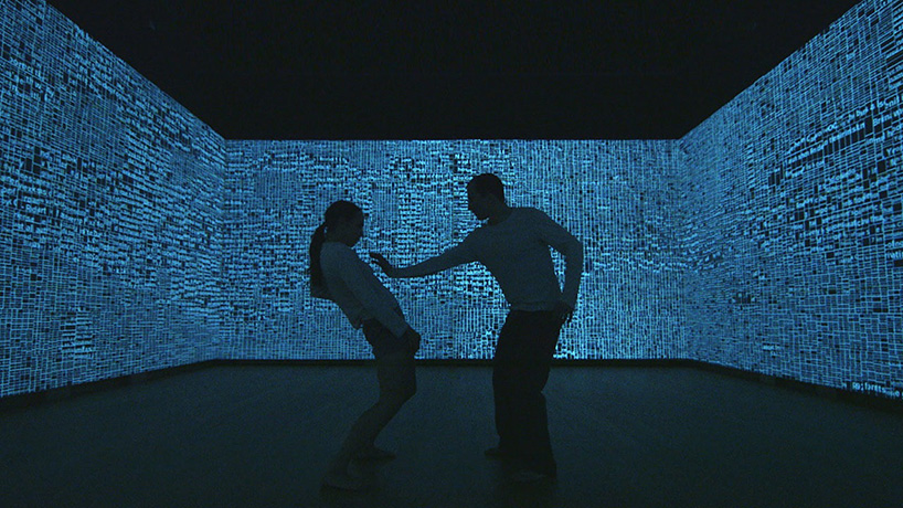
stills from a forthcoming short dance movie, shot and directed by ruben van leer, and choreography by lukas timulak
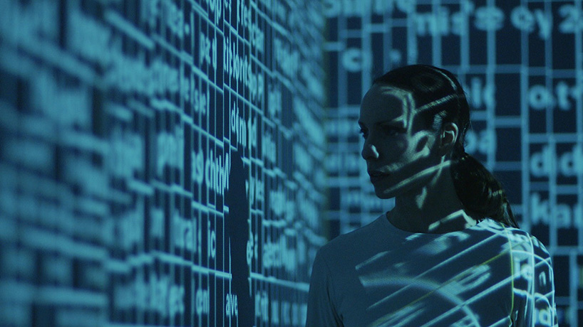
stills from a forthcoming short dance movie, shot and directed by ruben van leer, and choreography by lukas timulak
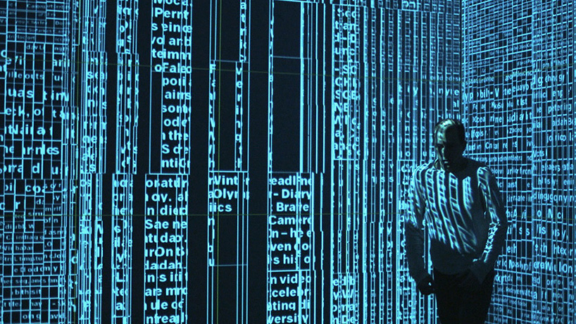
stills from a forthcoming short dance movie, shot and directed by ruben van leer, and choreography by lukas timulak
DB: what type of brief or project do you enjoy working on the most and why?
JB: the projects we really enjoy working on are the projects that involve multiple skills, and multiple disciplines. these are usually the most complicated also. since we started the studio, we have always been quite involved in redefining the original brief, redefining what is the real need or question – it’s not always what you are asked for.
refining a brief also has influence on decision chains, budgets, timelines, etc.. those are the kind of projects where you can really work with the client together to reach an unexpected outcome.
our design methodology is process and generative-based, founded upon the development of an analytical process which leads eventually to an end-product that then ‘designs itself’.
thomas and I teach at the the art academy in arnhem and one of the first things we tell our students is to start blank, and be as open as possible on a project, and let the project guide you to an idea, instead of imposing a predefined outcome based on your first understanding of the problem. you have to surprise yourself with the outcome – come up with something you could never think of if you design from a top-down perspective.
DB: which projects have had the biggest impact on the studio so far and why?
JB: in 2002 we started working on what we call digital depot, for museum boijmans van beuningen. it was a project that consisted of what we called a data cloud and data walls. the data cloud part was an interactive visualization where you could explore the whole collection of the museum in an intuitive manner. the data walls where the opposite of this general overview, but consisted of real art works, hung on walls in an 18 century manner, the whole wall filled, with paintings, sculptures, objects, etc.. in front of the wall there were free-floating screens that could change from transparent to opaque. on these screens the visitor could find and explore in-depth stories about art works, its context in art history, relations to the collection, etc.
in this project a lot of our fascinations came together, visualization, interactivity, developing of narratives, technique, and a bit of invention. we were quite lucky that the museum gave us a lot of trust, i think nowadays that would not happen so fast anymore. we got the opportunity to really develop something new, using new techniques to tell new stories. mostly when we are approached now for similar type of projects, the technique needs to have a proven track record of reliability. this makes sense for the client, but it also defines the outcome much more.
another project that had a big influence on the studio would be ‘poster wall for the 21st century’ that we developed for the graphic design museum in breda in 2008, both online and as a part of the museum’s permanent installation ‘100 years of graphic design in the netherlands’. in the museum about 600 unique posters are automatically generated daily, using content gathered from various internet sources. online, one new poster is generated every five minutes.
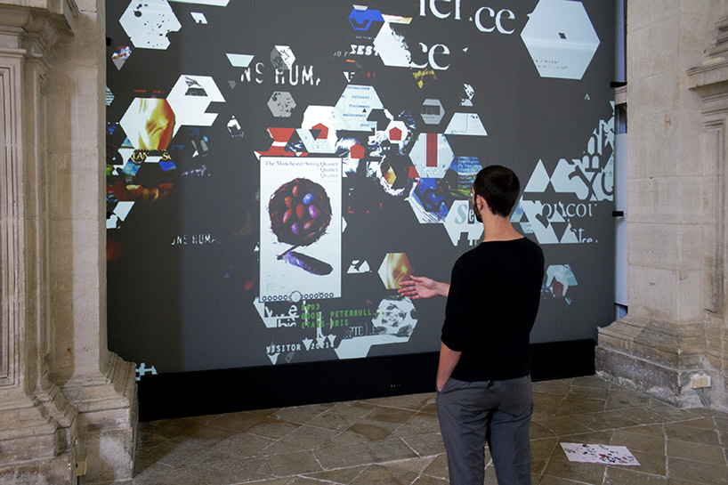
polyarc, media installation, poster festival chaumont, 2011
during the 22nd international poster and graphic design festival of chaumont, LUST took over the chapelle des jésuites with an in-situ piece intended to build bridges between the festival’s past and future. extending the notion of archiving to the future and to hypothetical pasts. prior to the exhibition, they compiled a visual and textual database. visitors at la chapelle could interact with this ‘polyarc’ to make their own digital or print publication, before adding their own contributions to it.
through its content, the installation explores and informs us about graphic design in chaumont: venues, accomplishments and projects. through its form, it considers the paths and media traveled by graphic design; and how they are evolving in light of technology, the amount of information and images being produced, and changes in the applications of the discipline.
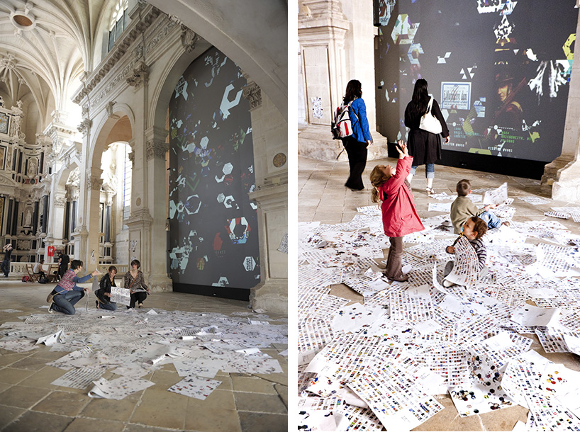
during the festival visitors could pick up one-of-a-kind print-on-demand booklets at la chapelle which could be inserted into this dossier. this dossier functions as a ‘snapshot’ of a constantly growing archive. visitors were invited to contribute to this archive by sending twitter messages. any messages sent will be stored and made accessible via the installation and printed for the dossiers.
photos by richard pelletier
DB: has any person or project recently challenged your views on graphic design?
JB: we challenge ourselves to adapt to a changing design landscape and also to be ahead of things. traditionally, culture in the netherlands has been the biggest ‘client’ of design, but the public funding of culture has been under fire lately, and has been reduced quite a lot under influence of the economical crisis and right wing populists. that is also why we set up the lab in 2010, in an attempt to take things in our own hands and create our own opportunities.
currently we are also challenging ourselves again, as LUST grows; we were always in favor of a non-hierarchical approach to almost everything, we used it a lot in our designs, and our philosophy of how a design studio should be run. we are now looking into ways in which we can stay a flat and non-hierarchical studio as much as possible, but at the same time provide more structure.
DB: how do you think online design resources have influenced the graphic design being produced today?
JB: the speed with which projects are spread around the world is rapid nowadays. this has made that the visual presence, the look of things, spread really, really fast, and thus things that ‘look good’ are copied, adapted, and spread again – sometimes without justification.
there is also much more homogeneous global visual style now. for instance, I would not know what ‘typical’ dutch design would entail anymore, except for perhaps that it’s designed or made by dutch designers, whereas before it was recognizable for specific traits and characteristics.
our work is often made for a specific context, and can often only function, or is understandable within that context. its very hard to reduce the visual aspects of such a project to a 640px wide image that should represent it online, because you lack all the information that informed the design – or that lets you experience it properly.
that is also why we think that the thinking behind a design, not the visual outcome is becoming more and more important, because that is the unique thing a designer can truly contribute towards.
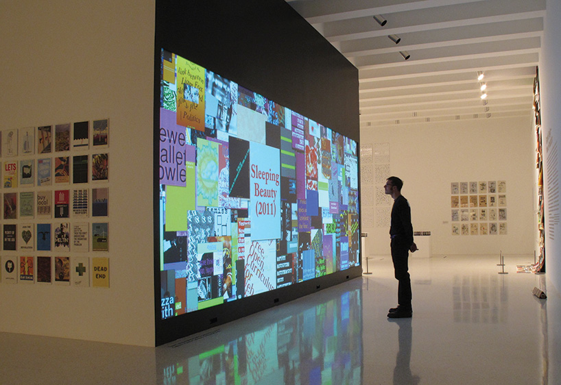
posterwall 2.0, various locations, 2009 – ongoing
for the graphic design museum in breda LUST developed in 2008 the poster wall for the 21st century, both online and as a part of the museum’s permanent installation ‘100 years of graphic design in the netherlands’.
in the museum 600 unique posters are automatically generated daily using content gathered from various internet sources. online, one new poster is generated every five minutes. new posters are automatically generated when physical events occur in the space: for example, when visitors enter the space, when visitors view the touch tables, and when visitors approach the wall itself.
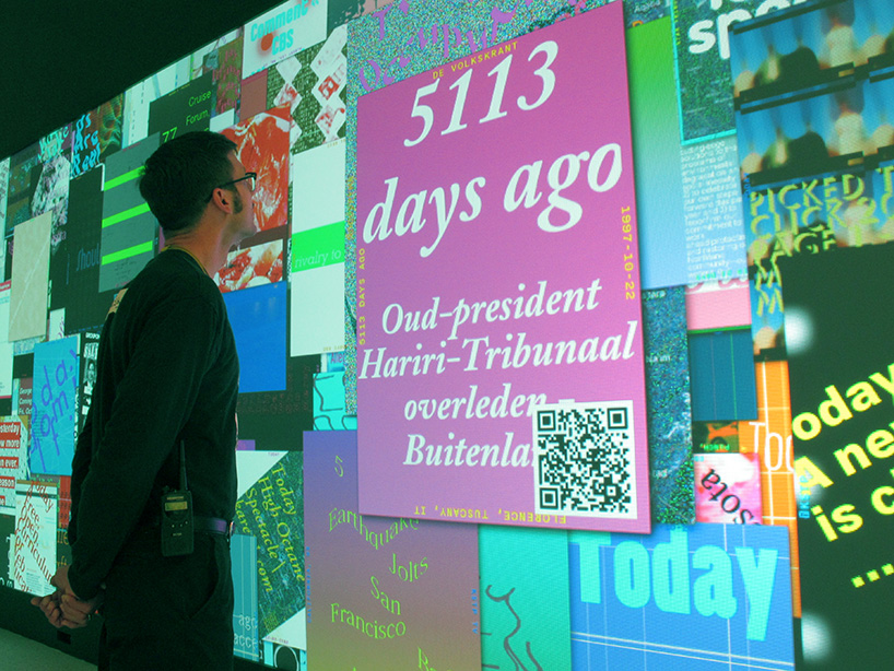
live-versions of the posterwall have been shown at the 2010-2011 triennial of design at the cooper hewitt in new york, at the wide white space exhibition in wattis, san francisco and public design expo in seoul. this 2.0 version of the posterwall offered new possibilities, like tweets, QR-codes, and social sharing. the posterwall is currently traveling across the USA.
DB: do you think drawing is an important skill for a designer to possess in this day and age?
JB: drawing for us is mostly used purely to illustrate an idea, to initially visualize an idea or concept, to communicate it with others, not so much as an end result. in that sense we are maybe too much children of modernity, and the idea of reproducibility. coding functions often as drawing for us. I guess we also like a certain objectivity and formalism in our visual language, made by mechanical processes.
DB: what do all the LUST founders share a passion for – besides your work?
JB: when the studio was a bit smaller (and we did not have children yet) we often went on snowboarding trips, in europe, the USA, canada and even chile. it’s a great way to see different cultures and nature.
DB: do any of you have any superstitious beliefs or rules that you live by?
JB: in designing, we believe that the outcome or solution of a project lies already in the materials that you are supplied with. that is also why in most cases we can’t start designing a project before we have the materials. we then analyze the materials, photos, texts, graphs and numbers, etc. and look for patterns, common denominators, small building blocks that we can use to build up a vocabulary.
we often talk about the ‘vocabulary’ of a project. during the research phase of a project, we don’t shape or design. we just try to build a ‘vocabulary’ for the project with each sketch, idea or experiment embodying a new ‘word’. the richer the words, the more elegant sentences we can speak.
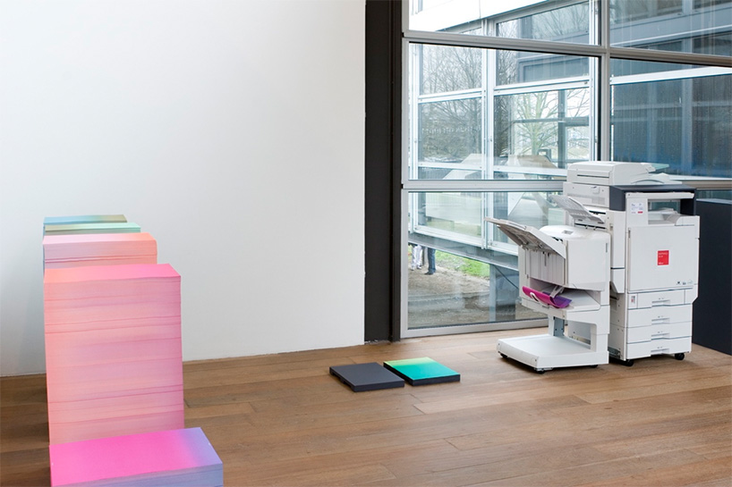
at random? networks and cross-pollination at museum de paviljoens, 2007
an exhibition curated by the museum de paviljoens in almere, netherlands. as its point of departure, at random? takes the idea that creative processes – now more than ever – do not evolve linearly but in an associative and unpredictable way. at random? is inspired by the enormous offering of information that is produced on a daily basis within our media society. at random? deals with interdisciplinary cross-pollination, networks and new sources of inspiration for the artists, designers and curators that are involved in the exhibition. LUST was invited to be part of this exhibition and, at the same time, design the exhibition design and all the related print collateral.
photo by nadine stijns
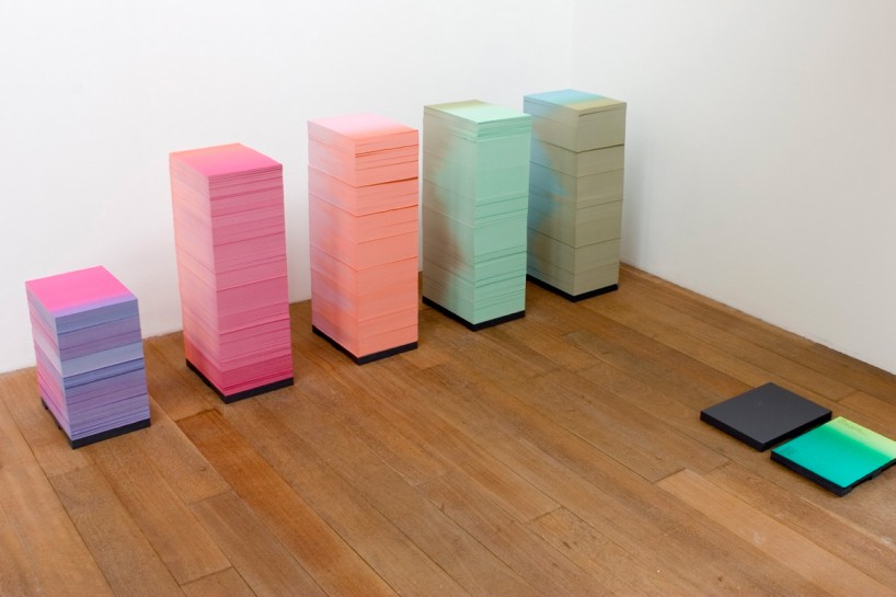
to play off the idea of randomness, LUST proposed to print all the paper needed throughout the course of the 6 month long exhibition to be made at the beginning of the exhibition, using a printing process known as ‘split-fountain’ printing (irisdruk in dutch). this technique involves printing multiple colors on the same roll during a single print run, effectively mixing the colors in gradient on the fly.
photo by nadine stijns
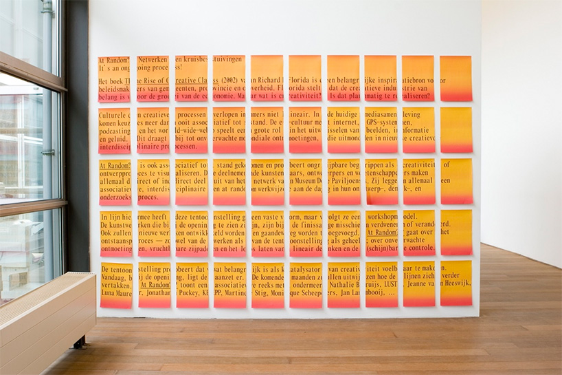
the total of 80.000 A3-sized sheets was exhibited in the museum, as a paper sculpture, in 10 stacks of 8000 sheets. this paper was to be also used for the digital copier in the installation which printed, collated and bound each on-demand piece. through a specially devised program, visitors could print their own unique copy of the exhibition catalog, for example, which always had a different lay-out according to the program in the digital copier.
photo by nadine stijns
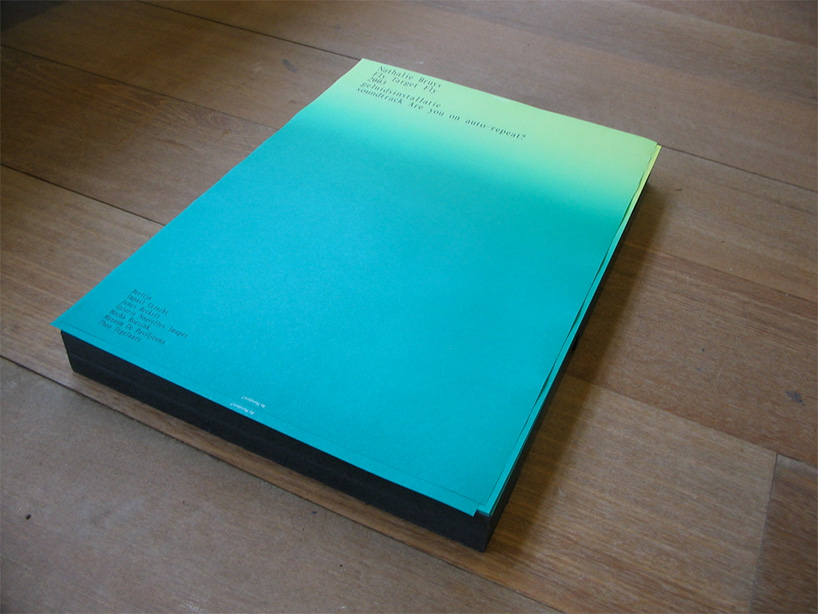
also all the posters, invitations, museum texts were printed on this paper. the stacks functioned as kind of timeline, since the paper dwindled as the paper was used for the show. the paper on which each piece was printed could be then related back to the time of the exhibition it was printed.
photo by nadine stijns
DB: what’s the best piece of advice that you have heard and repeat to others?
JB: there are many, but our good friend and teacher karel martens always compared design with eating. he once told us: at all moments in time you can eat french fries with mayonnaise, which gives you instant gratification, but after you have eaten them, you already have forgotten it, all that is left behind is a sore stomach. a fine dinner on the other hand might be challenging in taste, you might have to work a bit to appreciate it fully, but it gives you a much richer experience.
DB: what is LUST’s motto?
JB: when we started LUST in 1995 we always used the following piece of text as a sort of motto, and although we have not used it very much lately, in essence it is still what we try to accomplish and what we think design should be about:
LUST is the missing piece of the puzzle.
when you have almost finished the puzzle, you discover that there is one small, lousy piece missing. this is the moment we want to capture, because this is the moment something basic is going to happen. whether you start searching until you find the missing piece, or you throw away the puzzle altogether. both options are a thousand times more interesting than the moment the puzzle is finished, because when that happens, there is nothing more. however, what you will remember – the thing that indelibly stays with you – is that puzzle with the hole: the part asking for interpretation.
and LUSTlab’s motto could be:
the future of digital media lies in the design of its use.
happening now! in an exclusive interview with designbooom, CMP design studio reveals the backstory of woven chair griante — a collection that celebrates twenty years of Pedrali’s establishment of its wooden division.
